4 AI products
for dental.
From MVP to scale.
1000+ clinics. Canada, USA, Europe. The AI pipeline worked — but doctors couldn't use it. As Head of Design for 3 years, I rebuilt the entire experience: redesigned UX, built the design system, shipped two themes, and grew the platform from a single MVP to a four-product dental AI suite.
Under NDA. Product identity and client name are confidential. Screens shown are from the published case study on stepikin.ru. Real patient data and proprietary AI model internals are not disclosed. The platform is referenced here as "AI Dent."
Not one product.
Four.
Over 3 years the platform grew from a single AI radiology tool into a full dental AI suite. Each product required its own UX approach, user research, and design system work.
AI Radiology & Patient Management
CBCT, panoramic, bitewing AI analysis with findings overlay. Patient records, report ordering, multi-clinic management.
Studio — Treatment Planning AI
AI-assisted prosthetic and orthodontic planning. Visualizes restoration scenarios and implant placement from scan data.
Desktop App — MIS Integration
Native desktop app connecting AI Dent to clinic management systems (МИС). Bridges AI analysis with existing clinic software.
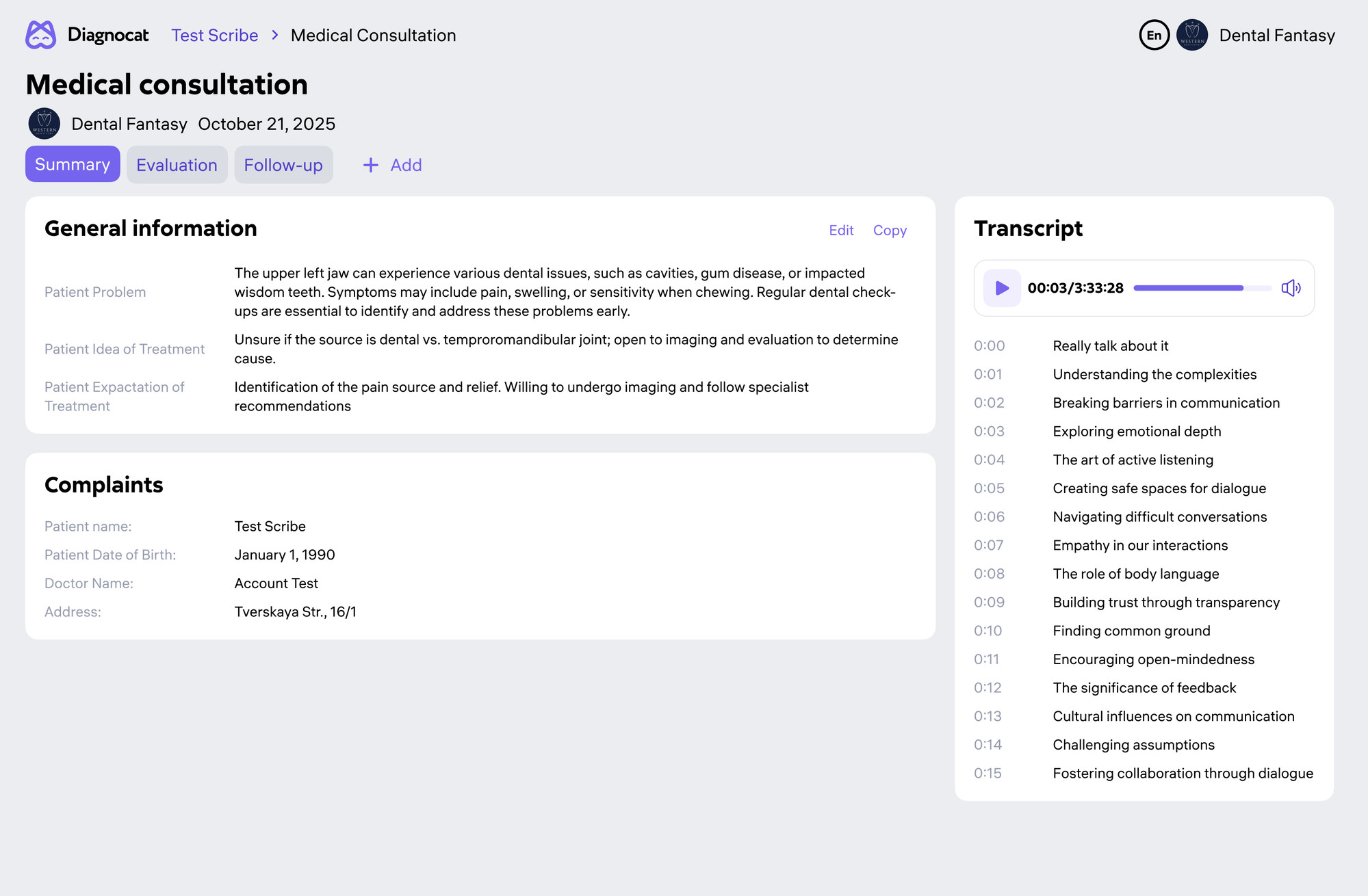
Scribe — AI Appointment Recording
AI recording and transcription of dental consultations. Extracts key findings, auto-populates patient notes.
Built for the AI.
Not for the doctor.
The platform launched in 2022 validating the AI pipeline as its north star. As it expanded internationally, six UX problems compounded into critical blockers.
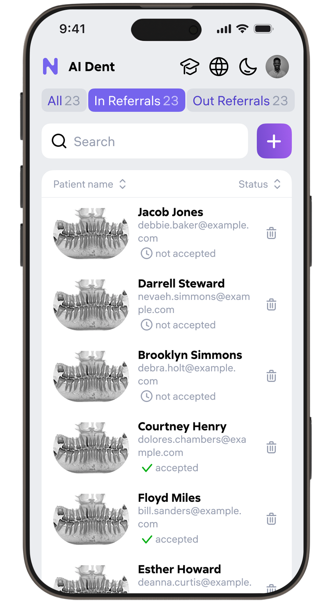
Cognitive overload in patient lists
Dense, unfiltered tables with no hierarchy. Finding a patient took 4–7 clicks. Doctors spent more time navigating than diagnosing.
Bloated patient pages
Up to 11 tabs per patient with inconsistent IA. Critical AI findings were buried. Doctors routinely skipped entire sections.
Unintuitive AI tools
Projection tools, tooth formula widgets, 2D/3D navigation — misunderstood by 70% of first-time users in corridor testing.
Complex 2D / 3D switching
Moving between panoramic, bitewing, CBCT, and 3D views required multi-step flows. Radiologists lost context mid-report.
Dark mode only — no mobile
No light theme. Interface broke below 1280px. Unusable on calibrated white exam monitors and in bright clinic lighting.
No design system
Each sprint introduced new visual patterns. No component library, no token system. Inconsistency compounded with every release.
30+ dentists.
Every specialty.
In-depth observation sessions with radiologists, therapists, prosthodontists, and orthodontists — in their actual clinic environments across three continents.
Discovery sessions
One-hour observation sessions in working clinics. We tracked how doctors actually moved between tools — not what they reported in surveys. Amplitude analytics tracked behavioral patterns at scale post-launch.
"I open the report, but I never know which part matters. Everything looks equally important."
— Radiologist, 8 years clinical experienceContinuous validation
A/B interface tests, 5-second comprehension tests for navigation, corridor usability studies. Hypothesis testing before every major release. Post-launch feedback interviews at 3-month mark.
"The new patient list — I found my patient in two clicks. Before, it was 30 seconds every single time."
— Prosthodontist, Moscow · post-launch interview
Research → analytics
→ design → ship.
Three parallel workstreams at all times — qualitative research, quantitative analytics, and design iteration. No stage-gated waterfall.
In-clinic discovery
- Observation sessions across 4 dental specialties
- Corridor usability testing with real patient flow
- A/B layout and comprehension tests
- Post-launch interviews 3 months after each major release
Amplitude tracking
- Event-level behavioral tracking across all key flows
- Funnel analysis for report ordering and patient navigation
- Hypothesis testing against pre-launch baselines
- Support ticket volume as confusion proxy before/after
Figma → production
- 200+ component design system with token-based theming
- Interactive prototypes via Figma Make for usability testing
- Design spec delivery with developer annotations
- Design leadership: reviews, QA, cross-product consistency
Discover
Clinic observation, 30+ interviews, Amplitude analysis
Define & Map
JTBD, user journeys, information architecture rework
Design
Wireframes → high-fidelity → Figma Make prototypes
Test & Ship
Usability testing, A/B experiments, live tracking
The interface
doctors actually use.
Each surface rebuilt from user behavior data. Five core flows — each with its own iteration arc and measurable outcome.
Navigation
rebuilt from scratch
Original patient list: 4–7 clicks to reach any record. We ran 12 design iterations — testing layout, filter logic, card density — before landing on a 2-click solution.
- Persistent inline search with instant filter by name, date, status
- Smart sorting: last visit, upcoming appointment, AI report readiness
- Compact / expanded view toggle saved per doctor preference
- Quick-action row — open report, schedule, share without entering patient card
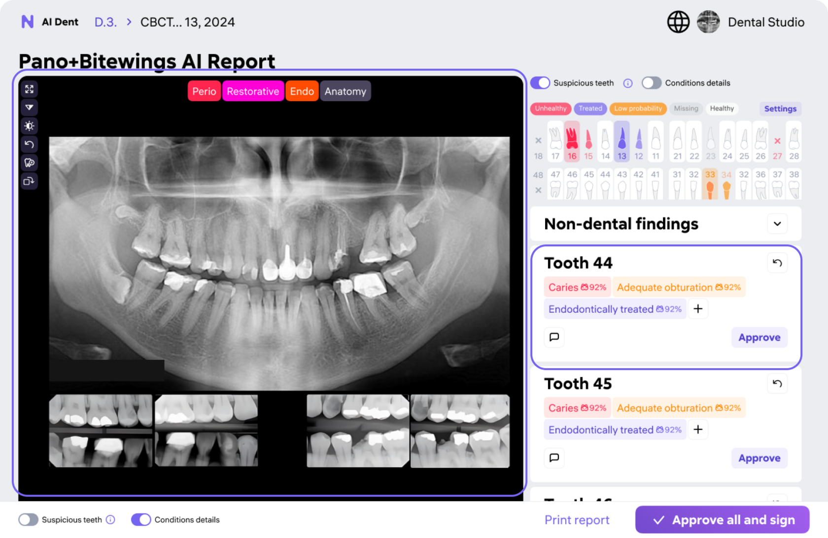
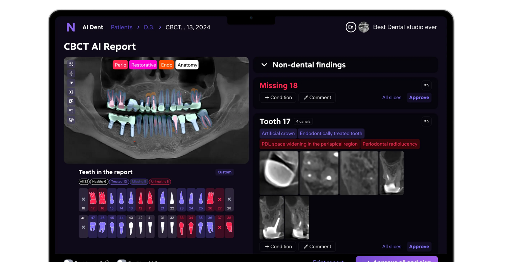
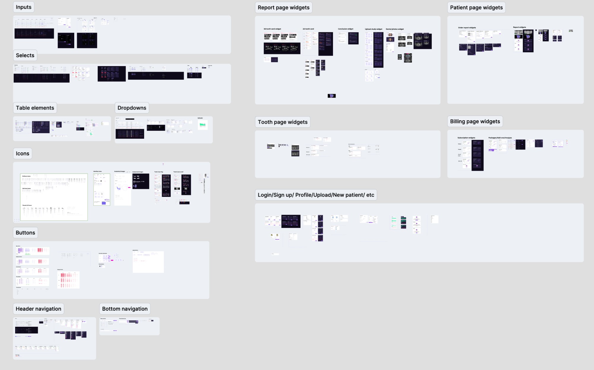
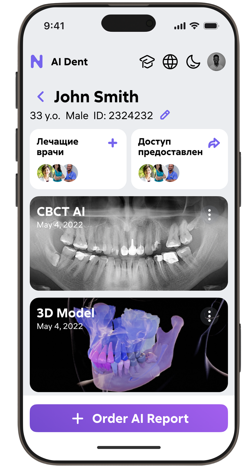
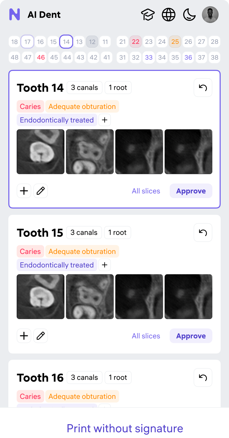
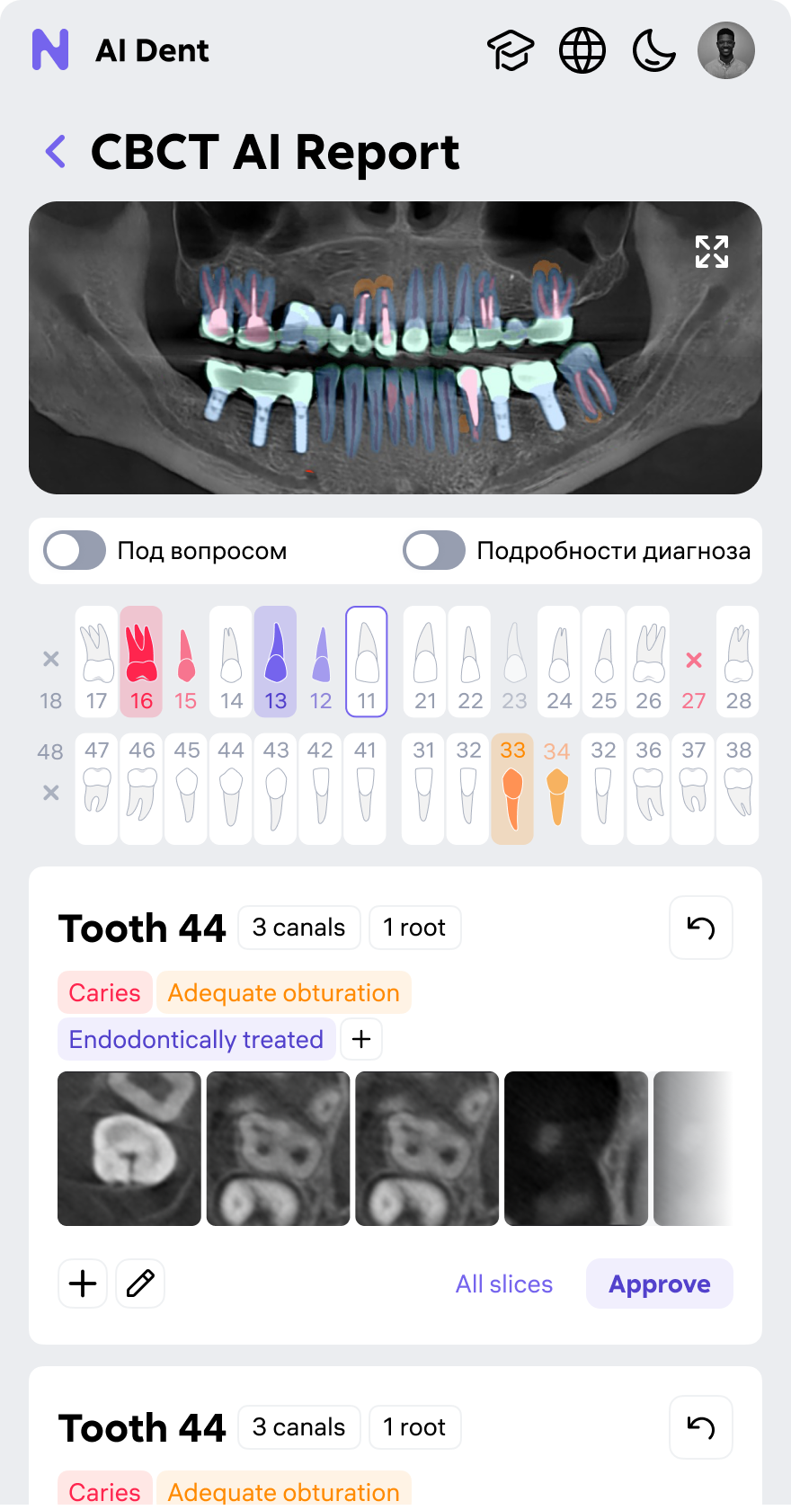
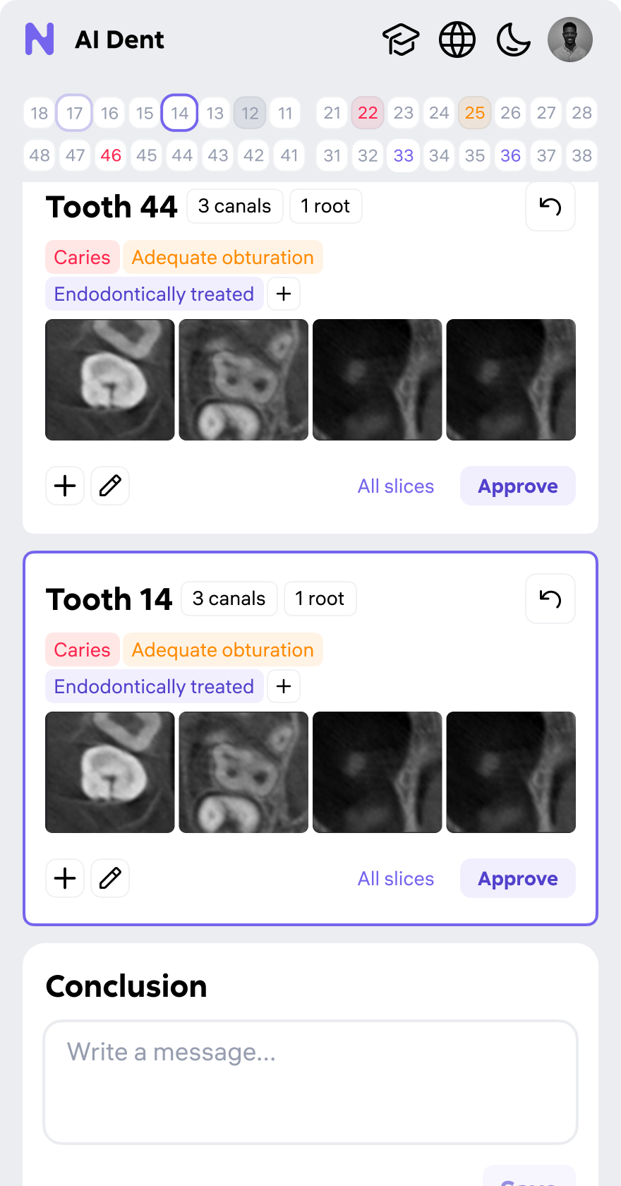
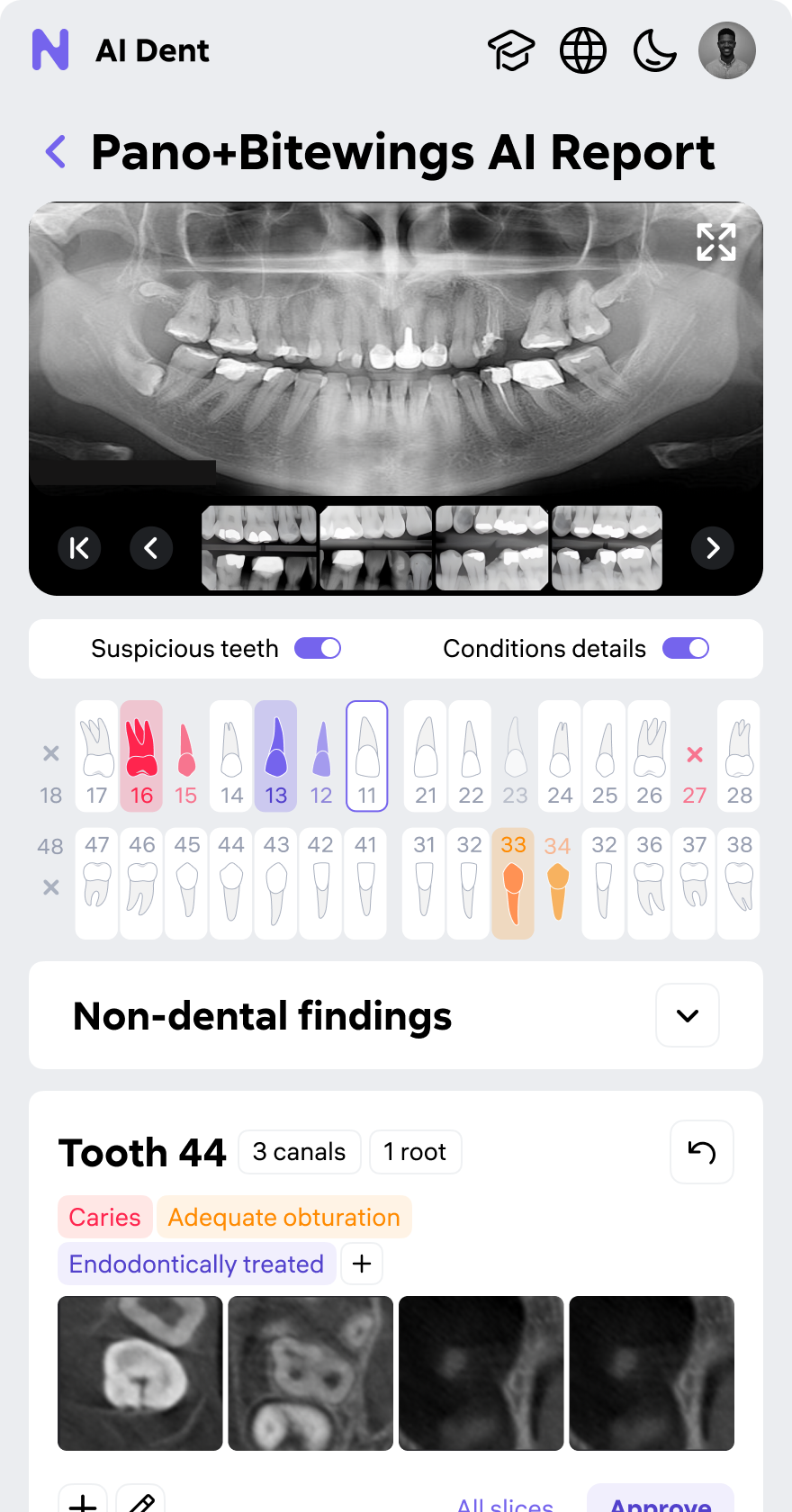
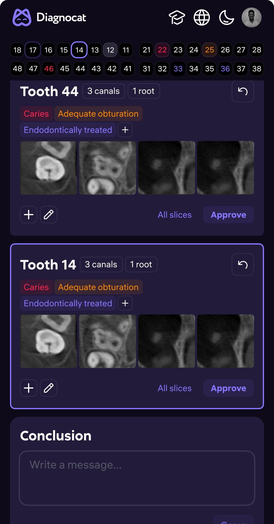
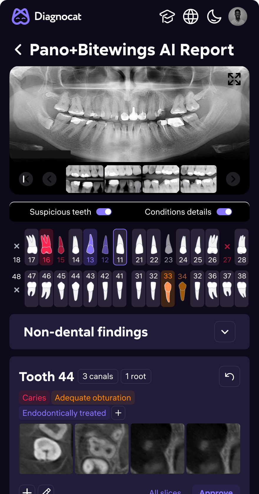
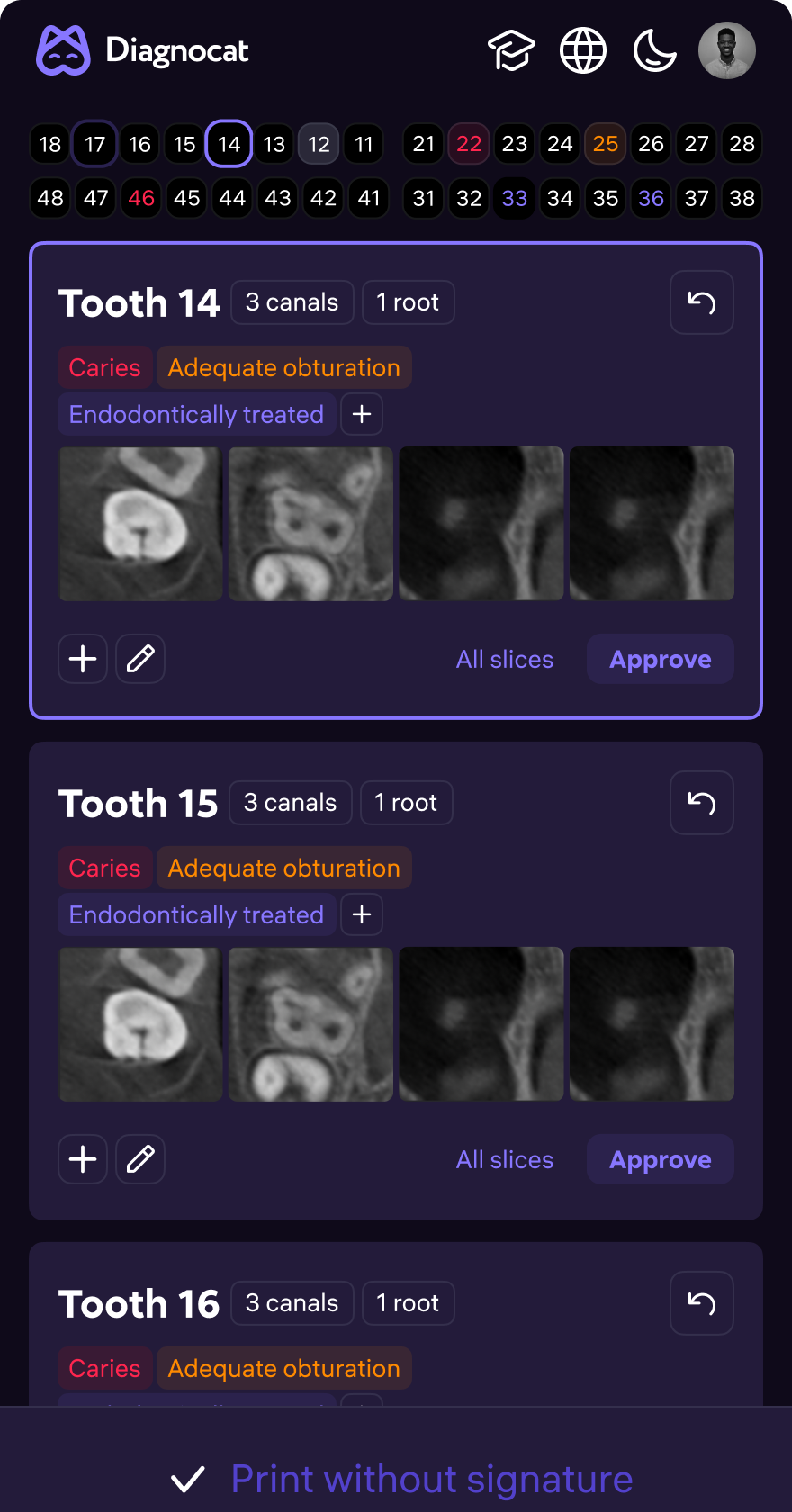
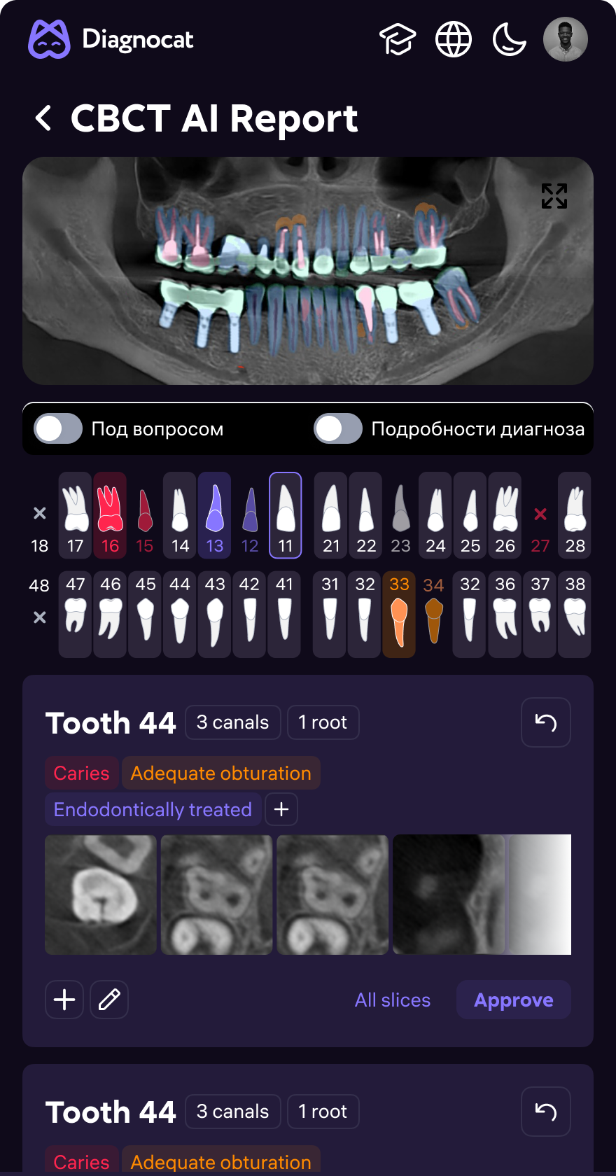
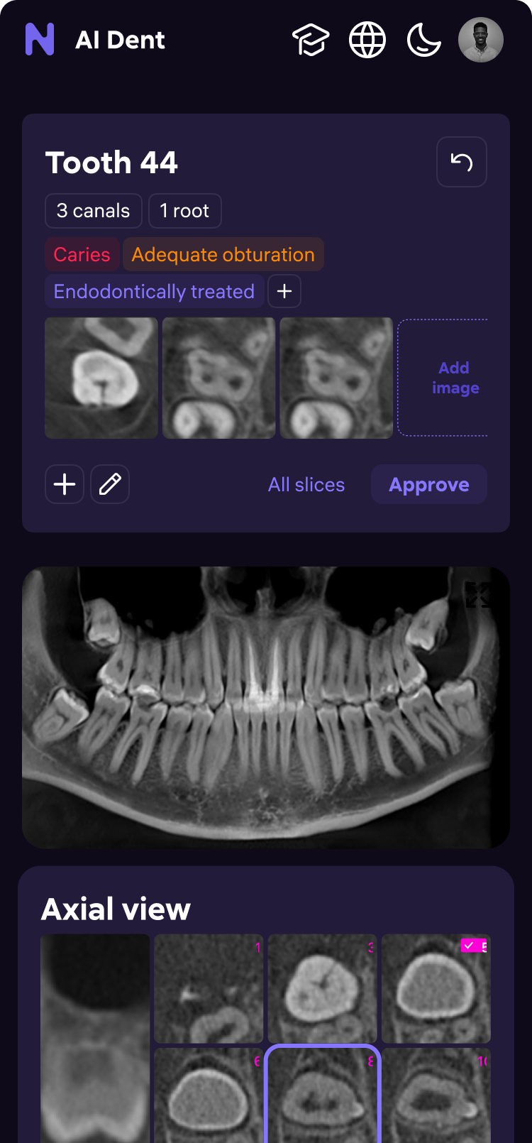
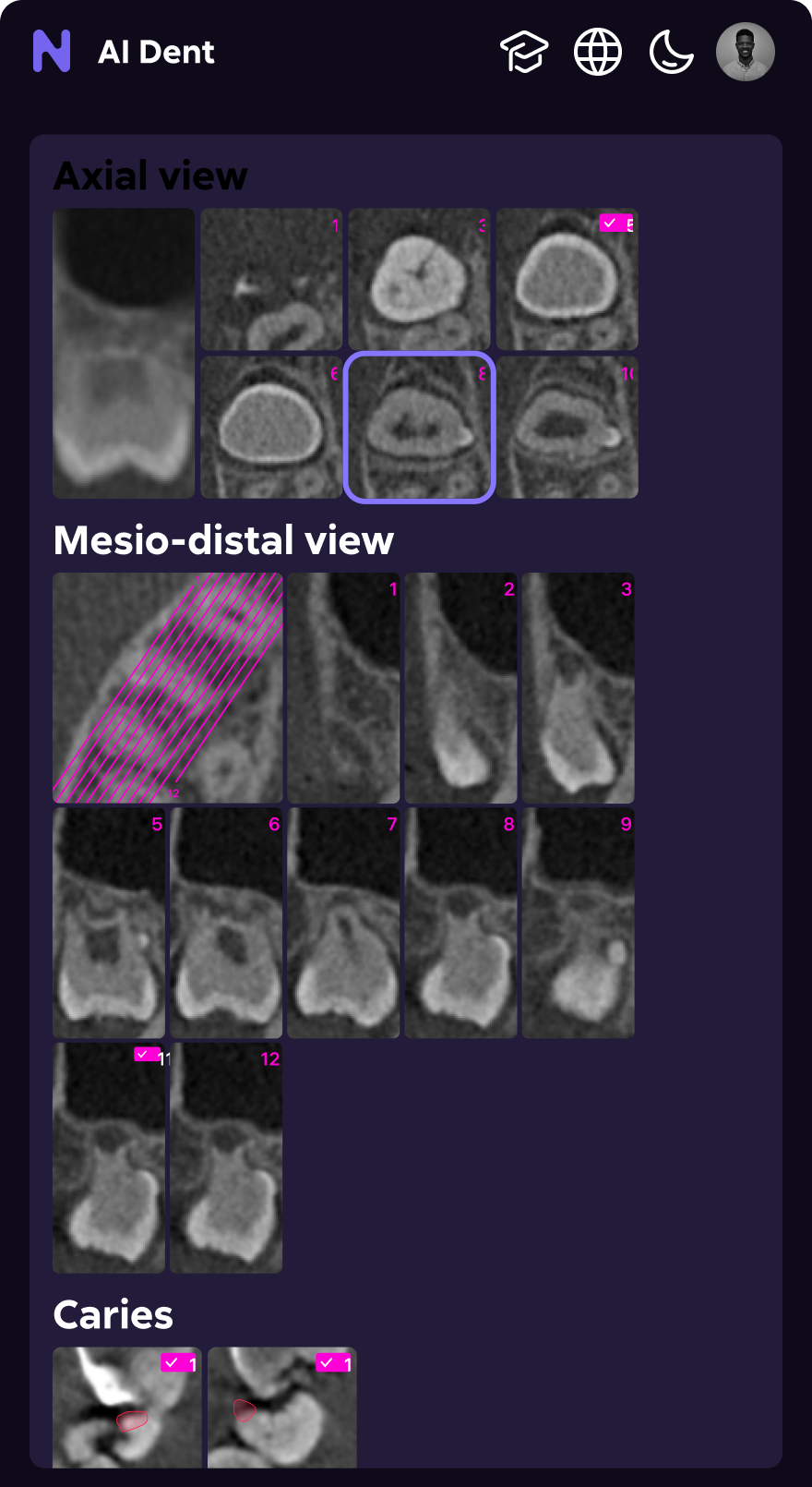
AI diagnosis
made readable
Raw AI confidence scores doctors couldn't act on → structured diagnostic surface. Color-coded overlays, severity tiers, per-tooth finding cards, one-tap approve — no context switching.
- Panoramic view with AI overlay toggle (show / hide masks)
- Non-dental findings panel — separated from dental pathology
- Per-tooth cards: condition label, AI confidence, radiologist comment
- Inline approve / edit / reject — without leaving the report
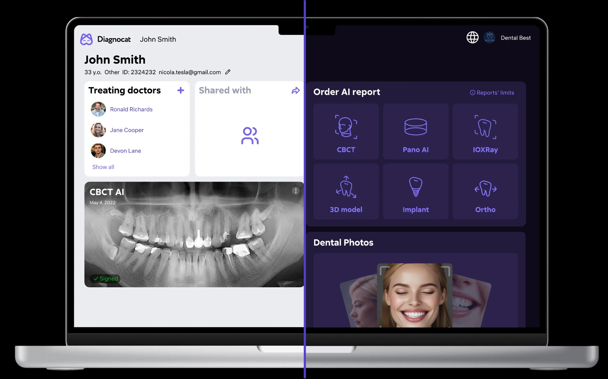
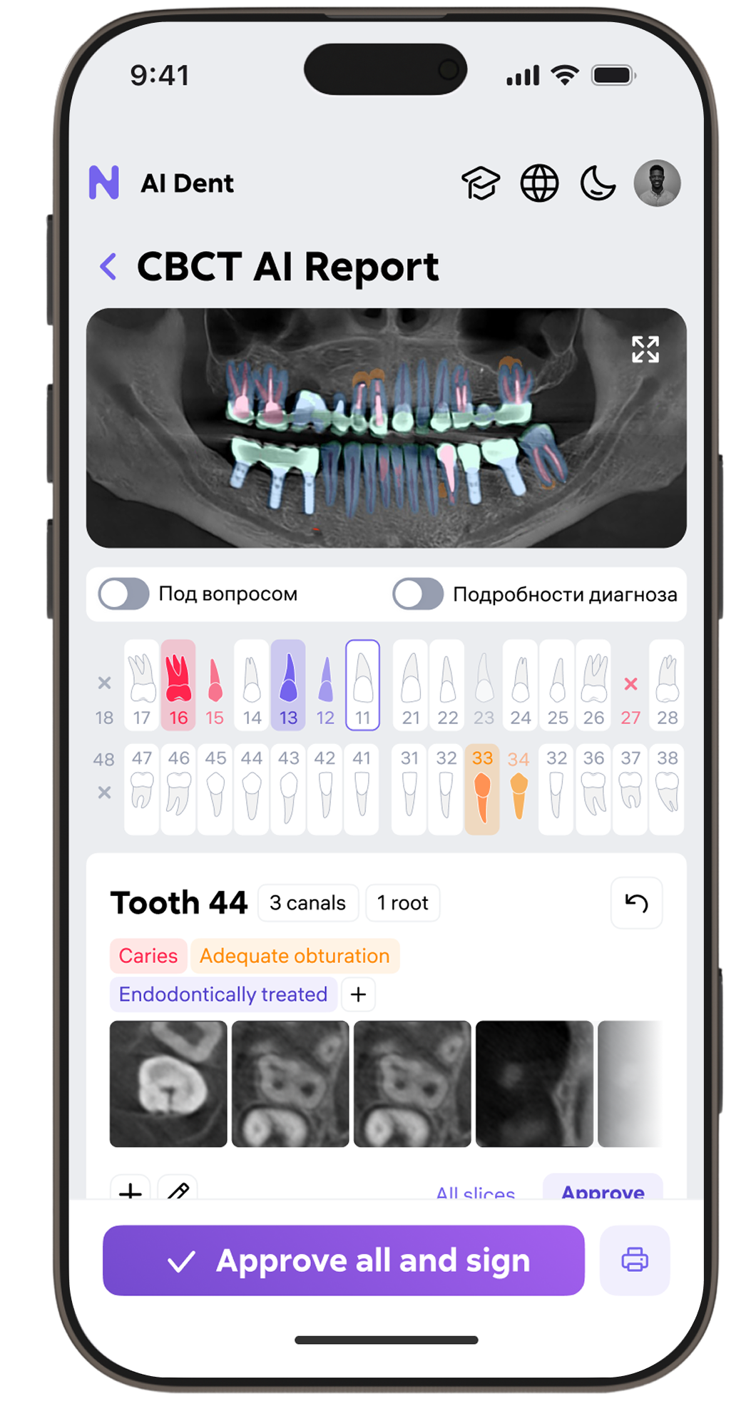
Patient card
redesigned for clarity
11 tabs → single scannable page. New card surfaces what doctors need first: treating team, AI report status, "Create report" action — all without scrolling. Then: report grid, photos, history.
- Treating doctors and shared access visible at a glance
- AI report type grid: CBCT, Pano AI, IOXRay, 3D, Implant, Ortho, Scribe
- Upload flow from patient card — no nested modal chain
- Dental photo gallery with per-image status tags
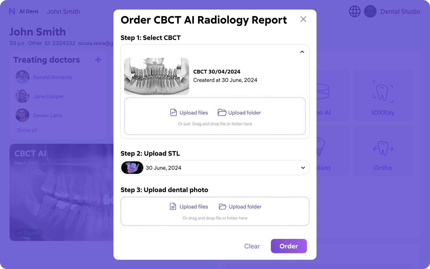
Report ordering
in 3 steps
5-screen ordering flow with no progress indicators → single guided modal. Select scan → upload files → confirm. Ordering time: ~4 minutes down to under 60 seconds.
- Step 1: Select CBCT scan from patient history or upload new
- Step 2: Upload optional STL model for 3D reference
- Step 3: Upload dental photos — drag-and-drop with folder support
- Confirmation with estimated AI processing time
Two themes.
One design system.
Radiology monitors calibrated for dark. General dentistry offices run on white walls and bright lighting. Both themes from a single token-based library — 200+ components, one source of truth.
- Semantic color tokens — one library, two theme outputs
- 200+ Figma components with auto-layout, variants, interactive states
- WCAG AA contrast compliance validated in both themes
- Per-clinic theme preference saved in account settings
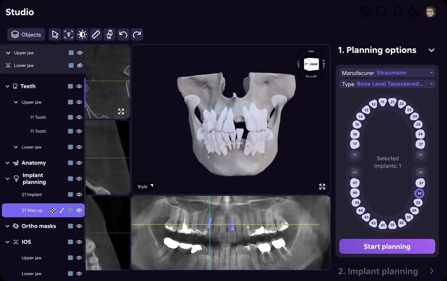
Studio —
Treatment Planning AI
Prosthetic and orthodontic planning tool built on CBCT scan data. Doctors place implants in 3D, visualize bone density, and model restoration scenarios — before any procedure starts.
- 3D jaw reconstruction with interactive layer tree (Teeth, Anatomy, Implants)
- Implant manufacturer catalog — select type, size, placement angle in 3D
- Panoramic cross-section synced to 3D model for reference
- Wax-up modeling layer for restoration preview
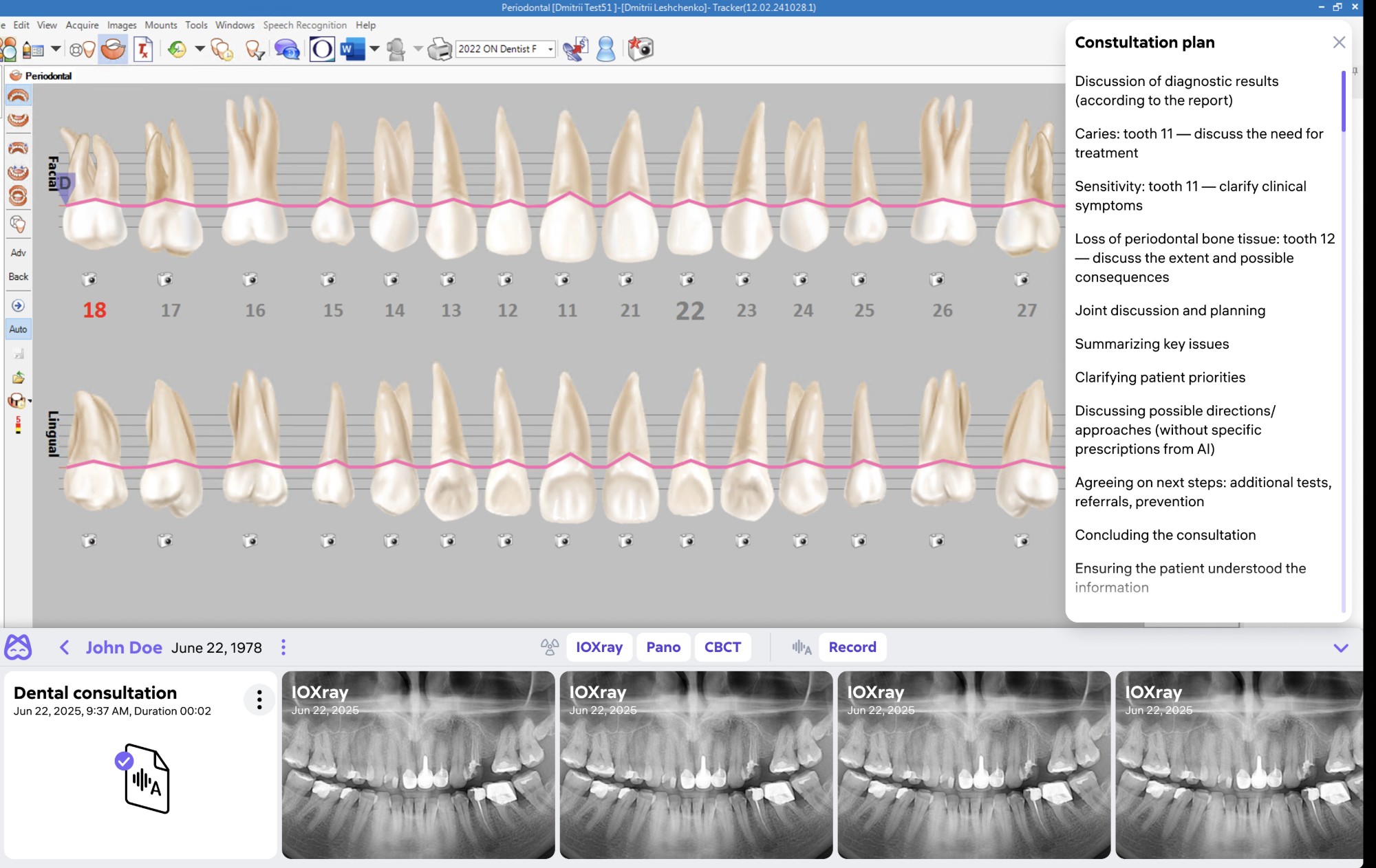
Desktop App —
MIS Integration
Native Windows app bridging AI Dent into existing clinic management systems. Doctors see AI analysis, periodontal charts, and AI-generated consultation plans — directly inside their existing workflow.
- Periodontal chart with full-mouth tooth visualization + probing marks
- AI-generated consultation plan: per-tooth issues, discussion agenda, next steps
- IOXRay, Pano, CBCT image strip at the bottom — always accessible
- Integrates with MIS patient record — no context switching between apps
Clinics aren't
desktop-only.
Doctors check reports between appointments, present findings on tablets during consultations, and access patient status on phones during rounds. We rebuilt the responsive layer from scratch — both themes, all screen sizes.
Light + dark,
every screen size
Both themes built from the same token system — zero separate mobile design pass. The design system adapted automatically from radiology workstations (2560px) down to iPhone SE (375px). Per-clinic theme saved in account settings.
- Responsive from 375px to 2560px — no layout breaks
- Bottom nav replaces sidebar on mobile — thumb-reachable primary actions
- AI report viewer: panoramic → scrollable, 3D → pinch-zoom
- Patient sharing flow optimized for presentation on tablet during consultation
Numbers that
matter.
Measured via Amplitude analytics, post-launch clinic interviews, and support ticket volume before vs. after each major release.