LLM UX patterns: how to design interfaces for AI products
Most AI products fail at the interface, not the model. The model works — but the screen around it hides cost, hides sources, breaks under rate limits, and leaves new users staring at a blank page. These are six patterns I keep reaching for when designing AI products, each shown with a real production screen from Atlas, an AI-agent control room.
By Aleksey StepikinUpdated June 20266 patterns
Pattern 01
Stream the reasoning, not just the answer
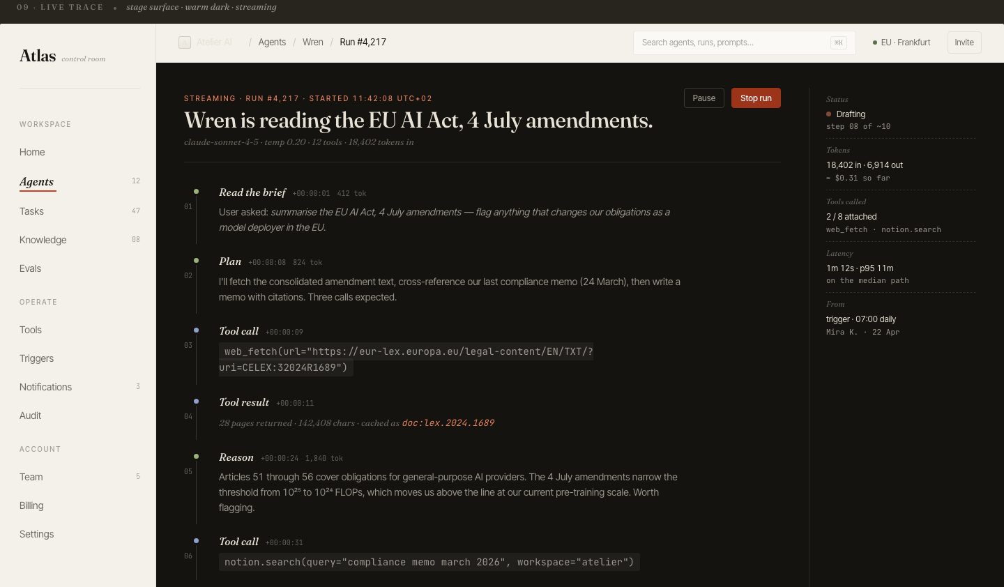
Atlas — live agent trace. Reasoning, plan, tool calls and results stream in order, with a running token count and latency.
The problem
A spinner for 20 seconds, then a wall of text. The user has no idea whether the model is thinking, stuck, or about to hand back something wrong. Trust collapses in the silence.
The pattern
Stream the steps, not just tokens. Show the brief the model understood, its plan, each tool call with its actual arguments, and the result of that call — in order, as it happens. A live token and latency counter turns an anxious wait into a visible process.
Why it matters
Watching the work is what makes an AI feel competent rather than magic. It also makes failure legible: when a run goes wrong, the user sees where — a bad tool call, a wrong document — instead of just a bad answer.
Pattern 02
Make every AI source auditable (RAG)
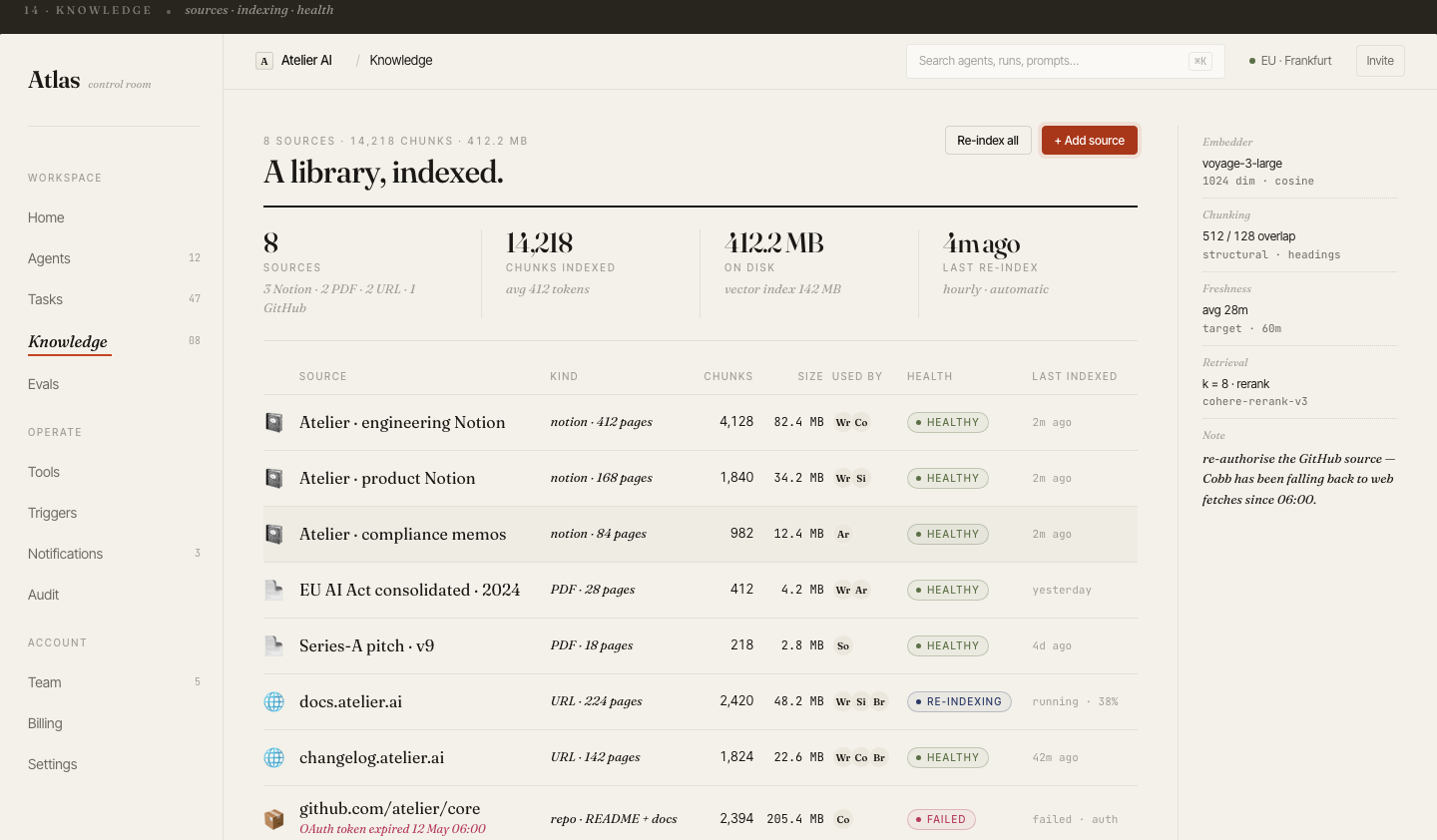
Atlas — knowledge base. Every source shows chunk count, freshness, retrieval config, and health — including a source that silently failed to re-index.
The problem
RAG systems answer confidently from documents the user can't see. When a source is stale, or quietly stopped syncing, the answer is wrong but looks identical to a right one. "Trust me" is not a feature in a knowledge tool.
The pattern
Treat the knowledge layer as a first-class screen, not a hidden config. Show what's indexed, how it's chunked, which embedding and rerank models are used, when each source was last refreshed, and — critically — surface the failed source. A red "auth token expired" row is the difference between catching a blind spot and shipping wrong answers for a week.
Why it matters
In any domain where being wrong has a cost, the audit trail is the product. Let users disagree with the AI by giving them everything they need to check it.
Pattern 03
Put token cost where the work happens
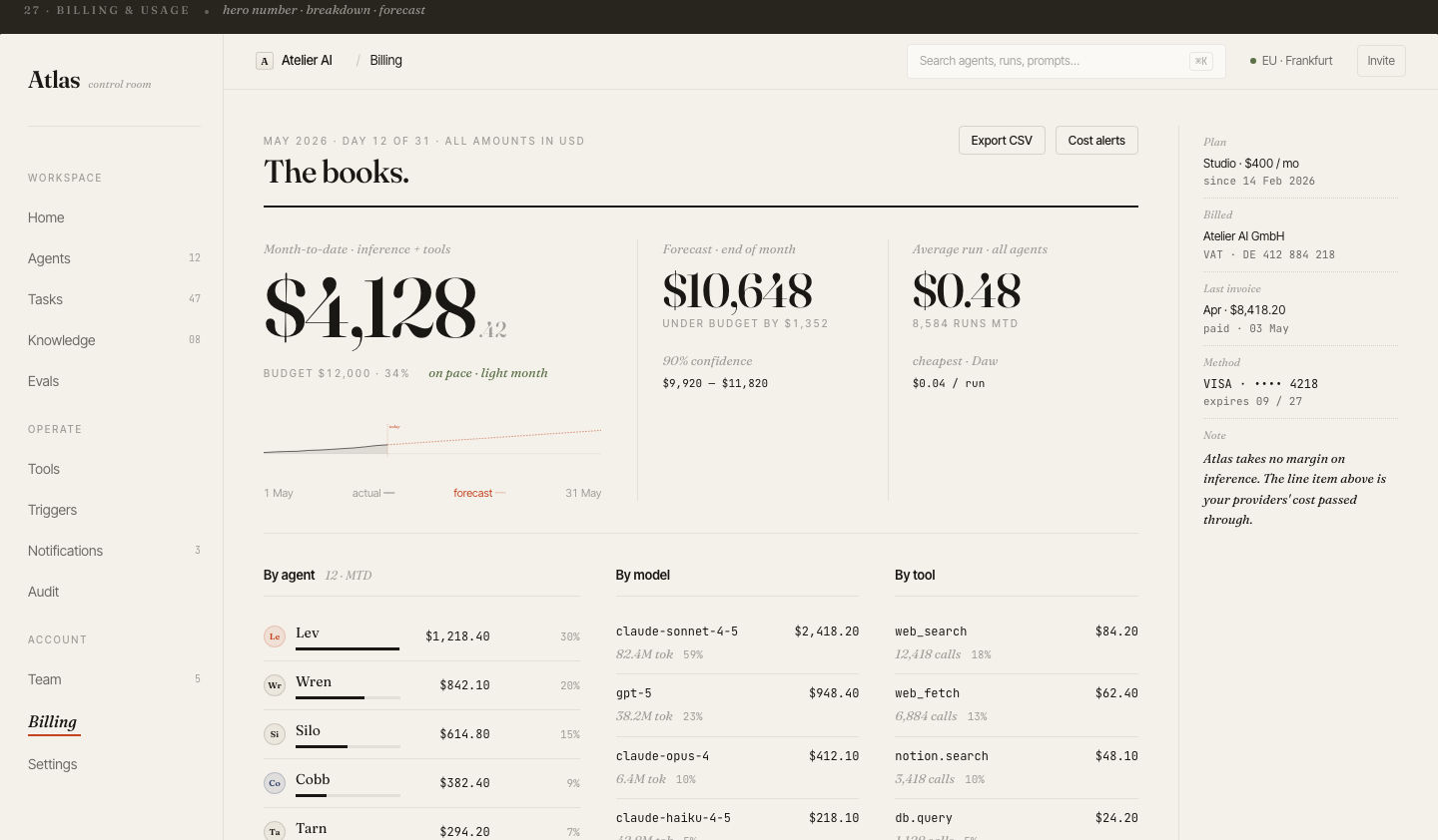
Atlas — usage. Spend broken down by agent, by model, and by tool, with an end-of-month forecast and cost-per-run.
The problem
AI features have a real marginal cost per use — and most products hide it until the monthly invoice. Users can't reason about a tool whose cost is invisible, and teams can't optimise what they can't see.
The pattern
Make cost a readable surface: month-to-date spend, a forecast against budget, cost per run, and a breakdown by agent, model, and tool. The expensive model and the chatty tool become obvious at a glance.
Why it matters
Cost transparency is what lets a buyer say yes. It turns "AI is unpredictably expensive" — the top objection to adopting AI features — into a number they can plan around.
Pattern 04
Design for quota limits and graceful fallback
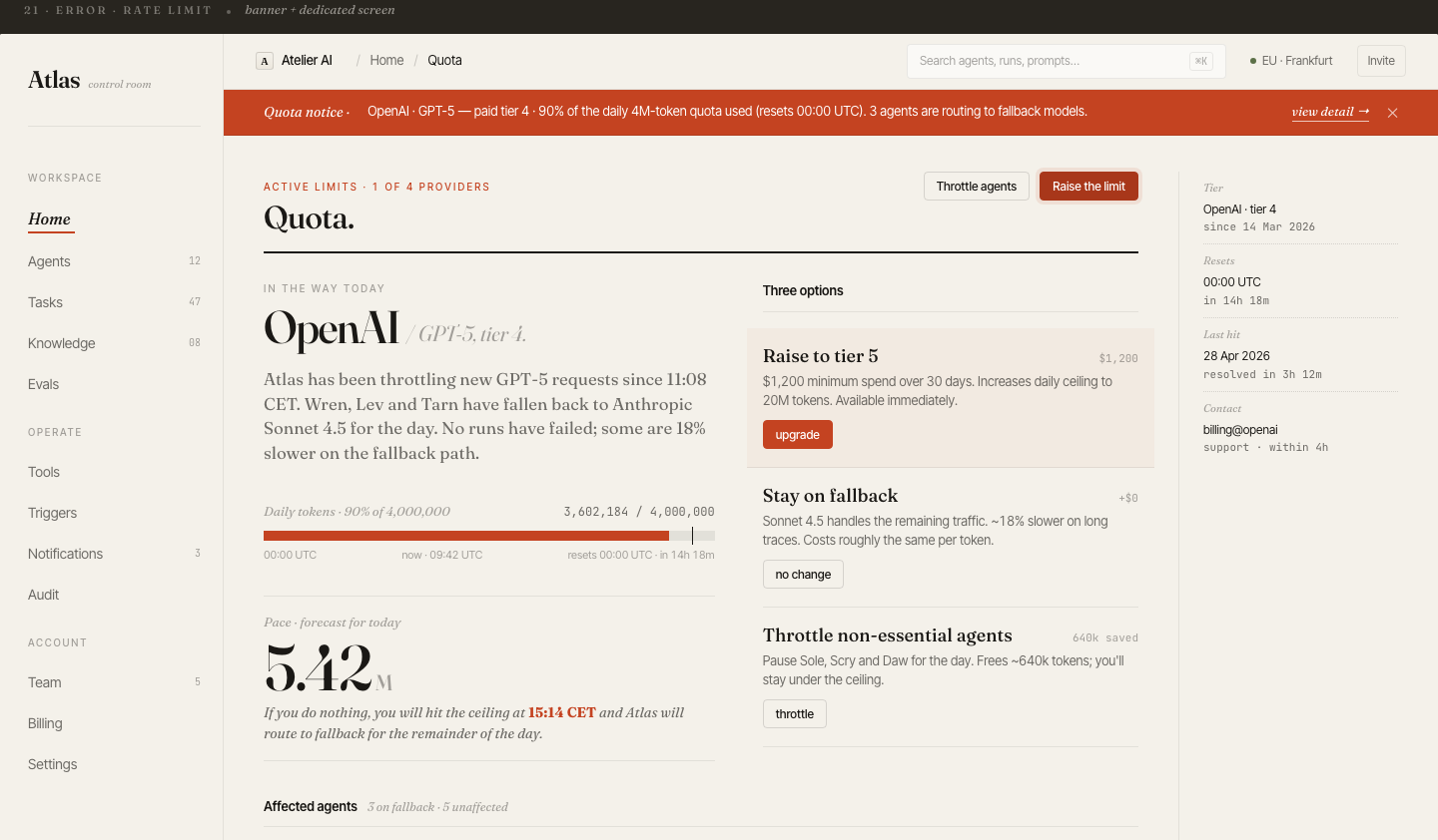
Atlas — quota. A provider is throttling; agents auto-route to a fallback model, with three explicit remediation paths.
The problem
Provider rate limits are not an edge case — they're Tuesday. Yet most AI products treat a 429 as a generic error toast, leaving the user with a dead feature and no idea why or what to do.
The pattern
Design the limit as a first-class state. Show which provider is throttling, what's already happening automatically (routing to a fallback model), and give the user real choices: raise the tier, stay on fallback, or throttle non-essential agents — each with its cost and speed trade-off spelled out.
Why it matters
Graceful degradation is what separates a product that survives a traffic spike from one that just breaks. The user should never have to guess whether the AI is down or just busy.
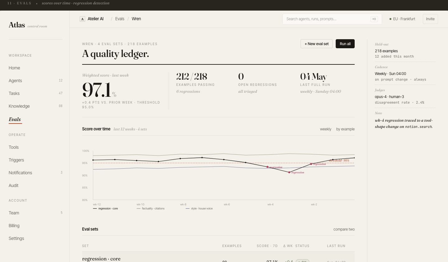
Pattern 05
Make evals a first-class surface
Atlas — evals. A weighted quality score tracked weekly, with regression detection against a threshold and judge disagreement rate.
The problem
"Is the AI getting better or worse?" is the question every AI team is asked and few can answer on screen. A prompt change ships, quality silently regresses, and nobody notices until a customer complains.
The pattern
Put quality on a visible ledger: a weighted score over time, a pass threshold, regressions flagged the moment they cross it, and the judges (model and human) with their disagreement rate. Tie each regression back to the change that caused it.
Why it matters
Evals on screen turn AI quality from a vibe into a number a team can defend — to themselves, to a buyer, and to a regulator. It's also the strongest trust signal you can show a skeptical technical evaluator.
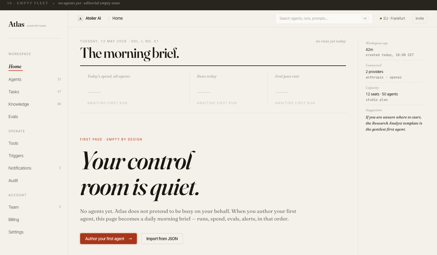
Pattern 06
The empty state is the hardest AI screen
Atlas — first run. No fake metrics, no pretend activity. One clear first action and a suggested gentlest first agent.
The problem
A new user opens an AI product to nothing — no data, no examples, no idea what "good" looks like. This is exactly where most AI tools lose people, and exactly where most teams paste a generic "no data yet" placeholder.
The pattern
Make the empty state honest and directive. Don't fake activity on the user's behalf. Explain what the screen will become once they act, give one unambiguous primary action, and suggest the gentlest first step — a starter template, not a blank canvas.
Why it matters
The first run is the highest-stakes screen in the whole product. An AI tool that respects the user's intelligence on a quiet day earns the right to a loud one.
These patterns come from designing and shipping AI products solo — LLM interfaces, agent control rooms, RAG systems. If you're building one and the design-to-ship loop is your bottleneck, that's what Stepikin Studio does: concept to live product in 2–4 weeks.