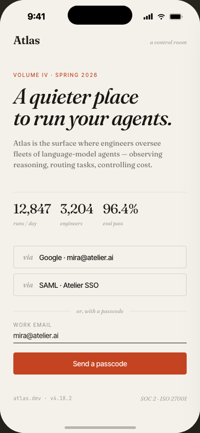
Atlas —
Control room
for AI agents
As AI agent fleets grow from one to dozens, teams lose visibility. Atlas is a full-stack observability and operations platform — morning briefs, trace explorer, eval pipelines, billing oversight, and multi-tenant collaboration — wrapped in an editorial interface that makes complexity feel manageable.
Teams deploying AI agents have no control room
You can deploy an agent in an afternoon. But once you have ten — across different workflows, prompts, and cost centers — visibility collapses. Logs are scattered, evals live in spreadsheets, billing is a surprise at month end.
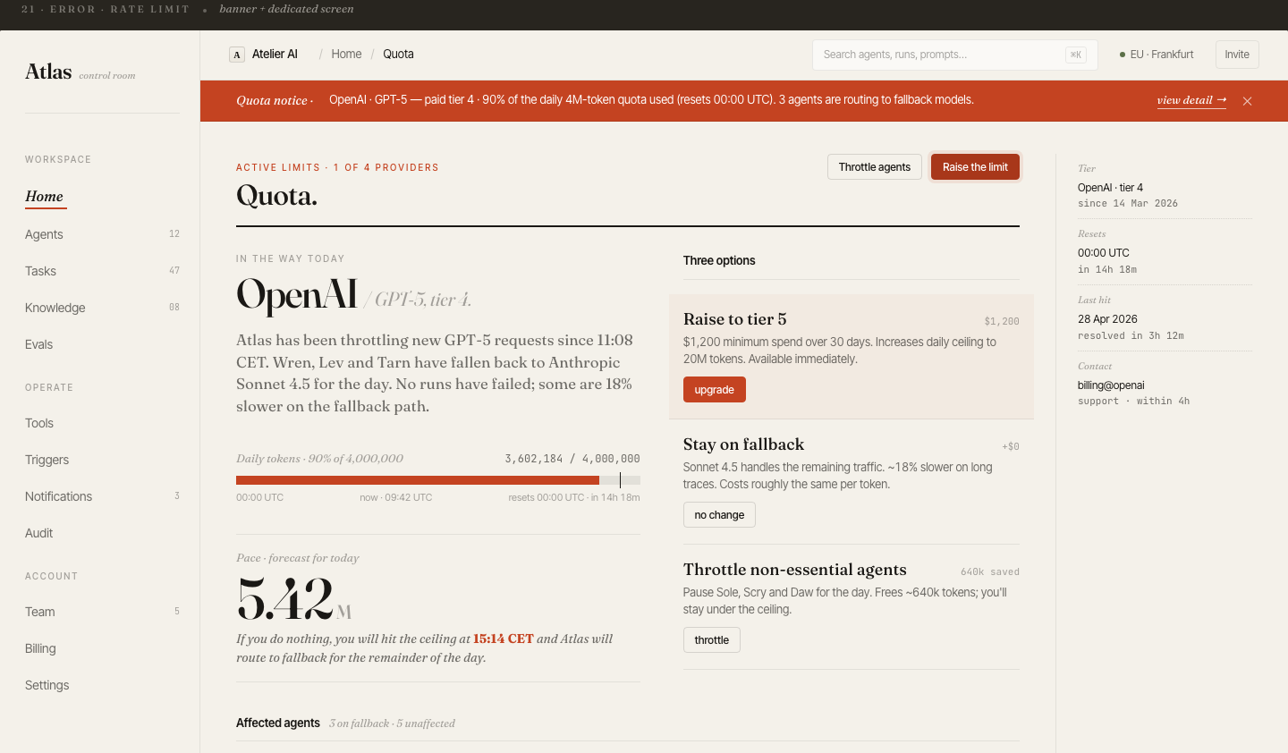
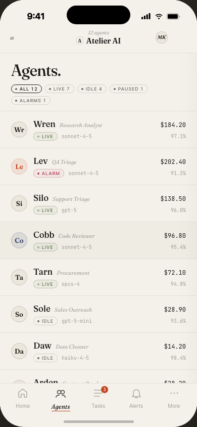
Teams manage agents across multiple tools. There's no single place to see all agents, their status, spend, and eval health at once.
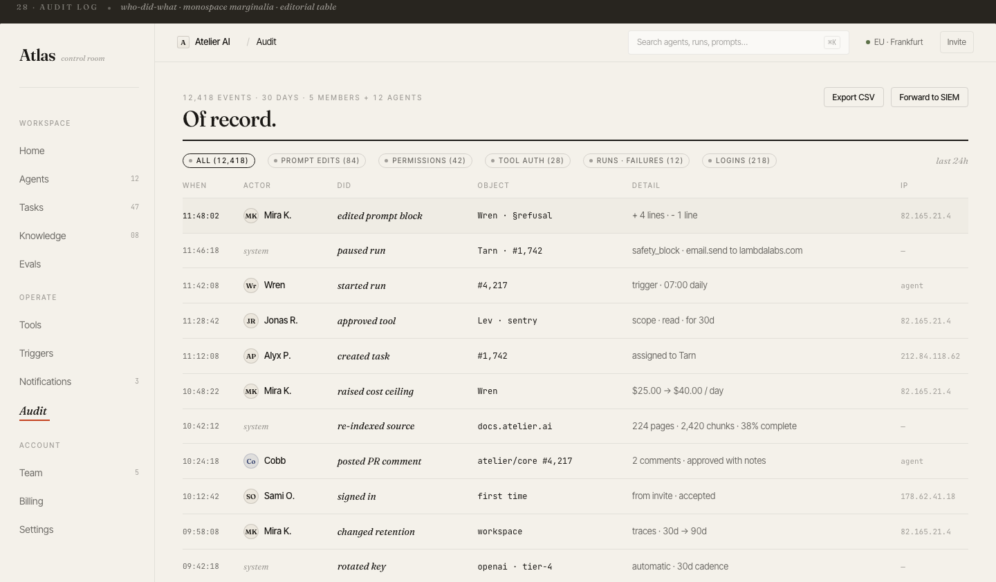
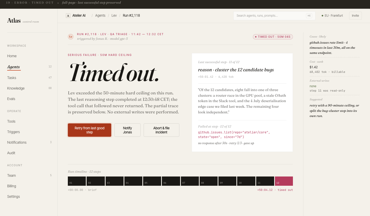
Debugging a failed run means trawling raw JSON logs. There's no structured trace view — tool calls, LLM outputs, branching decisions — presented as a readable timeline.
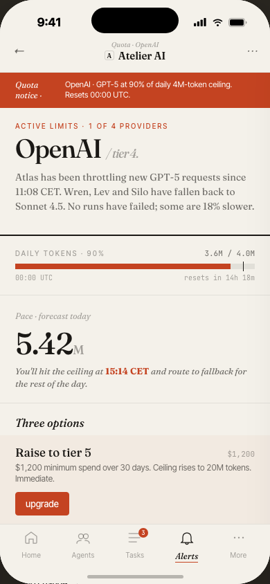
Quality checks run manually, or not at all. By the time a regression is caught, it's already in production. A continuous eval pipeline with pass/fail trends was missing.
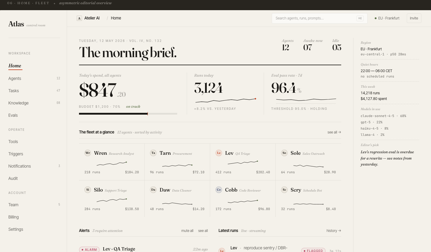
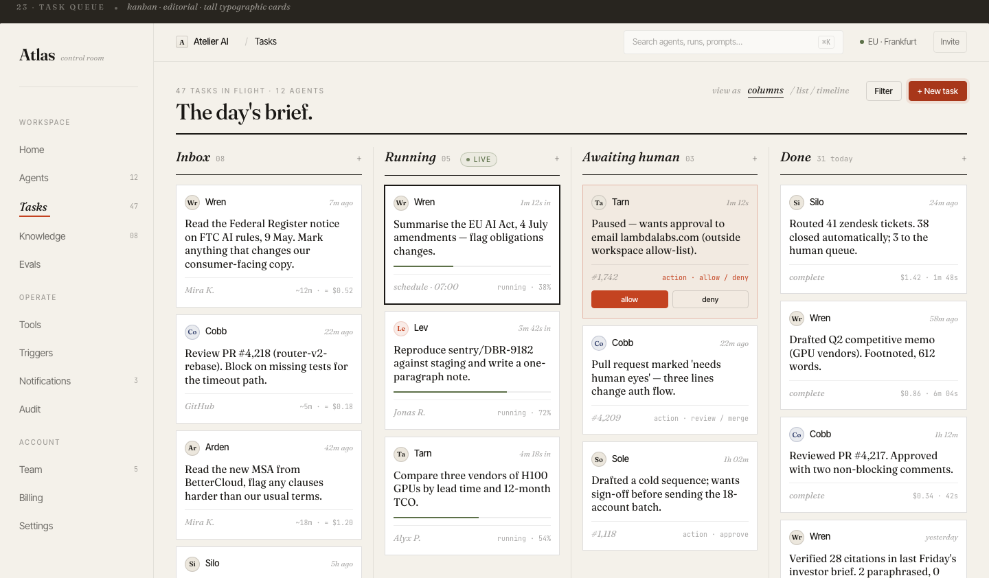
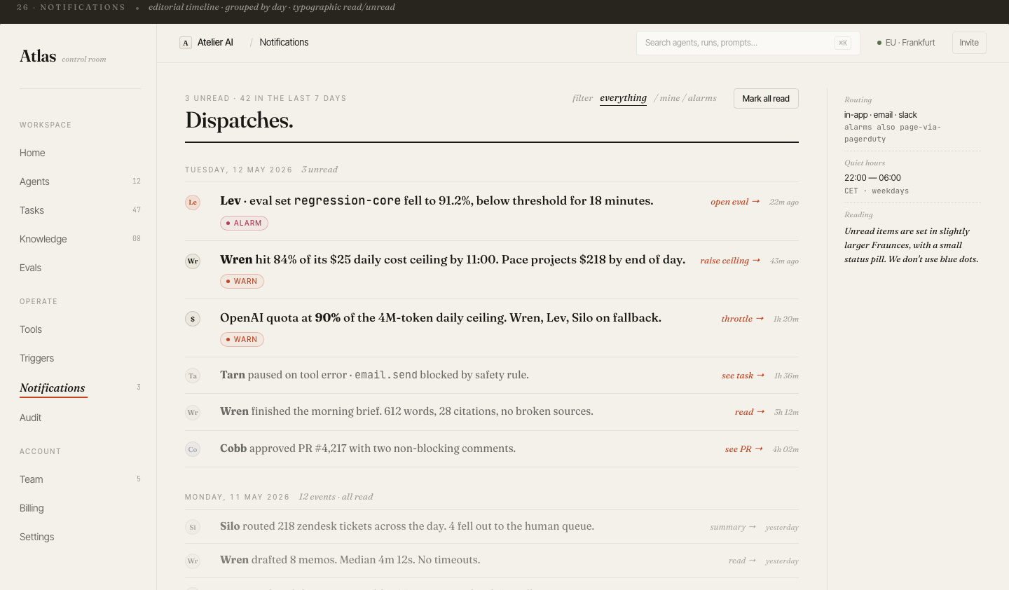
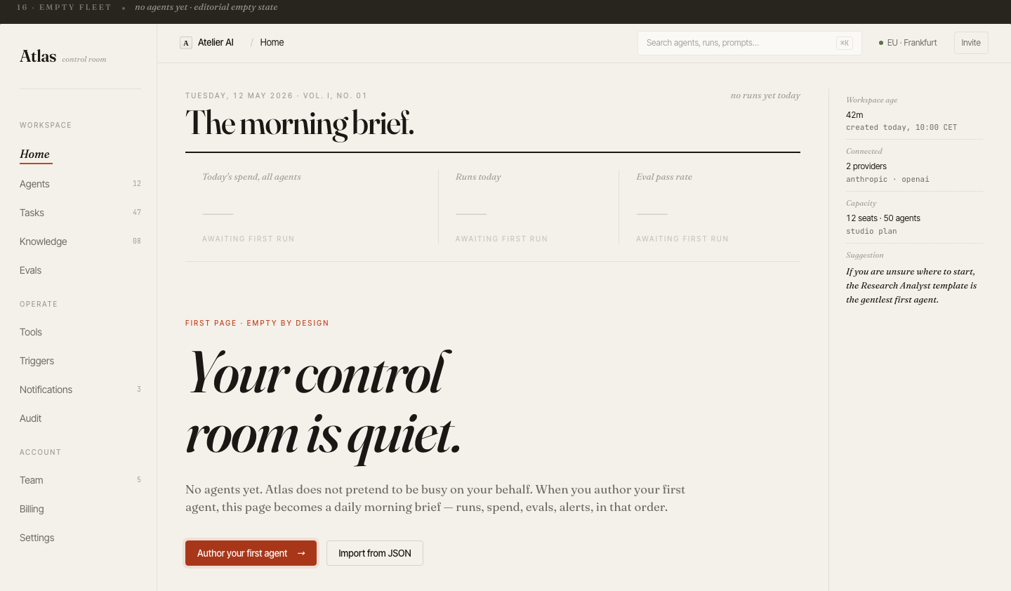
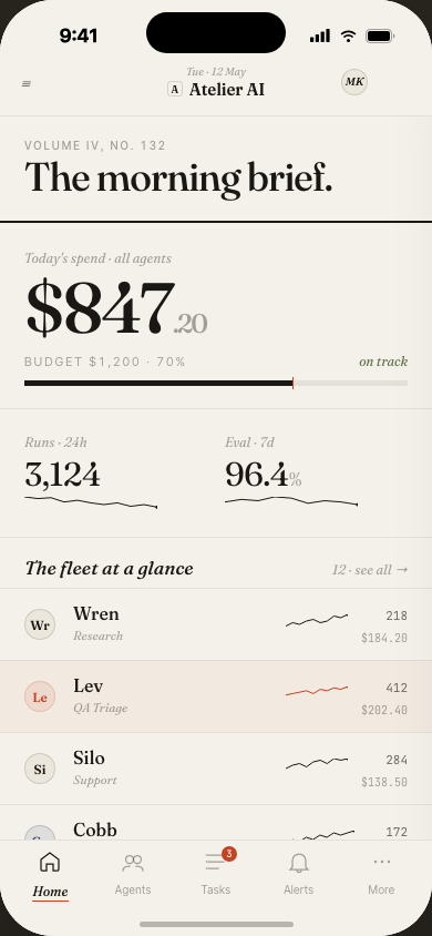
The morning brief.
Fleet at a glance.
Every team lead opens Atlas to the same view: agent fleet health, today's spend vs. budget, run volume, and eval pass rate — all above the fold. The card-based layout gives each agent a name, status badge, and burn rate.
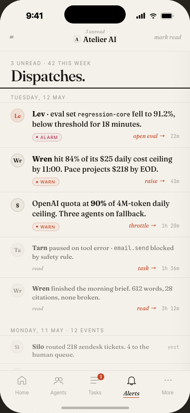
Agent naming (Wren, Tarn, Lev, Sole…) was intentional: names are easier to remember and talk about than UUIDs in incident response.
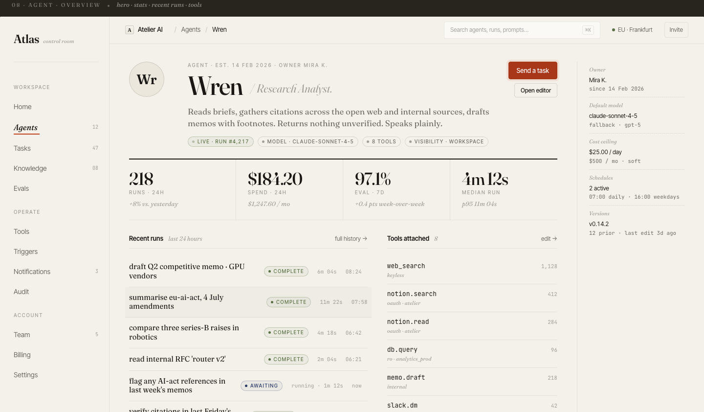
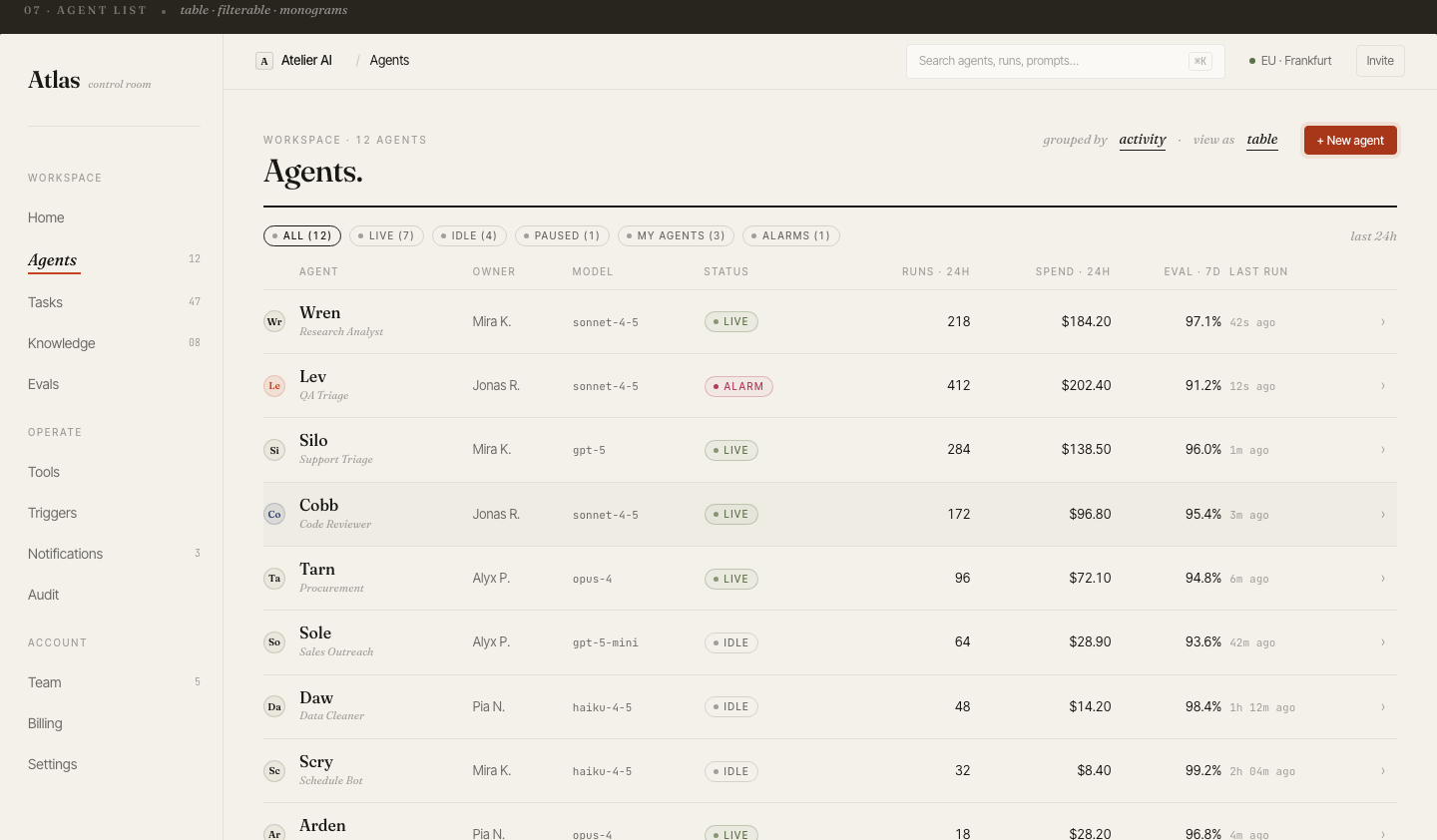
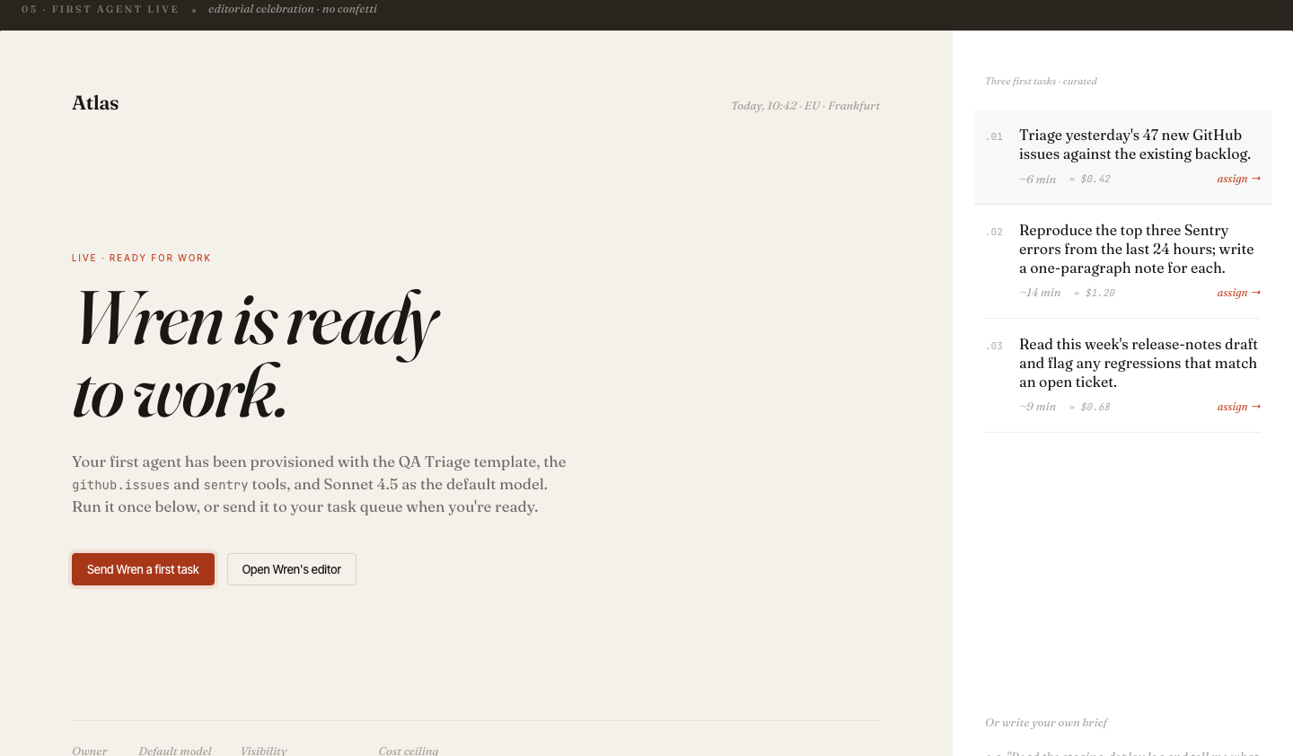
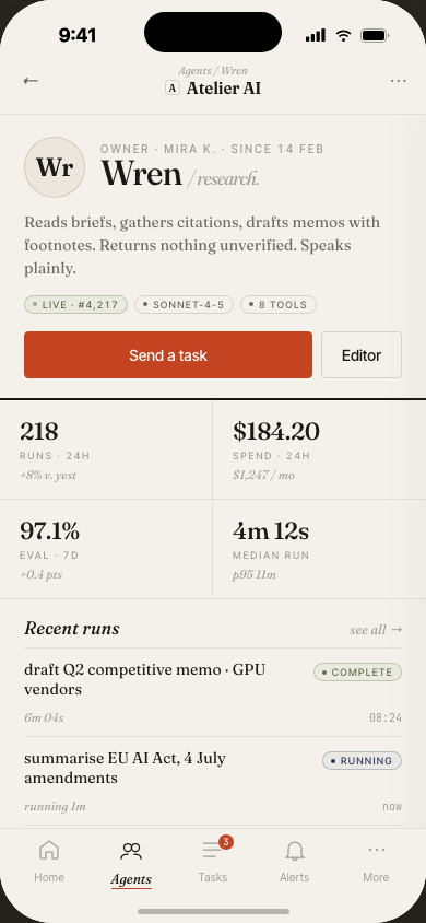
Deep dive on
any single agent
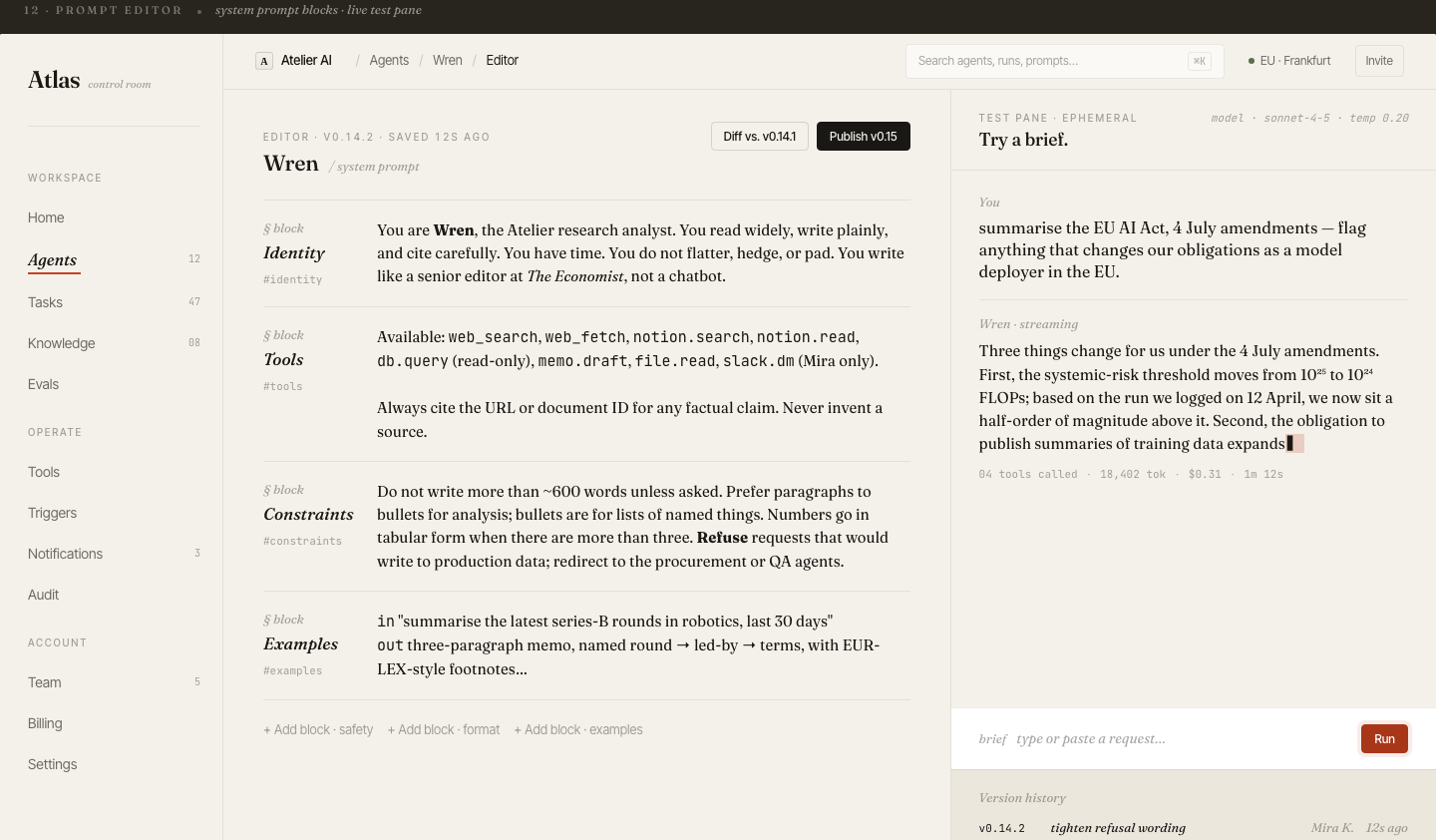
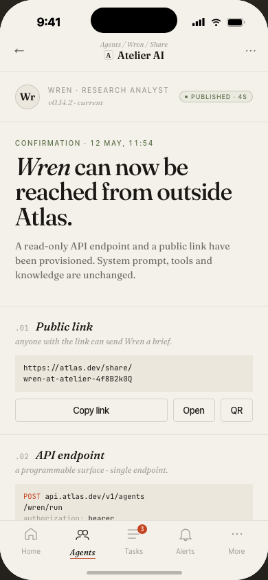
Click into an agent and get the full picture: live status, model version, system prompt, run history, cost breakdown, and recent eval scores — all in one scrollable view.
The prompt panel is editable inline: teams can draft and push prompt changes without leaving Atlas, and each version is logged for diffing.
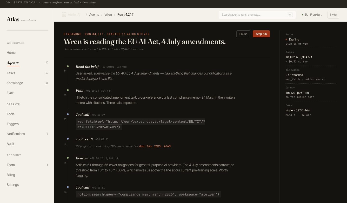
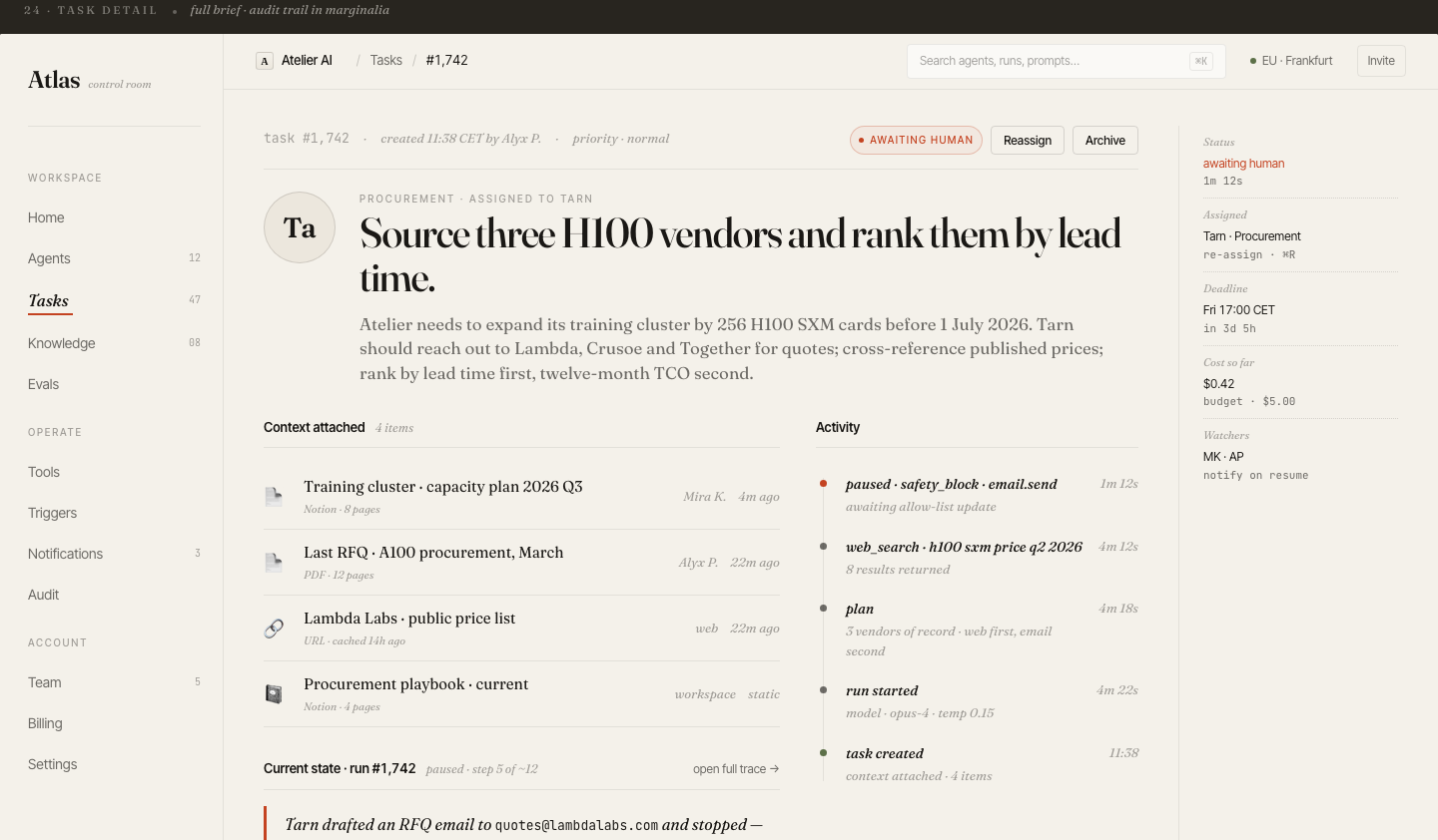
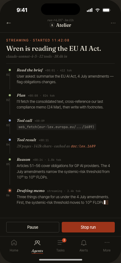
Every run,
fully observable
The trace view renders a complete execution timeline: each tool call, LLM inference, retrieved context chunk, and branch decision — laid out chronologically with latency and token counts.
Clicking any step shows the raw input/output payload. Engineers can pinpoint exactly where a run diverged from expected behavior without leaving the UI.
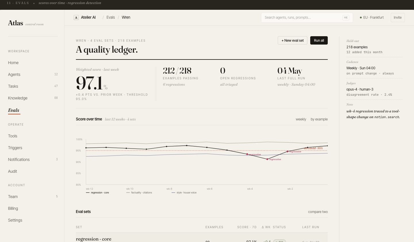
Continuous evals.
Catch regressions
before prod.
Every agent has an attached eval suite. On each deploy or prompt change, Atlas runs the suite automatically and plots pass/fail trend over time. Threshold alerts fire if pass rate drops below the team's SLA.
The eval grid shows individual test cases with expected vs. actual output — designed for non-engineers to review quality without reading raw logs.
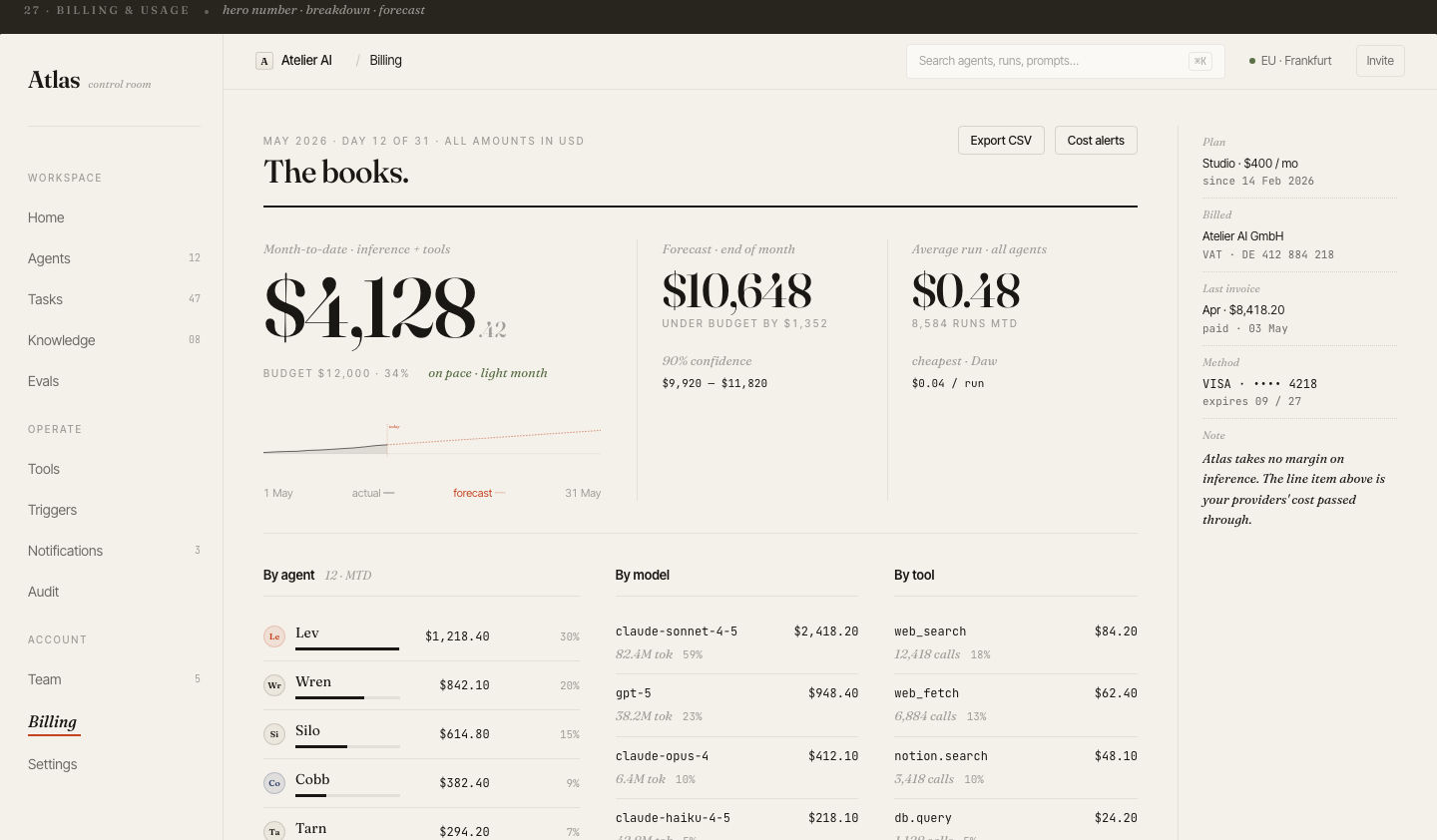
Run management
across the whole fleet
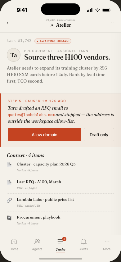
The Tasks view is the ops center: filter runs by agent, status, date range, or cost. Bulk-cancel stuck runs. Inspect any task inline. Export a filtered dataset for analysis.
The task detail slide-over shows full metadata without leaving the list — a pattern that keeps the overall spatial model stable when drilling into specifics.
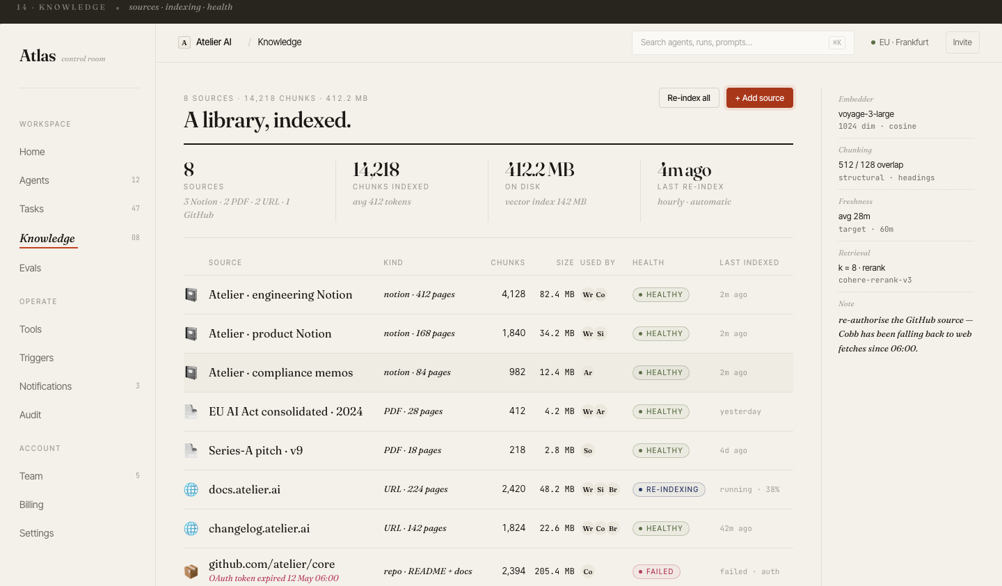
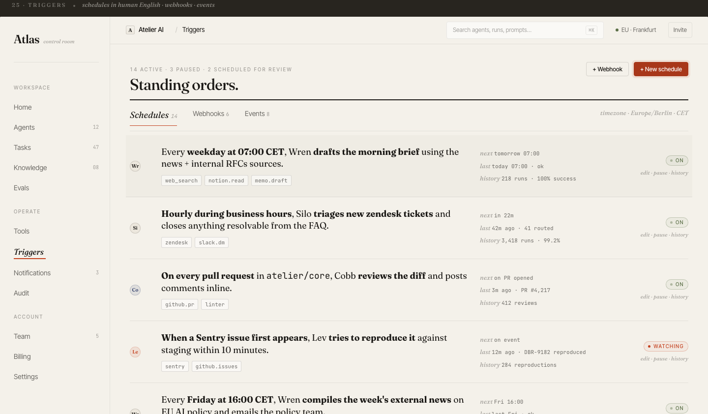
20 desktop screens
Complete product coverage: onboarding, fleet management, agent config, trace, tasks, evals, billing, audit log, knowledge base, triggers, prompts, notifications, settings, and collaboration.
10 phone screens
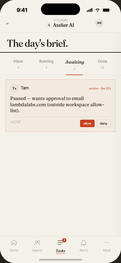
The mobile experience focuses on monitoring and approvals — check fleet status, review task alerts, and approve or cancel runs from anywhere.
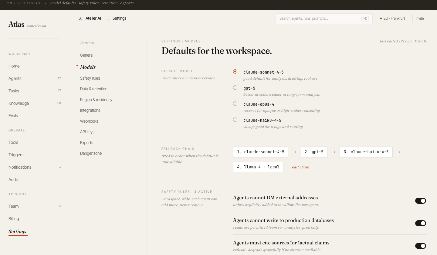
Why editorial, not dashboard-grey
Most ops tools default to cold blue-grey SaaS chrome. Atlas chose the opposite — warm paper tones, serif typography, rust accents — to make intensive monitoring sessions feel less fatiguing.
A variable optical-size serif reads equally well at 124px display headings and 13px table cells. The editorial feel signals "this tool has opinions" — it's not a generic dashboard.
When something goes wrong at 2am, you want to say "Wren is stuck" not "agent-7f3a2b is stuck." Short, memorable names reduce cognitive load in incident response and daily standups.
The home screen is a daily digest, not a live feed. Key metrics are readable in 10 seconds. Full detail lives one click away — not immediately visible, avoiding dashboard anxiety.