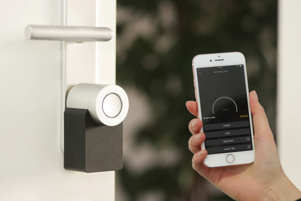
SmartNest is a concept for a smart-home iOS app that prioritises a single quiet glance over a wall of toggles. 25 production-grade screens, a small-but-bold visual system, and an in-app coachmarks tour.
After auditing six incumbents, three patterns kept showing up — and kept breaking flow. SmartNest is built around fixing those three.
Every device wants its own row. The home screen turns into a settings panel. You scroll for context.
Houses are organised by room and routine — not by manufacturer. Most apps still group by brand or device type.
Tiny icons, identical card silhouettes. You squint to know if the lock is locked or if the AC is running.
Audit, model, system, build. The constraint was 25 screens and one design system. The aim was a hi-fi prototype, not a pitch deck.
Tore apart 6 reference apps — Google Home, Apple Home, SmartThings, Aqara, Hue, Nest. Mapped their info hierarchy.
Settled the mental model: house → room → device → state. Energy and security got their own top-level surfaces.
Light cream + lime + black. One typeface. Six component primitives. Big numerics, soft cards, real photographic accents.
25 screens in React + inline SVG illustrations. Empty states and an onboarding tour to make the system feel lived-in.
One contrast card holds the most-used room. Below it, four equal-weight room tiles say what's actually happening — temperature, light count, music — without you tapping.
The thermostat isn't a slider buried in a list. It's a 220-pixel arc with a temperature large enough to read across the room. Eco and Auto live as a pill, not a settings tree.
Energy is shown as one number, one trend chip, one lime bar that always points to today. A small per-device breakdown turns into action — not a wall of receipts.
Status is one line. Below it a 2×2 grid of live camera feeds. Activity is timestamped, not gamified. Alerts borrow the rose accent — used nowhere else in the app — so they read instantly.
Six handcrafted illustrations replace the standard "nothing here" gray text. They explain the missing thing, hint at the next move, and keep the brand voice when there's no data to show.
Coachmarks dim the home screen and highlight one element at a time. A single black tooltip explains the surface, a progress bar shows where you are. Skippable, replayable.
Every additional toggle costs trust.
Calm comes from a system that decides what matters before you touch the screen.
Onboarding, dashboards, device controls, automations, energy, security, six empty states, four onboarding coachmarks. Every screen reuses the same six primitives.
One accent, used like a scalpel. It marks the active room, the next action, the only thing on screen worth looking at twice. Used too widely, it loses meaning.
Temperature. Energy. Time. The most important value gets the biggest type — never crowded, never centred-by-default. Tabular figures so they don't shift while you watch them.
Real photos of rooms inside softly-rounded cards. Cream UI around them. The home looks like a home — not a control panel.
One typeface, four accent hues, six component primitives. Everything else in the app is a recombination of these. Specs are tuned for iPhone (390pt) but scale cleanly to tablet.