stepikin.com
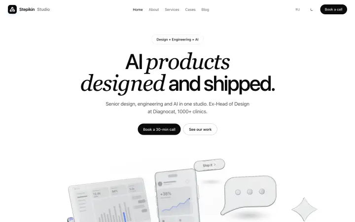
The studio’s own site, rebuilt to sell one thing: AI products, designed and shipped.
Real depth and motion on top — plain static HTML underneath.
with Claude Code
A premium dark and light studio site with real depth and motion — that still loads as plain HTML and reads cleanly for search engines and AI assistants.
Read the full story
The brief. The site had to sell AI-product work — a 4-week MVP, a full build or a monthly partnership — and feel as premium as the products it promises. Elegant in dark and in light, with real depth and motion, from a solo senior studio.
The approach. Designed directly in code with Claude Code, no Figma. Every word lives in static HTML; WebGL, glass and motion are layered on top as progressive enhancement, with poster fallbacks on phones. One kit of tokens and components for every page.
The outcome. A studio site that shows depth instead of describing it: a glass 3D hero, a coil of work, a consistent cover system, a redrawn mark and one case template — and underneath it all, plain readable pages with llms.txt, ai.html, OpenAPI and JSON-LD.
Stepikin Studio is a solo senior studio: design, engineering and an AI workflow from one source. The website had to be the first proof of that offer.
The tension was clear from the start. A premium studio site wants depth and motion; a site that has to be found wants to be plain, fast and readable. The answer was to keep the two apart. Every word is static HTML. The glass, the coil, the globe and the grain are layered on top as progressive enhancement, and each has a fallback — a poster, a list, a still.
Underneath the visuals the site speaks to machines as clearly as to people: llms.txt, a dedicated page for AI assistants, an OpenAPI description with an ai-plugin manifest, and JSON-LD on every page. Search engines and assistants read the same text a visitor reads.
There was no Figma file. The site was designed directly in code with Claude Code — three.js for the glass, raw WebGL2 for the coil, vanilla JavaScript for everything else — and checked visually with Playwright screenshots at every step, in both themes and at phone width, before shipping to Netlify.
Depth on top. Plain HTML underneath.
Every effect is progressive enhancement with a fallback — a poster, a list, a still.
OpenAPI · JSON-LD
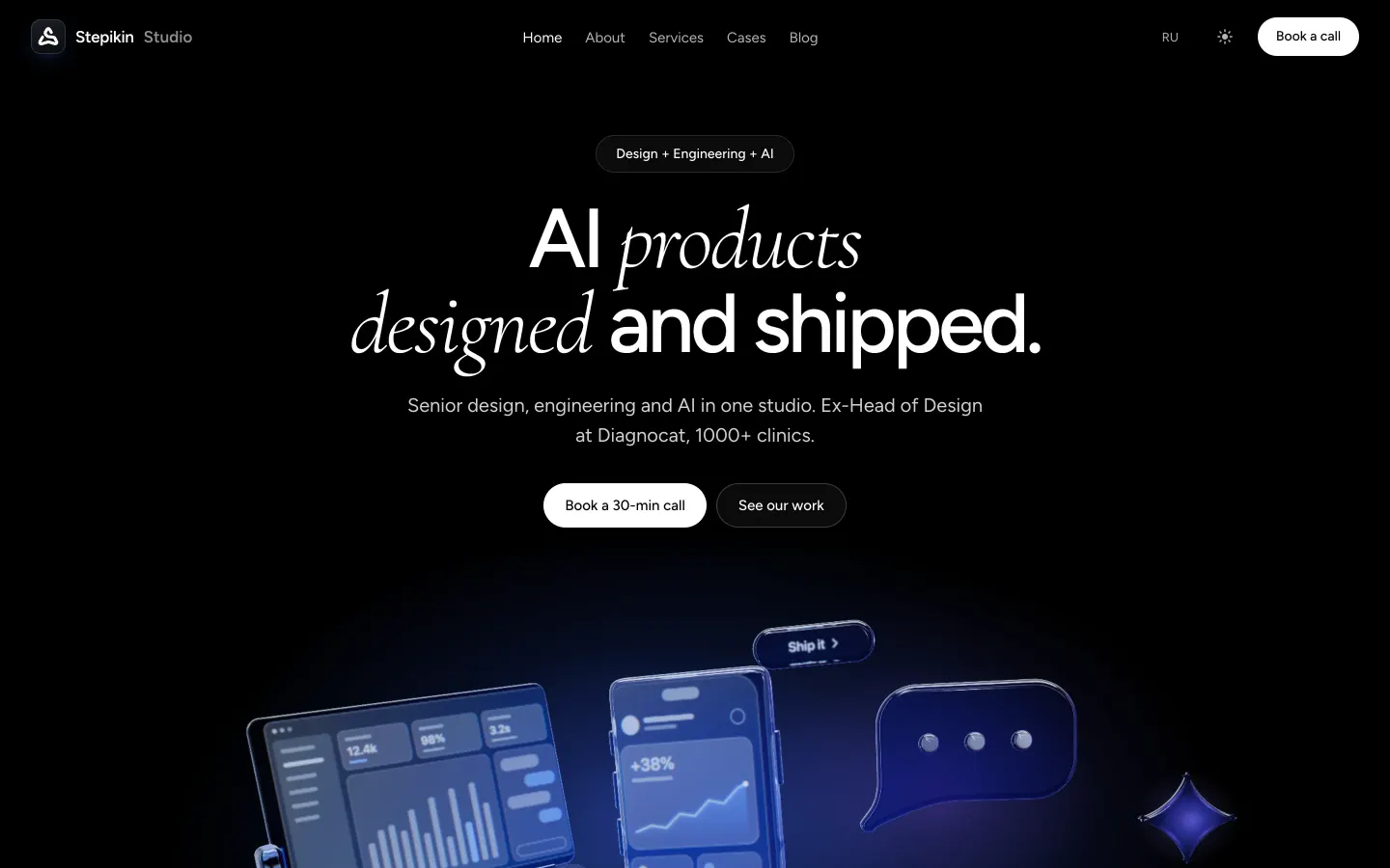
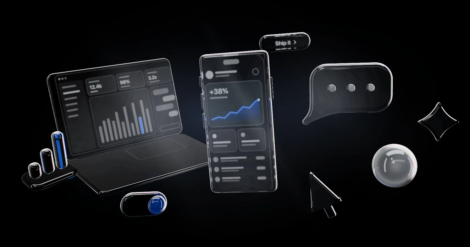
Glass objects, in real time.
A still life of product objects rendered live with three.js — transparent glass that tilts with the cursor and drifts on scroll.
DarkDeep blue glow under black glass.
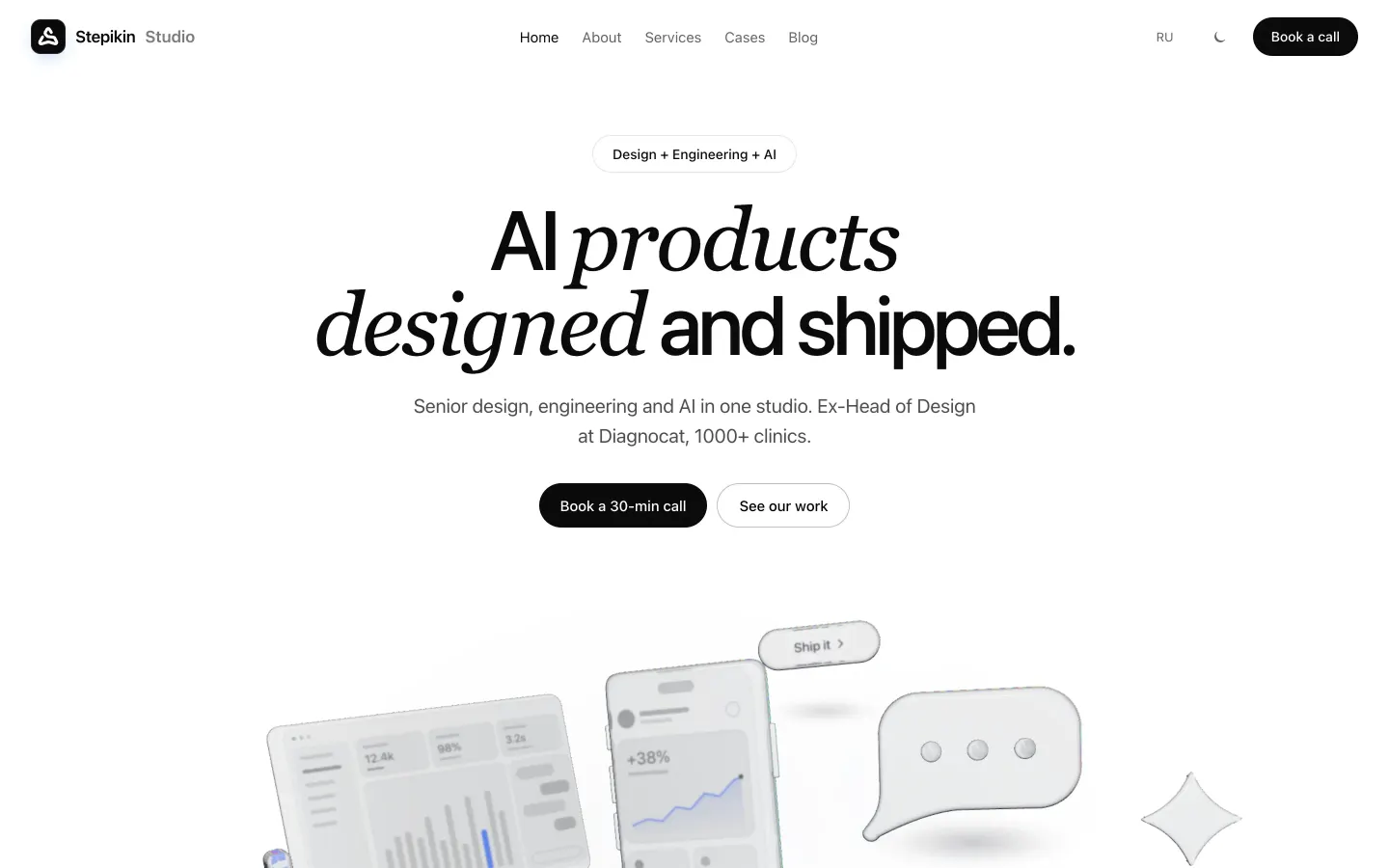
LightA separate art direction, not an inverted dark one.
What phones get instead of live WebGL.
How the glass is made
The hero is a small still life of product objects — phone, laptop, chat bubble, AI orb, sparkle, toggle, cursor, chart, pill — rendered live with three.js. Transparent glass from MeshPhysicalMaterial transmission, procedural rounded geometry, a tilt that follows the cursor and a slow drift on scroll.
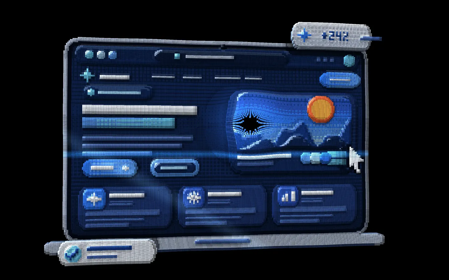
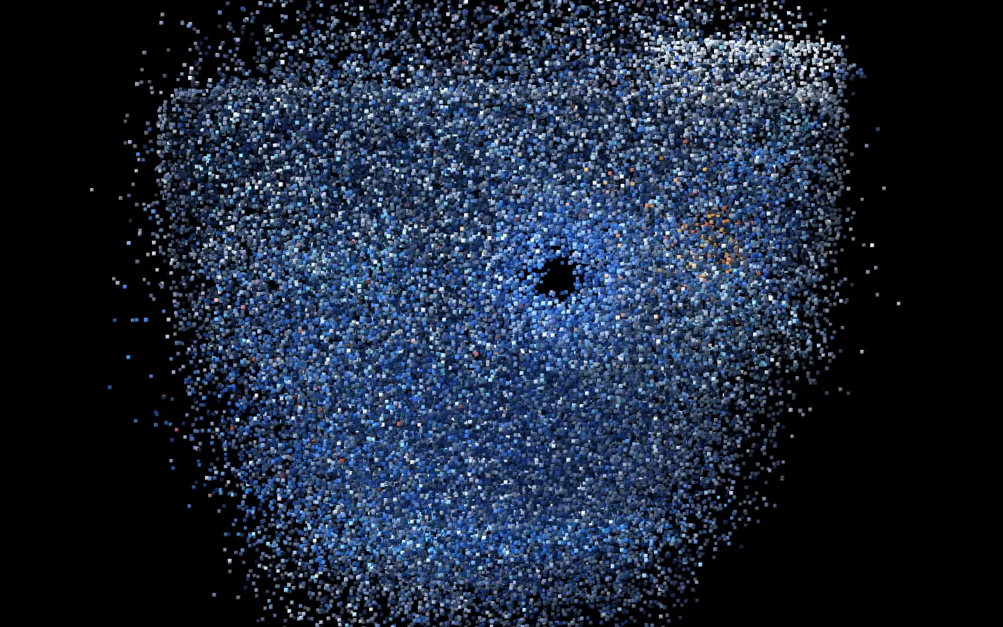
Four heroes before the glass.
Each direction lived on the page long enough to be judged in motion, not as a still.
Why each one lost
- Voxel — digital products assembled from bevelled cubes, morphing from one object to the next. Striking, but it read as a game rather than a studio.
- Monitor frame — the work shown inside a single screen. Clear, but flat and too literal.
- Product-window crossfade — real product windows dissolving into each other. Honest, but it competed with the gallery further down.
- Fanned cover deck — case covers fanned like cards. It became the seed of the works coil instead.
- Glass objects — kept. Abstract enough to stay premium, specific enough to say “AI products”.
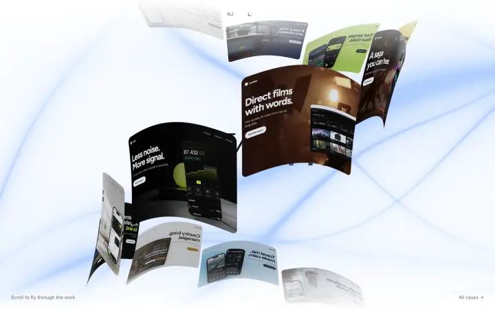
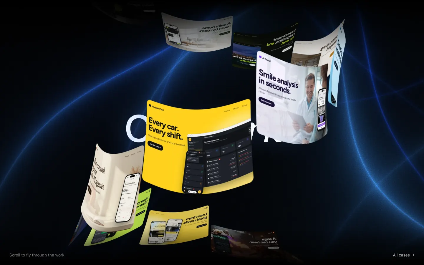
One cylinder, thirteen covers.
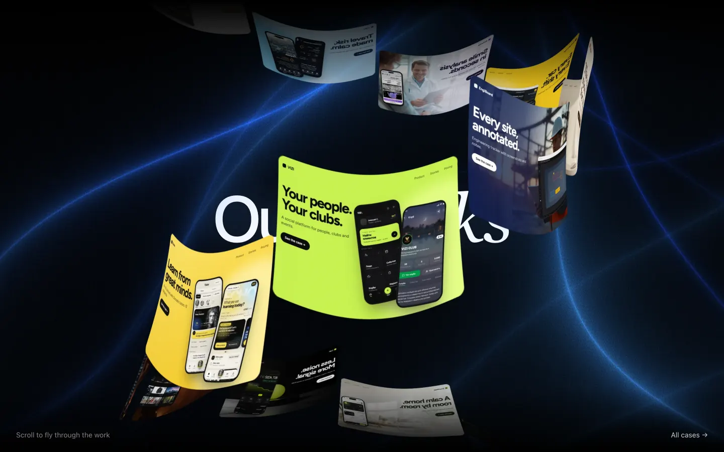
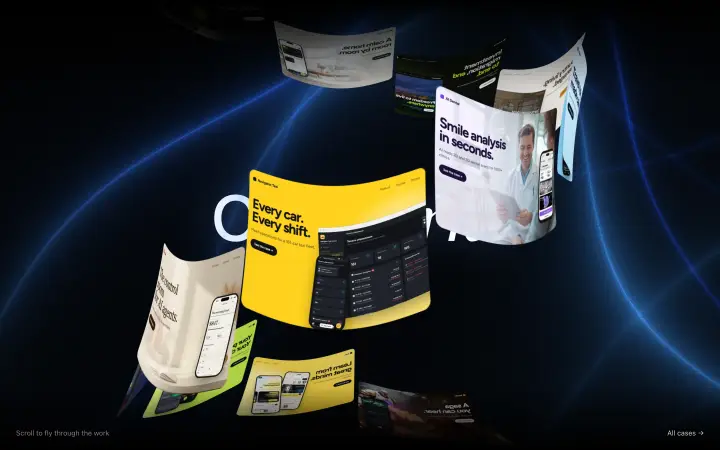
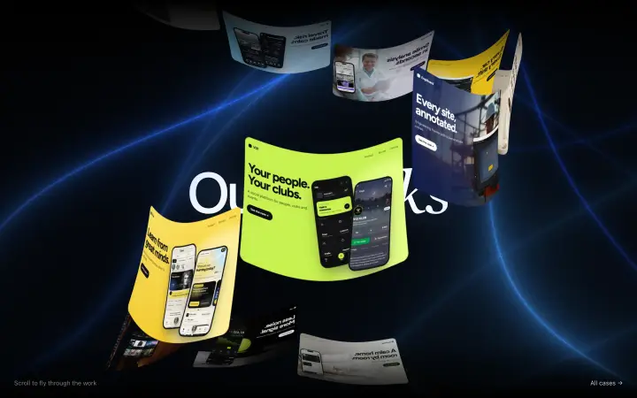
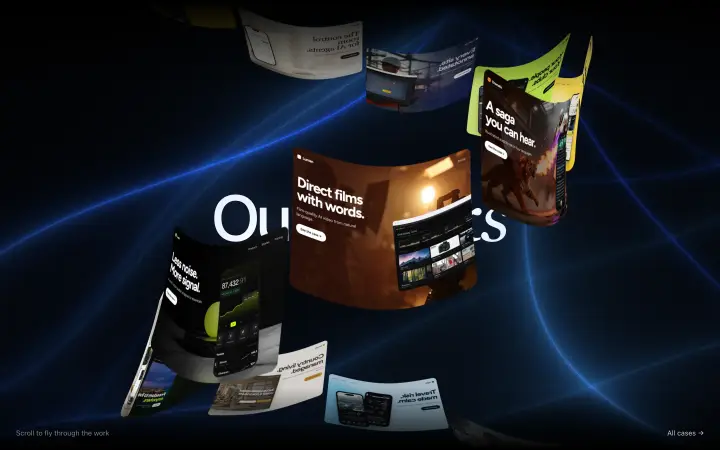
A WebGL coil: every cover is a segment of one helix that flares like a trumpet, so cards reshape as they rise.
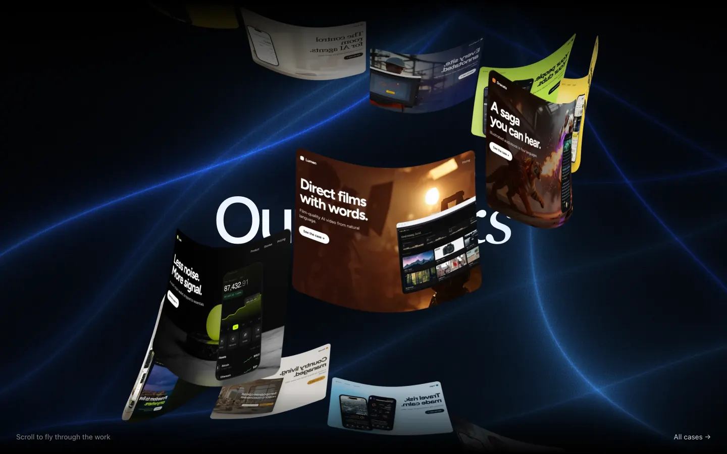
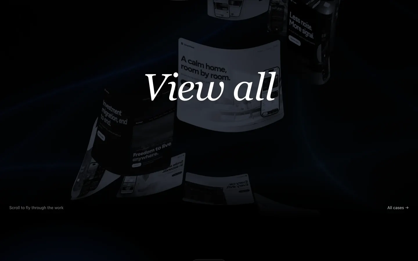
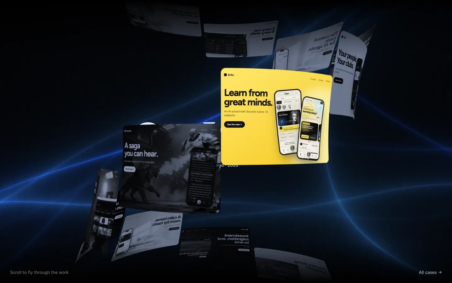
HoverOne card in colour; the rest go blue monochrome.
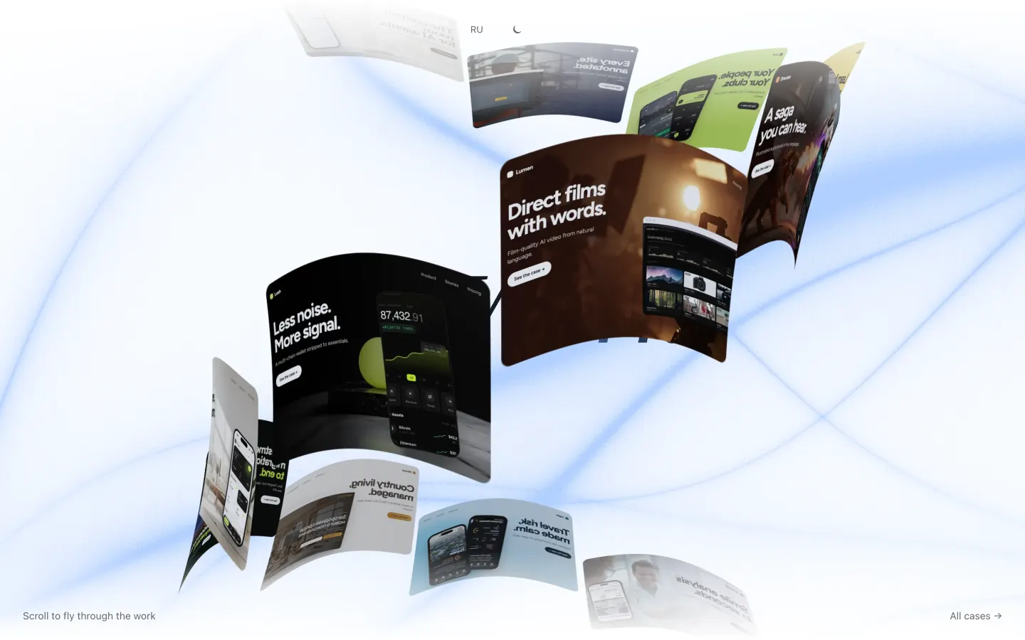
LightThe ribbons turn to pale blue light.
How the coil works
The works gallery is a WebGL coil. Every case cover is a segment of one tall cylinder wound on a helix that flares like a trumpet towards the top and bottom, so the cards reshape continuously as they rise. Scroll velocity adds an inertial flutter. The canvas is transparent, with the HTML title underneath and smoky light ribbons with grain behind.
The same coil at four scroll positions — the flare reshapes each card on its way up, and the run ends with a dim and a big serif “View all”. Hover keeps one card in colour and slightly larger; the rest go blue-tinted monochrome.
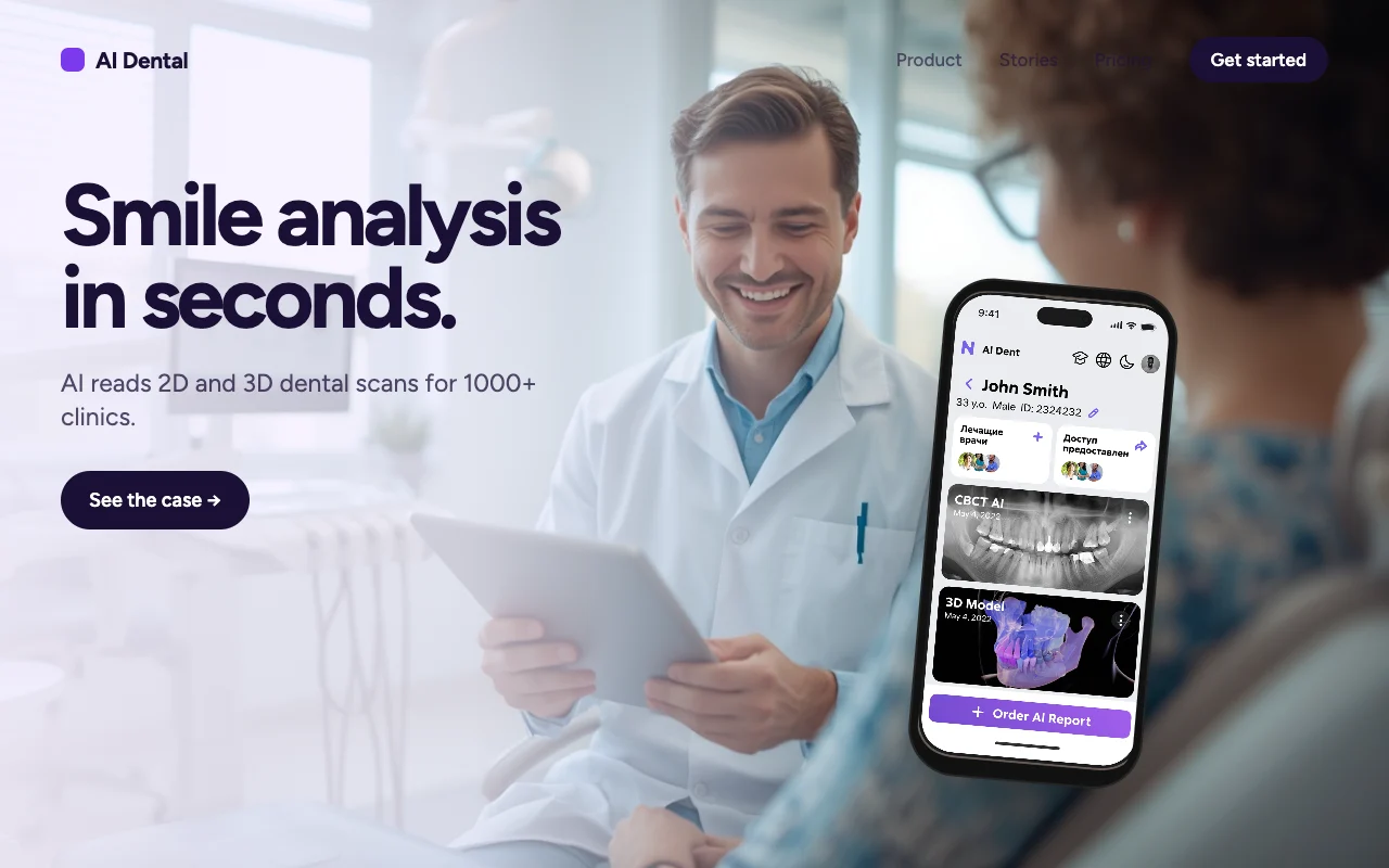
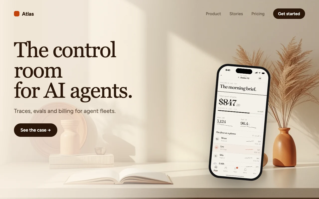
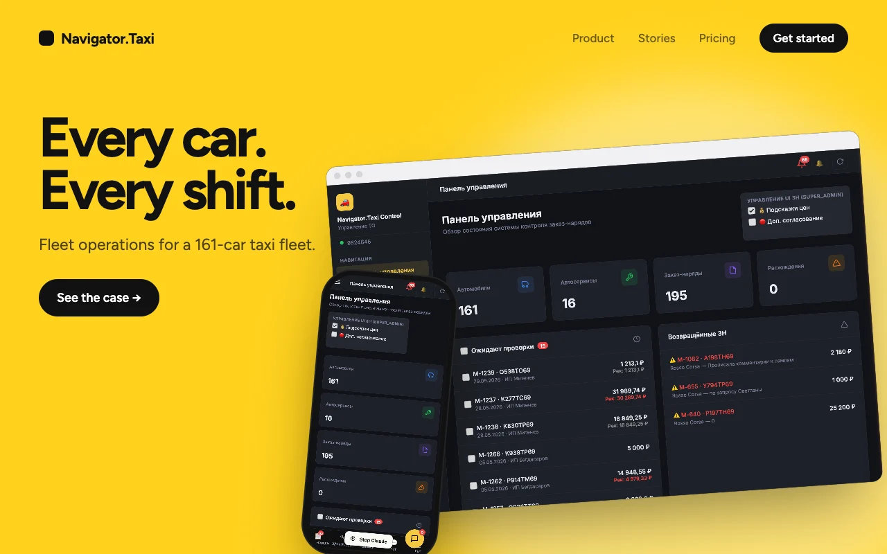
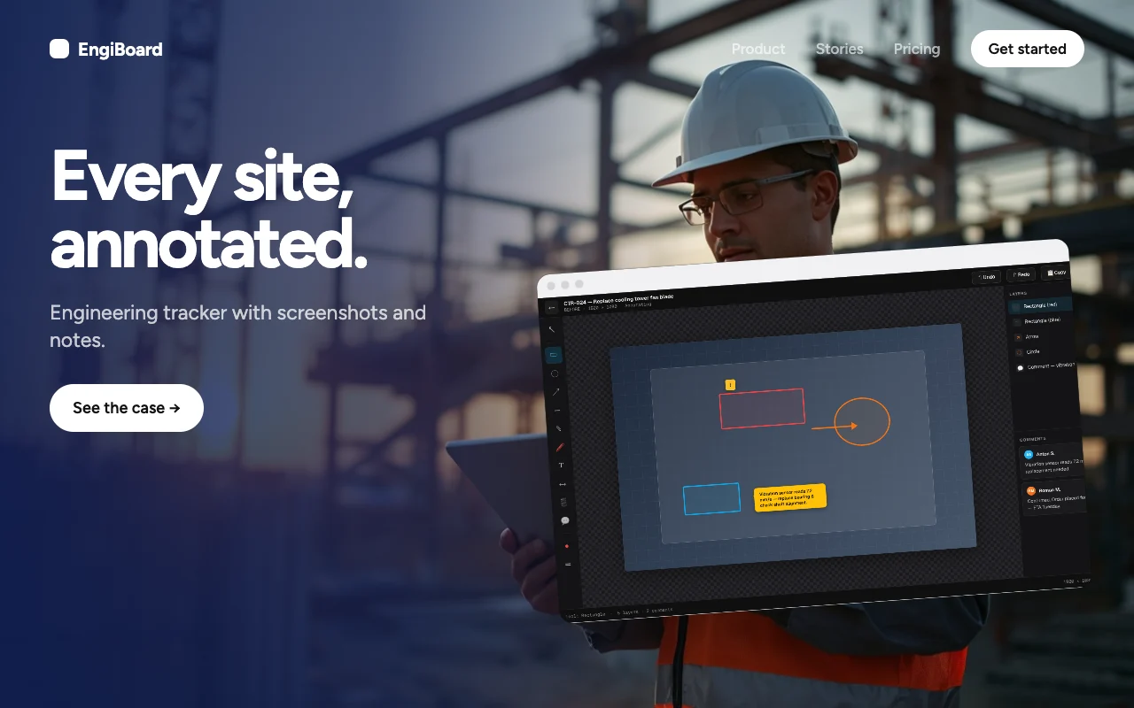
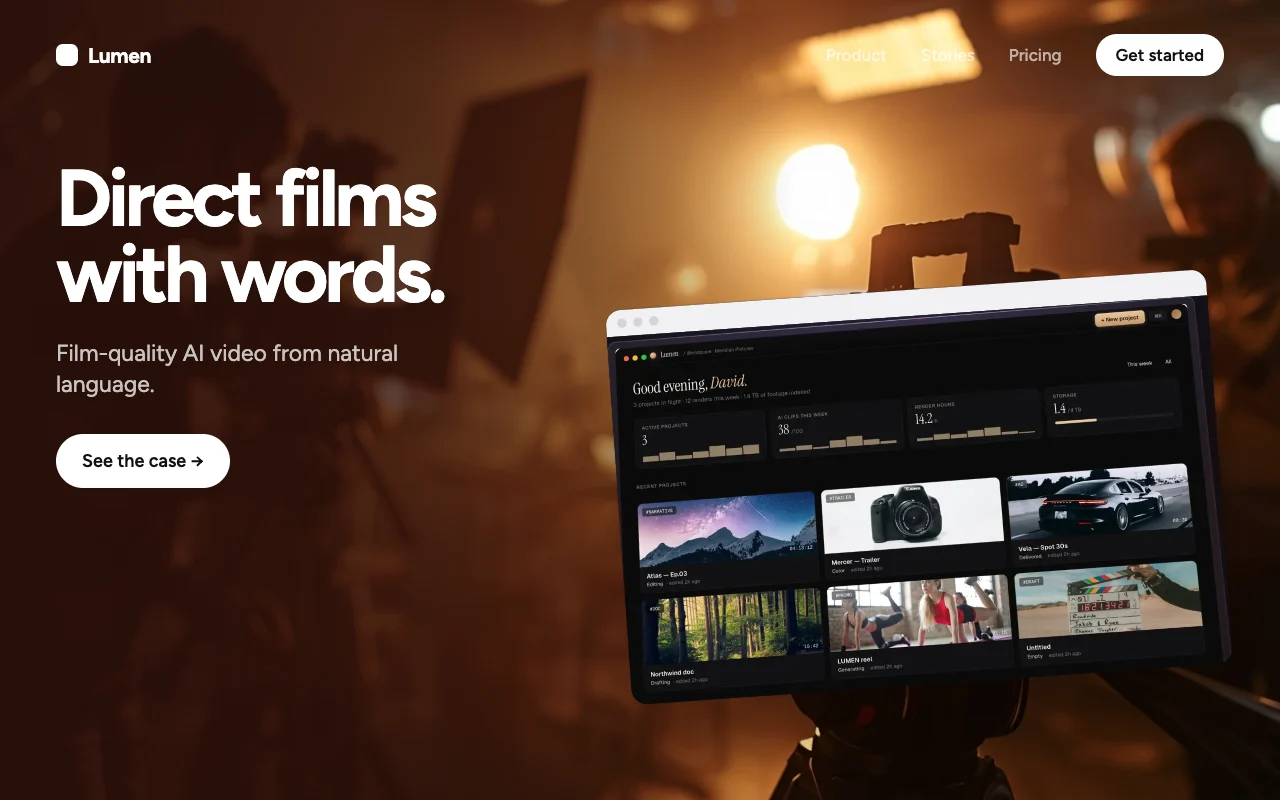
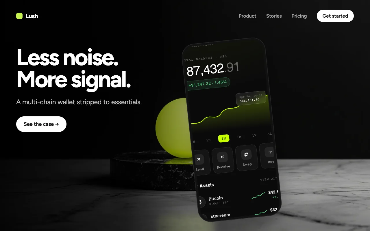
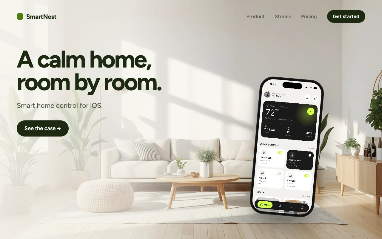
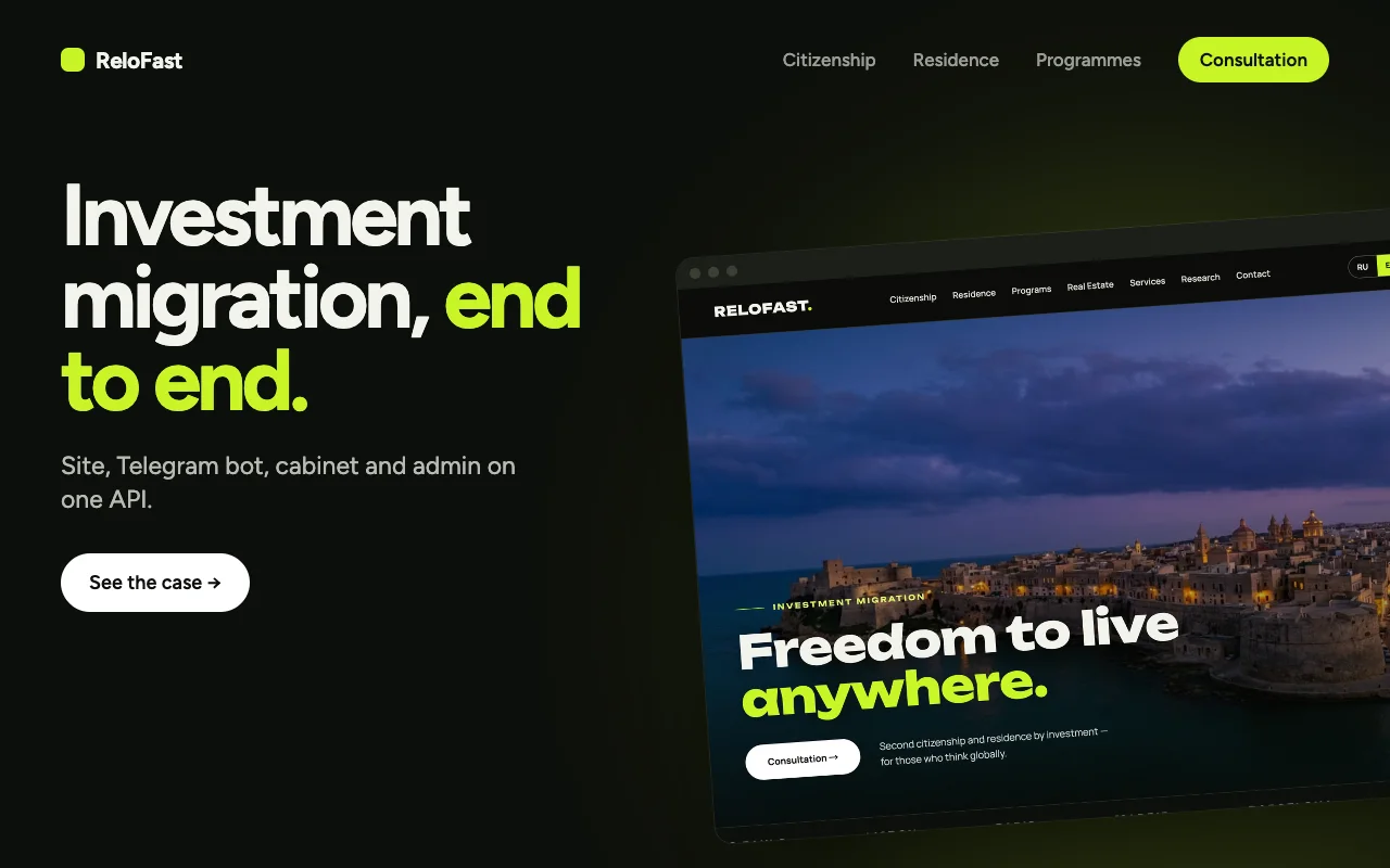
Every case, a website hero.
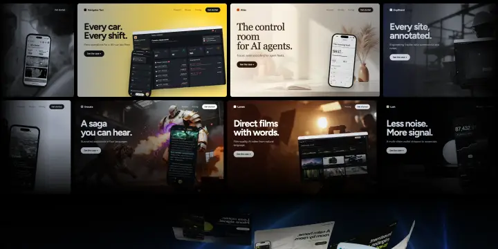
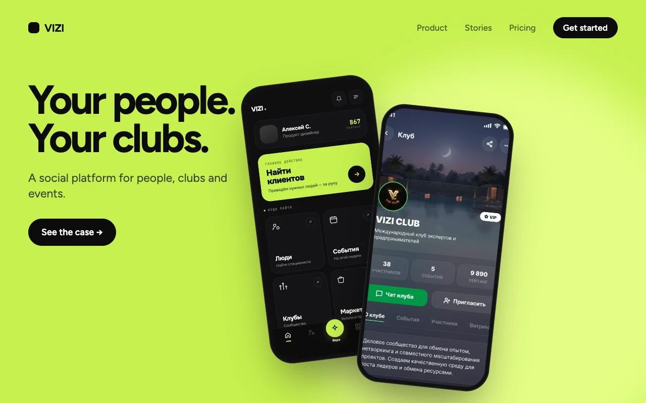
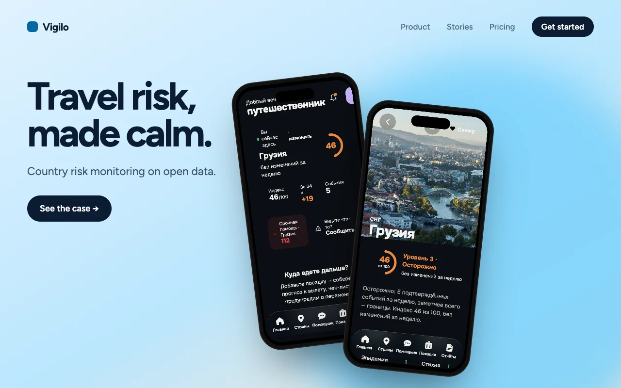
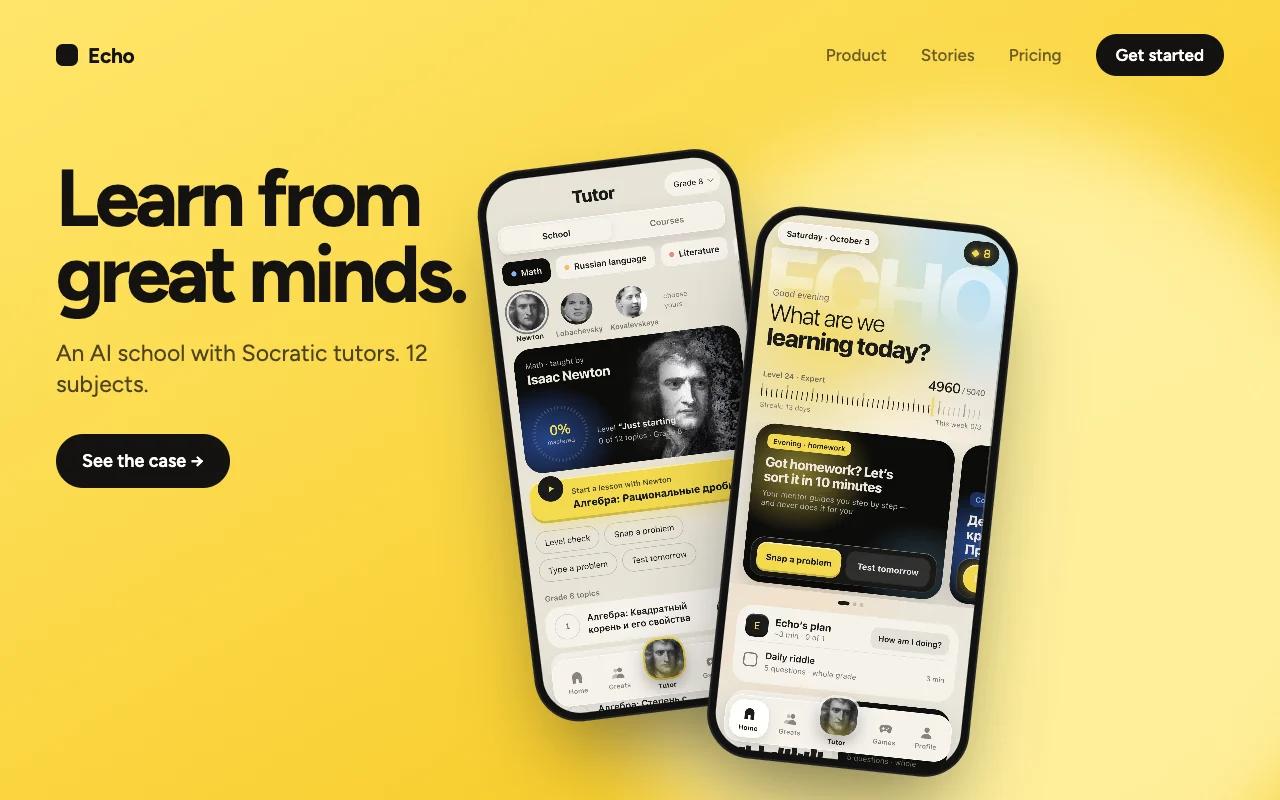
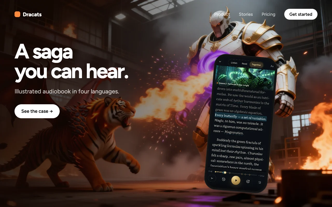
Nav strip, one headline, one call to action, real screens — different products, one grammar.
How one cover evolved
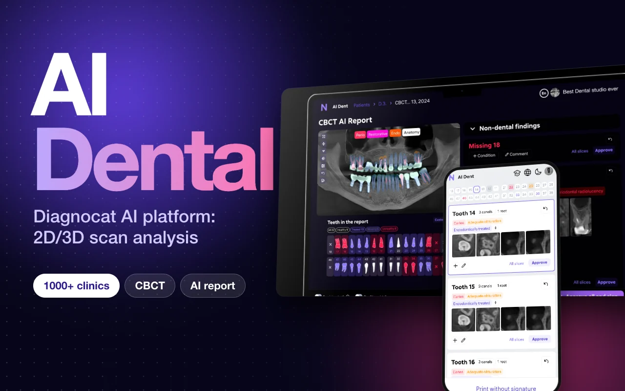
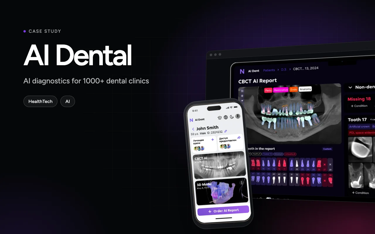
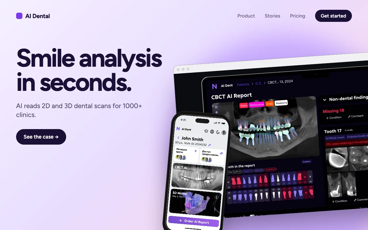
Read the full story
Thirteen covers were rebuilt as “website hero” posters: a nav strip, one big headline, one call to action, real product screens and a brand colour or photo background. Different products, one grammar — so the stack reads colourful and consistent at once.
Three earlier cover sets came before the hero-poster system; the AI Dental cover is shown above, version by version.
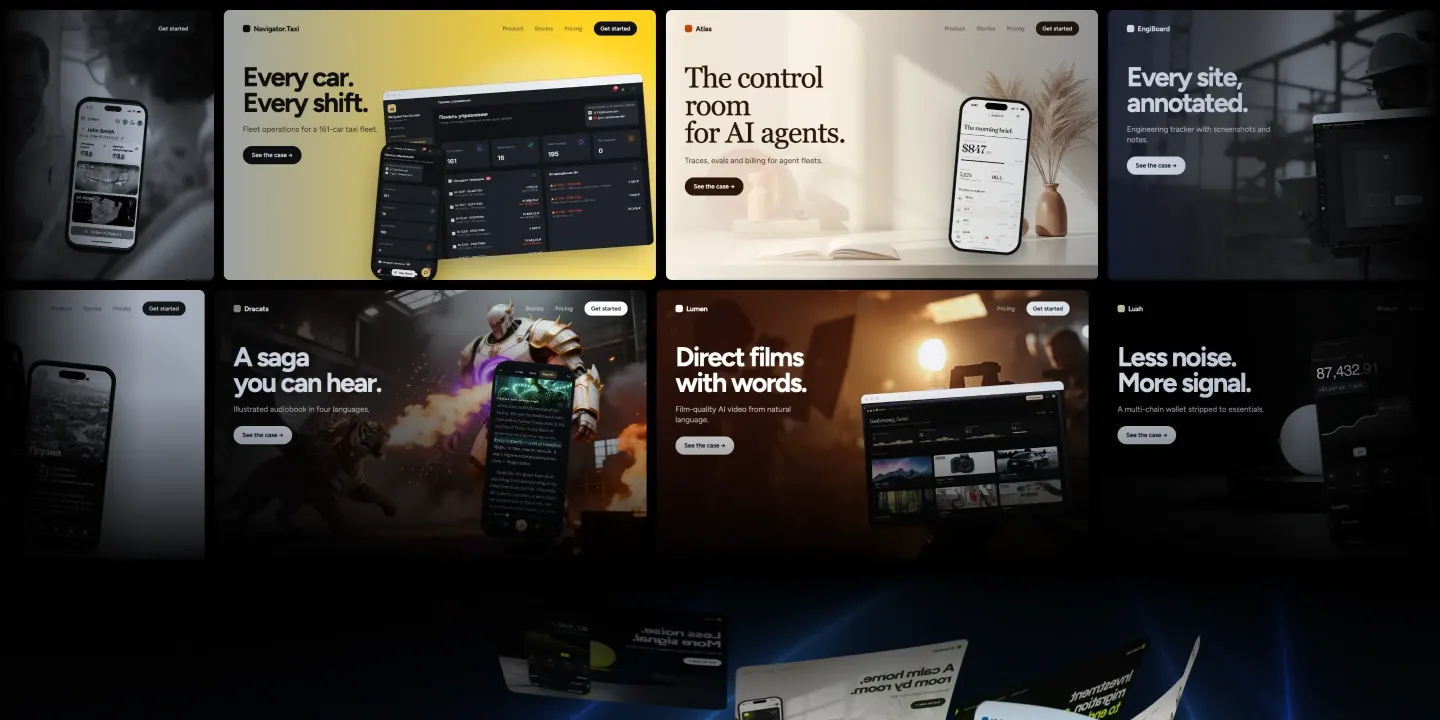
Colour in the centre. Tiles that wake up.
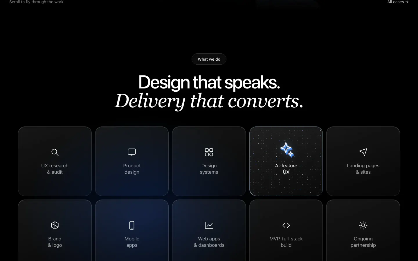
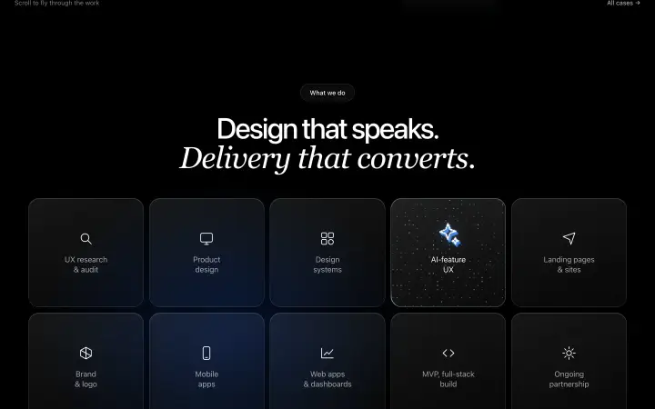
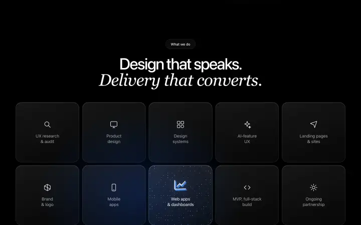
Cover rows bloom into colour where the eye goes; ten service tiles twinkle, glow and extrude on hover.
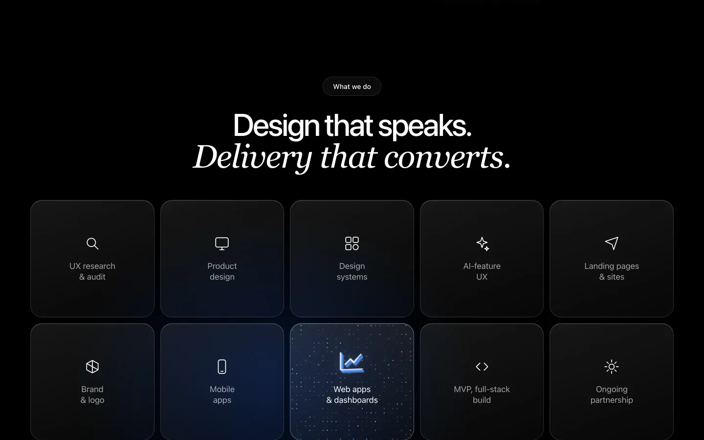
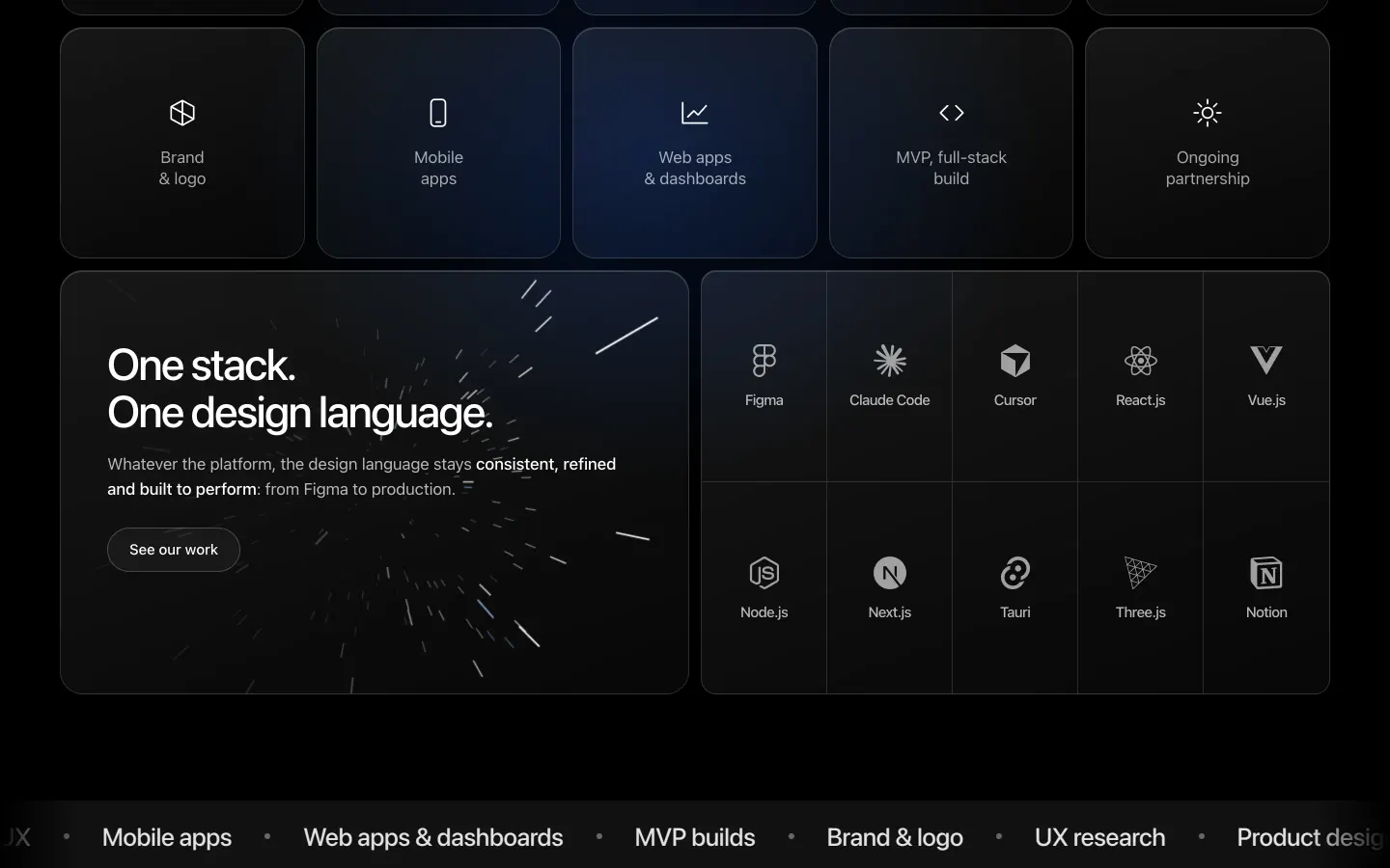
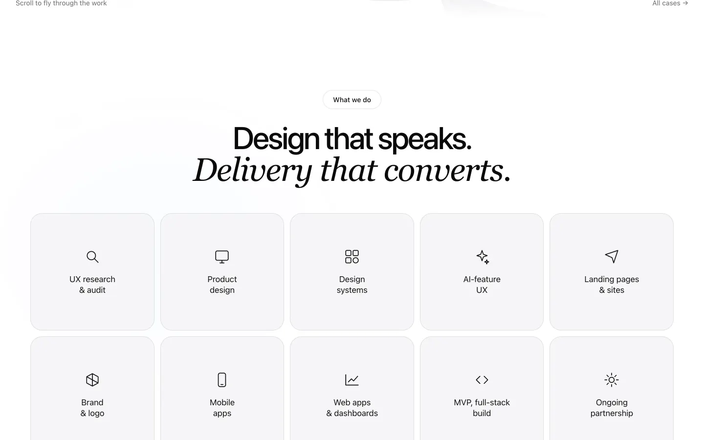
Read the full story
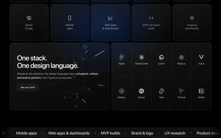
Cover rows. Under the hero, two rows of covers drift in opposite directions. A single backdrop-filter overlay turns them blue-tinted monochrome at the screen edges and lets them bloom into full colour in the centre — the eye goes where the colour is.
Services. Ten service tiles sit quiet until the cursor arrives. On hover a pixel grid starts to twinkle, a light runs around the border and the icon extrudes into 3D, turning to follow the cursor. Next to them: one stack, one design language — a starfield card and monochrome tool logos.
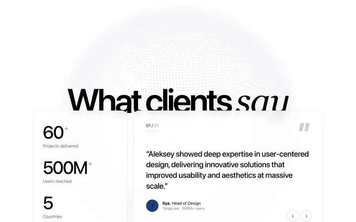
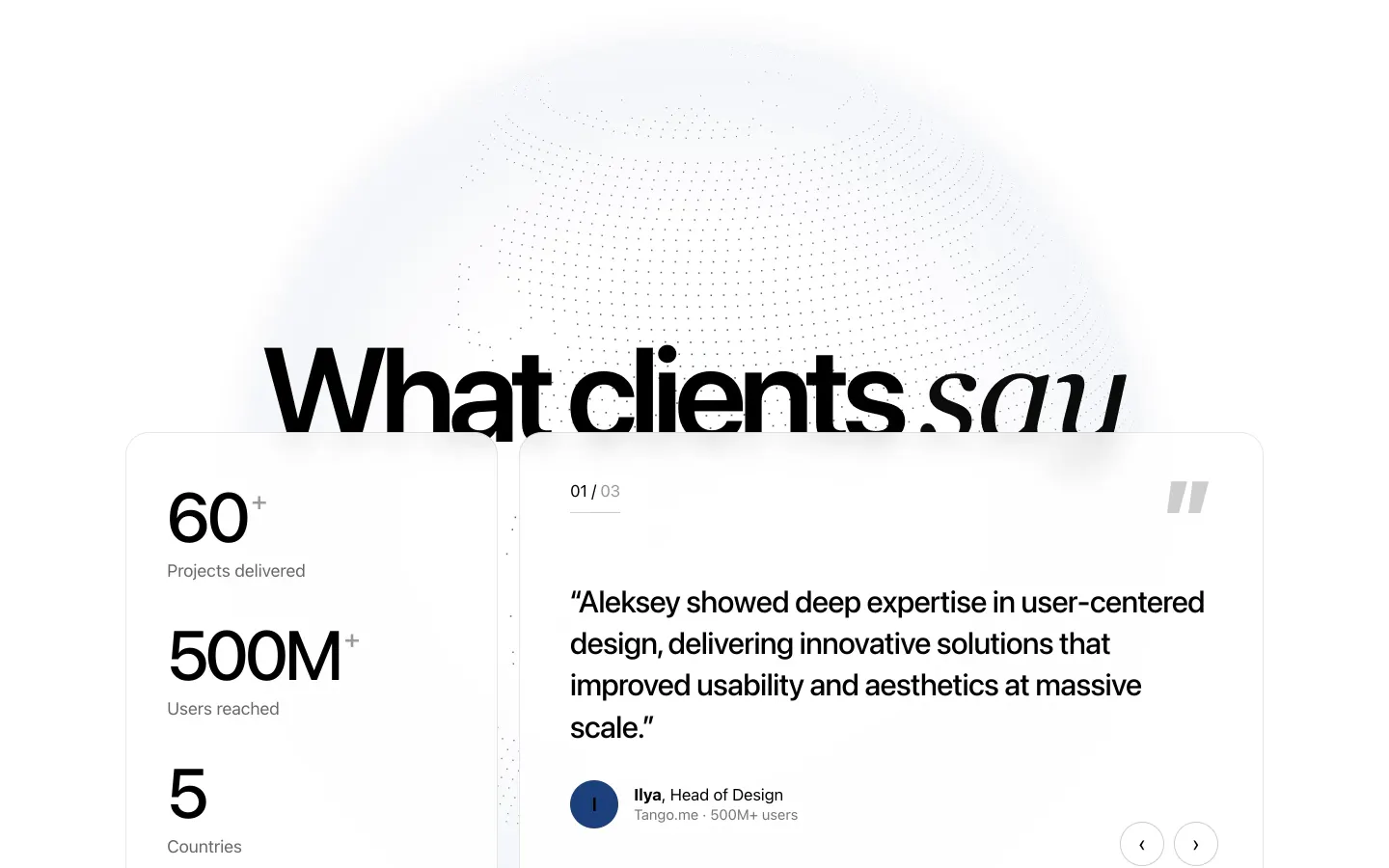
A globe made of dots.
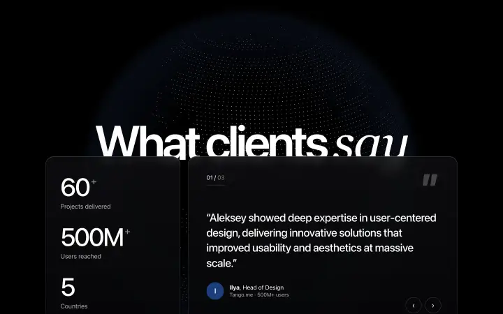
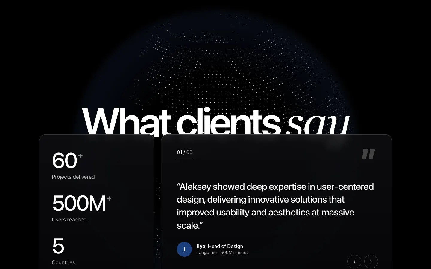
Quotes over a slowly rotating globe; a 1° land mask makes the dots trace real coastlines.
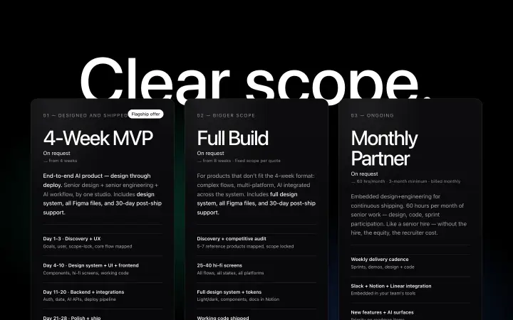
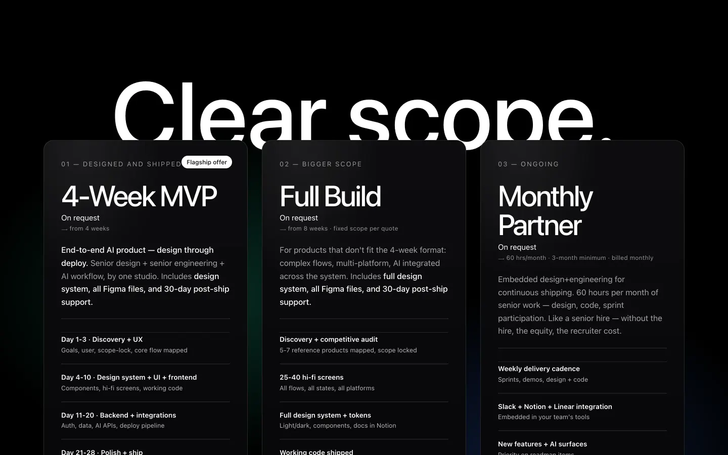
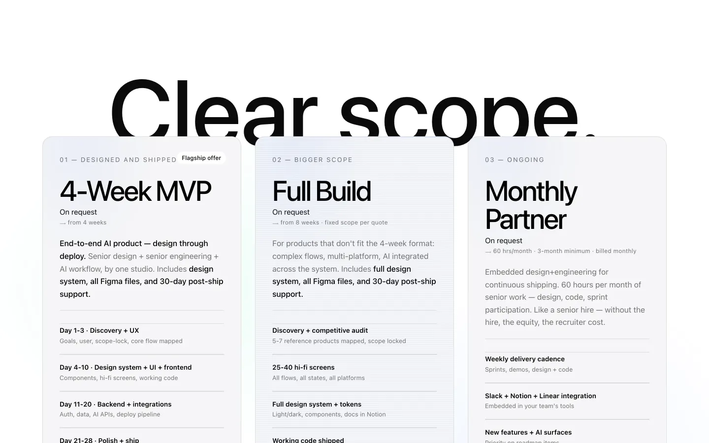
Three ways to work together.
A 4-week MVP, a full build or a monthly partner — week by week, what’s included, who it’s not for.
One stroke, redrawn precisely.
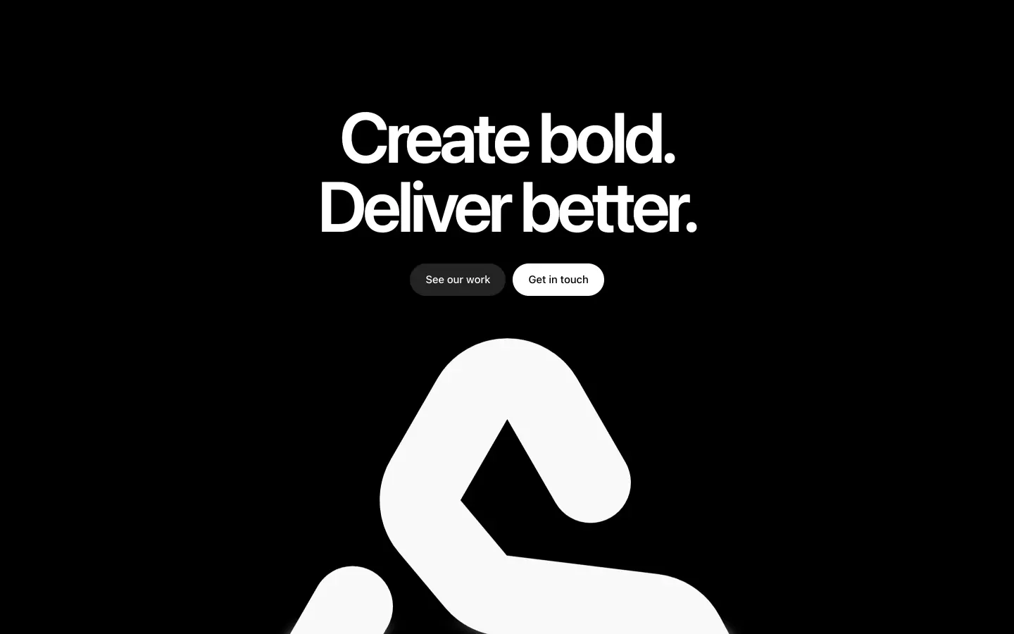
An “S” that opens into a mountain — rebuilt as exact geometry, with new tiles for dark and light.

Icon · dark
Icon · light
Read the full story
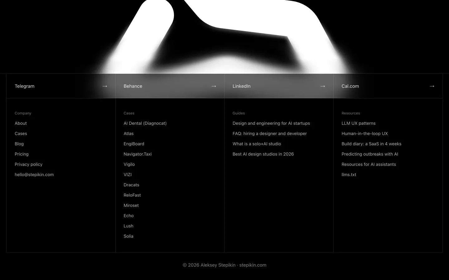
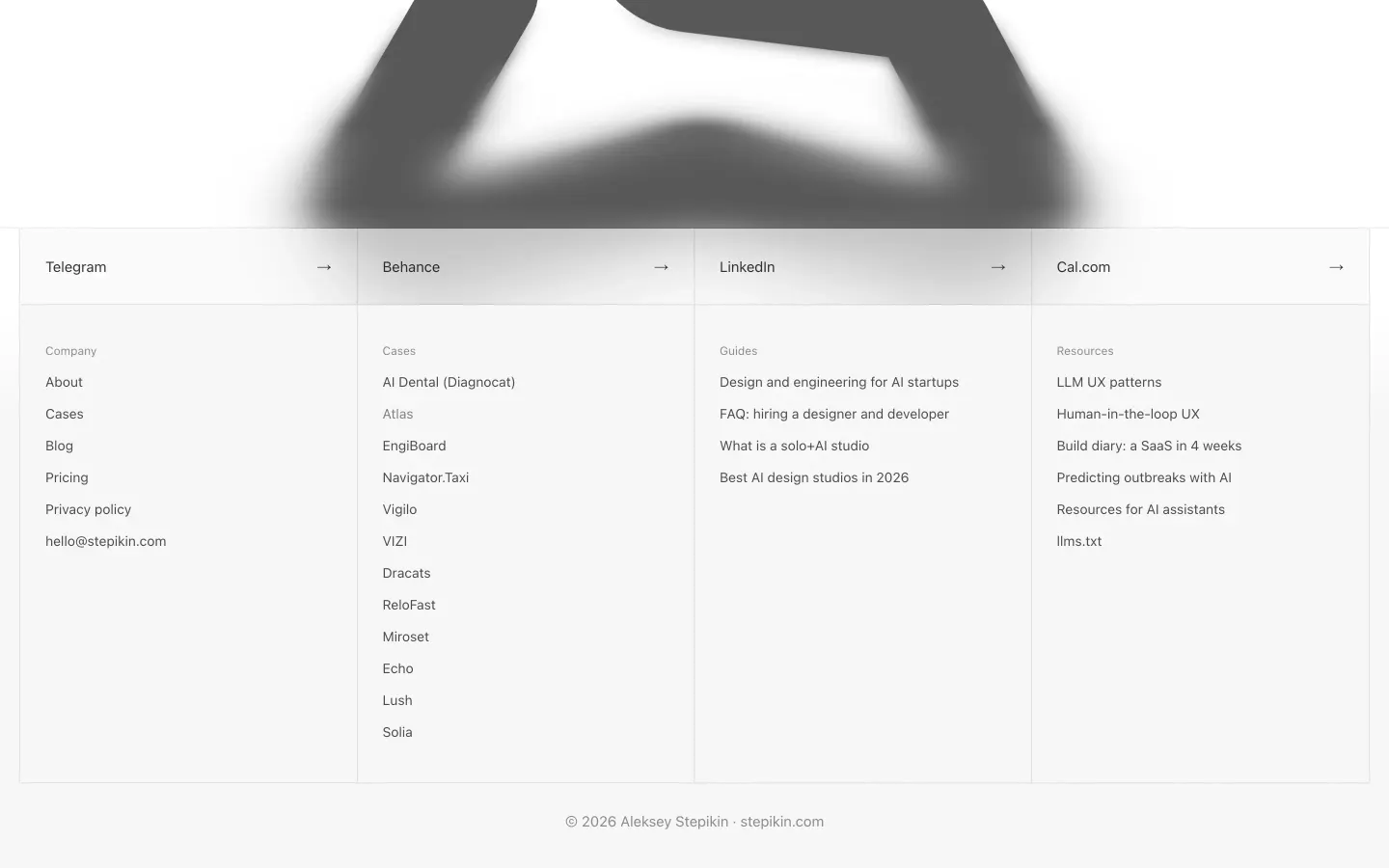
The mark is a single continuous stroke — an “S” that opens into a mountain. It was redrawn as exact geometry: whole-degree angles, one stroke width, equal corner radii and optical centring inside the tile. New icon tiles for dark and light followed.
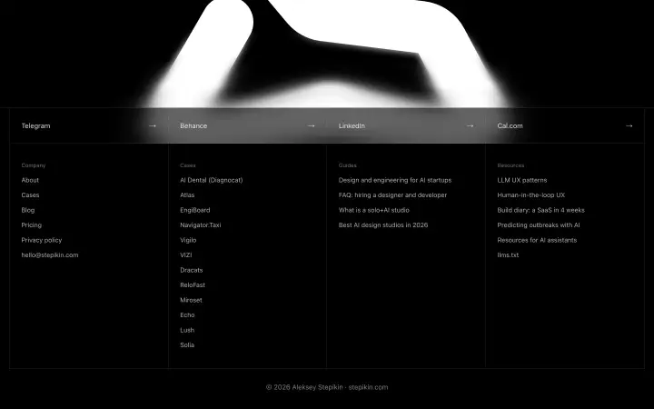
The giant footer mark: a four-step progressive SVG blur bleeds it into the footer; it fades and slides into place on scroll.
One kit, every page.
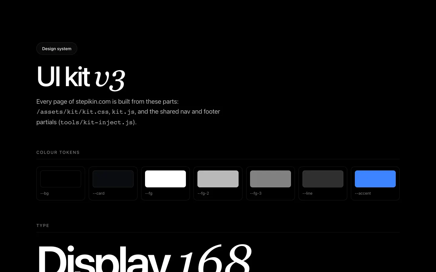
Shared k-* tokens and components; nav and footer injected by a small Node script, so a change lands everywhere.
Every case, one template
The visual language
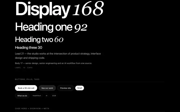
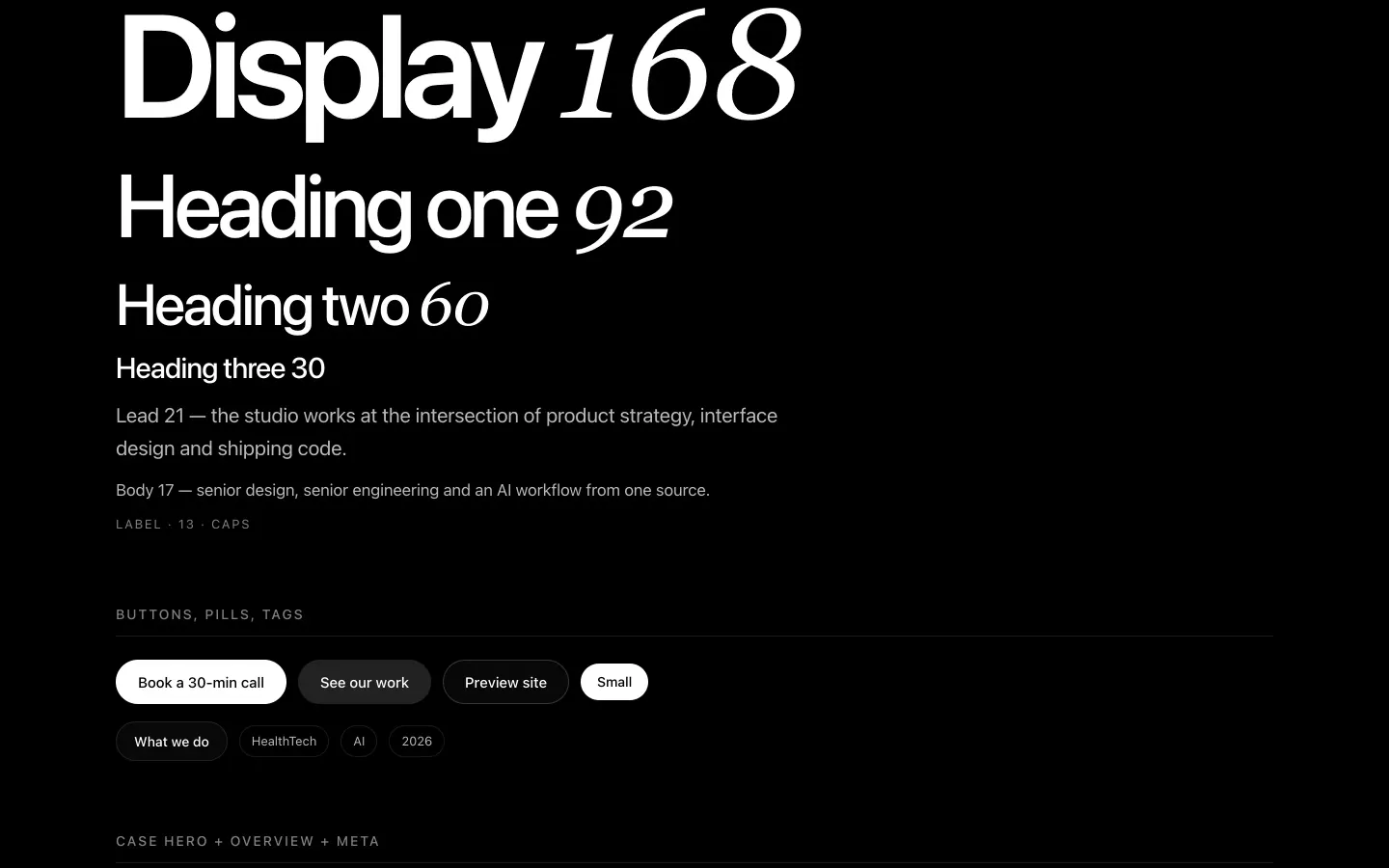
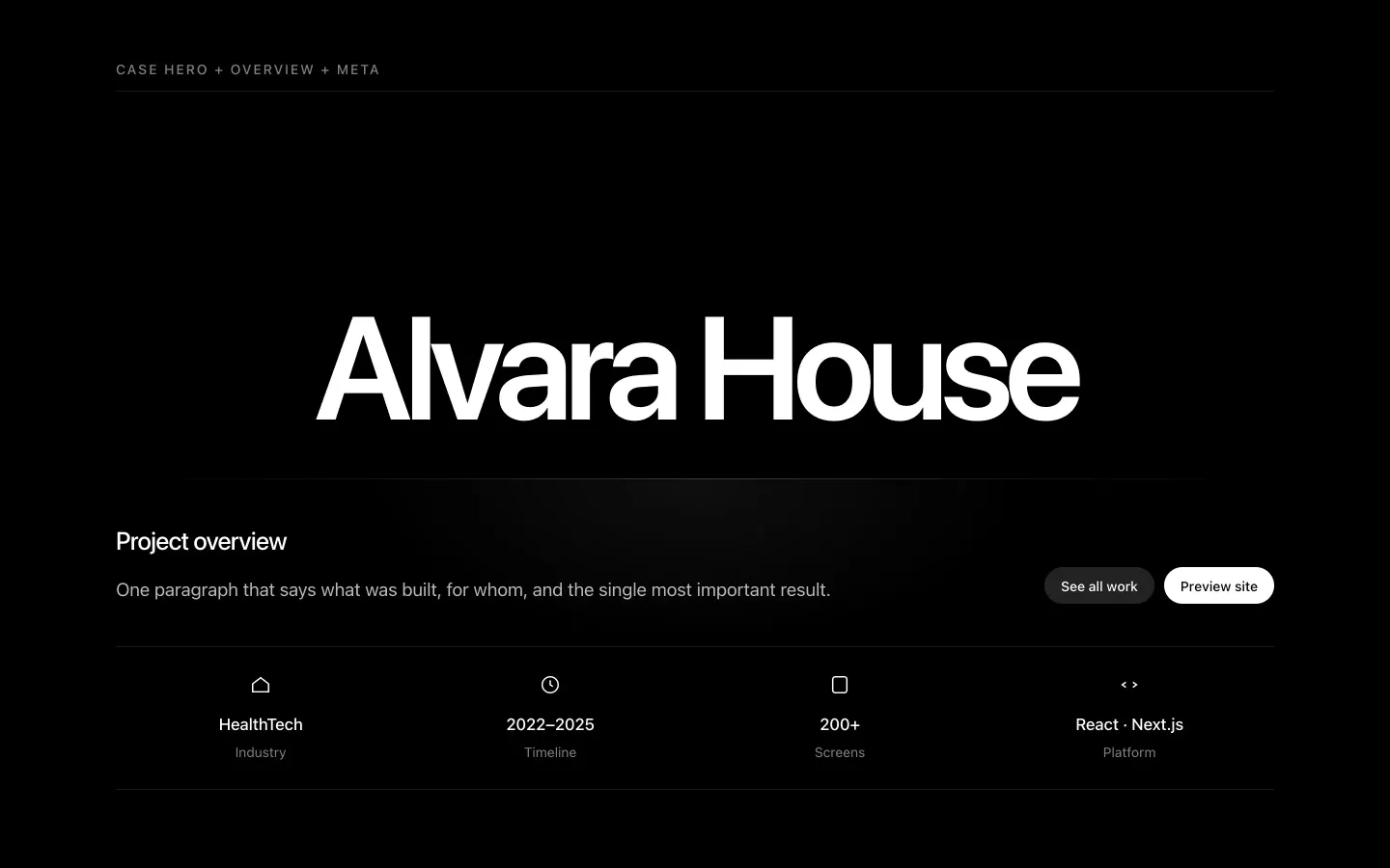
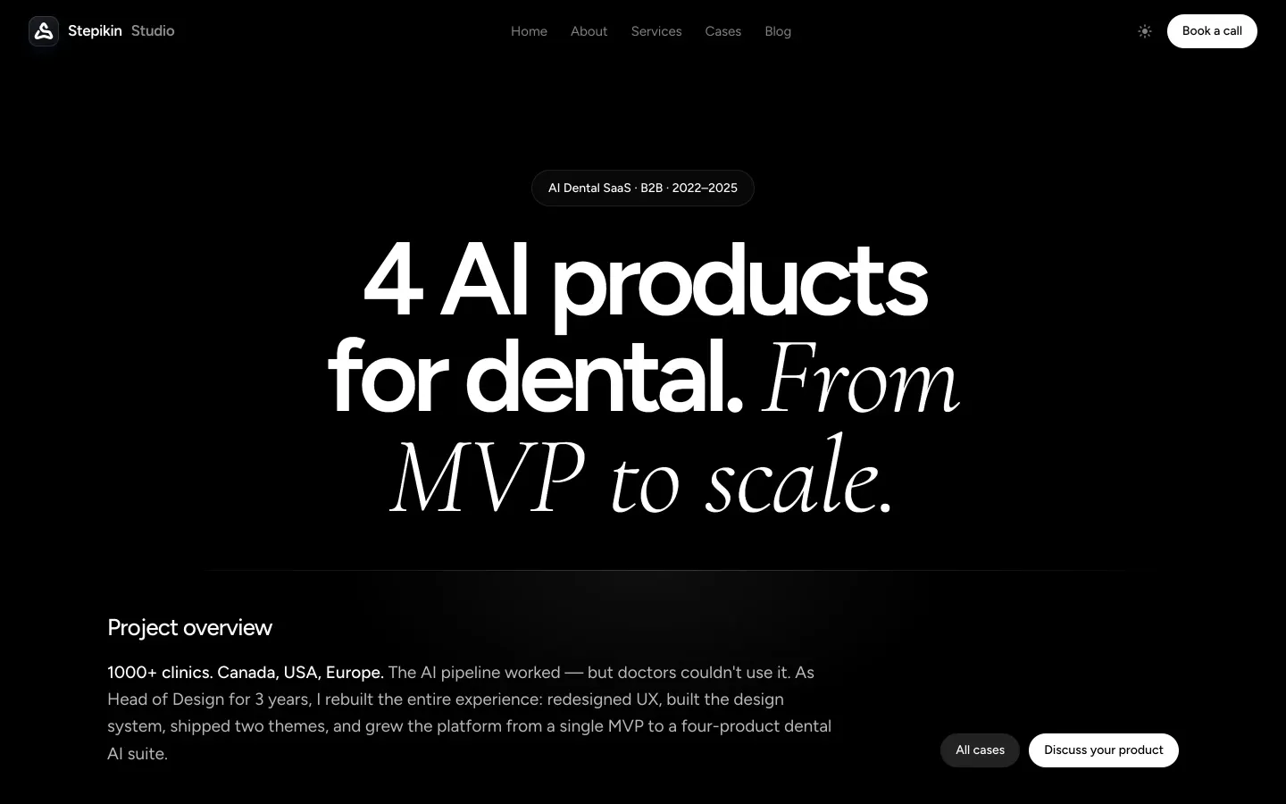
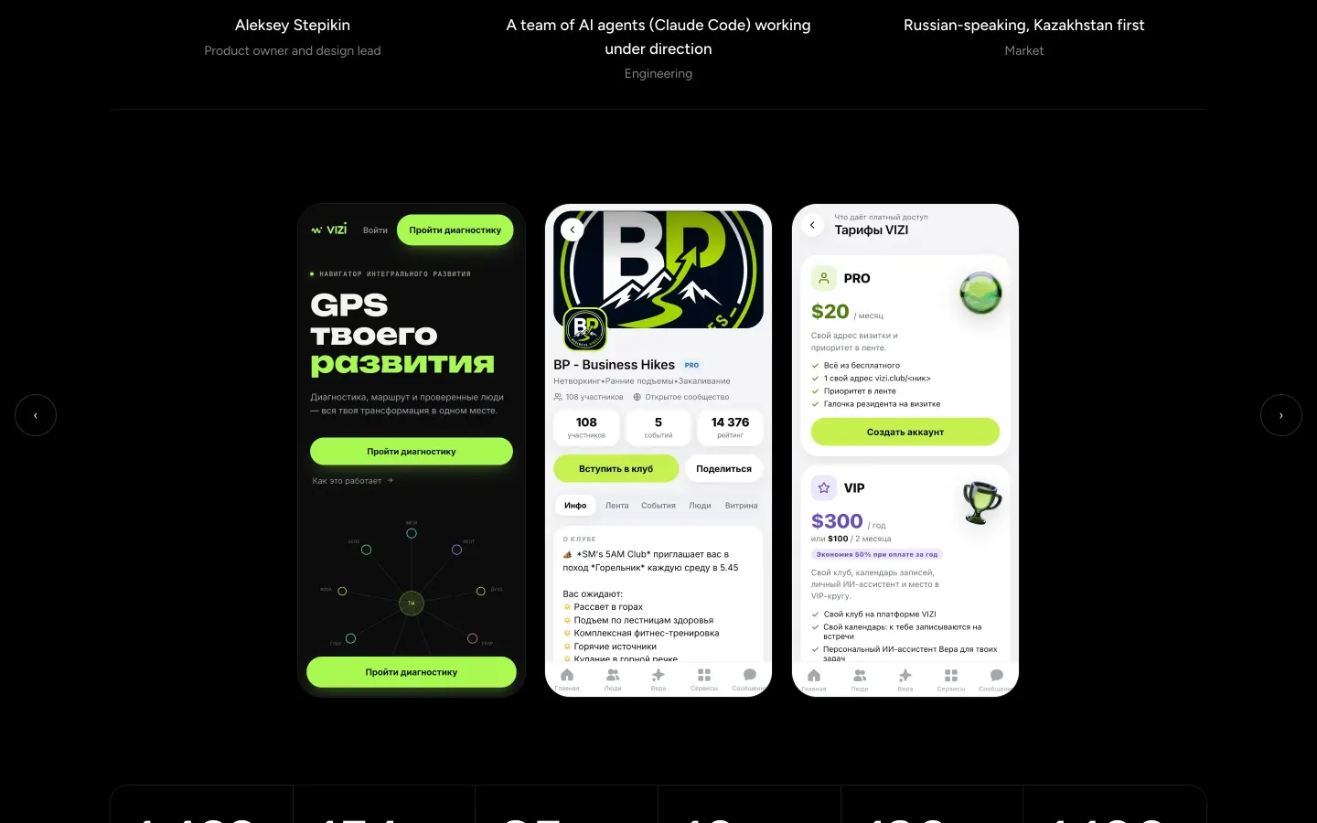
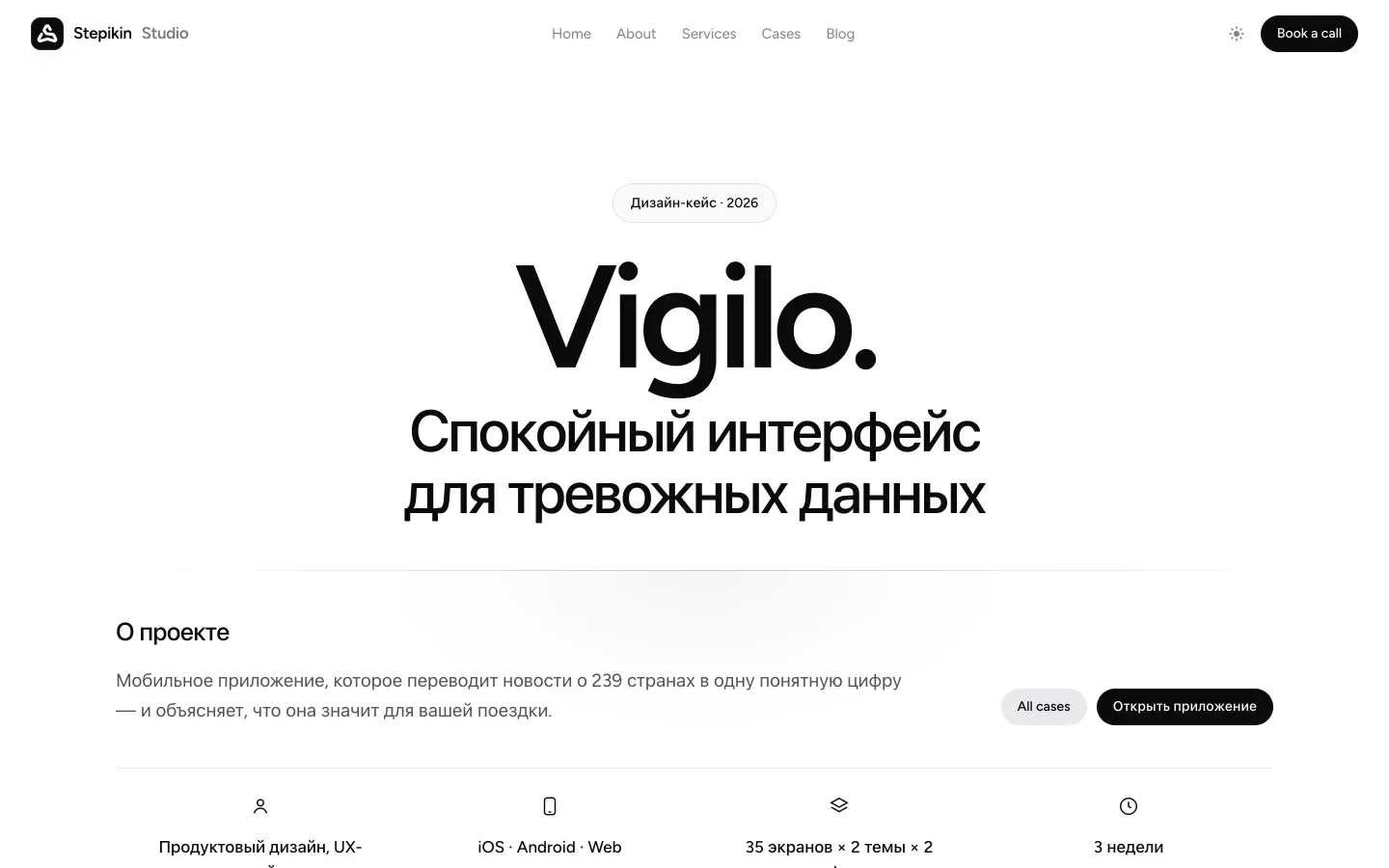
Shared tokens and components — the k-* classes — power the homepage, every case, the blog and the guides. The nav and the CTA-plus-footer are injected into each page by a small Node script, so a change lands everywhere at once.
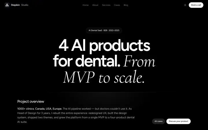
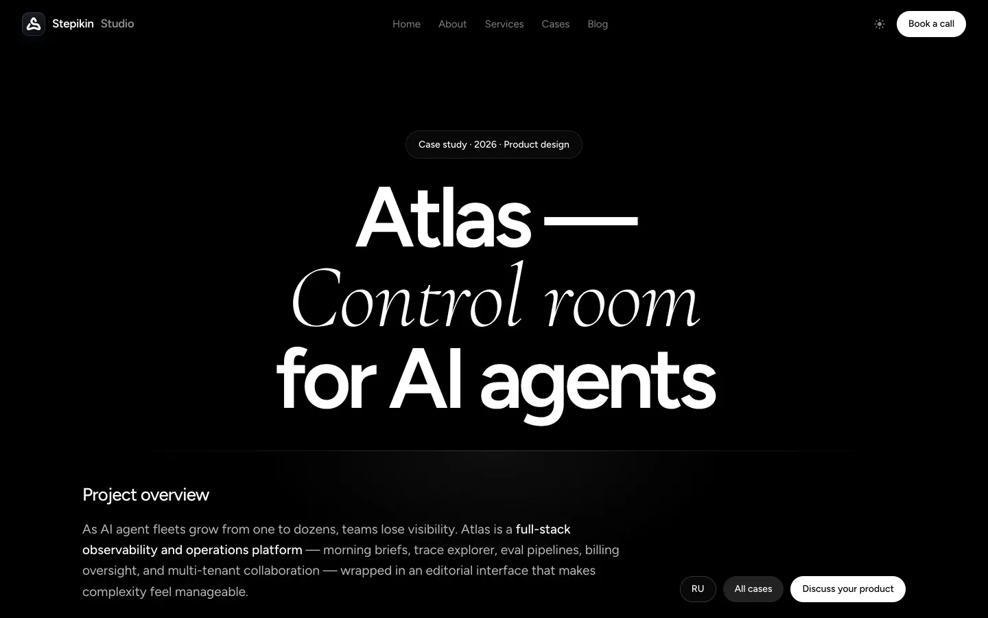
The visual language: a black canvas, Figtree with one thin Cormorant Garamond italic accent word, white pill buttons with a letter-roll hover, glass, blue glow and film grain — and a light theme as a full second treatment.
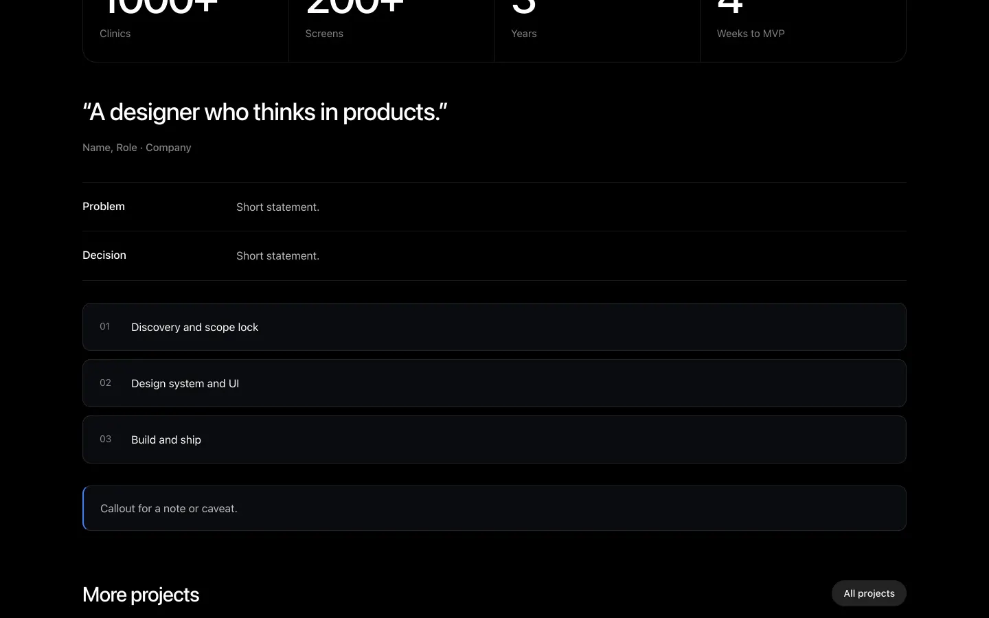
All case studies were restyled into one template: a big title, an overview, a meta row, a gallery, brief / approach / outcome, prose with a sidebar, and more projects.
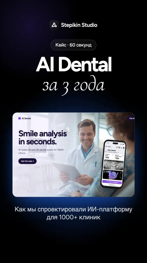
Cases, in vertical video.
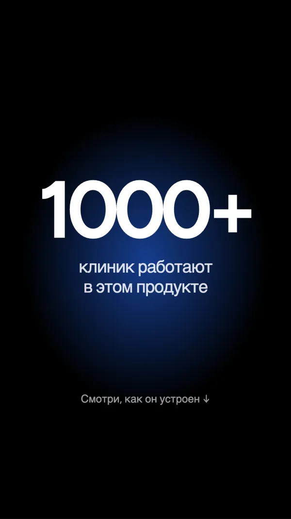
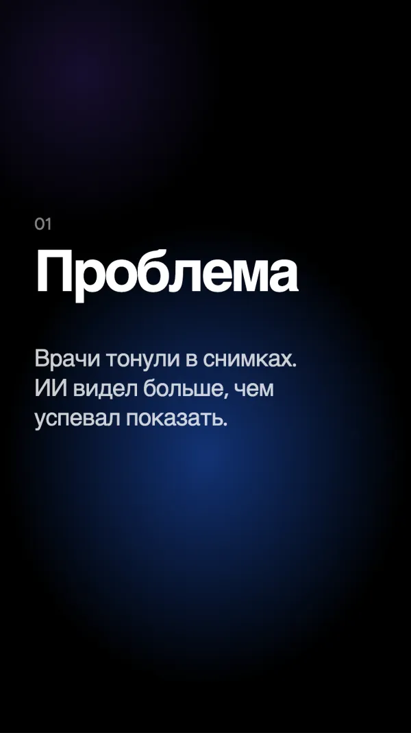
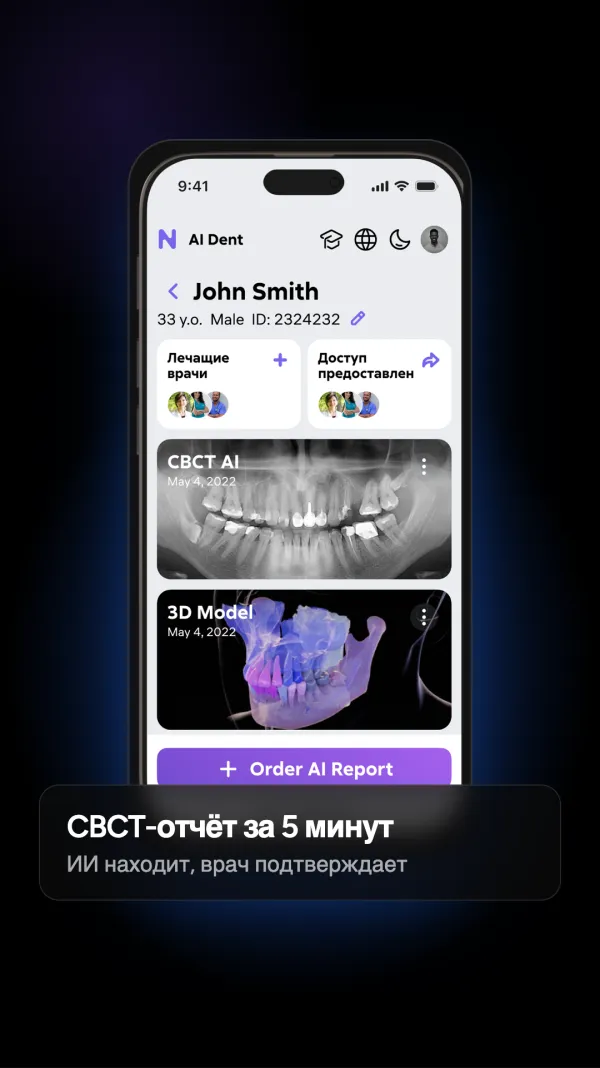
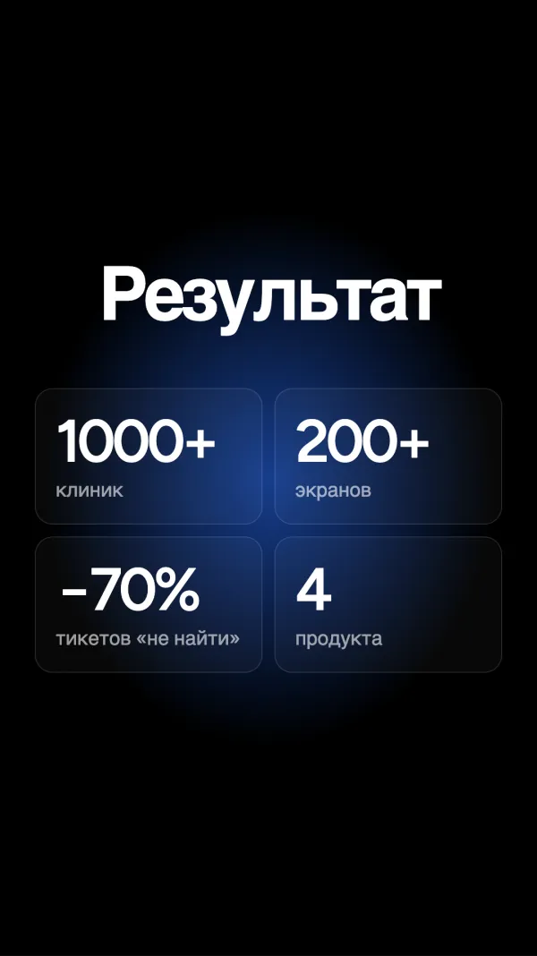
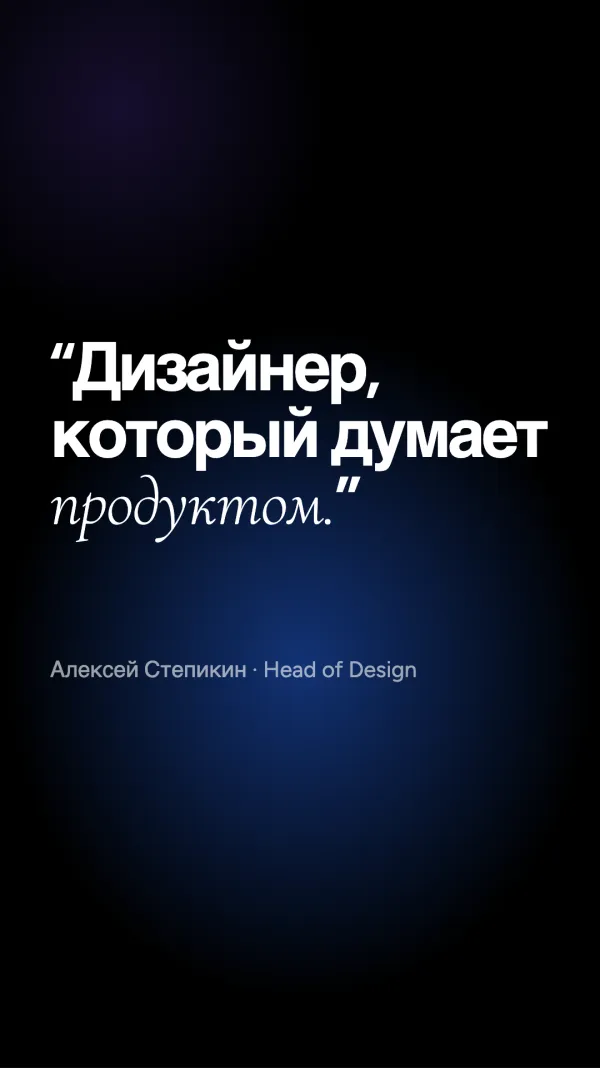
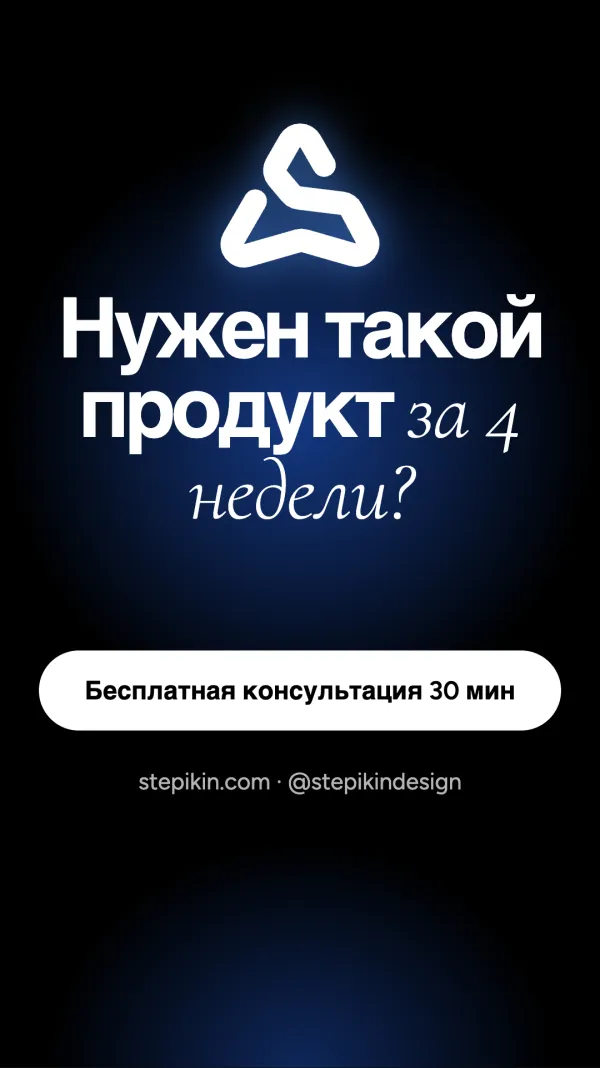
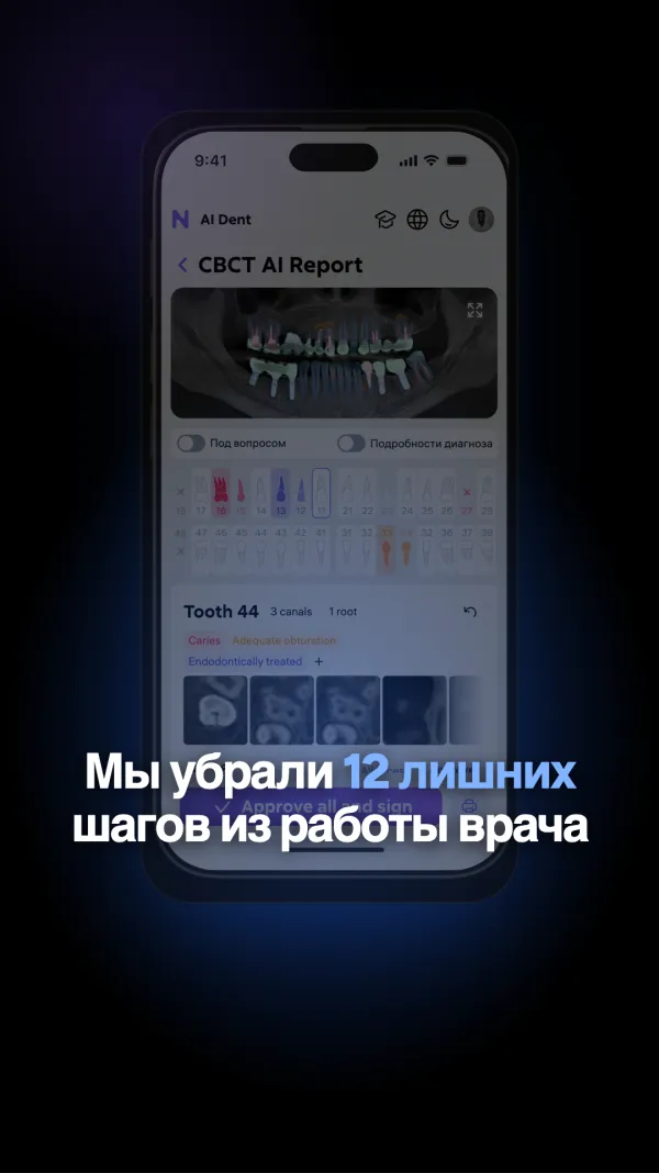
1080×1920 templates with safe zones marked for every platform’s UI.
Lighter on the phone.
Heavy WebGL steps aside: the glass becomes a poster, the coil a crawlable list.
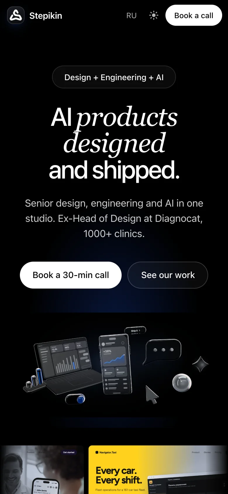
HeroPoster instead of WebGL.
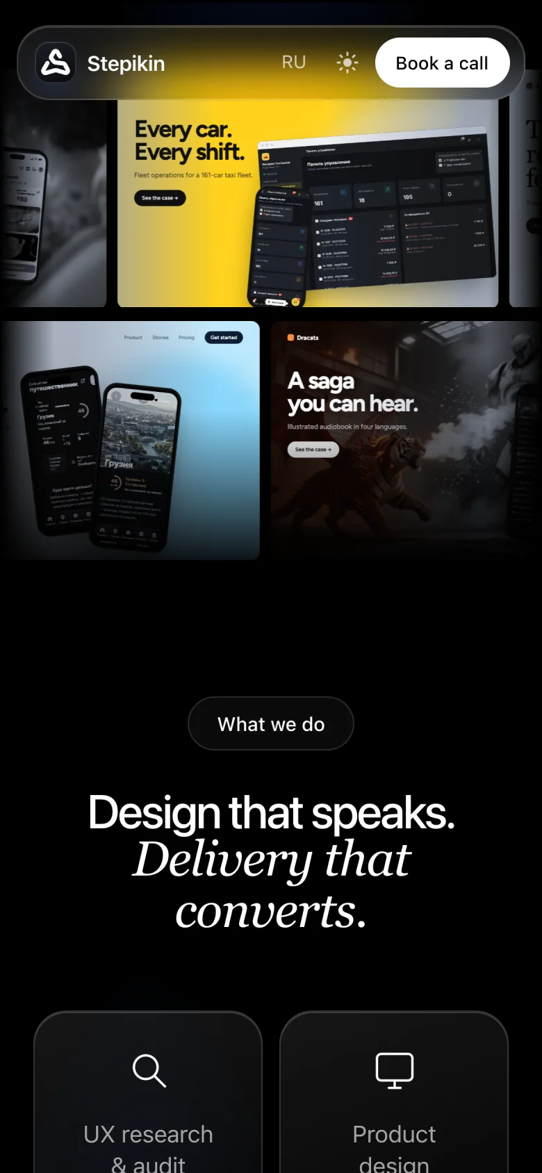
Cover rows
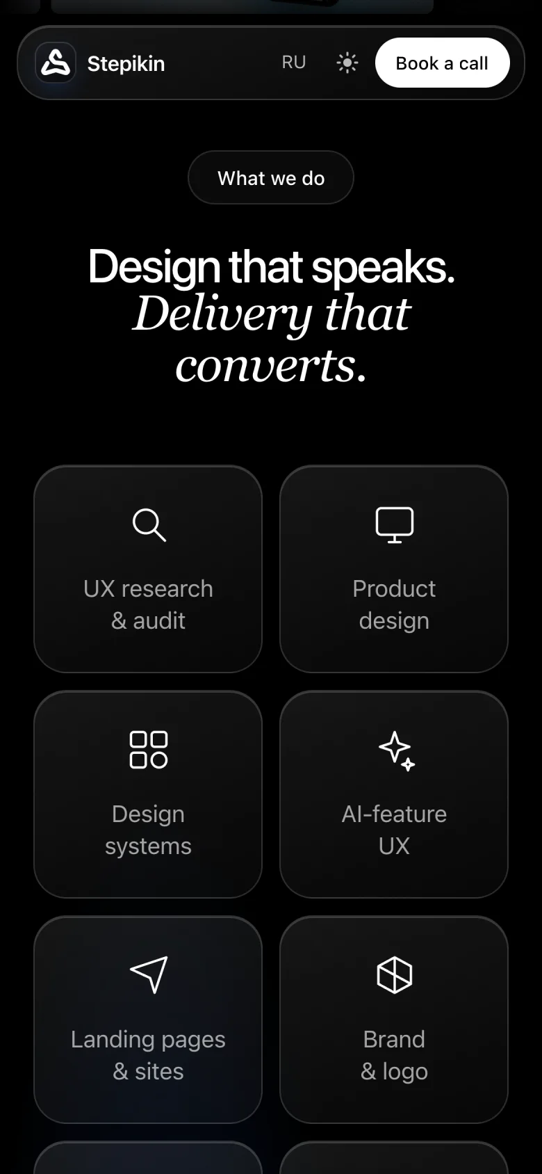
Services
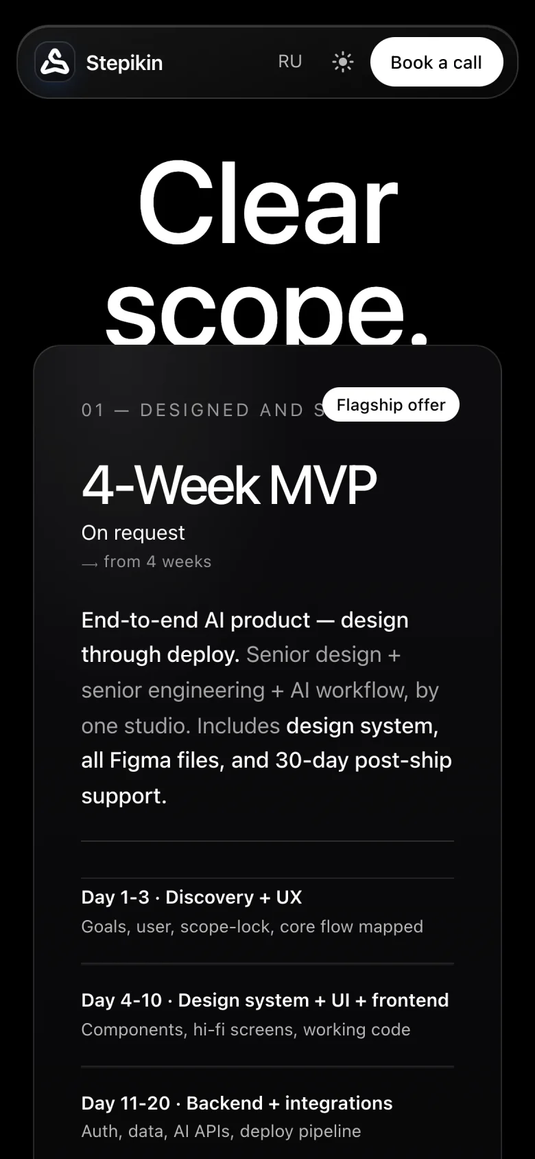
Pricing

A caseRhythm kept at 390 px.
Thank you.
Want a site that shows depth and still reads like plain text? We design and build it end to end.