VIZI.
A professional reputation you can see. One personal card, a reputation grown from real actions — and an AI assistant who proposes while the person decides.
Four months, a full redesign, a new design system.
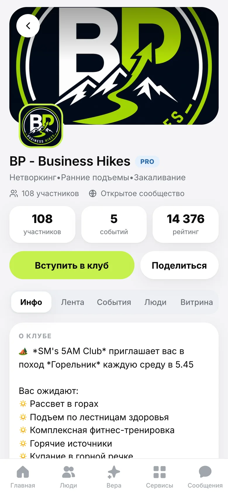
events, clubs, learn, chats
- What
- A social platform for people who work with people: a card, a reputation and the AI assistant VERA.
- Why
- Make professional value visible around the clock, without cold outreach or a brand built from zero.
- My role
- Product owner and design lead; engineering by a team of AI agents under direction.
- Result
- 1,403 profiles in 4 months · 527 monthly active · 217 events
VIZI is a social platform for people who work with people: experts, entrepreneurs and community leaders. A card, a reputation, clubs, events, booking and courses — around one assistant, VERA.
Read the full story
VIZI is a social platform for people who work with people: experts, entrepreneurs and community leaders. One personal card, a reputation that grows from real actions, clubs and events, built-in booking, courses — and VERA, an AI assistant who proposes while the person decides.
VIZI grew out of an earlier product (Wave Match) into Vizit Club and then VIZI. The first commit is dated 4 June 2026; everything since lives in one repository.
One card. Eight surfaces. Two themes.
One quiet system, light by default and dark on demand.
Learn · Card · VERA
Résumés don’t show real work. Networking forgets by morning.
The thesis: make a person’s professional value visible and working around the clock — without cold outreach or a personal brand built from zero.
Résumés are static
Where you worked, not how you work.
LinkedIn is noisy
Built for another market.
Networking forgets
Contacts swapped, gone by morning.
Marketplaces sell jobs
No identity, no reputation that accumulates.
Read the full story
Résumés are static. They show where you worked, not how you work or how you grow.
LinkedIn is noisy. Built for another market — a weak fit for entrepreneurs and experts across the CIS.
Networking forgets. You meet offline, swap contacts, and by morning it’s gone.
Marketplaces sell jobs. One-off orders with no identity and no reputation that accumulates.
Matching and the marketplace are how the platform earns. Activity — learning, meetings, a complete profile — becomes a public signal of quality: a reputation you can’t buy and can’t fake with a polished bio.
“Identity first. The card is the front door — visibility is the value.”
One card, eight surfaces.
The first concept had three tabs — Me, People, Feed. The product that shipped grew into eight surfaces around the same core.
The card
vizi.club/<nick> — the entry point of everything.
Reputation
A score with no ceiling, grown from real actions.
People
Search, matching, introductions, Want / Can requests.
VERA
An AI assistant in the centre of the tab bar. She proposes; you confirm.
Events
RSVP, QR tickets, an event team.
Clubs
Clubs as small businesses.
Services & Learn
Moderated showcase, courses with certificates.
Chats & meetings
Booking built in.
All eight surfaces in detail
The first concept had a rule against clutter: shops, reviews and QR are actions in context, not sections.
- The card. A public page for every person at vizi.club/<nick>: photos, blocks, services, recommendations and a QR. The entry point of everything.
- Reputation. A score with no ceiling, grown from real actions: invitations that came alive, recommendations, reviews, events. Paid status doesn’t move it.
- People. Search, matching, introductions, and Want / Can requests: say what you need and what you can give.
- VERA. An AI assistant in the centre of the tab bar. She reads the context and proposes a change; the person confirms or rolls it back. Voice input included.
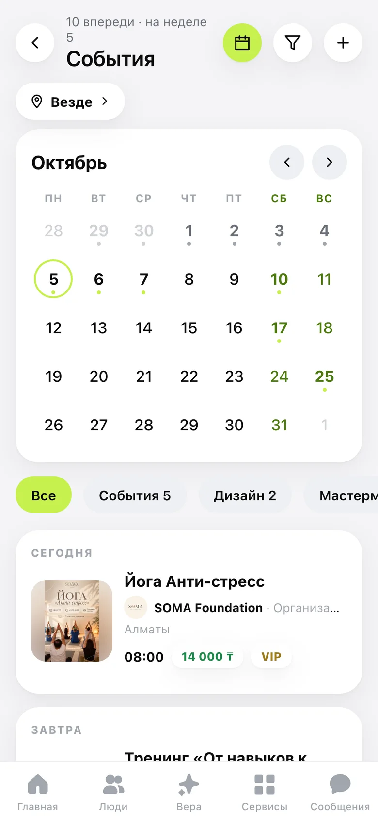
- Events. RSVP, QR tickets, an event team and an organiser funnel — one feed for everything happening nearby.
- Clubs. Clubs as small businesses: events, members, a showcase and a manager panel, each with its own page and rating.
- Services and Learn. Services, shops and projects behind moderation; Vizi Learn courses with lessons, quizzes and signed certificates.
- Chats and meetings. Chats, plus booking built in: set your hours and people book you without leaving VIZI.
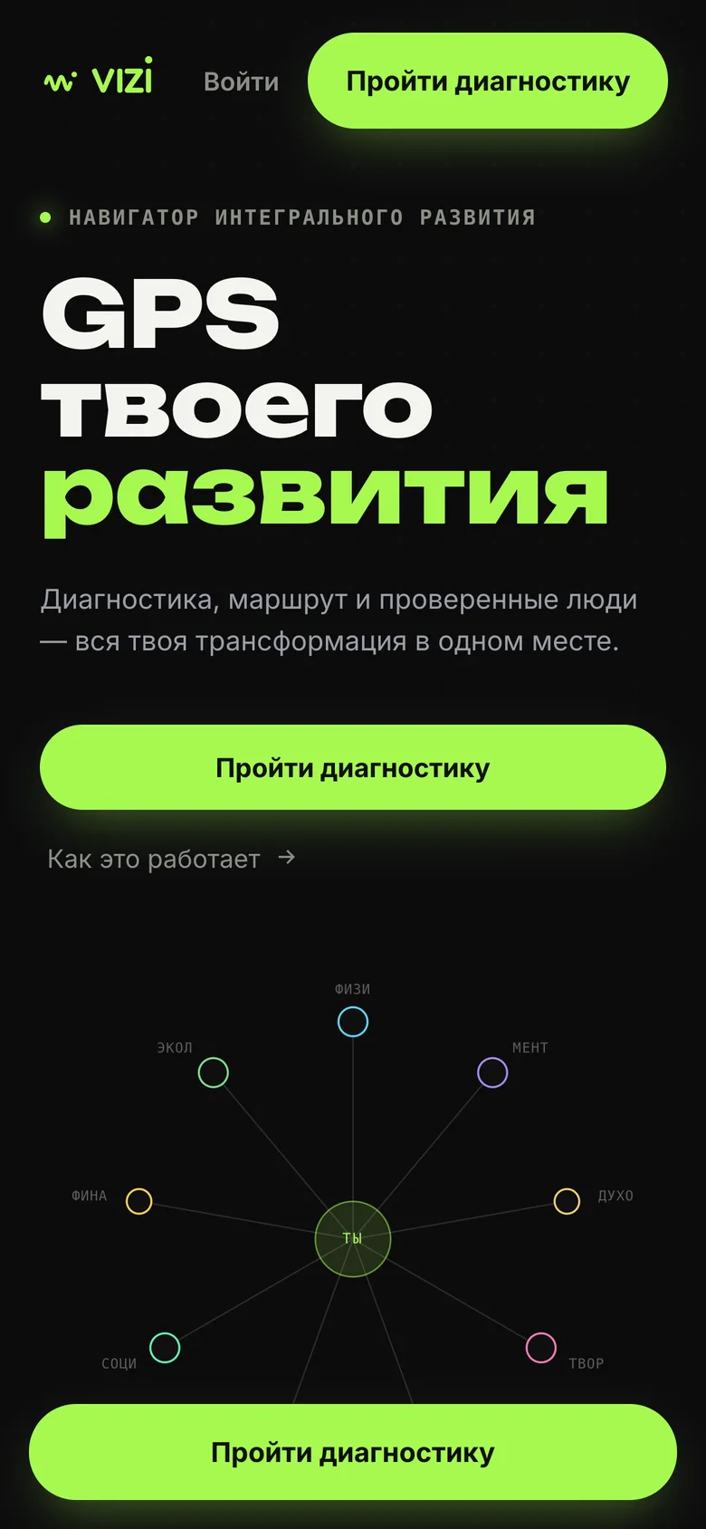
A diagnosis becomes a route.
Nine spheres, scored 1–10 on a radar. Tap a weak one and the product points to the people, events and clubs that can help.
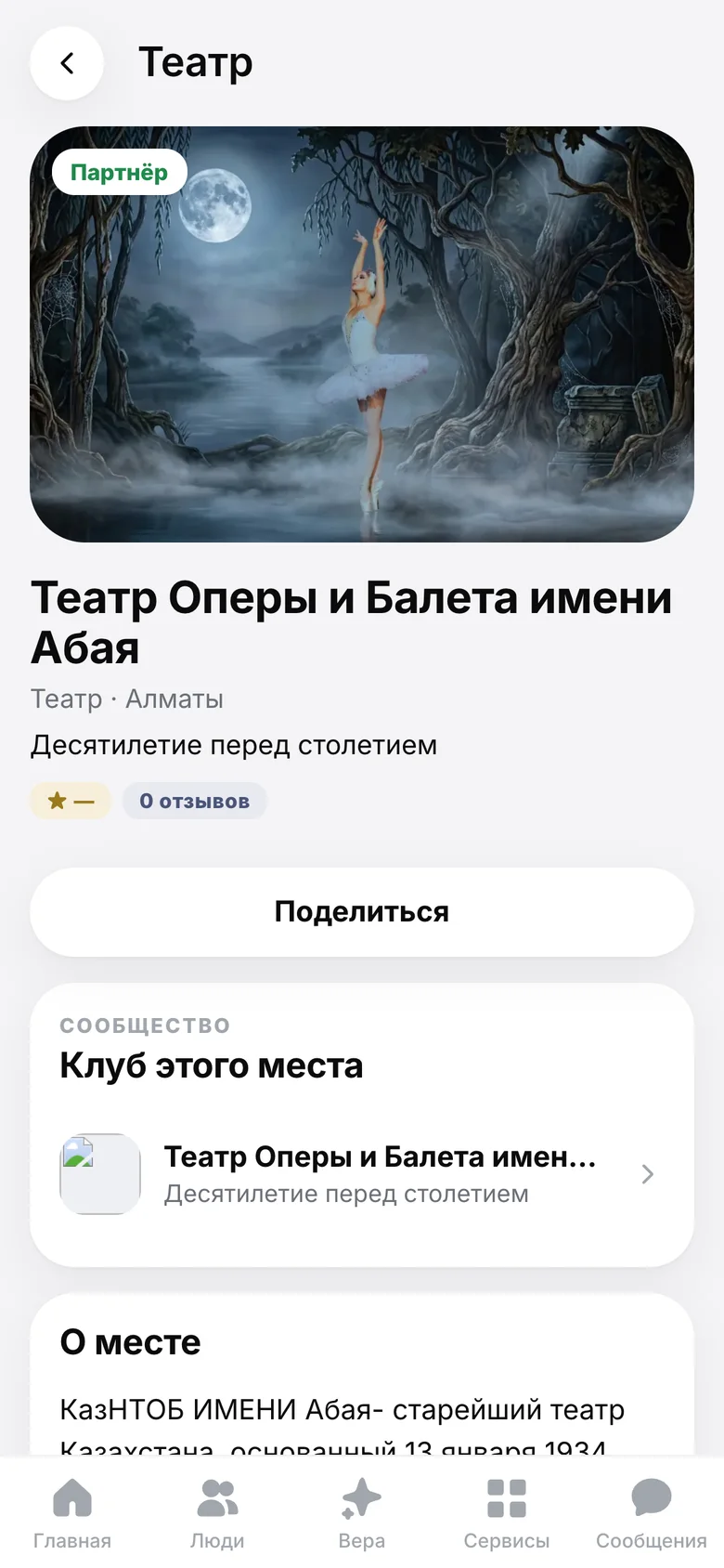
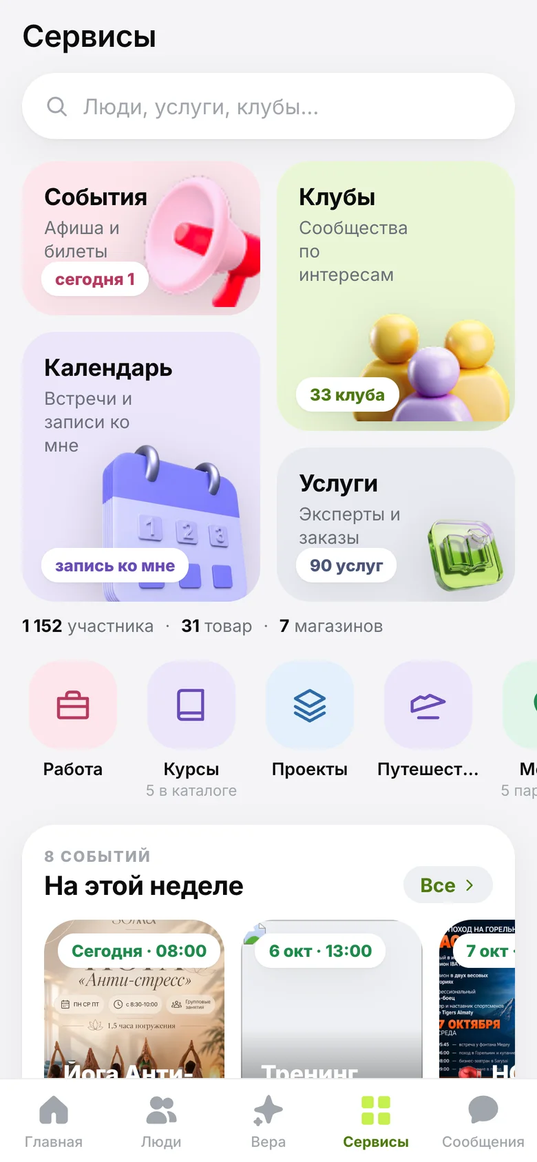
Clubs, events, places. Live at vizi.club.
Screens from the public site, personal data blurred.
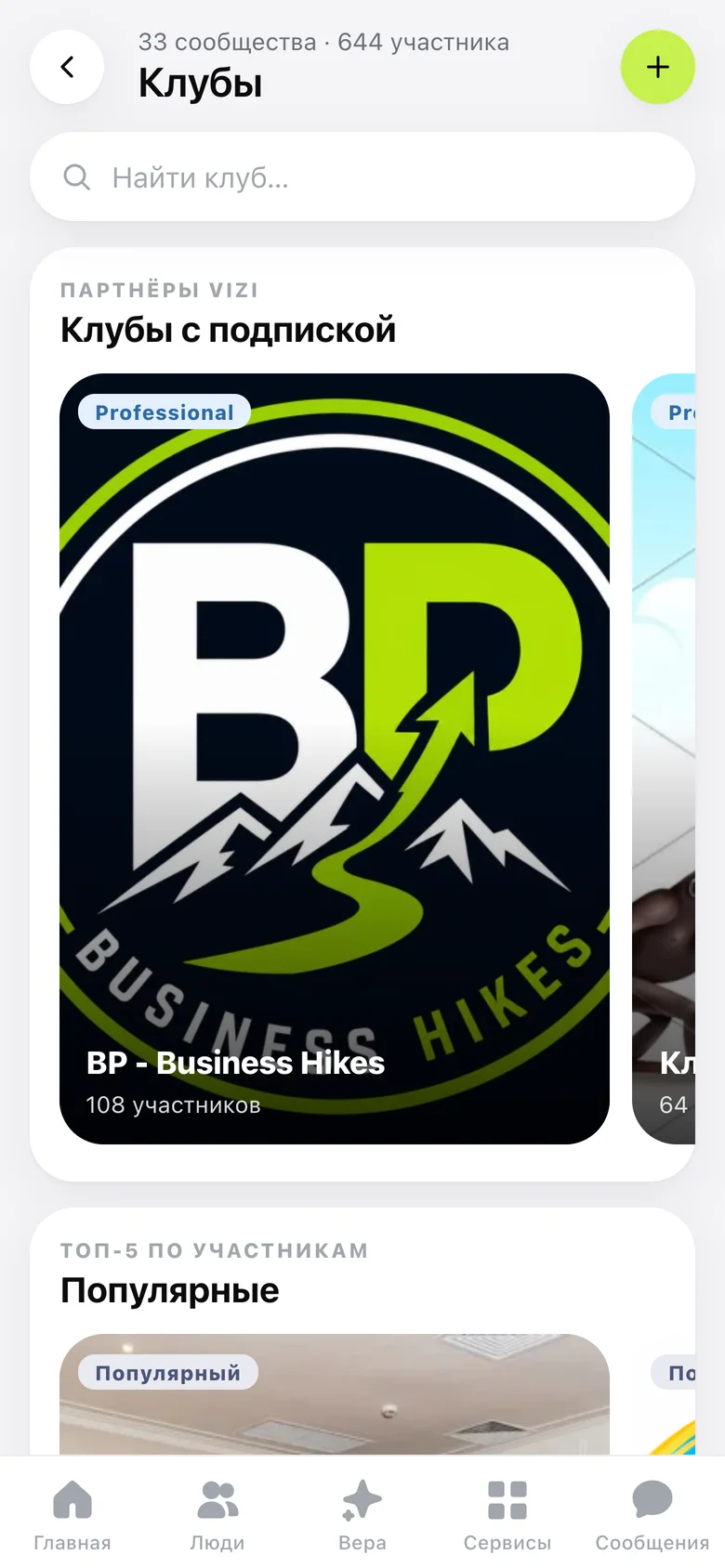
ClubsCommunities as small businesses.
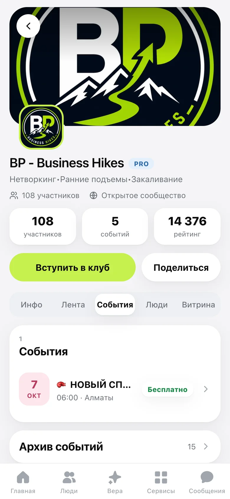
Club eventsMembers, events, a rating.
EventsOne feed for everything nearby.
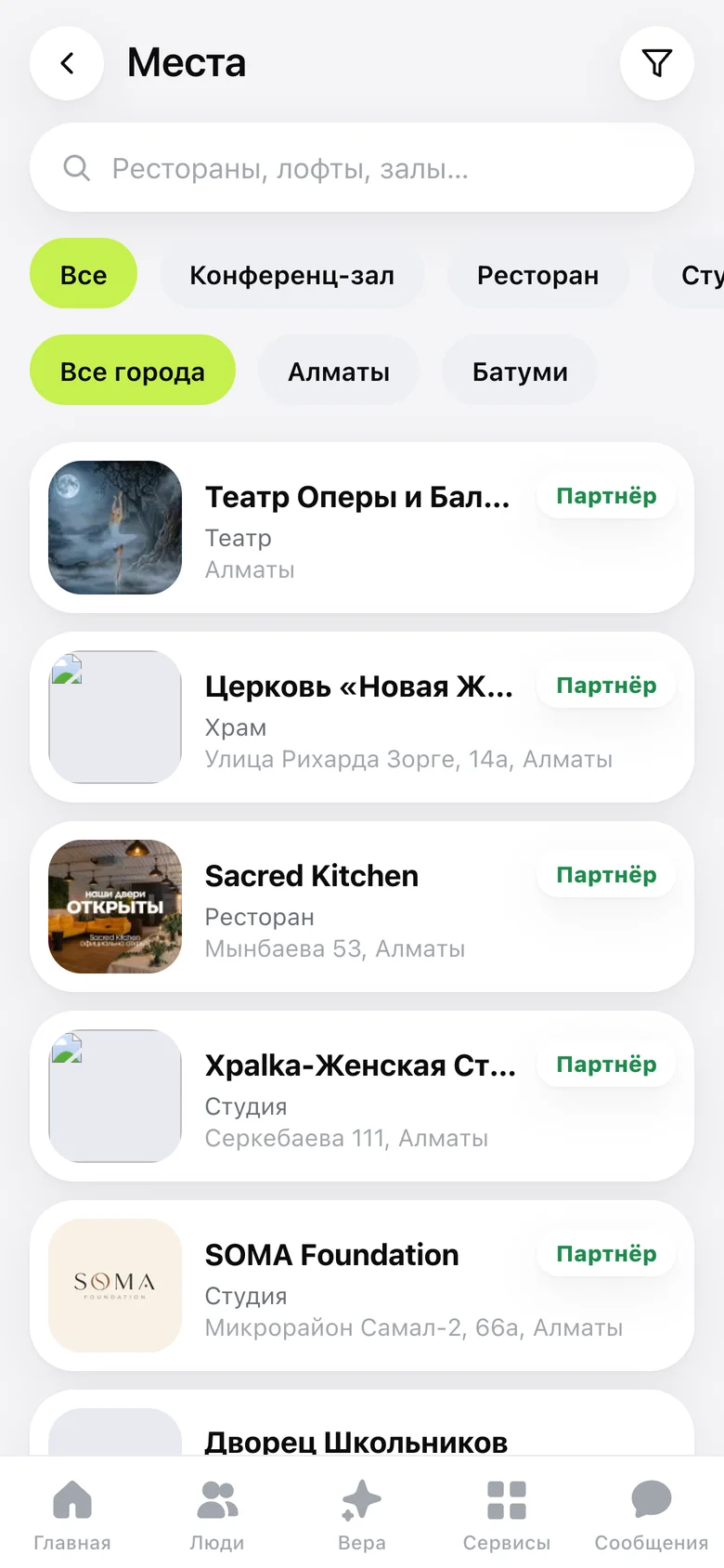
PlacesVenues, partners, a city map.
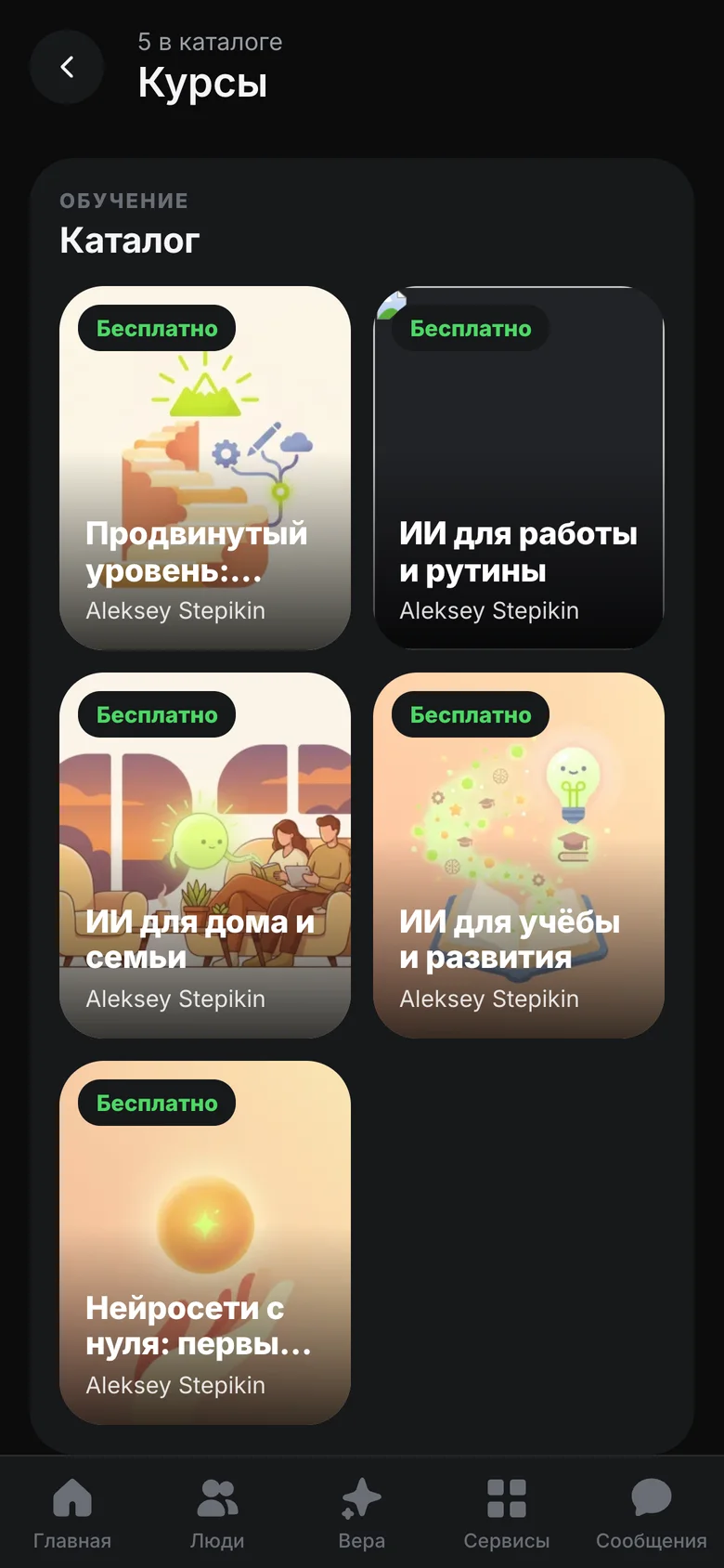
Learn · dark themeCourses with lessons and quizzes.
AI-translated content
Five design stages in four months.
Each stage ended with an owner’s decision and a reason that fits in a sentence. The lime survived all of them.
Minimal, professional, expensive.
Wave Dark, Soft Light and Mono Editorial went on the table. Mono Editorial won.
- 01One accent.Hierarchy through space.
- 02One primary action per screen.The card is the unit of the interface.
- 03Prototype first.10+ clickable HTML screens.
Stage 01 in full
Three concepts went on the table: Wave Dark, Soft Light and Mono Editorial. Mono Editorial won — “minimal, professional, expensive”. References: Linear, Cal.com, Arc, Vercel.
Principles: one accent, hierarchy through space, one primary action per screen, the card as the unit of the interface. A clickable HTML prototype of 10+ screens covered onboarding, gamification, sheets and toasts. Tokens: #C4F042 accent, #0F0F10 canvas, #161618 surface; Manrope, Inter and JetBrains Mono; radii 12 / 16 / 22; a 4 px grid.
Before colour, structure. What is the main action?
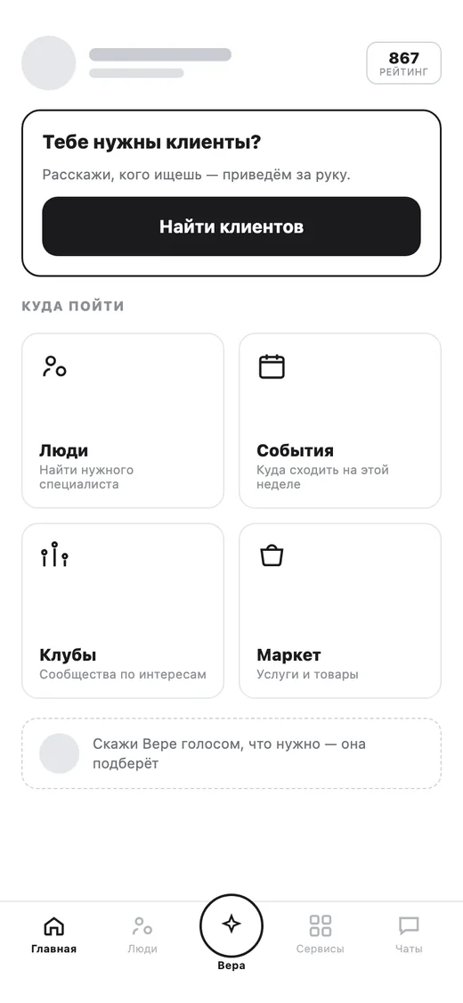
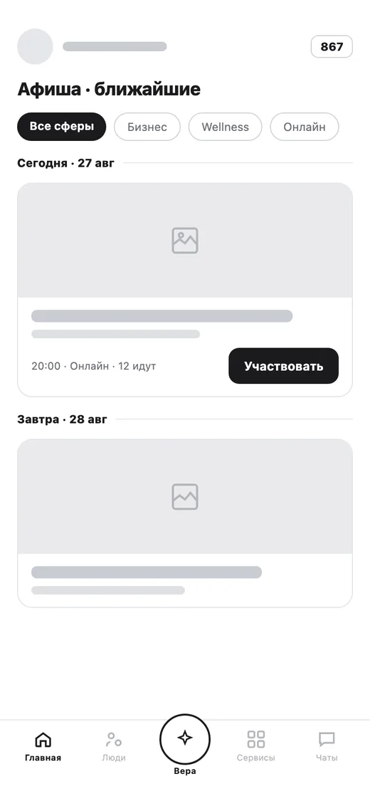
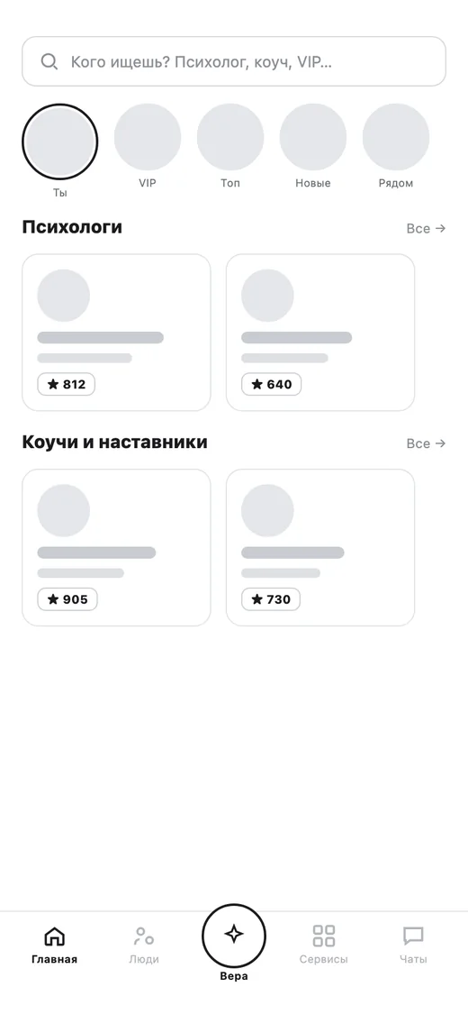
Onboarding ends in “Who are you?” — expert, participant or leader. Then three homes answer one question.
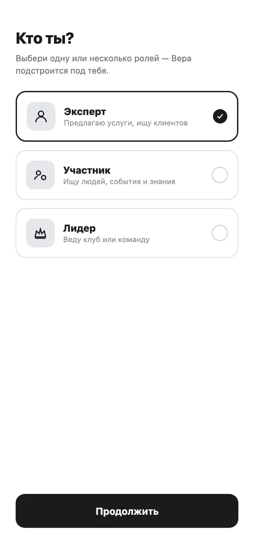
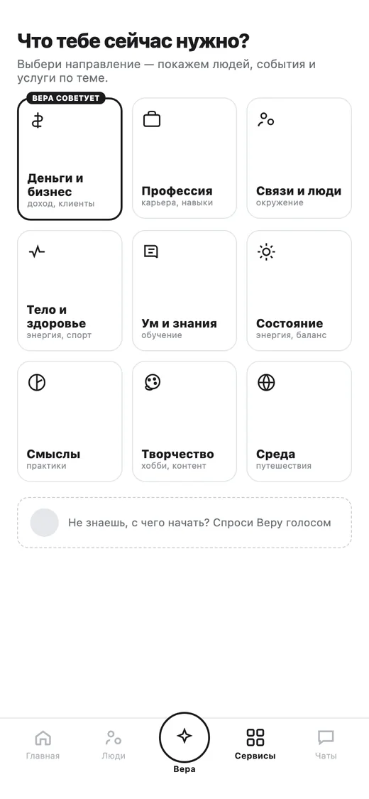
Services hub
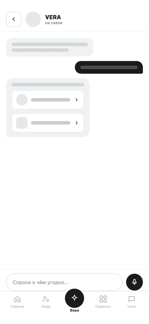
VERA
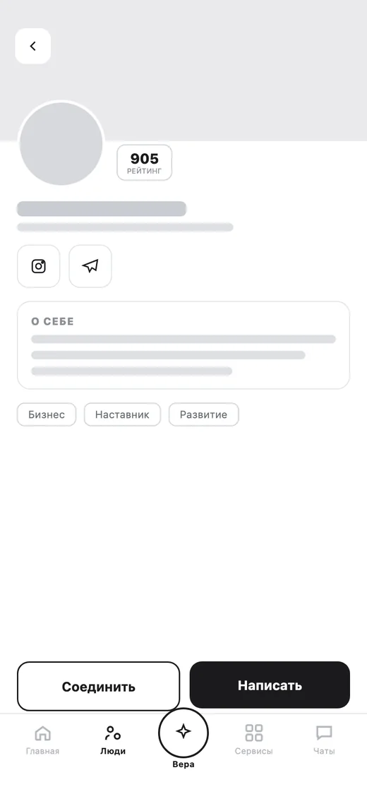
Profile
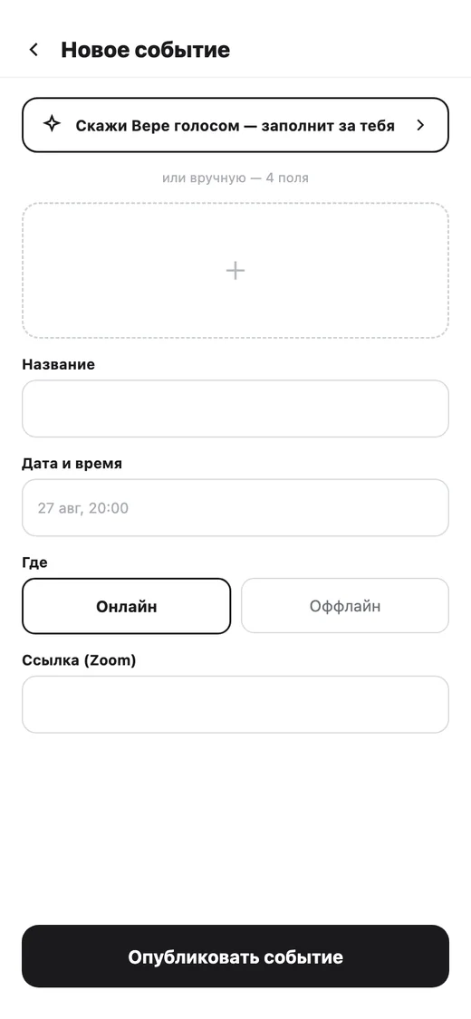
Create · a wizard
- ABentoA grid of directionsPeople, events, clubs, market.
- BFeedEvents nearbyToday and tomorrow, first.
- CCatalogueExperts to findPsychologists, coaches, mentors.
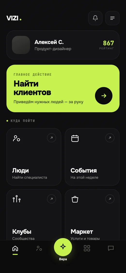
Bold, refined, or the hybrid.
Dark-and-lime against cream-and-serif. The owner chose the hybrid; the serif was dropped on 31 Aug. 21 screens in this style.
- 01Real photo avatars, never silhouettes.
- 02Text tabs with a lime underline.
- 03People cards of equal height.
- 04Every creation flow is a wizard with a progress bar.
Stage 03 in full
Three directions were compared side by side: a bold dark-and-lime one, a refined cream-and-serif one, and a hybrid. The owner chose the hybrid. A serif was dropped on 31 Aug. Onest was the only typeface.
Rules set here still stand: real photo avatars, never silhouettes; text tabs with a lime underline; people cards of equal height; every creation flow is a wizard with a progress bar, not a long scroll. The first hi-fi home led 21 screens in this style.
Carry the layouts over. Don’t retell them.
The owner brought a new design from Figma: Inter, an iOS-style green, a floating glass tab pill, large radii. A first attempt to redraw it was rejected.
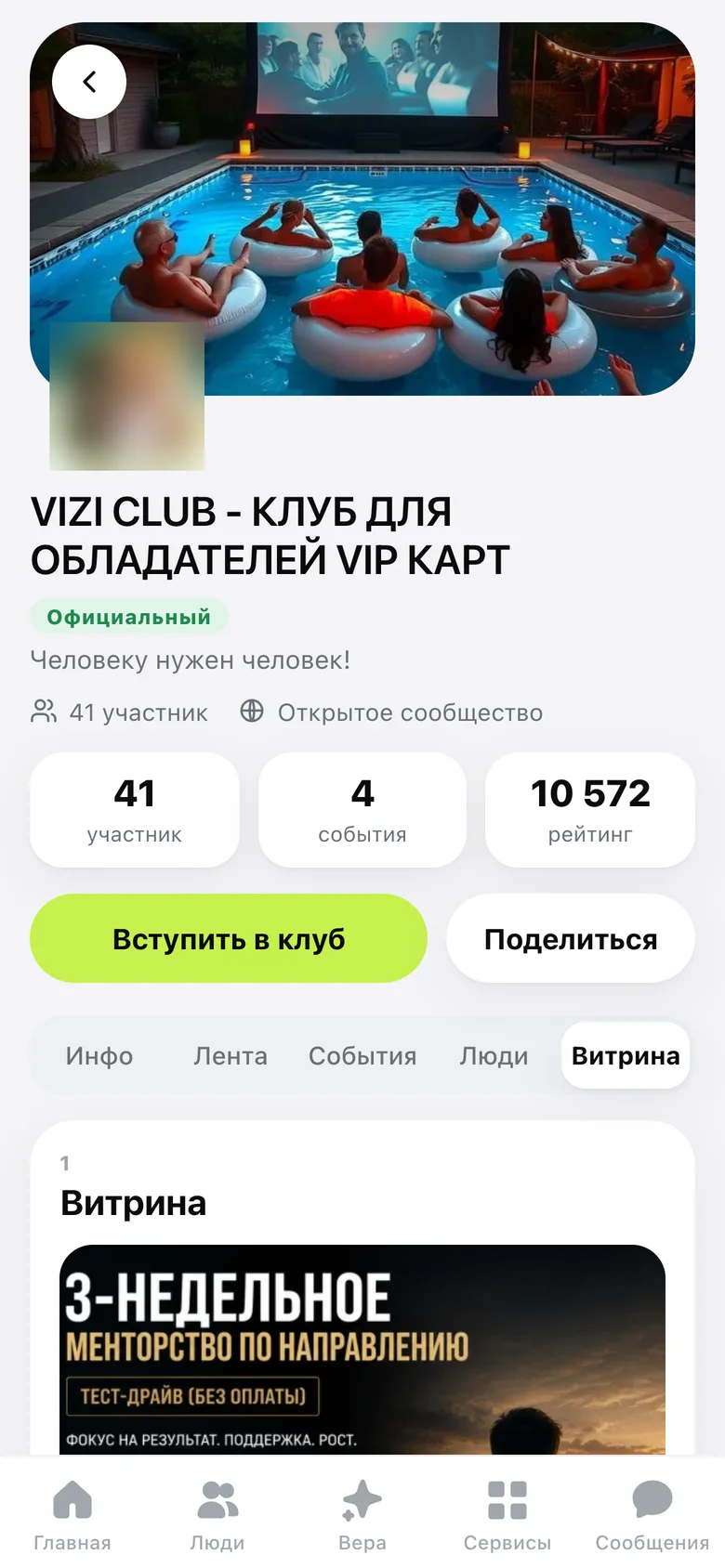
Club showcase
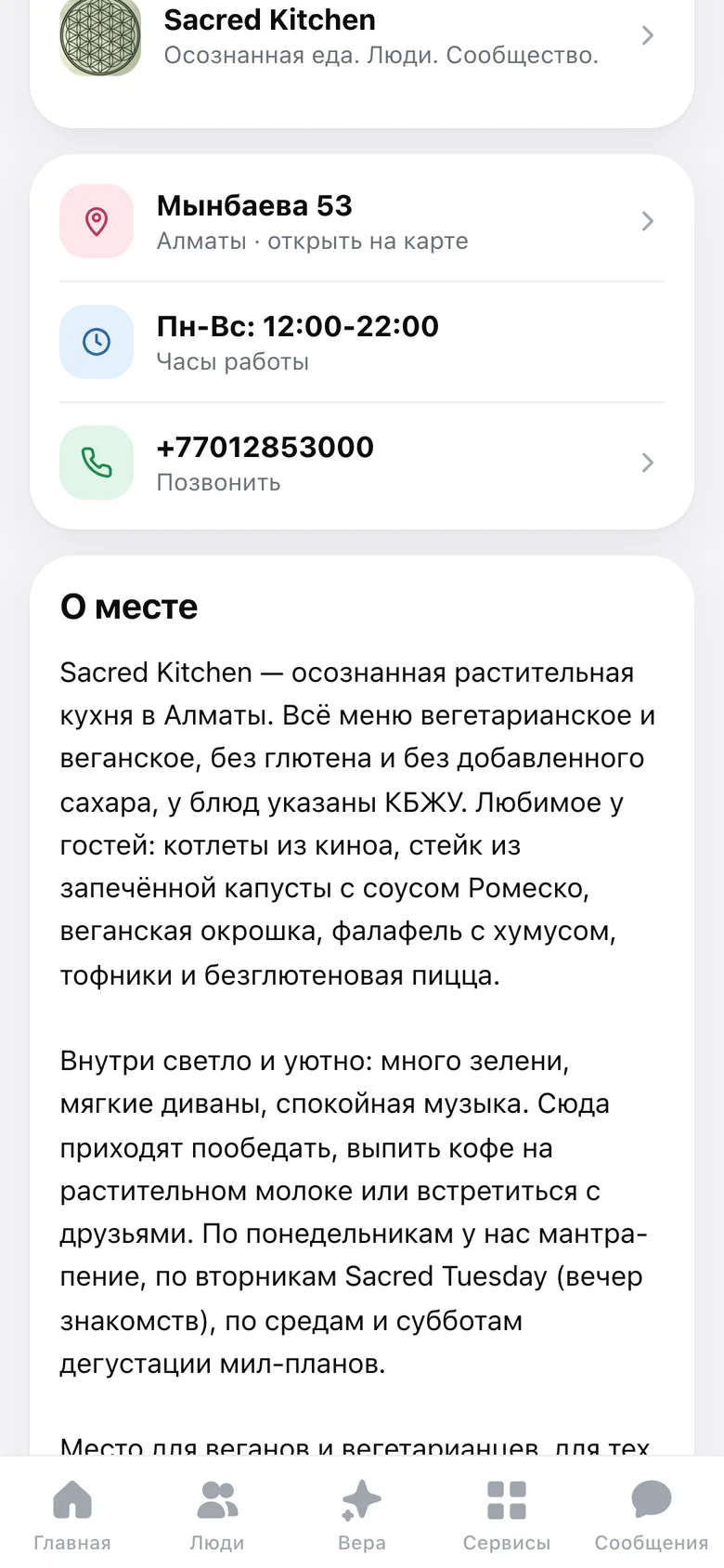
Place · menu
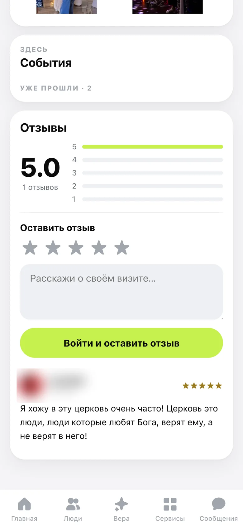
Place · reviews
Services hub
layouts as they are
“v2 won, we work with it.”
A second system for comparison: quiet, native iOS — one accent, soft surfaces, pastel tints, two themes. References: T-Bank, Yandex Afisha, Yandex Travel.
Stage 05 in full
For comparison a second system was built: quiet, native iOS — one accent, soft surfaces, pastel tints, two themes. References: T-Bank, Yandex Afisha, Yandex Travel. On 11 Sep the verdict: “v2 won, we work with it.” Old screens had to disappear from every user path.
Shipped 12 Sep, 22:15: 382 commits, 498 files, +40,402 / −4,243 lines, 46 old routes redirected.
A version note: the shipped default is flat and light; the glass look survived only as an optional mode in Settings → Appearance.
Quiet by default. Loud only where it matters.
Two first-class themes, one accent, eight pastel tints that code an object’s type. Real tokens from the codebase.
Lime text on white fails contrast — its ink is #4D7A12.
Radii, px.
Inter 22 / 600Screen title. Section 19 / 700, wizard step 20 / 700.
Touch targets, unchanged look — invisible ::after expanders.
2.0 → 4.1–4.7Secondary text on the light header. Dark surfaces fixed from 1.13.
154 components, grouped by what they serve
- 1No emoji on buttons
- 2Screen title 22 / 600, everywhere
- 3No holes in a layout
- 4Tabs are an iOS segment
- 5Counters are neutral
- 6Creating is a wizard
- 7Sheets ≤ 80% of the screen
Components and the seven rules
- Primitives · Button, Chip, Tile, Badge, Avatar, Row, Toggle, StepBar, EmptyState, ErrorState
- Shell · tab bar, sheets, iOS segment, skeletons
- People and card · PublicCard, Builder, Score, BalanceWheel, Reviews, QrSheet
- Events and clubs · EventTicket, EventTeam, EventFunnel, ClubMembers, ClubManage, wizards
- Places and market · PlaceCard, PlaceBook, Shop, Cart
- Learn · CourseCreate, CourseQuiz, CourseCert
- Chat and AI · ChatRoom, VERA, WantCan, Introduce, Notifications
- Settings · Appearance, Language, Messengers, AI discovery toggle
Seven rules. 1 — No emoji on buttons: plain text, an inline SVG icon when needed. 2 — Screen title 22 / 600: one size, everywhere. 3 — No holes in a layout: one card goes full width, two sit in a row, three or more become a carousel. 4 — Tabs are an iOS segment with a raised pill. 5 — Counters are neutral, not a rainbow of coloured tiles. 6 — Creating is a wizard, never one long form. 7 — Sheets are at most 80% of the screen, scroll inside and have a grab handle; a sticky action bar stays under 45%.
The component specimen showed primary and secondary buttons, toggles, chips, an iOS segment (Upcoming / Past / Cancelled), a person card with a score, and two states: “No events yet — create the first one for your club” and “Couldn’t load — this isn’t ‘nothing here’, try again”. Dark-theme surface contrast measured 1.13 and was solved with dedicated tokens.
Five things broke sign-up. Each got a rule.
It started with one line of feedback: “I managed to register on the fifth try.” A walk through the flow found five silent breakages.
The breakages and the fixes
What was broken.
- The inviter got lost whenever the link carried no code.
- No inviter, no entry: a lock and “send me a link”.
- A guest on someone’s card saw no logo and no Sign in.
- “Back” ended in a dead end and dropped the code.
- The slowest method came first: email on top, while most people use Telegram.
What was decided.
- Telegram first (two taps), Google second, email third and collapsed.
- “Email didn’t arrive?” appears after 30 seconds with three ways out.
- Guests on a card get the VIZI mark and Sign in on top, and “Already have a card?” below.
- A hard inviter, a soft candidate. Only an explicit code makes someone the inviter. The last card you opened is kept for 72 hours as a candidate — it never becomes the inviter silently, only after you confirm it on a “Who invited you?” screen.
- Find the inviter by name, not by pasting a link.
- Drop the “person or organisation” step.
Before, by invite link: 7 screens, 11 taps. After: 4 screens, 5 taps. Design-document estimates. For a visitor with no code the flow went from a dead end to 5 screens and 6 taps; for a returning user on a new device, from 5–7 steps to 2 taps.
Status: stage 1 — the guest header on cards, the “email didn’t arrive?” help and links that carry the code — shipped with v2. Later stages wait on product decisions, including whether to keep invite-only sign-up.
Nine decisions, and the reasons.
Each one works in the product today.
A reputation you can’t buy
Paid tier no longer touches the score.
AI reads your card — only if you say so
Opt-in, off by default, checked in the database.
Our own Calendly
Booking built in for every plan.
One list of what a plan promises
One file feeds the pricing page and VERA.
“Each lost path is a visitor who was already convinced.”
Never lose the person’s path: one helper carries the destination through every sign-in.
Pending → queue → showcase
Public only after approval.
Delegate the page, not the money
Editors run the page; the owner keeps the rest.
A wheel that points somewhere
Weak spheres suggest who can help.
VERA’s nudges can’t break sign-up
Database triggers, best-effort.
Problem, decision and why — for all nine
01 · Trust — a reputation you can’t buy. Problem: a legacy term in the score let paid status nudge reputation: take away someone’s tier and the score of the person who invited them dropped. Decision: the tier no longer touches the score. Points already earned were frozen as a manual adjustment, so nobody lost anything. Why: a trust index that can be bought — or lost by an admin’s decision — stops being reputation. It is now a standing guardrail.
02 · AI — AI assistants read your card, only if you say so. Problem: people now ask assistants instead of search engines, and a network of earned reputations is exactly what agents lack. Decision: visibility to AI is opt-in, off by default, VIP only, with a counter of agent visits. schema.org markup, llms.txt and a machine-readable layer; a closed card answers 404, not “empty”. Why: the checks live in the database, so the interface can’t bypass them. Step 1 of 4 shipped on 24 Sep.
03 · Retention — our own Calendly. Problem: “Book a meeting” sent people to another service at the exact moment they were ready to meet. Decision: booking built in for every plan: hours, duration, buffer, daily limit, time zones. Slots are computed by the same pure functions on client and server; the server recomputes on booking, and a unique index settles two people choosing the same minute. Why: keep the person inside the product. The schedule stays private — only “on, duration, place, zone” is public.
04 · Honesty — one list of what a plan promises. Problem: a plan’s perks lived in four places: the pricing page, VERA’s cheat-sheet, the code and the owner’s head. Some promised items had no mechanism at all. Decision: one file feeds the pricing page and VERA’s handbook. Items with nothing behind them were removed. Why: a promise on a sales page is a contract with the code. A perk is added only when something in the product does it.
05 · Growth — never lose the person’s path. Problem: open an event link, tap Join, sign in — and land on the home screen. Telegram sign-in didn’t carry the destination. Decision: the destination is stored once and passed to every entry point by one helper and a next parameter. Gated guests go to sign-in with the path; onboarding finishes the trip. Why: each lost path is a visitor who was already convinced. Rule: any new sign-in or gate must preserve the path.
06 · Operations — pending → queue → showcase. Problem: new market entities — projects, products, places — can’t go live unmoderated, and hand-granting a premium plan is easy to abuse. Decision: one pattern: submitted as pending, shown in an admin queue, public only after approval. Manual premium grants need a second pair of eyes: two super-admins confirm. Why: one pattern is learnable, testable and reusable. The gate covers manual grants only, so purchases are untouched.
07 · Permissions — delegate the page, not the money. Problem: busy club owners need help running their page, but a helper shouldn’t touch finances or membership. Decision: an editor can run the club page and create content on the owner’s behalf. Plan limits are checked against the owner; finances, the member list and deletion stay with the owner. Why: delegating editing is cheap. Extending trust to money isn’t.
08 · Engagement — a wheel that points somewhere. Problem: the idea was strong but sat at the bottom of VERA’s section, found by almost nobody. Decision: score nine spheres 1–10 on a radar. Tapping a sphere opens people, events and clubs for it, ranked. Weak spheres suggest who can help; strong ones, what you can share. Why: a diagnosis becomes a route. And it aims for an effective system, not a “correct” one — the score is subjective.
09 · Resilience — VERA’s nudges can’t break sign-up. Problem: the assistant should greet newcomers and mark the first club and first service — but a failure there must never block registration. Decision: messages fire from database triggers, so no code path can forget them. Each is wrapped to swallow errors and de-duplicated per step; demo users are excluded. Why: a trigger fires however the entity was created; best-effort guarantees onboarding help never blocks the main flow.
Small decisions that add up. Public email is a visible toggle (on by default), not a column permission — revoking the permission once silently broke every public card. Buttons are plain text: no emoji; key actions are full-width and bright. VIP seats on paid club events confirm instantly — a stale pending record used to hide the ticket. Everyone gets a link, vizi.club/<nick>; partners can also have nick.vizi.club — one wildcard DNS record covers them all.
One product, four first sentences.
A new visitor shouldn’t read a product map. Each audience gets its own landing — with live UI fragments, not pictures.
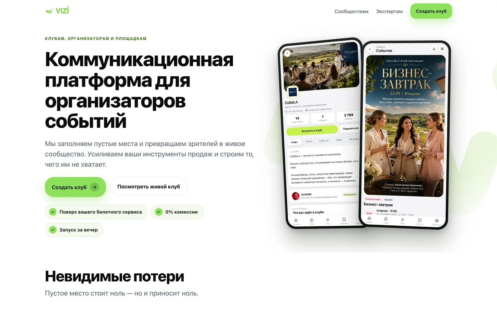
Clubs, organisers, venues“A communication platform for event organisers.”
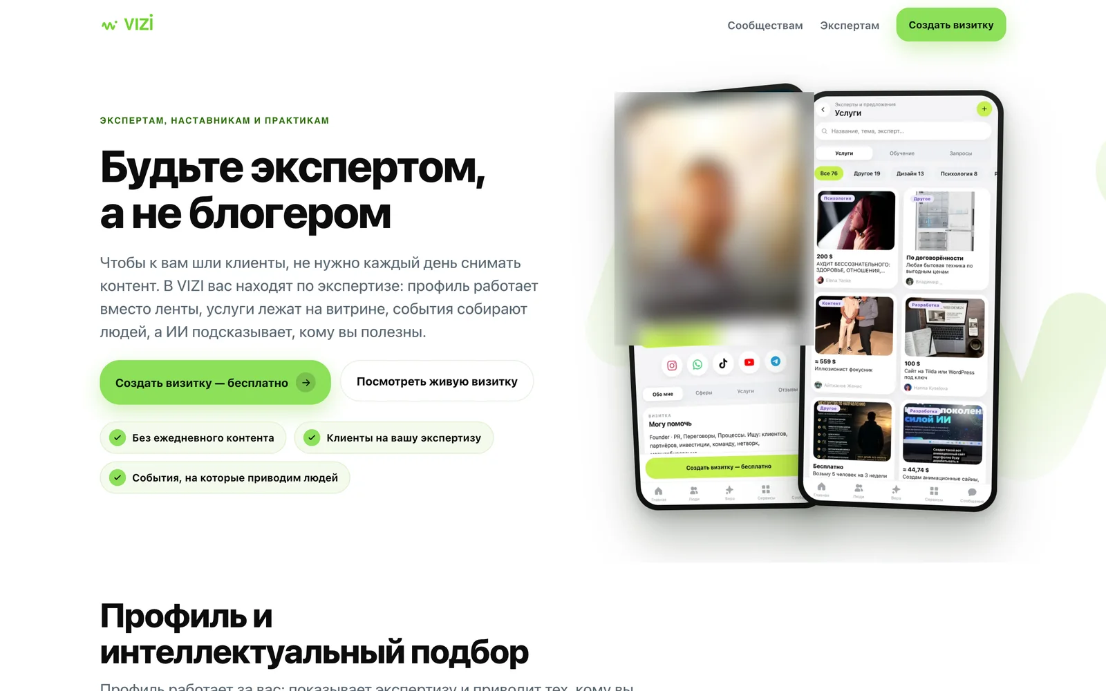
Experts and mentors“Be an expert, not a blogger.”
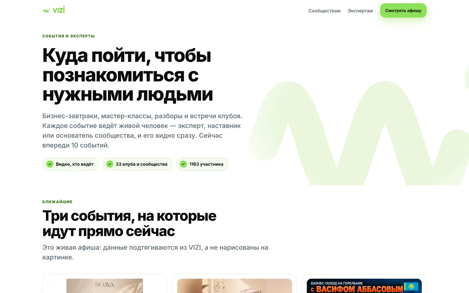
People looking for events“Where to go to meet the right people.”
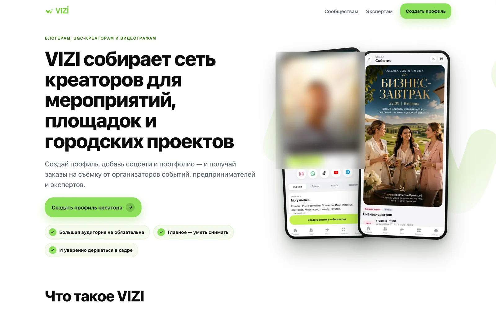
Creators“A network of creators for events, venues and city projects.”
What each landing promises
The first two were assembled on 21 Sep from the owner’s pitch decks.
- For clubs, organisers and venues. Fill empty seats and turn spectators into a community, on top of your existing ticketing service, launched in an evening.
- For experts and mentors. A profile that works instead of a feed, services on a showcase, events that bring people, and AI matching that suggests who you are useful to.
- For people looking for events. A live listing of business breakfasts, masterclasses and club meetings; every event shows who leads it. The numbers on the page are pulled from the product, not typed in.
- For creators. A profile, social links and a portfolio, and shooting orders from organisers, entrepreneurs and experts. A big audience isn’t required.
Russian only, for now: the landings are excluded from the interface translator, because a partial dictionary produced mixed languages.
Shipped like a release, not a prototype.
An audit, three passes and a manual check on a phone.
Legacy vs v2 pages
At the time of the audit.
Routes redirected
Query strings kept.
States unified
Empty, error, loading — 60 files.
Hidden failures
Empty states masking errors.
URLs on an iPhone
375×812, both themes.
Fixes from that walk
Targets, headings, tags.
Checks green
Plus a stress suite.
Dead test suites
One verified nothing.
How a release was proven, and what an audit found
The numbers. 109 legacy pages versus 50 v2 pages at the time of the audit. 46 old routes got a redirect to their v2 equivalent, query strings kept. 111 empty, error and loading states unified into one canon, across 60 files. 6 screens where an empty state was hiding a failed request. 43 v2 URLs walked on an iPhone 375×812 in both themes, four palettes and glass mode. 19 fixes from that walk: touch targets, headings, clipped tags, button backing. 190 automated checks green at release, plus a stress suite. 8 old test suites found dead for years — one verified nothing.
How a release was proven.
- A full backup of the production database and a schema comparison across 139 tables.
- Smoke by rendering, not by status code: 15 of 15 screens checked on what they display.
- Query parameters survive redirects: 8 of 8 sampled links kept their code.
- A manual pass on real phones, including sign-in, an invite link, a push and both themes on an iPhone SE.
- Caught by hand: the “Create card” button sat under the tab bar on an iPhone 14 and off-screen on an SE.
What an audit found.
- A background layer covered the admin screens.
- The Onest font had no fallback in 431 places, so text fell back to Times.
- Secondary text on a light header measured 2.0:1; after the fix, 4.1–4.7:1.
- The light theme broke the sign-in and 404 screens.
- About 75 links from v2 still pointed into the old design, in 14 patterns.
Stack. Sign-in by Telegram, Google, email code or WhatsApp; web push and Telegram notifications; 10 interface languages. Localisation works in two layers: an interface dictionary with a DOM translator, and database content translated ahead of time by AI. Chats are deliberately not translated.
Directed, not typed. One designer, one agent team.
Every major call was an owner’s decision, made on screens.
Product and design direction
Visual language, the v2 switch, the landings, who may be seen by AI.
Agents briefed as a company
CEO, CPO, full-stack, Head of Design, senior UX/UI.
Guardrails over speed
Isolated branches. Prove a release by what renders.
Role, team and rules in full
Role. Every major call — the visual language, the v2 switch, the audience landings, who may be seen by AI — was a product-owner decision, made on screens and prototypes.
Team. On 10 Sep the agents were asked to assemble a team — CEO, CPO, full-stack, Head of Design, senior UX/UI — and work through every section of the product.
Rules. Agents work in isolated branches. Standing rules: never break invitation links, always work on both domains, and prove a release by what renders, not by a status code.
Four lessons from a platform built in public.
Test what the user sees
A 200 proves a server answered, not that a page works.
Empty must never hide an error
Say it failed, offer a retry.
Every promise needs a mechanism
If the sales page says it, the product does it.
Design the path, not the screen
The breakages lived between screens.
Lessons, what’s next and the sources
Test what the user sees. A 200 status proves a server answered, not that a page works. Smoke checks should read the render.
Empty must never hide an error. “Nothing here” is only allowed when we are sure there is nothing. Otherwise, say it failed and offer a retry.
Every promise needs a mechanism. If the sales page says it, the product must do it. Put the list in one file and let everything read from it.
Design the path, not the screen. Sign-up, links and gates were broken between screens, not on them. The fix was a rule about the journey.
What is next. AI discovery, steps two to four: a connector for ChatGPT and Claude, VERA talking to other people’s assistants, and reputation as a checkable signal. Then the business landing, and the remaining stages of the sign-up redesign.
Measured in the codebase on 4 Oct 2026: 154 component files in v2, 85 v2 pages, 106 API routes, 1,433 commits since 4 Jun 2026. Release and QA figures are from the 12 Sep 2026 release documents. User figures as of 5 Oct 2026: 1,403 profiles (1,166 completed cards), 527 monthly / 200 weekly active, 302 new in the last 30 days; 33 public clubs, 217 events, 488 event sign-ups, 15 one-to-one meetings. Payments for event tickets go to organisers; platform monetisation is being launched. Design screens are Figma and wireframe artefacts with sample data; live screens are from the public site.
Building a platform where trust has to be earned?
We design and ship products end to end — from the first wireframe to a release that holds up on a real phone.
vizi.club