Vigilo Pro.
A risk product that publishes its own failures.
The professional side of Vigilo: a live console, compliance as a product, and a public record anyone can grade.
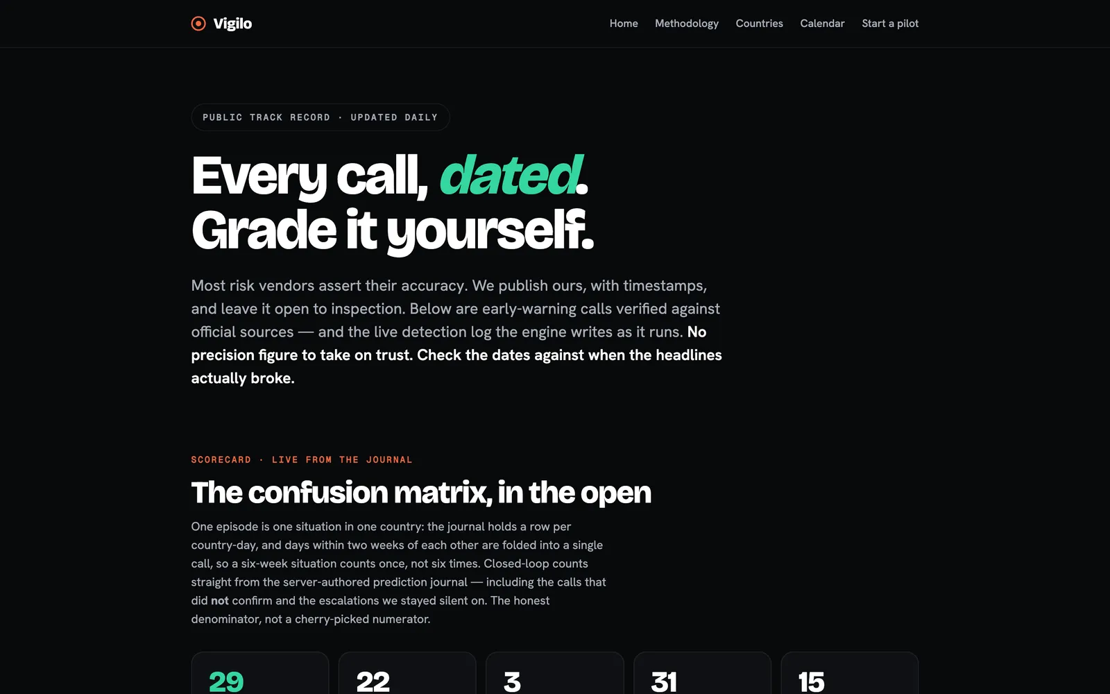
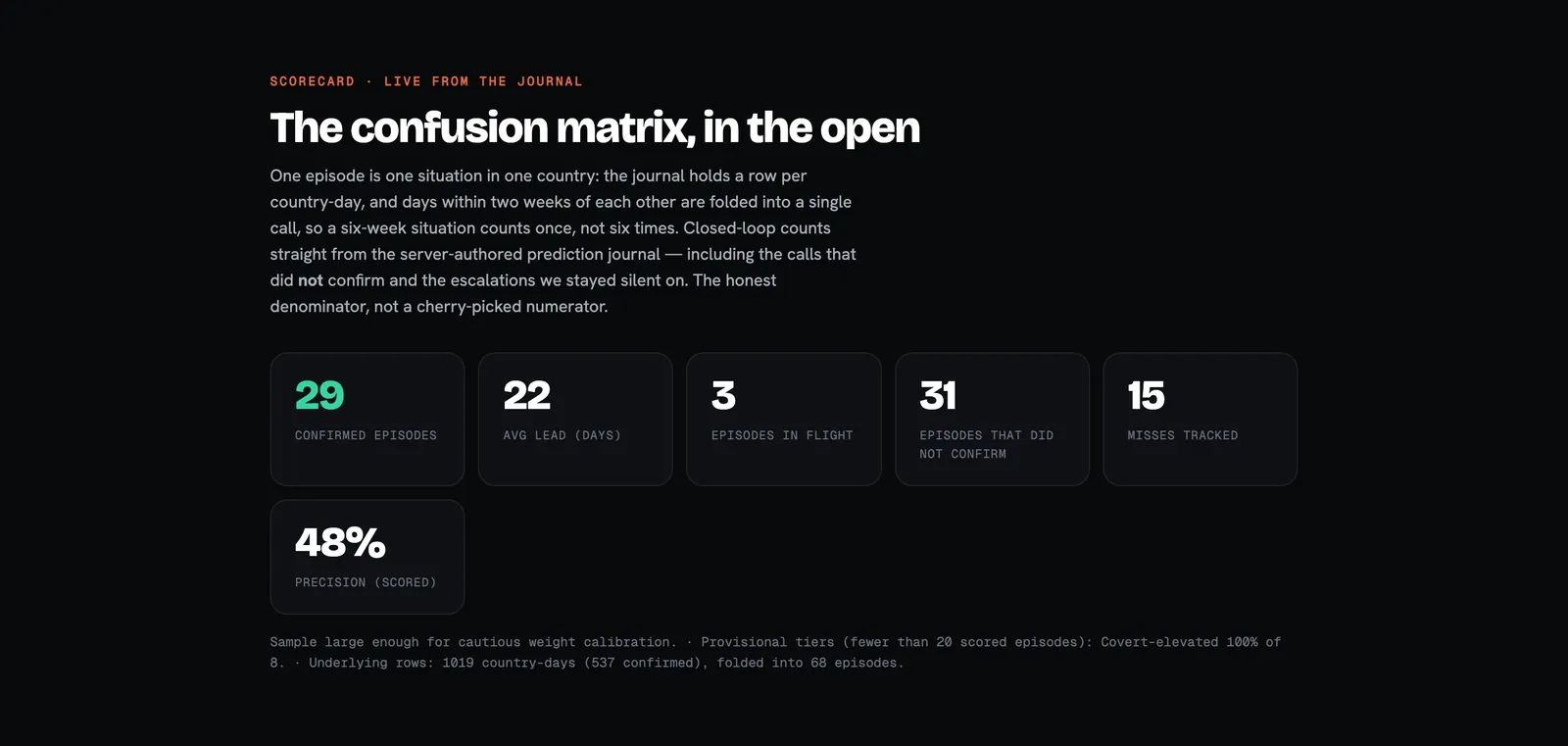
scorecard, next to the 29 that did
Live scorecard on vigilo.cc/track-record, read on 5 October 2026; the failed backtests are on vigilo.cc/business.
- What
- The professional side of Vigilo: a live risk console, compliance pages and a public track record.
- Why
- A risk call has to be defensible for the people who sign off on the trip.
- My role
- Product, UX writing, data UI, design to code.
- Result
- 22 days average lead · 29 confirmed episodes · 48% precision, scored publicly
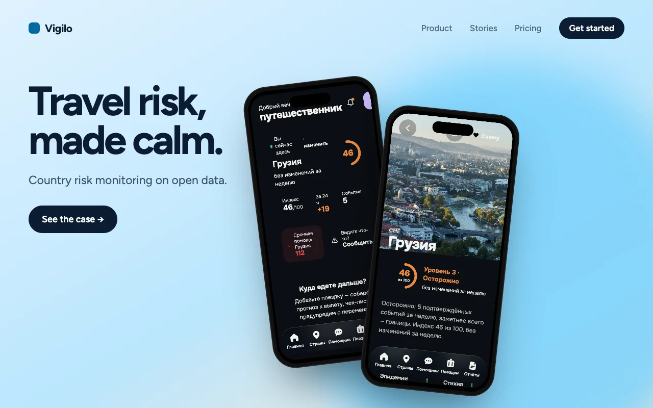
Part 1 made risk calm for a traveller. Part 2 makes it defensible for the people who sign off on the trip.
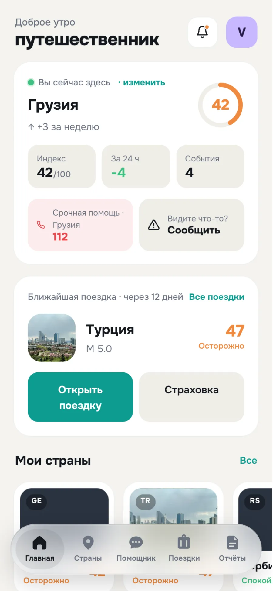
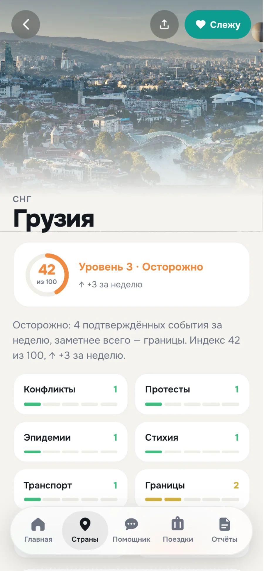
Same data. Two different jobs.
A traveller asks “is it safe?”. A specialist asks “what changed, who says so, and can I show my auditor?”.
One number → seven domains, each traceable
Reassure → let them audit
Phone in a pocket → a second monitor all day
Why a second interface
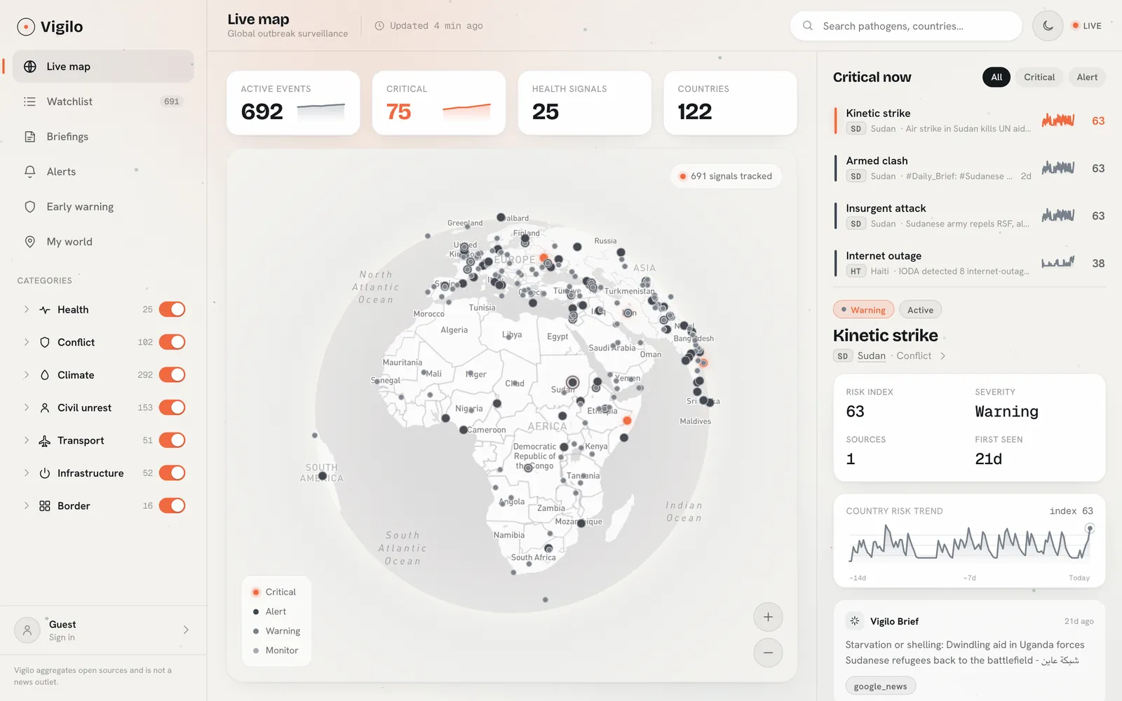
The consumer app hides the machinery on purpose: one score, a calm voice, an action. For a security or duty-of-care lead that calm is a problem — they need to see the signals behind a number, how many sources agree, when something was first seen, and how it trends.
So Pro is not “the app with more features”. It is a different density contract: everything a specialist needs to make and defend a decision, on one screen, without the screen raising its voice.
Dense, but never loud.
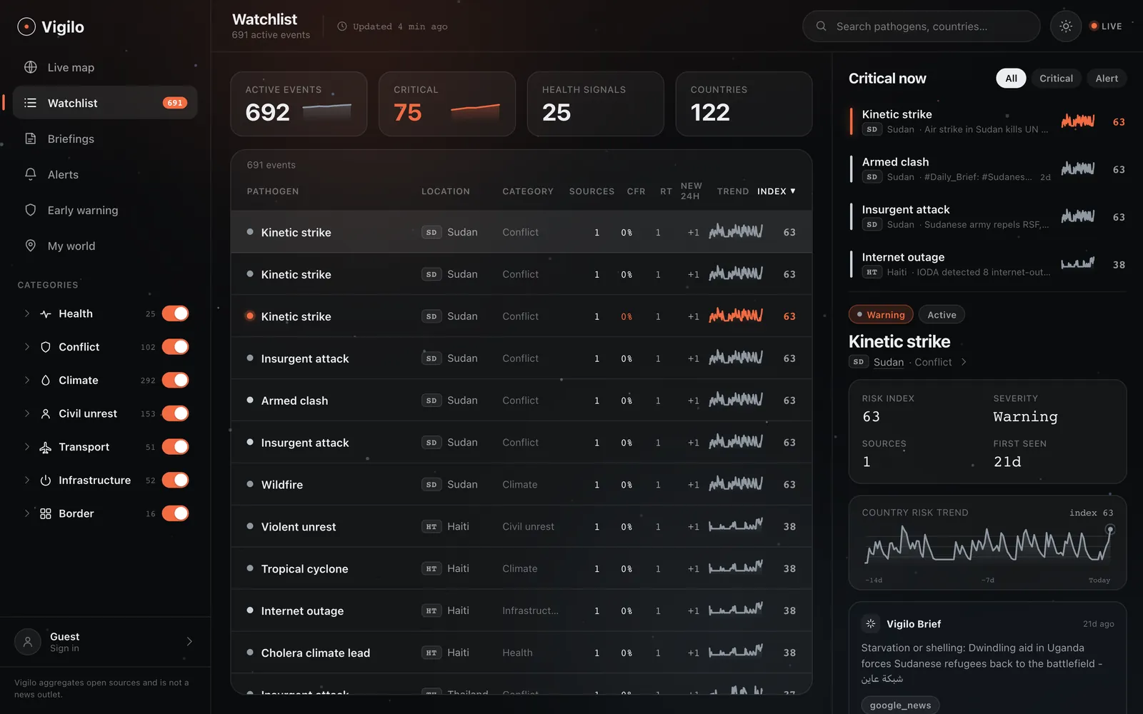
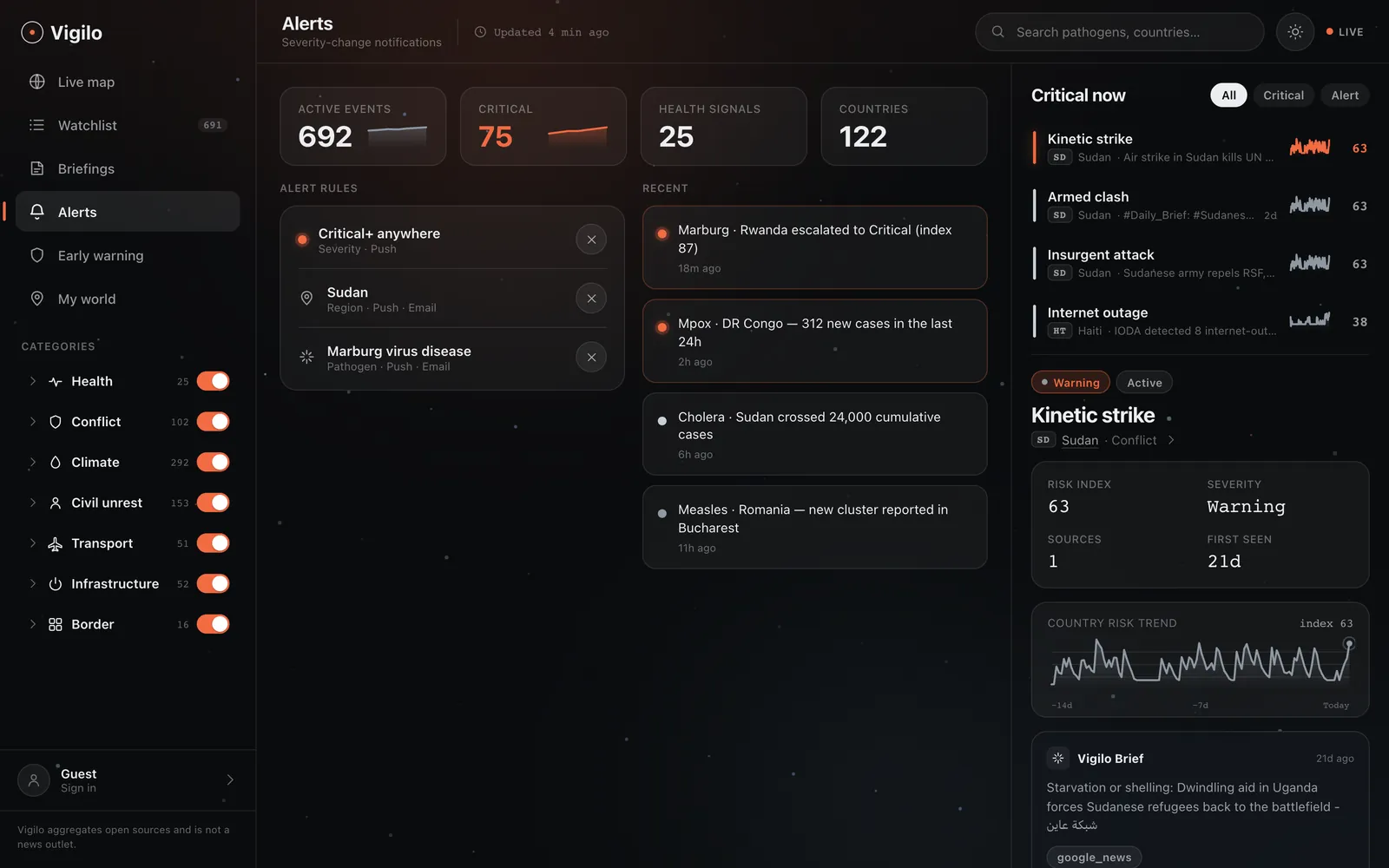
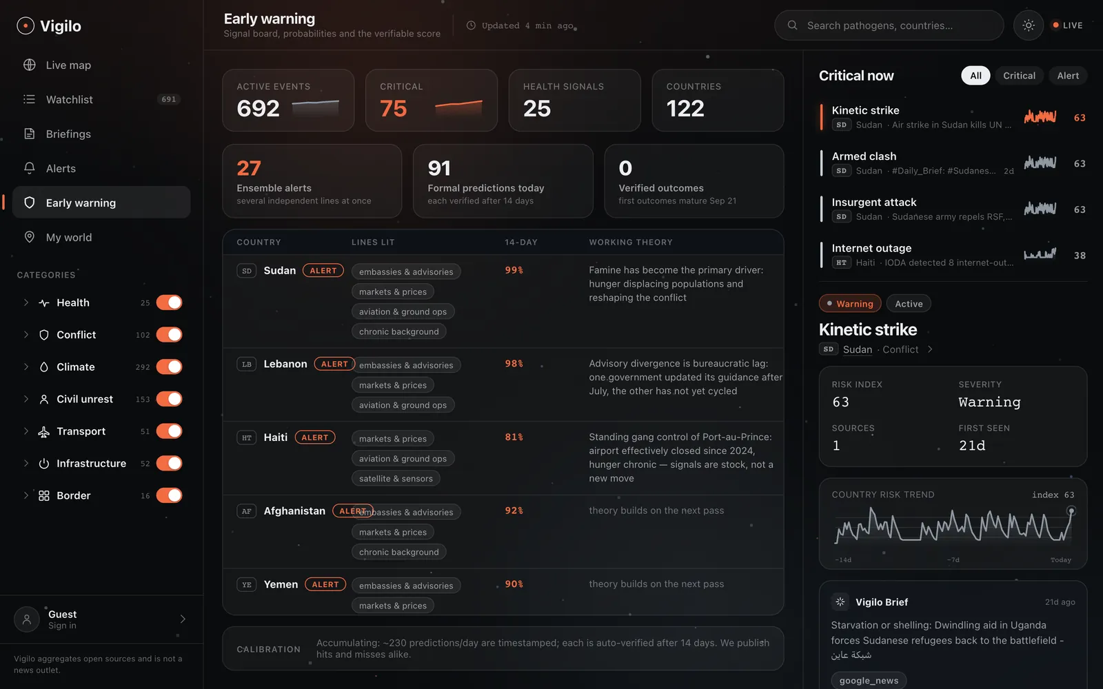
Hundreds of live signals on one screen, and only one colour is allowed to shout.
everything else is grey
Density decisions
- Grey does the work. Severity below critical is a monochrome ramp. A specialist scans for the one orange row, not a rainbow.
- Numbers in mono. Indices, counts and “first seen” sit in a monospace face so columns align and change is visible at a glance.
- Every row carries its proof. Source count, first-seen age and a 14-day trend live next to the headline, including when there is only one source.
- One rail for detail. Selecting anything opens the same right rail: risk index, severity, sources, trend, brief. No modal maze.
- Categories are switches, not tabs. Seven domains stay visible with live counts, so filtering never hides how much is happening.
Four greys and one alarm.
Part 1 spent colour on a five-step scale. The console spends it on one question: is this critical?
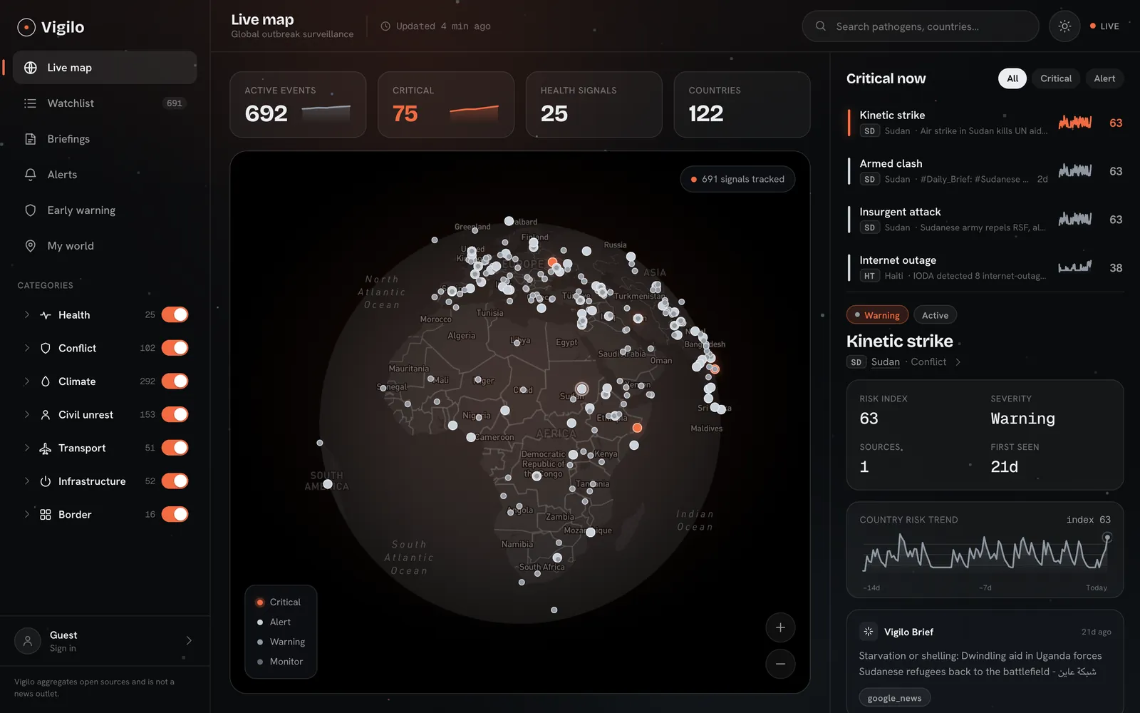
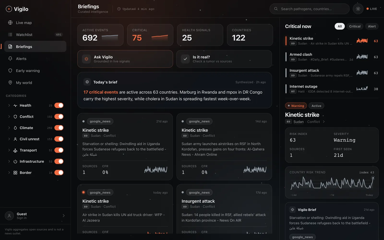
The console, one signal at a time.
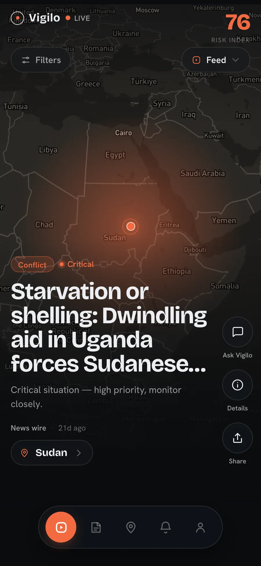
On mobile the table becomes a feed: pick countries, get alerts, swipe through what changed.
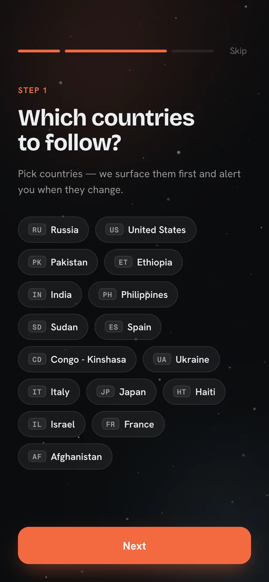
Designing trust, not screens.
Buyers don't buy a globe. They buy an answer for their auditor, their insurer and their board.
Five pillars of the standard, mapped to what already runs
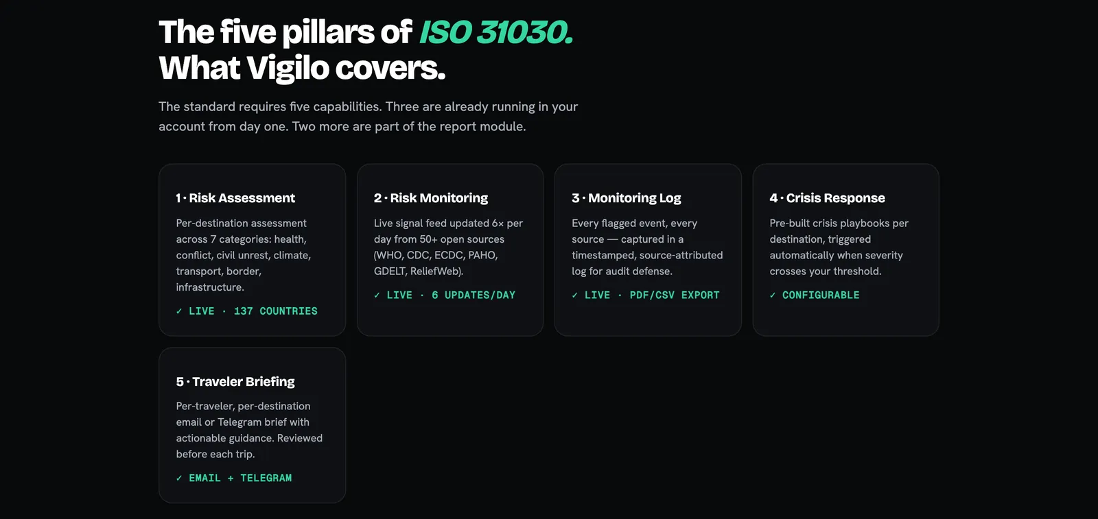
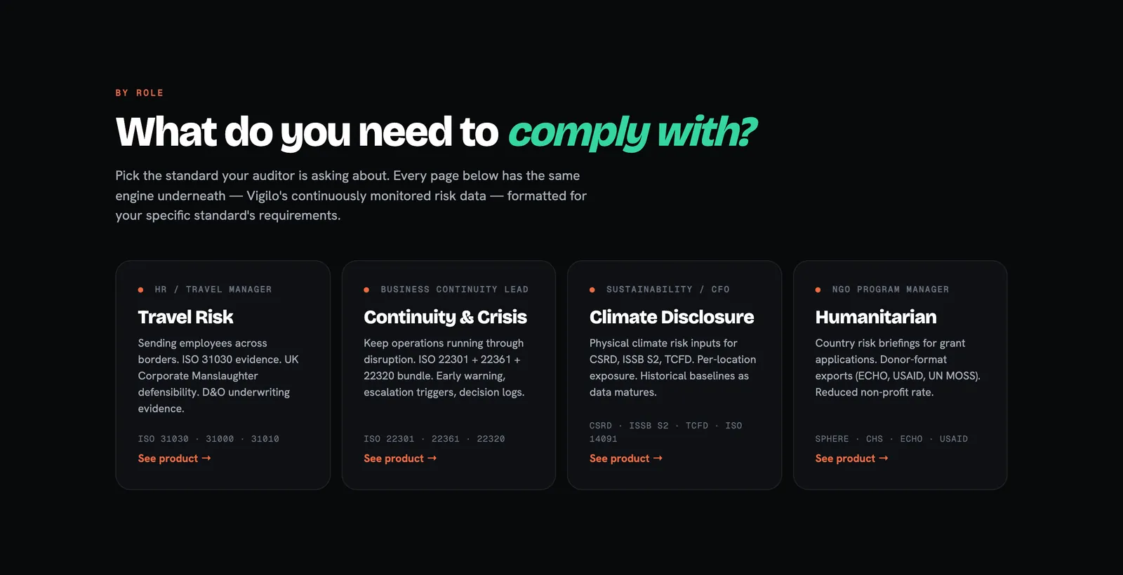
Start from the standard your auditor asks about
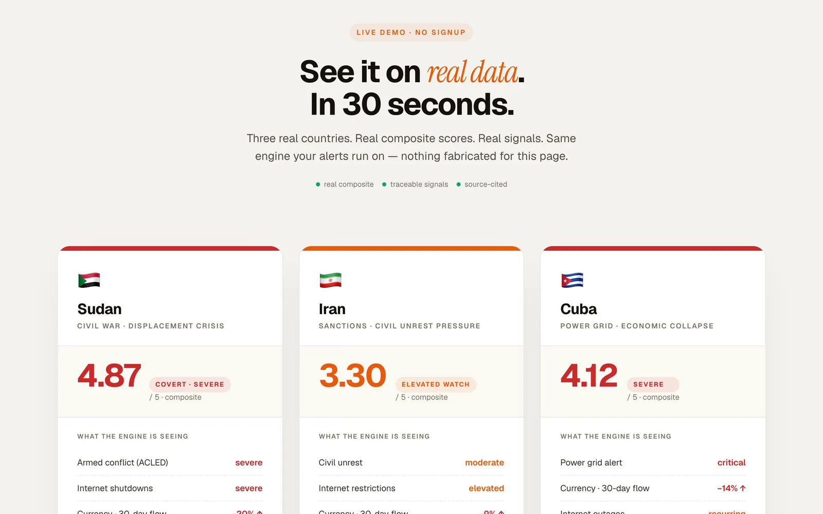
Real composites, nothing staged for the page
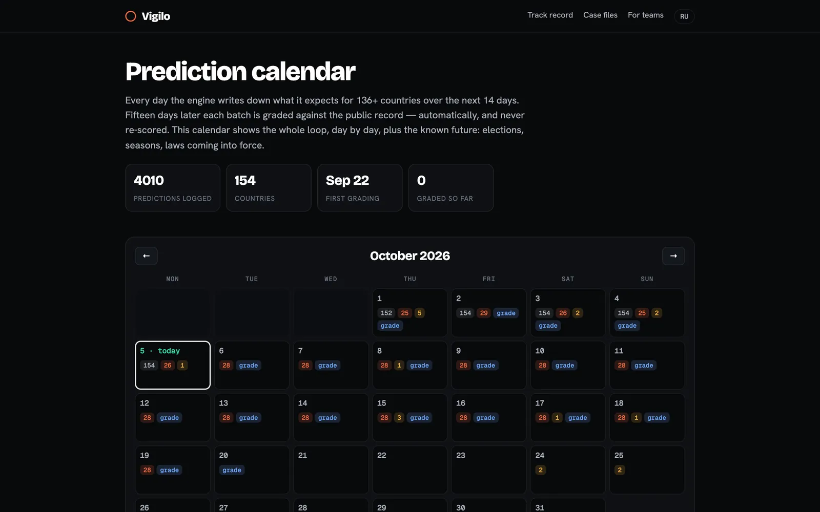
What the engine expects, day by day, 14 days out
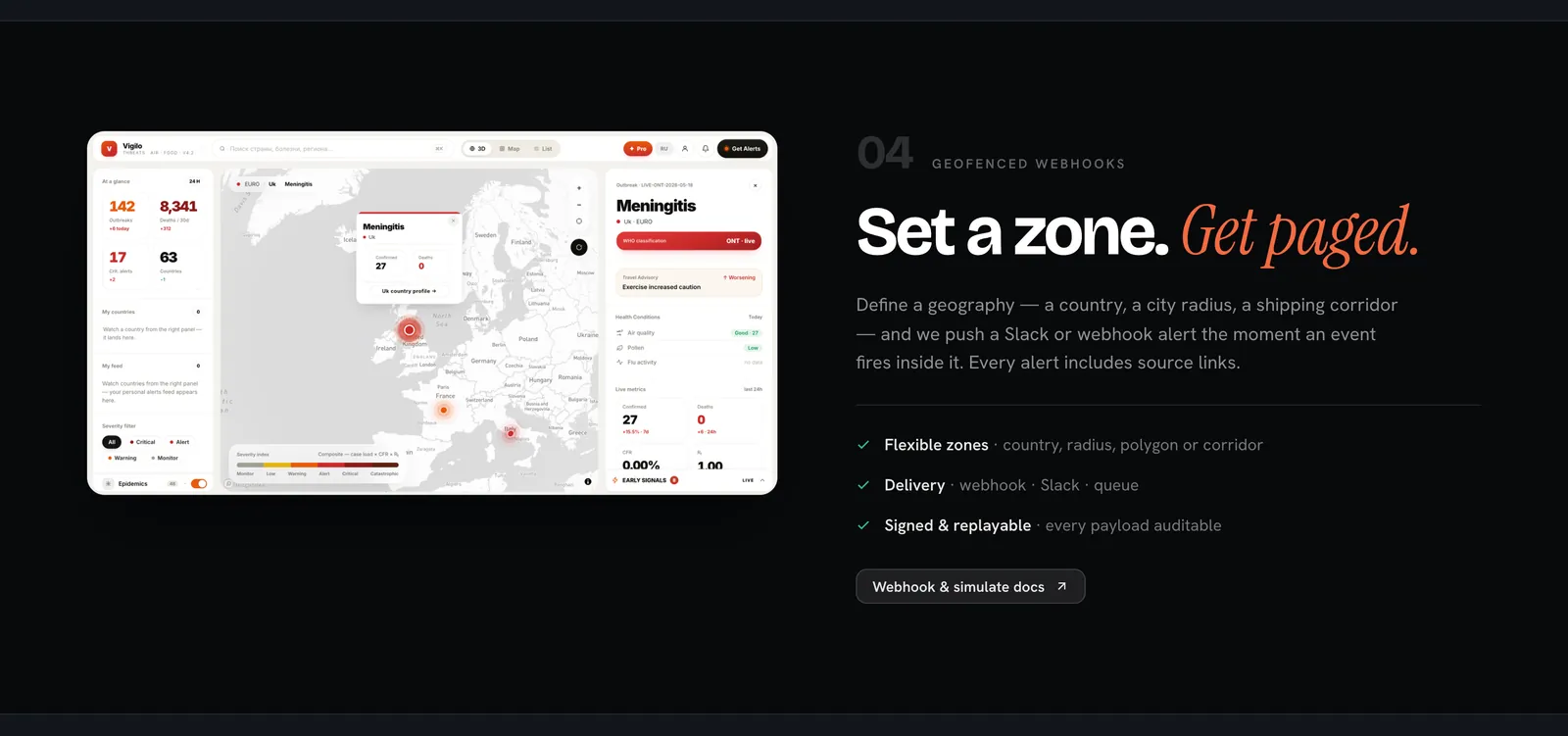
Set a zone, get paged, with sources attached
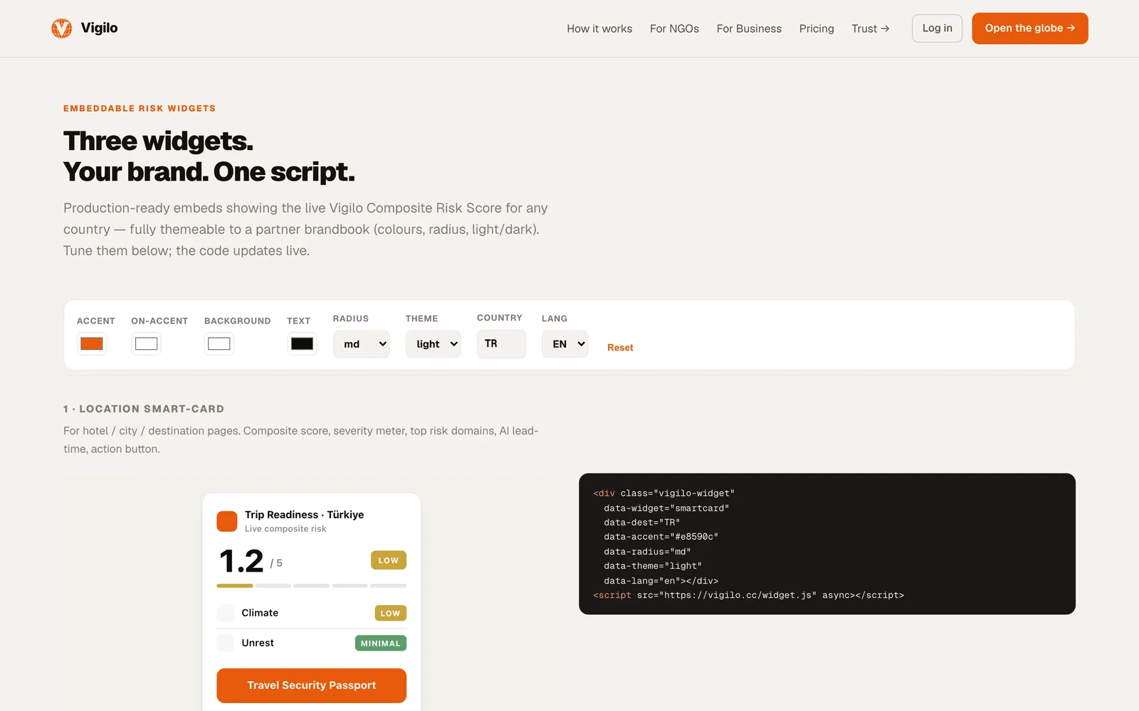
One script, themed to a partner's brandbook
One composite, seven domains, try it without a key
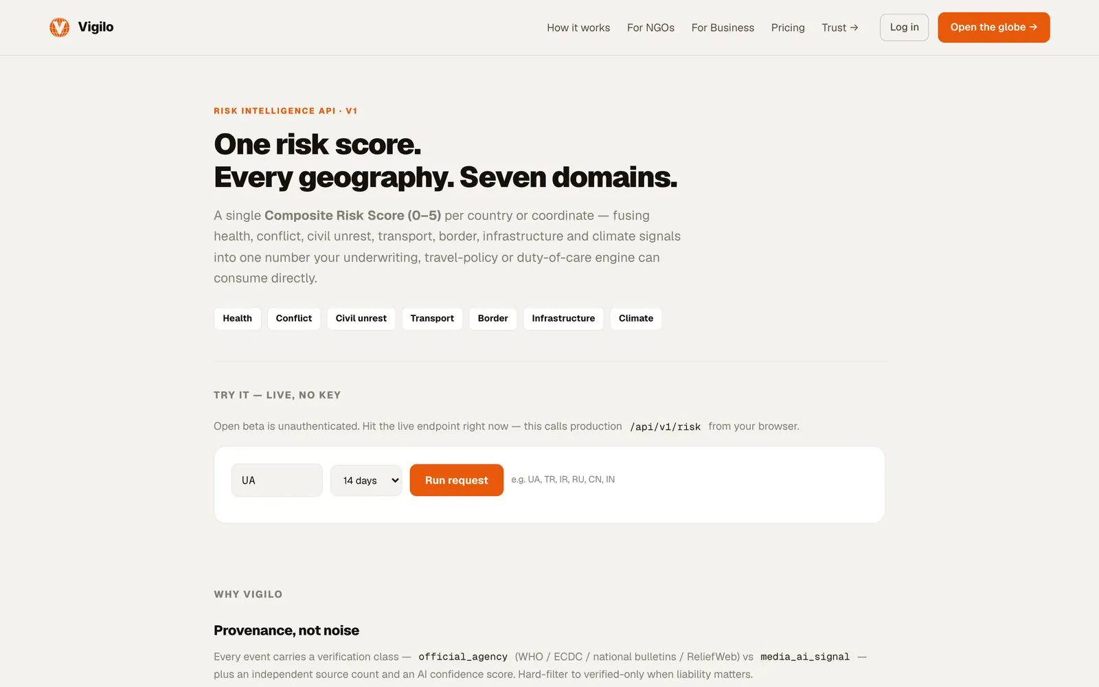
How the B2B surface is built
Sell the answer, not the dashboard. Each page starts from the buyer's question: an ISO 31030 programme, a continuity plan, a donor report. The same engine sits underneath; the page formats it for that standard.
Show real output early. The demo shows three real countries with their composites and the signals behind them, with no signup and no email gate.
Integration is a copy-paste. The widget builder writes the embed code as you tune colours and radius; the API page has a live “run request” box.
Say the scope out loud. Climate disclosure pages state that Vigilo covers physical climate inputs only and integrates with a full CSRD platform rather than pretending to be one.
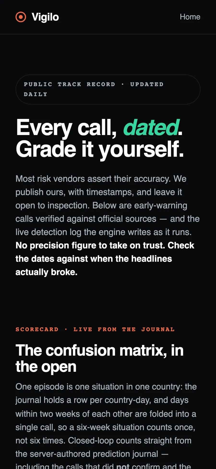
Don't trust the score. Check the receipt.
Every call is written to a public journal when it is made, then graded against official sources. Misses stay in the denominator.
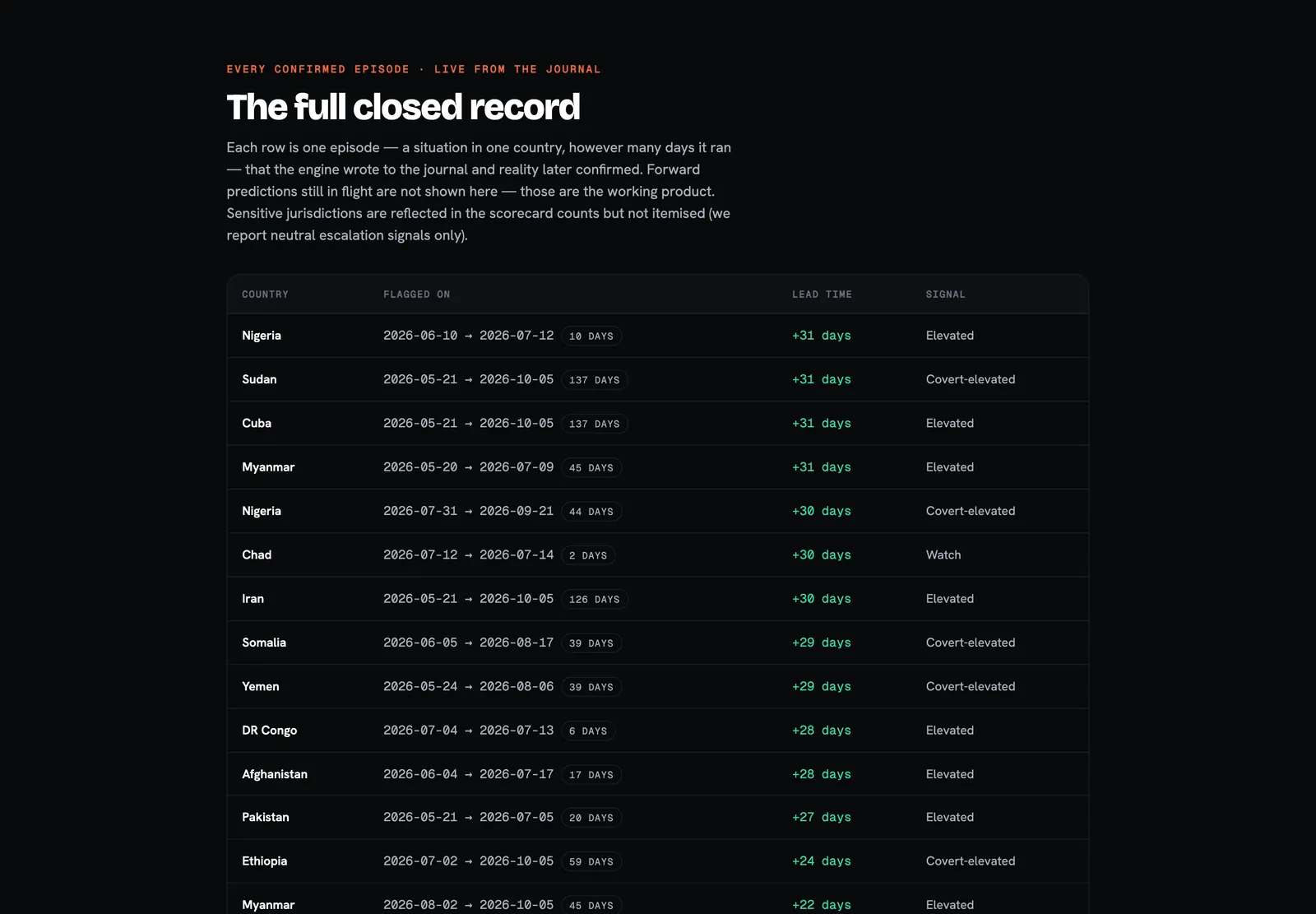
Sudan
Covert-elevated tier, called on 2026-07-13; escalation confirmed 31 days later.
Myanmar
Three separate watch-tier calls, each confirmed with a 30–31 day lead.
Vietnam
A safe window inside typhoon season instead of a blanket warning.
Russia
An election window sat in the public calendar months ahead.
Case files as published on vigilo.cc/cases. Neutral escalation signals only, no attribution.
How the record is designed
Episodes, not days. One episode is one situation in one country; days within two weeks are folded into a single call, so a six-week situation counts once, not six times.
The honest denominator. The scorecard shows the calls that did not confirm and the escalations the engine stayed silent on, next to the ones that landed.
Dated, not backfilled. Calls are written when made. The value is the gap between the flag and the headlines, verified against ReliefWeb, UN OCHA and WHO.
Lead time, not a verdict. The page says plainly that an early signal buys time to look and does not replace a team's own judgement.
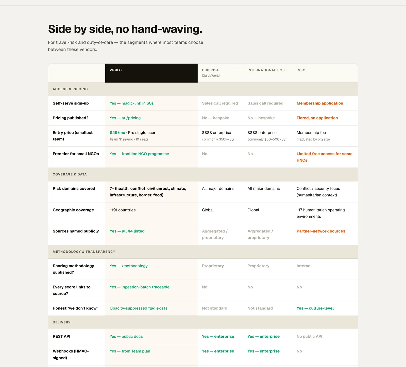
Say where the others are the better buy.
The comparison with Crisis24 and International SOS is about public posture, not a capability ranking, and it says when to buy them instead.
- 01They lead on people24/7 operations centres, physical and medical evacuation, in-country analysts.
- 02Vigilo competes on opennessSelf-serve sign-up, published pricing, published methodology, every score linked to its source.
- 03Gaps in writingSoftware only, no evacuation, no SOC 2 today — targeted for 2027.
Rules first. Results after. Failures stay.
Trust here is a process with a paper trail, and the interface's job is to expose every step of it.
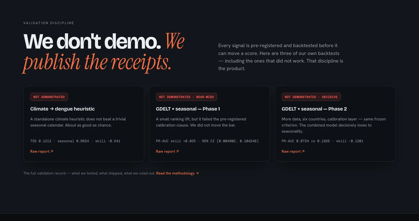
published with raw reports
precision, 95% CI 36–61% · track record
recall against an external ground truth · methodology
7-day edge over a naive baseline, out of sample · methodology
of history, listed as a known limitation · methodology
What the methodology page commits to
Accuracy is never the headline. On rare events a constant “all quiet” scores 90%+, so the page scores with Brier, false-alert rate and median lead instead.
Words are pinned to numbers. “Likely” is 55–80%, “very likely” 80–95%, “almost certain” 95%+, product-wide.
Narratives alone never escalate. Media waves count as “words”; an alert also needs a “deed” channel such as prices, reroutes or government advisories.
Known limitations are listed. Recall is 58%, history is short, and resolution is country-level; sub-national precision is roadmap, not current capability.
Sources: track record (live, read 5 Oct 2026) and methodology v1.0.
Procurement, without a sales call.
Privacy, security, a GDPR Art. 28 DPA, terms and prices, in one place and in plain words, honest gaps included.
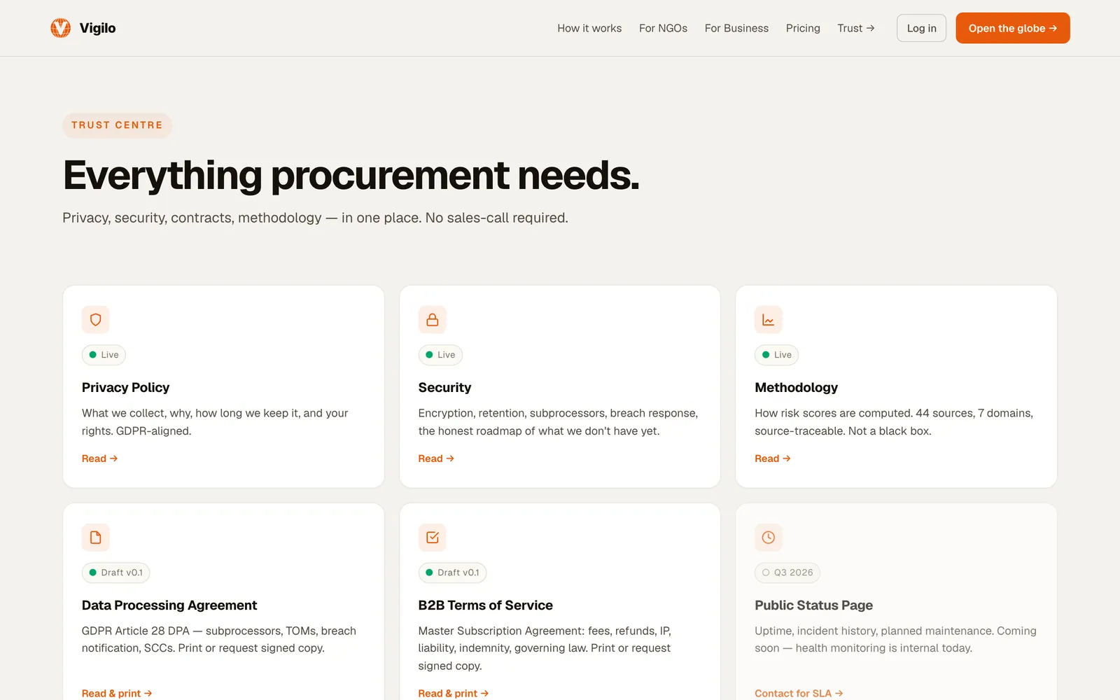
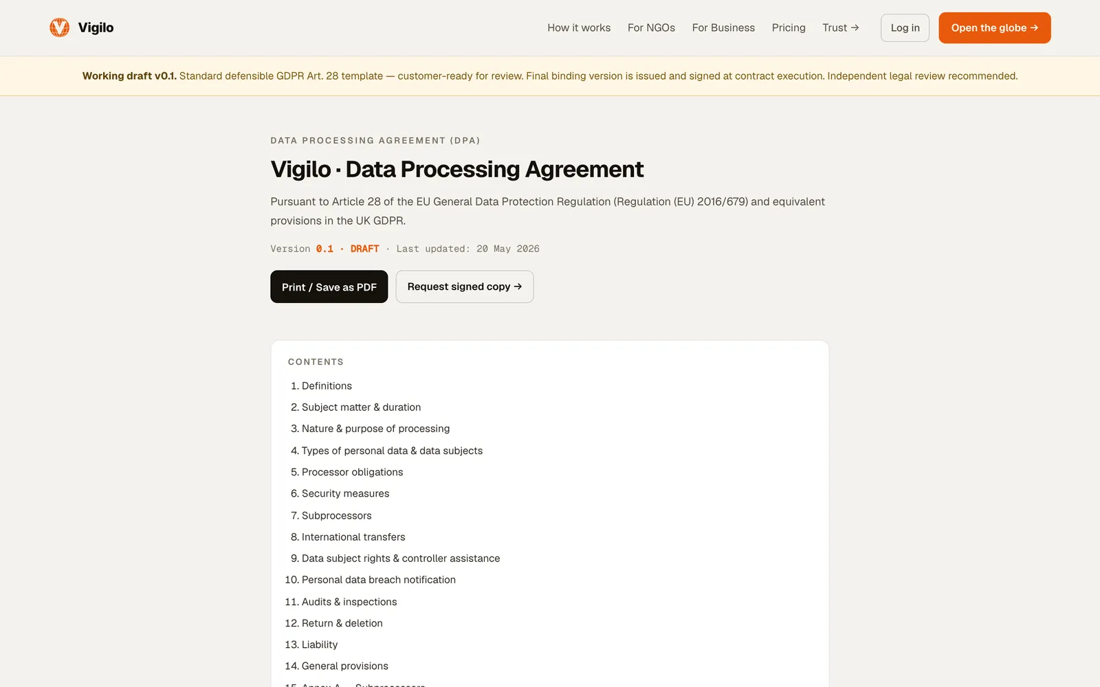
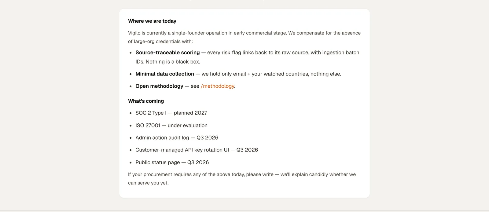
The first full windows closed. Here is the receipt, misses included.
Figures from the public scorecard, read on 6 October 2026. It updates daily, so the live page may differ.
“Trust isn't a feeling the UI creates. It's a record the UI exposes.”
What I learned
- Density is a contract, not a style. Specialists accept a full screen when nothing on it competes for attention without a reason.
- Copy is part of the evidence. “Not demonstrated”, “did not confirm”, “we are not a 24/7 operations centre” are product decisions written as UI text.
- Publish the denominator. A number with its misses next to it is easier to defend in front of an auditor than a perfect-looking one.