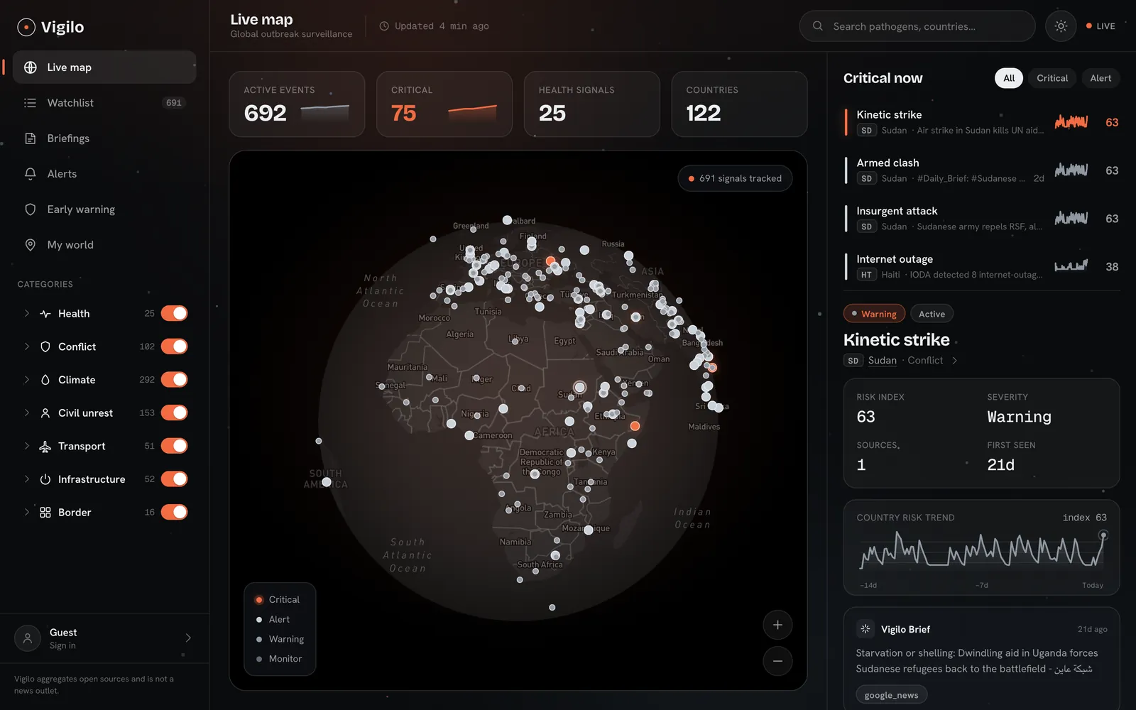
Vigilo.
A calm interface for alarming data: the news about 239 countries, turned into one clear number.
Product, copy and system — in 3 weeks.
of news
- What
- A travel-safety app that turns the news about 239 countries into one 1–5 risk number.
- Why
- Plenty of information about danger, zero understanding: 14 of 18 interviewees couldn’t tell how dangerous it is.
- My role
- Product design, UX writing and design system for iOS, Android and Web.
- Result
- 239 countries · 35 screens × 2 themes · 3 weeks
A mobile app that turns the news about 239 countries into one number — and explains what it means for your trip.
One scale. Every screen.
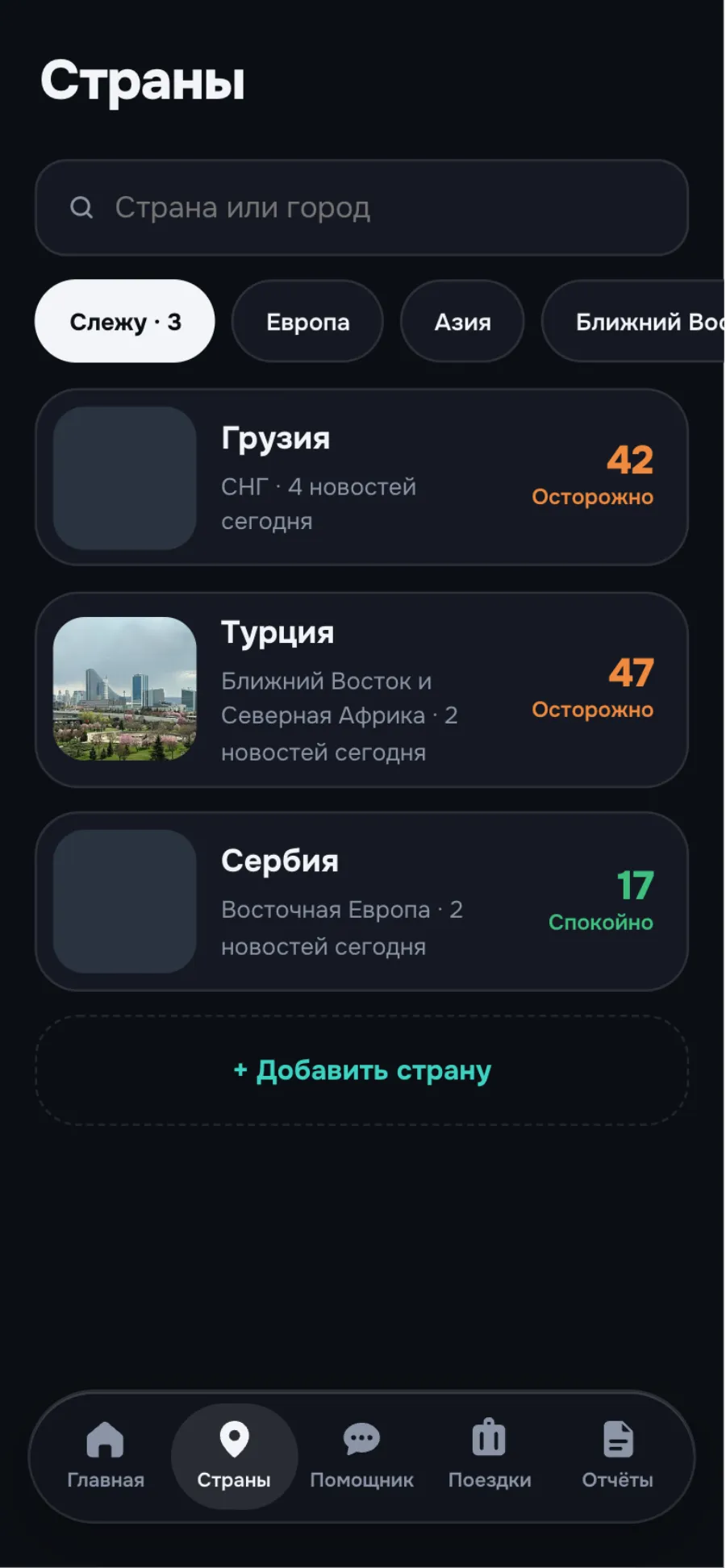
Home, country, assistant, report, trip and SOS — in two themes.
Plenty of information about danger. Zero understanding.
18 interviews: tourists, expats, business travellers.
Can’t tell how “dangerous” it is
“Unstable situation” — does that mean don’t go?
The family chat sets off the panic
The forwarded video turned out to be from 2019.
Don’t know the emergency number
“Is it 112 in Georgia? In Thailand?”
Read the full story
Before a trip, people open five tabs: the news, Telegram channels, a forum, the foreign ministry website, and a family chat with a forwarded “it’s awful there”. Everything contradicts everything else, and it’s all written either in panic or in bureaucratese. So the decision gets made on emotion — or doesn’t get made at all.
We interviewed 18 people — tourists, expats and people who fly for work. Three things came up with every one of them.
- 14/18 can’t tell how “dangerous” it is. “They write ‘unstable situation’. So what — don’t go? Or just stay away from protests?” — a family holiday with kids.
- 11/18: the family chat sets off the panic. “Mum forwarded a video. I spent half an hour googling — it was from 2019.” — a designer.
- 16/18 don’t know the emergency number. “Is it 112 in Georgia? In Thailand? Honestly, I don’t know. Hope I never need it.” — a photographer.
Colour is only a signal. Everything else stays quiet.
Neutral surfaces, five risk colours and a single teal accent for action.
One card, one thought
Red is for SOS only
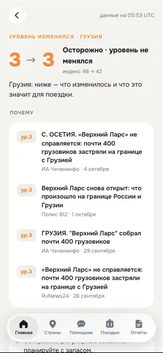
Source next to the fact
A calm voice
Read the full story
An app about threats is easy to make alarming: red banners, exclamation marks, sirens. We went the other way. Surfaces are neutral, with no decorative iconography and no gradients. The only carriers of meaning are the five-colour risk scale and a single teal accent for action. When a screen turns orange, you see it instantly — because nothing else on it is shouting.
- One card, one thought. No composite blocks. If you need two conclusions, you get two cards.
- Red is for SOS only. The emergency red matches level 4 on purpose: it means “act now”.
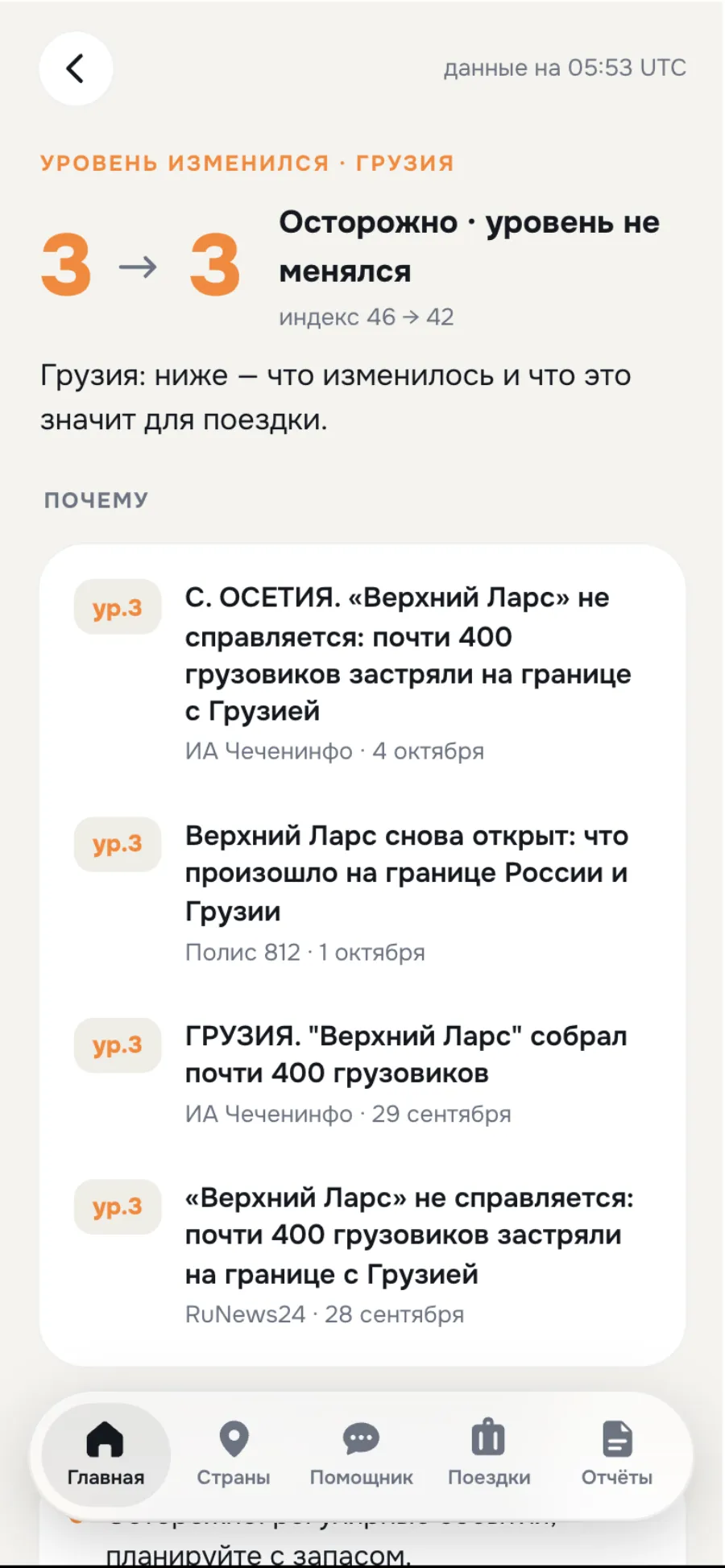
- Source next to the fact. An index without sources is just a number. We always show where it came from and when.
- A calm voice. No exclamation marks, even at level 5. Facts, district, time, action.
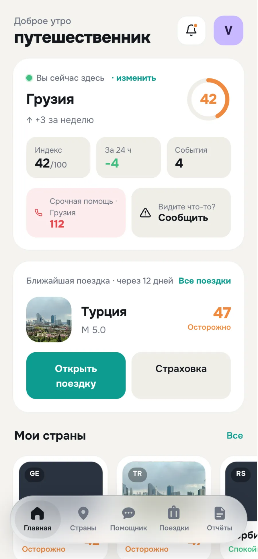
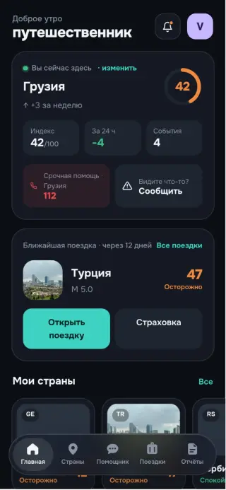
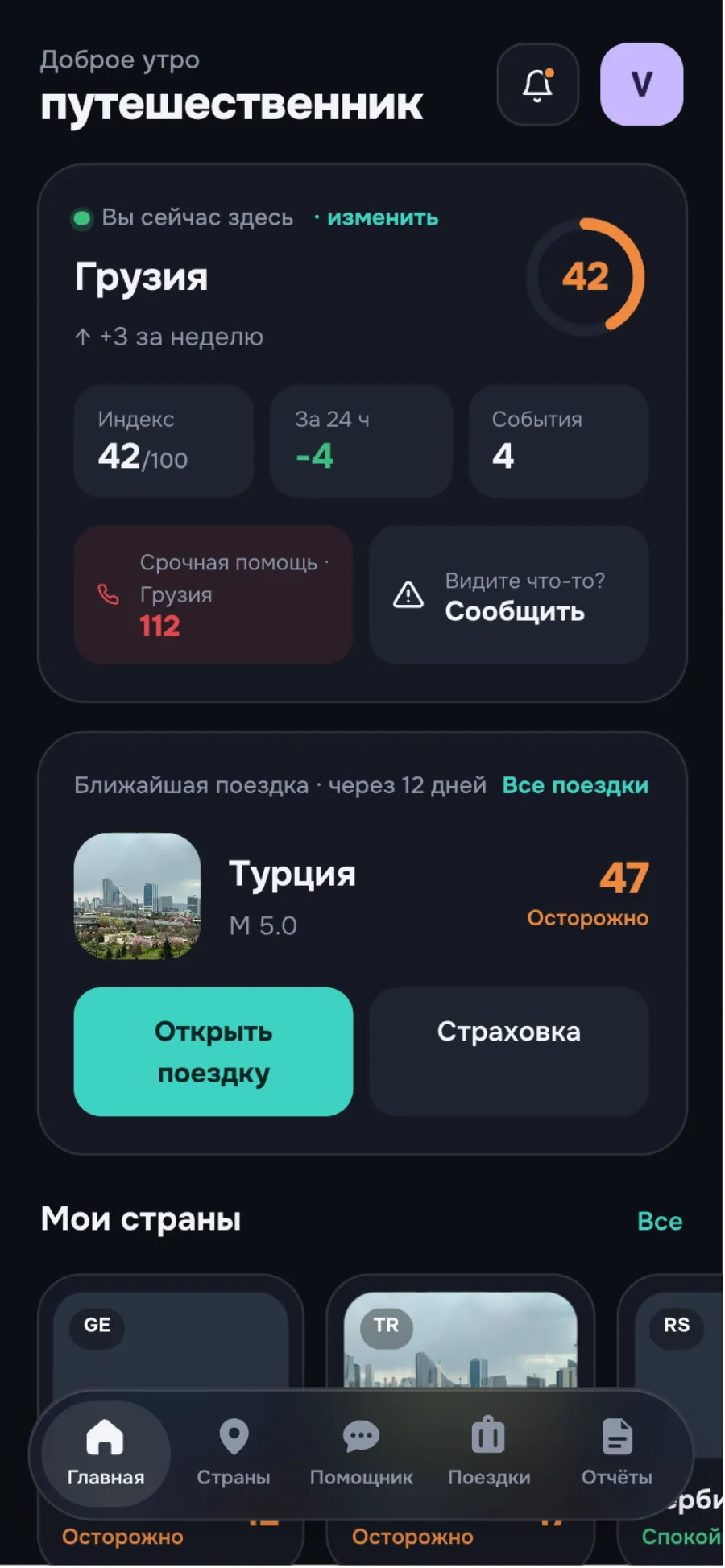
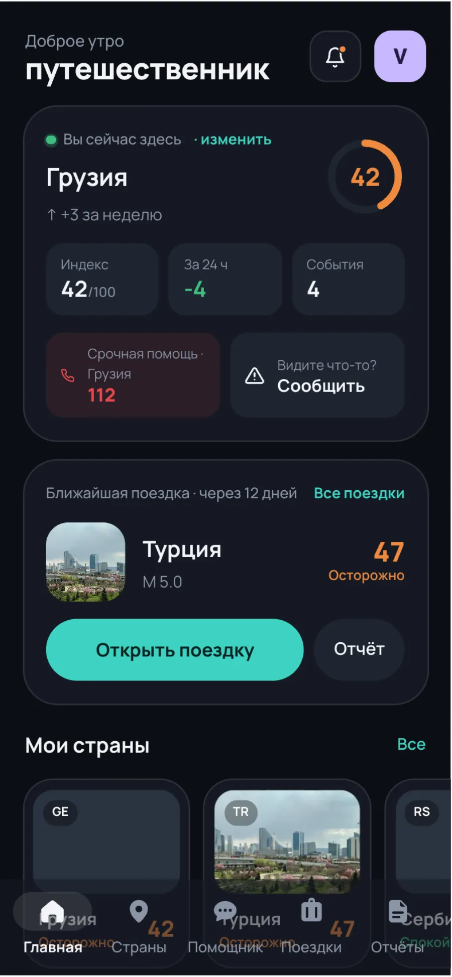
First — where you are. Then — where you’re going.
“Is it calm here?” and “what about where I’m flying?”. The only thing that pulses is the “you are here” dot.
Read the full story
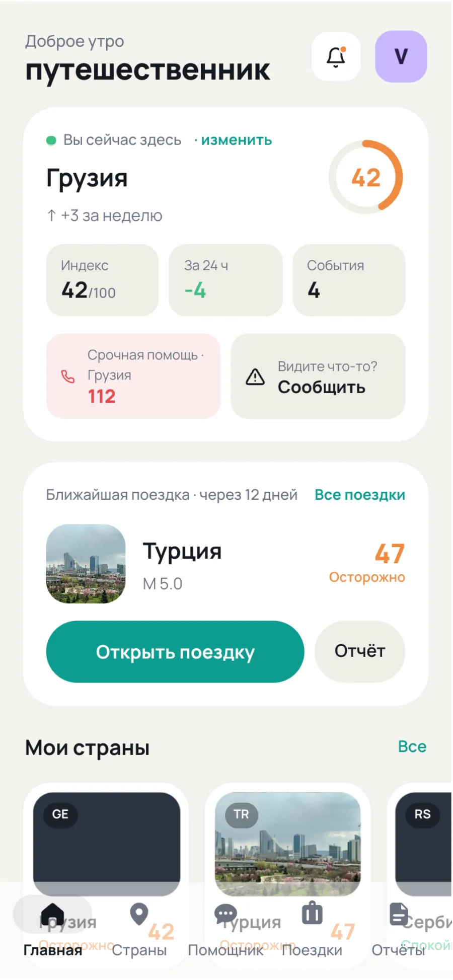
The home screen is built around the two questions people actually ask themselves: “is it calm here?” and “what about where I’m flying?”. The first card is your current location with its index, the 24-hour trend and the emergency number of the country you’re physically standing in. The second is your next trip with a forecast.
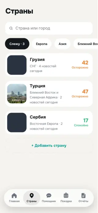
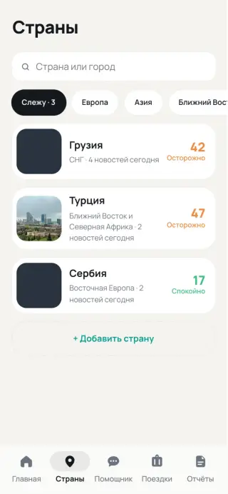
Tracked countries, the “today in the world” feed and the assistant sit below. Nothing blinks: the only living thing is the “you are here” dot.
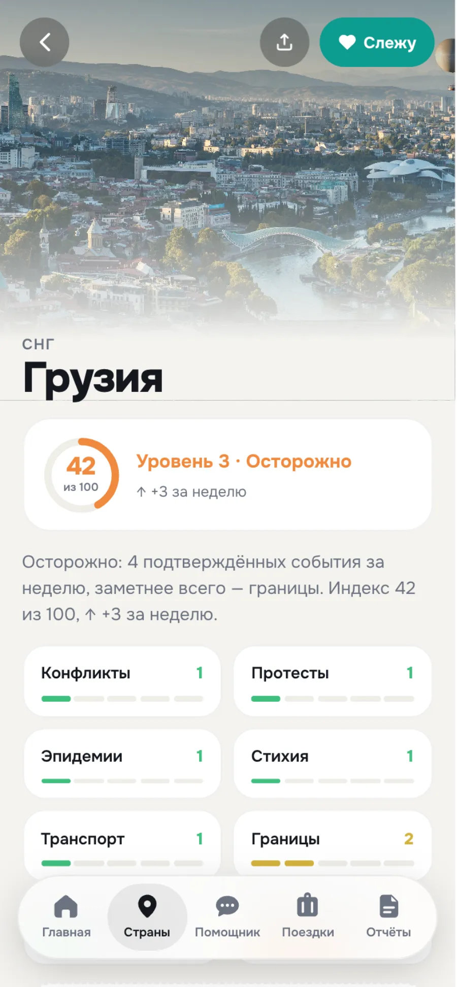
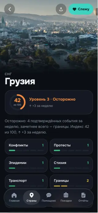
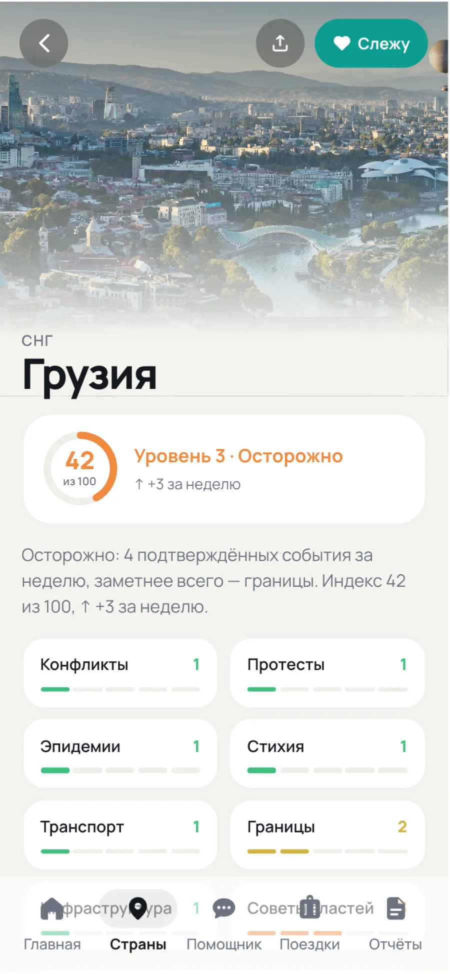
“Go or not” — in ten seconds.
Free understanding first — and only at the very end, the option to buy a report.
Country · 8 threat categories
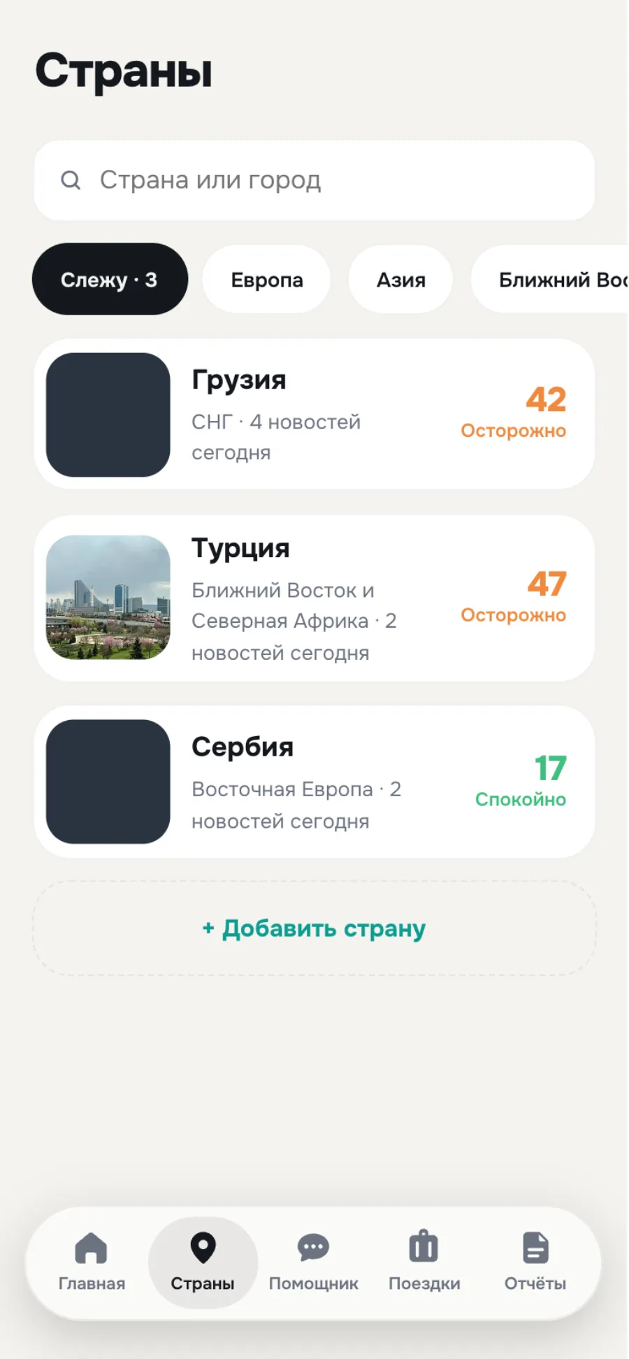
My countries
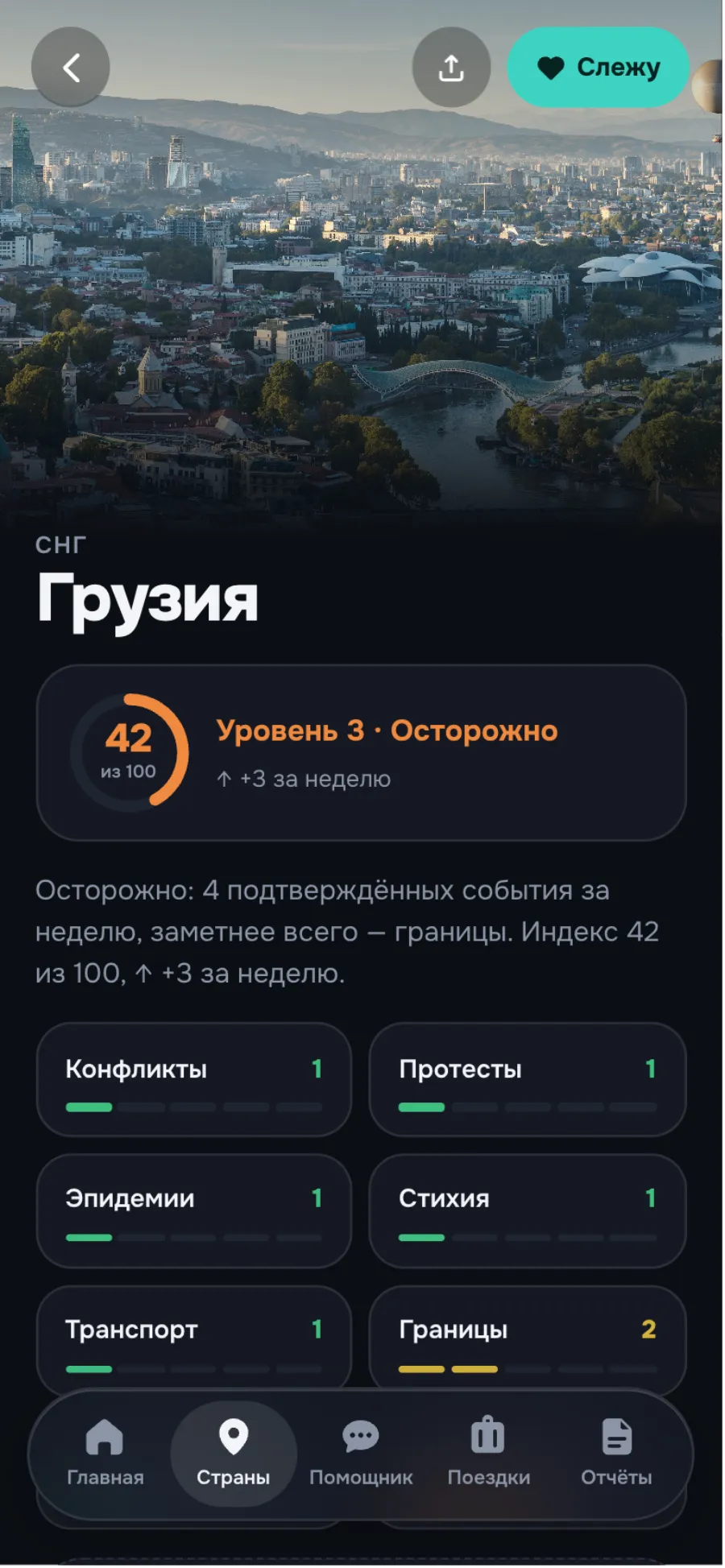
Dark theme
A ring instead of a mascot
The character entertained; the ring informs.
The map shows events
Only those confirmed in the past week.
Guest view
A link opens everything that’s free.
Read the full story
One page answers “go or not” in ten seconds. A photo header with the level, eight threat categories in a grid, a district map, today’s news, a 12-month archive and — only at the end — the option to buy a report. The order is deliberate: free understanding first, the offer second. The resort is calm but the capital isn’t — you see it from the first screen.
- A ring instead of a mascot. We tried a character whose emotions changed with the level. We dropped it: it entertained rather than informed. A ring with a number reads in a second.
- The map shows events, not scenery. A real map distracts with detail. The schematic shows only the places where confirmed events happened during the week.
- Guest view. A link to a country opens everything free without sign-up. The archive and the report sit behind glass, one action away.
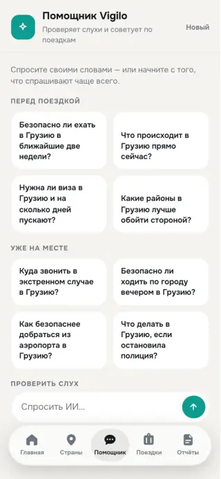
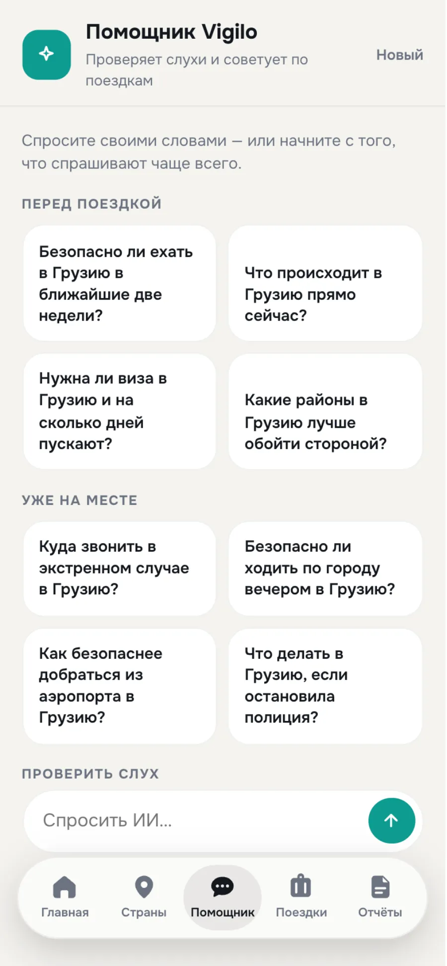
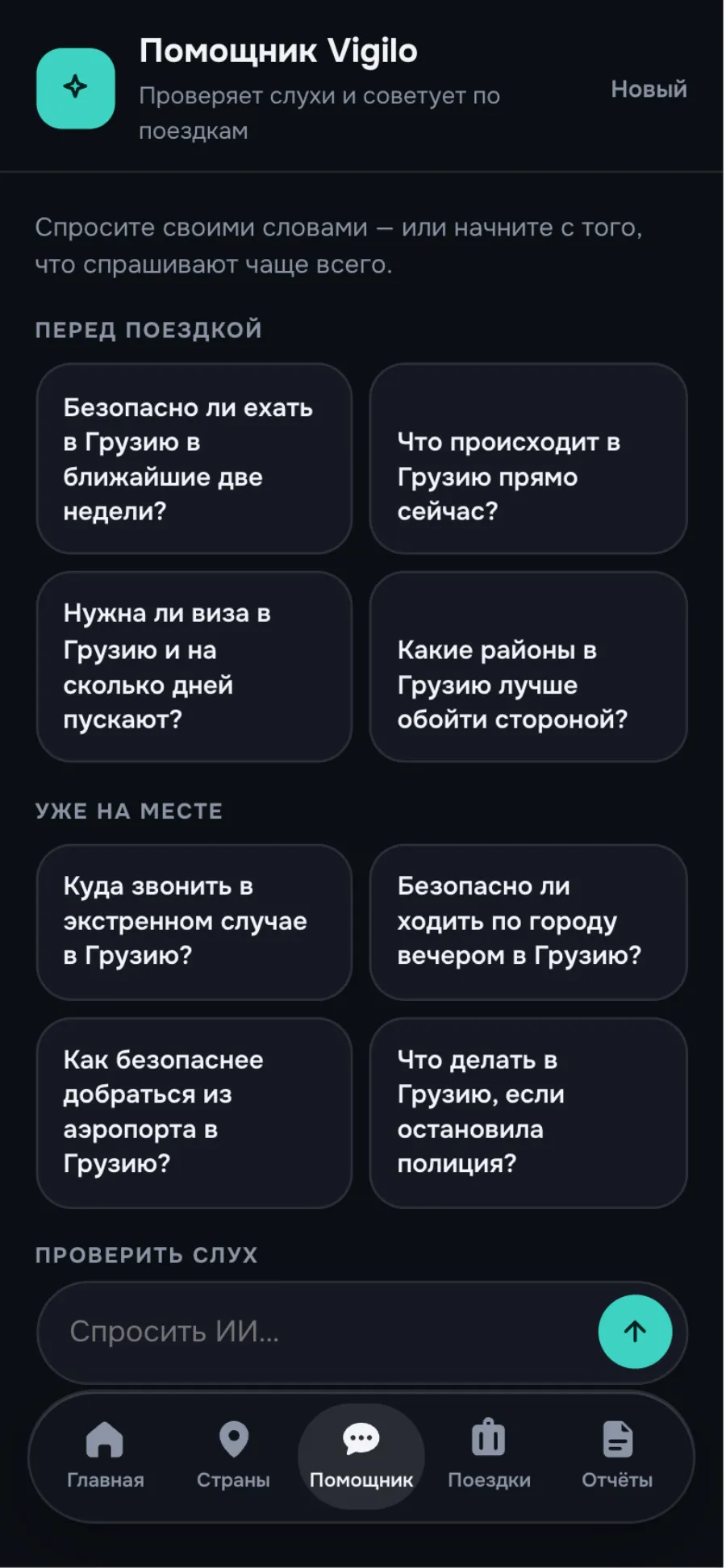
Not a chatbot — a rumour checker.
Paste a forwarded message and get a verdict card with sources.
Read the full story
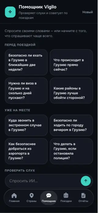
The most common panic trigger is a forwarded message in the family chat. So the assistant’s main scenario isn’t “ask anything” — it’s paste a rumour and get a verdict: true, partly true, rumour. With the level colour and a list of sources. The answer is a card, not a wall of text.
The second scenario is “is this district safe at night”. The answer comes with hours and streets, not “be careful”.
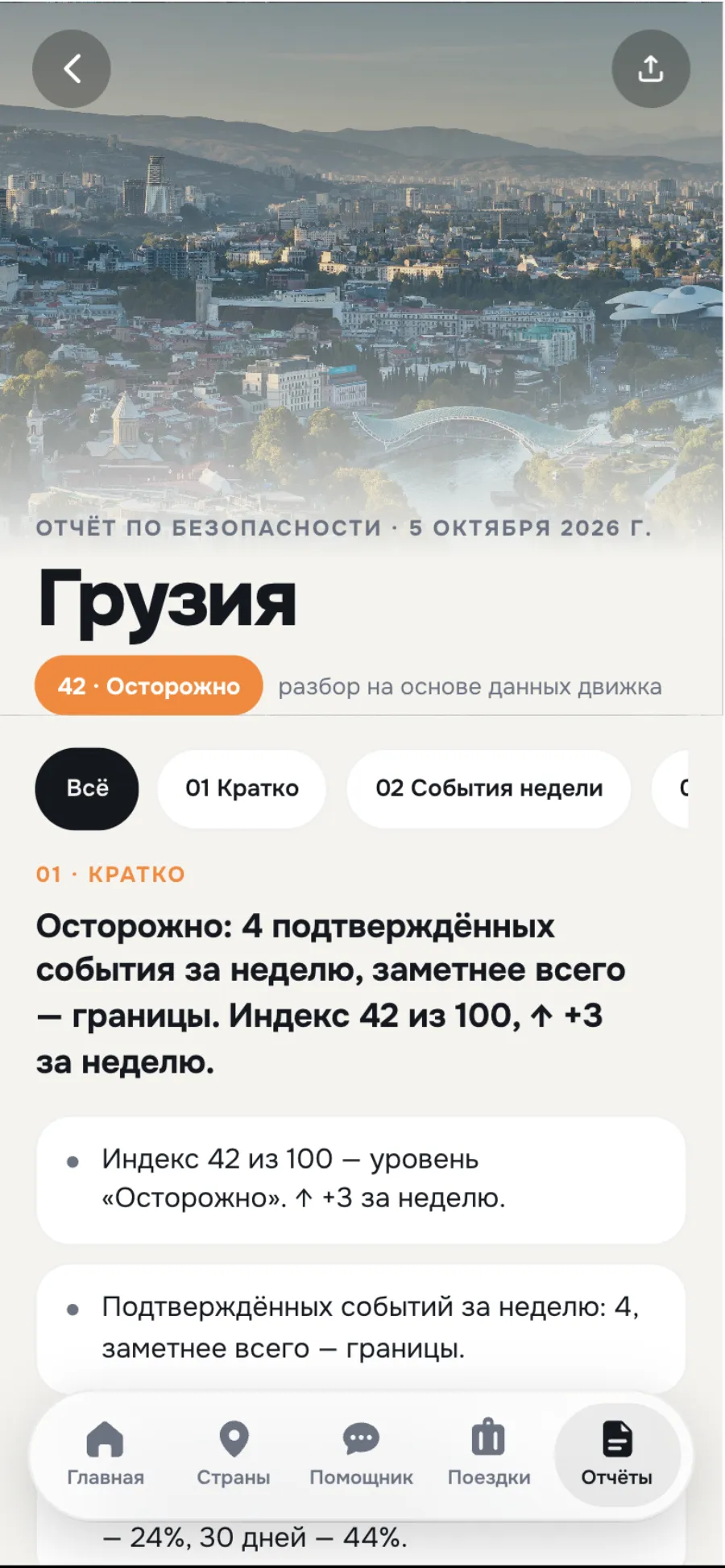
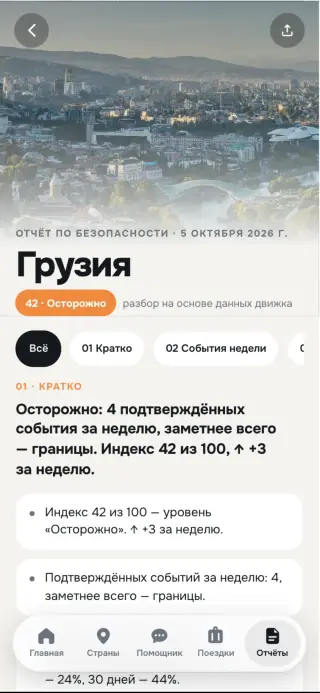
A document you actually want to read.
A paid product with the breathing room of a magazine — and the same design language.
- 01Numbered sectionsand large pull-quote conclusions
- 0230-day forecastwith a confidence band
- 03Offlineplus the emergency number of the country you’re in
Read the full story
The report is a paid product, and it has to look worth the money. Editorial layout: numbered sections, large pull-quote conclusions, a district map, a 30-day forecast with a confidence band, contacts. The same design language as the app, but with the breathing room of a magazine.
It’s saved for offline use. The emergency number at the end isn’t generic — it’s for the country the person is standing in right now.
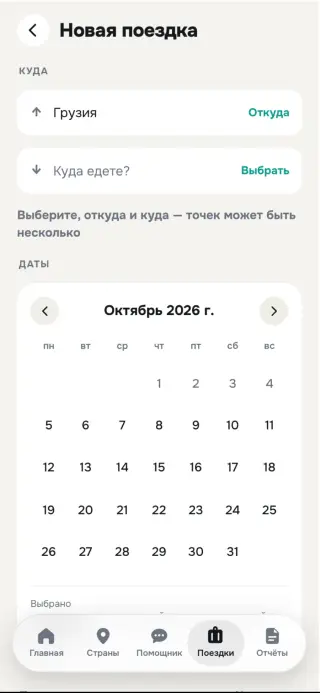
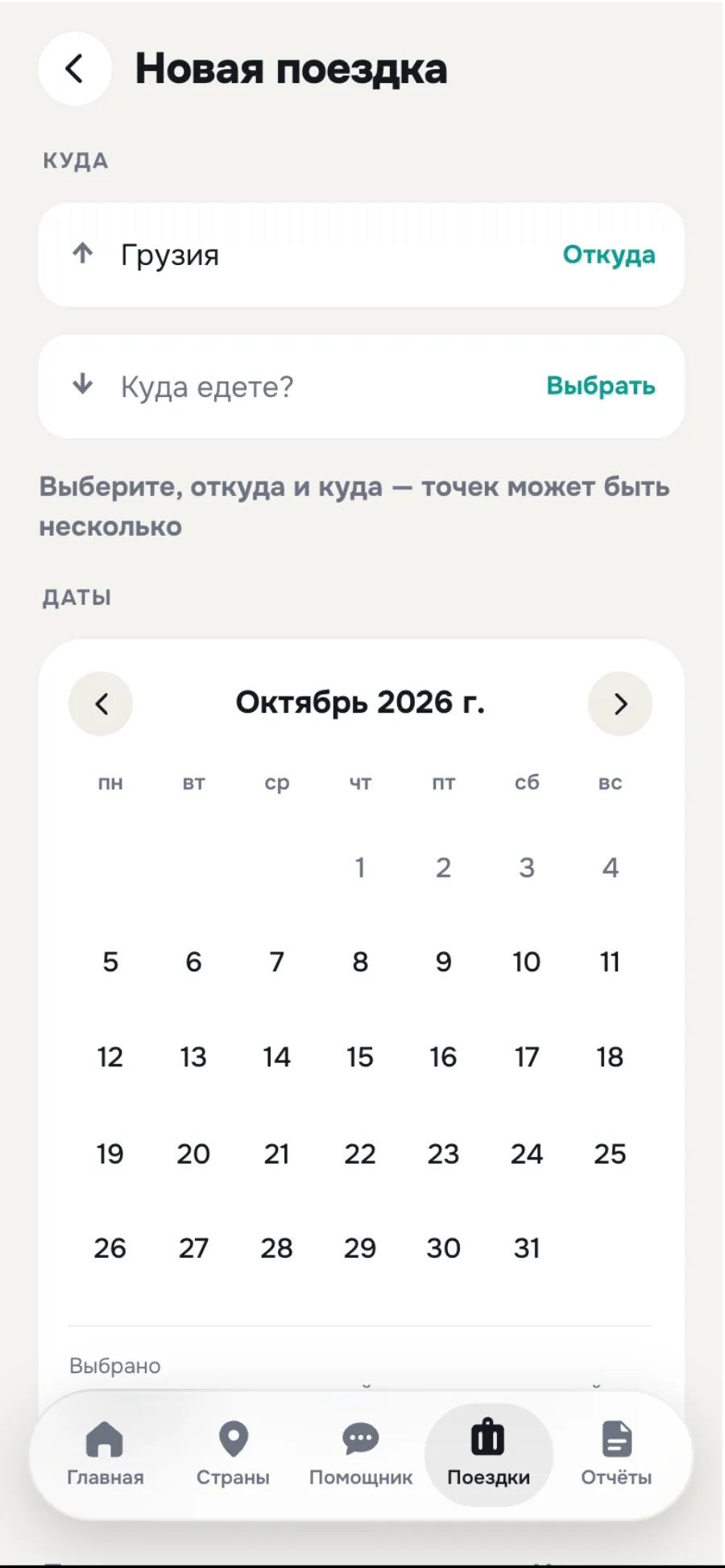
A calendar that shows risk day by day.
Under every date sits a dot in the forecast colour. Red dominates only in SOS.
Read the full story
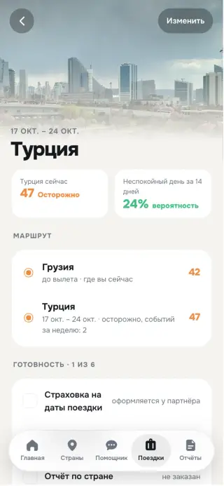
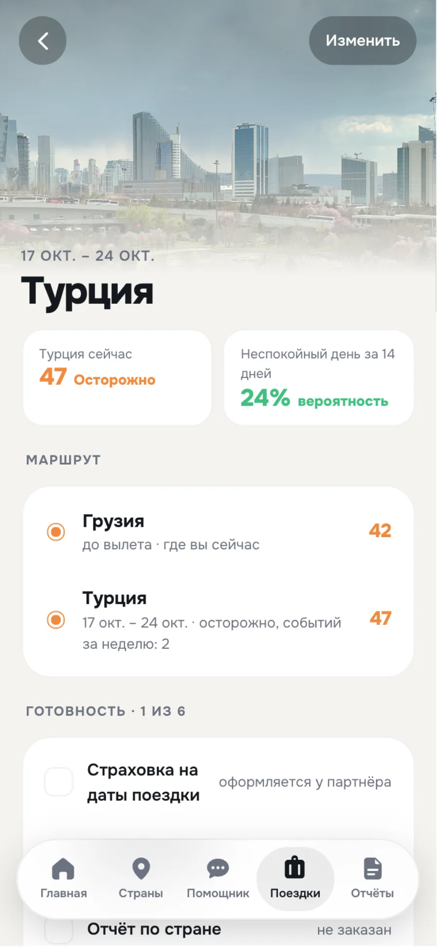
When you create a trip, every date has a dot in the forecast colour underneath it. Picking dates stops being a lottery. The trip screen brings together the route, a checklist and trusted contacts.
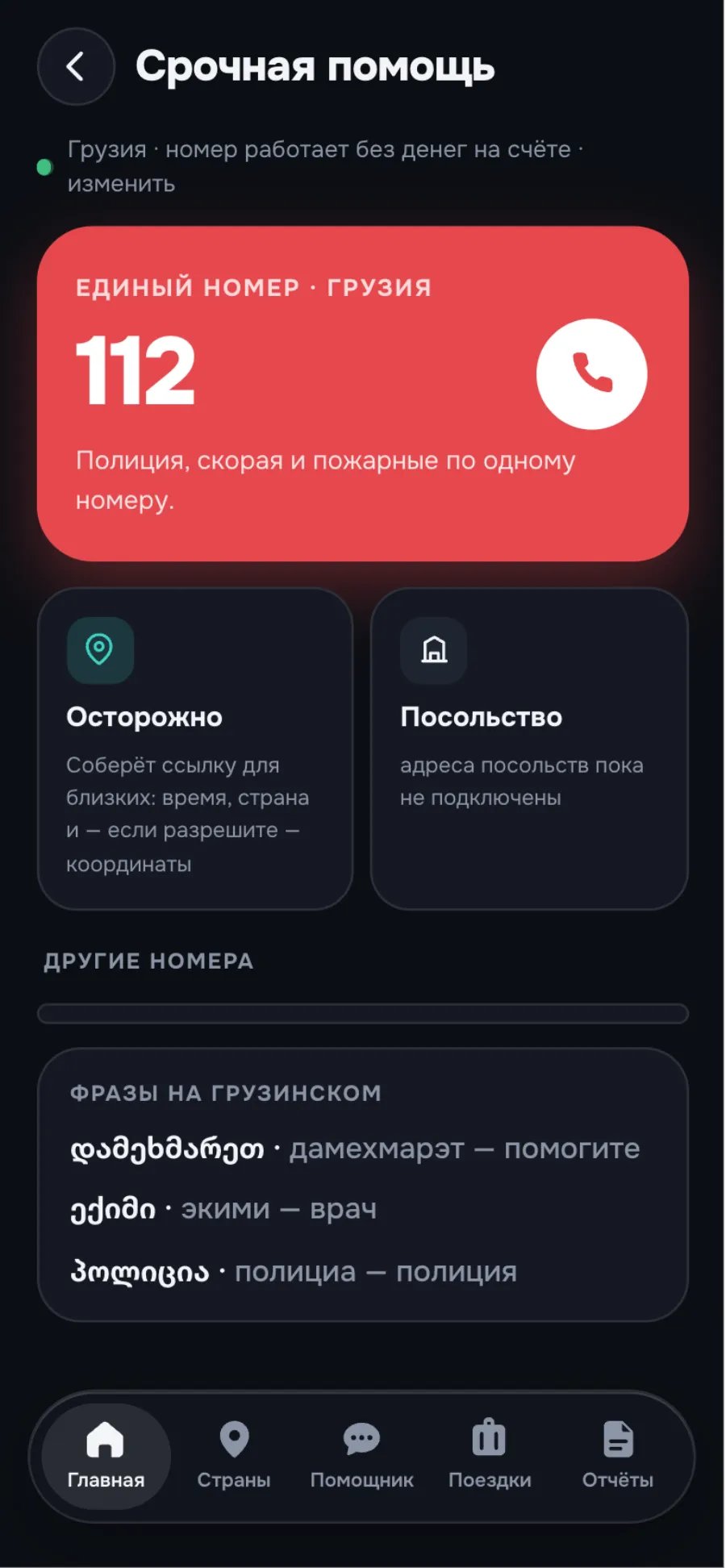
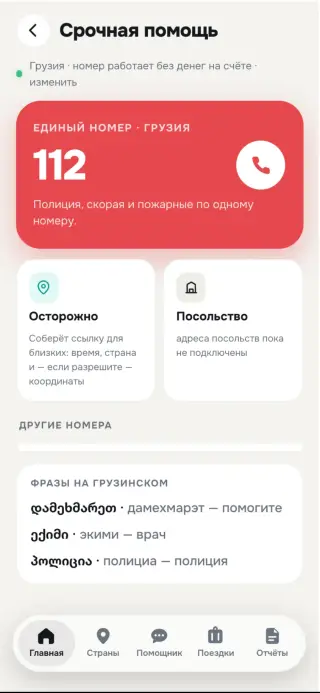
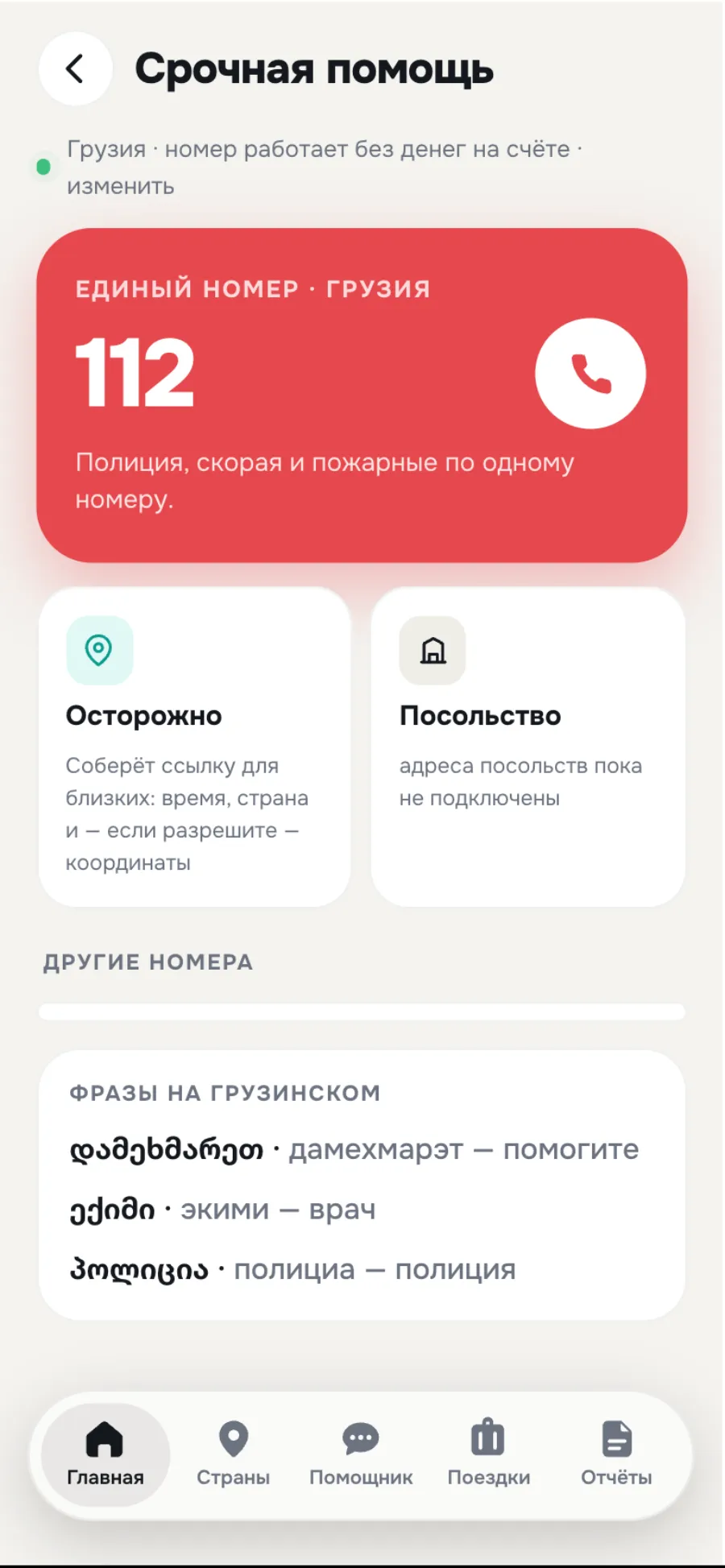
SOS is the only screen where red dominates: a huge number, a one-tap call, “I’m OK” with your location, phrases in the local language. It works without a connection.
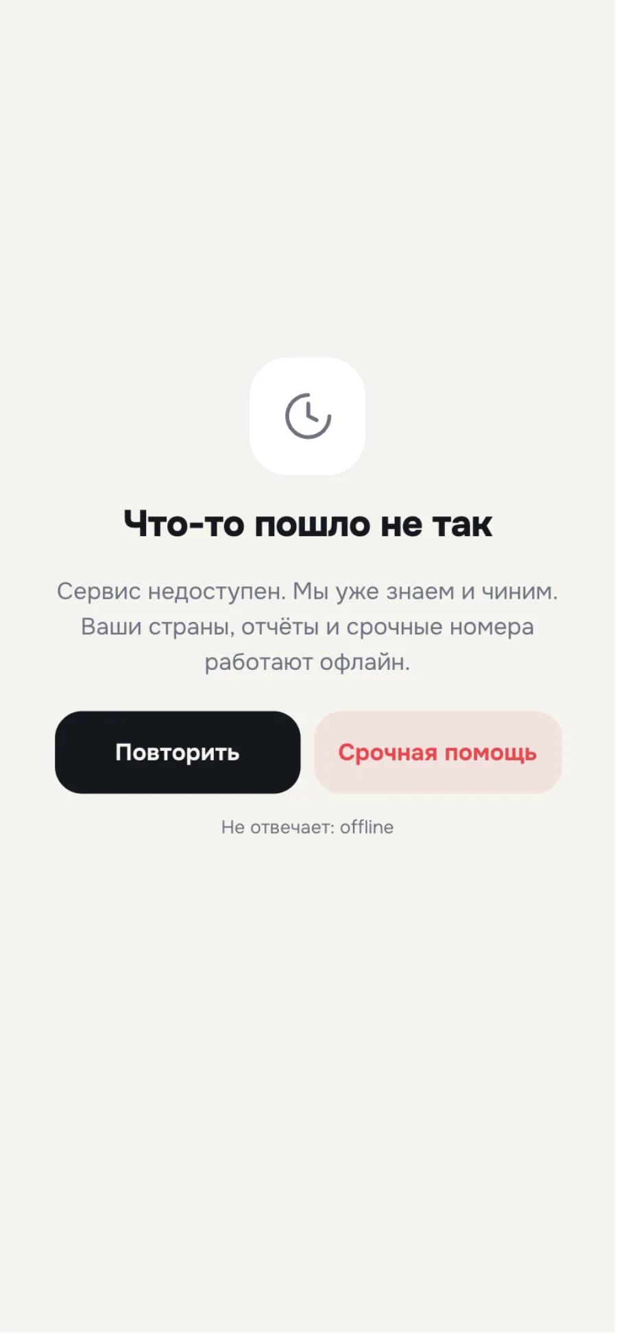
An error never switches off SOS.
A safety app has to work when everything else breaks.
Read the full story
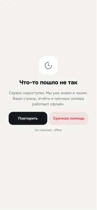
Empty states explain the value in one sentence and offer one action. Errors say what we’re showing instead of the data and when we’ll refresh. A full service outage leads to emergency help. Skeletons, the offline banner, guest view via a link — all of it designed up front, not “later”.
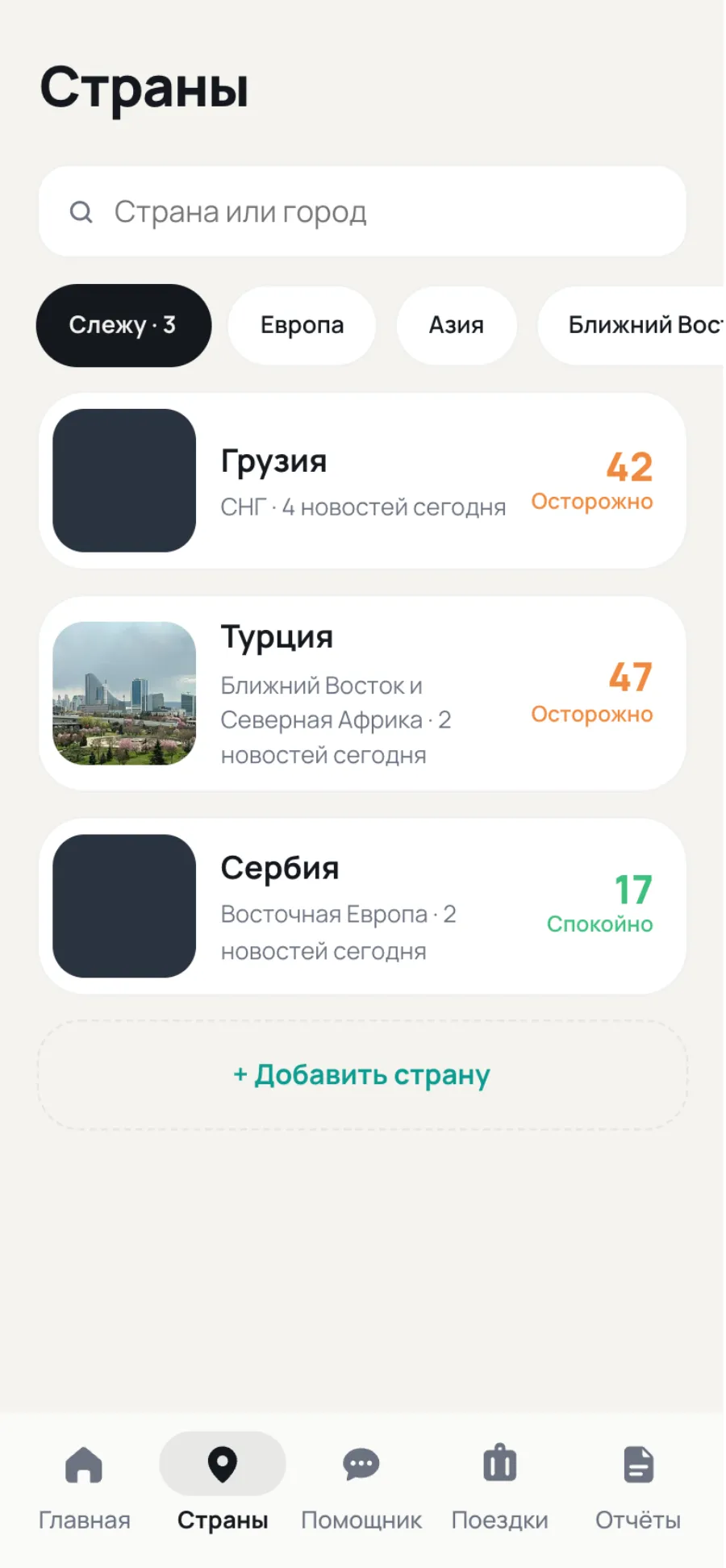
One meaning, two native languages.
The scale, the structure and the copy are shared.
Read the full story
iOS: Onest, thin strokes, a floating liquid-glass menu over the content. Android: Material 3 Expressive — Manrope, tonal surfaces without strokes, pill buttons, a navigation bar with an indicator. The risk scale, screen structure and copy are shared. Someone who switches phones doesn’t have to relearn anything.
Few rules, but strict ones.
Seven tokens per theme, four radii, five components.
Onest 400–800, Latin and Cyrillic. 4px grid, 18px margins.
“Don’t plan a trip. If you’re already in the country, know where the nearest shelter is.”
Tokens and voice in full
Two themes, seven tokens each. Four radii. Seven type styles. Five components that everything is built from. The voice comes down to three rules. The full system with tokens and examples lives in a separate document.
- Light theme background #F4F3EF — warm, not white.
- Dark theme background #0B0E13 — near-black with a hint of blue.
- Accent #0E9C90 / #3ED3C3 — action and purchase.
- Typeface Onest — Latin and Cyrillic, 400–800.
- Radii 18 · 24 · 28 · 999 — button · card · sheet · pill.
- 4px grid, 18px margins, 12–14px gaps, 16–18px padding.
Voice: calm, no exclamation marks. Even the critical level is described with facts: “Don’t plan a trip. If you’re already in the country, know where the nearest shelter is.”
What this means for you. Every event comes with a takeaway: district, time, action. “Avoid places where crowds gather, and don’t film near the police.”
Source next to the fact. Where the data comes from and when it was updated is always visible: “JAMnews · 2 sources · 13 September” under every line.
What shipped and what we learned.
screens × 2 themes × 2 platforms
states
tokens per theme
decorative icons
“When only the level shouts, people believe it.”
What we learned
- Removing is harder than adding. The mascot, the real map, the AI “sparkles” — each looked good on its own and got in the way together. Every removal made the product more honest.
- States are the product. Half the trust in a safety app is born the moment there’s no connection. Design that first, not last.
- Calm is a design decision. Not the tone of voice or the palette on their own, but a system: what shouts, what stays quiet, and why. When only the level shouts, people believe it.
Shipped: 35 screens, each in two themes and on two platforms; 12 states — empty, errors, offline, guest, loading; 7 tokens per theme — the entire palette; 0 decorative icons and gradients.