Lush.
Less noise, more signal: a multi-chain crypto wallet stripped to its essentials — every state designed, every transition timed.
Self-initiated concept, built solo with AI in about seven hours.
wait for an Uber
- What
- A multi-chain crypto wallet stripped to its essentials: an iOS concept with a live prototype.
- Why
- Wallets compete on colour; people need the number: how much do I have, and is it safe?
- My role
- UI/UX end to end, motion and design system, solo with AI (self-initiated).
- Result
- 30 screens · 10 wired into one prototype · ~7 h solo + AI
Crypto wallets compete on colour. Lush competes on the number — how much do I have, and is it safe? Black, white, one acid accent, tabular numerals everywhere.
Thirty screens. One accent. Zero noise.
Portfolio, send, receive, swap, earn, markets, settings — and every seam in between.
Markets · Settings · Edges
Money is serious. Reduce noise to amplify trust.
Crypto wallets compete on colour.
Gradients, mascots, badges. Users want two answers: how much, and is it safe.
Strip everything that isn’t the number. Glanceable in 0.4 seconds.
- 01One accent per screen — active or positive or focused, never all three.
- 02Tabular numerals on every balance — when crypto ticks, layout doesn’t.
- 03Elevation through opacity, not shadows or borders.
What didn’t make it
Holographic gradients · mascots and 3D coins · achievement badges · multi-colour asset coding · pull-to-refresh theatre.
Read the full story
Problem. Crypto wallets compete on colour. Gradients, mascots, gamified badges. The user doesn’t want spectacle — they want two things: how much do I have, and is it safe.
Thesis. The number is the product. Strip everything that isn’t the number. Black, white, one acid accent. Tabular numerals everywhere so the layout never shifts. Glanceable in 0.4 seconds — the time it takes to check a balance while waiting for an Uber.
Principles. One accent per screen — active or positive or focused, never all three at once. Tabular numerals on every balance — when crypto ticks, layout doesn’t. Elevation through opacity, not shadows or borders — surfaces breathe, not stack.
Rejected. Multi-stop holographic gradients; mascot illustrations and 3D coin renders; gamified achievement badges; multi-colour category coding for assets; pull-to-refresh haptic theatre.
Seven hours. Five phases, in that order.
Research, flows, wireframes, hi-fi, prototype — from public pain to a single shipped HTML artifact.
Send flow · UX map — happy path, 5 nodes, 4 user decisions.
Phase by phase
- Hour 0–1 · Research + brief. Audit of public pain: App Store reviews of 4 wallets (90 reviews), Reddit threads on getting lost in onboarding. Self-set brief: the simplest path from $0 to the first transaction.
- Hour 1–2 · UX flows. Four journeys — onboard, send, swap, earn. Every fork branched (success, error, empty, loading). One arrow = one user decision. 4 flows · 30 nodes.
- Hour 2–3 · Wireframes. Greyscale low-fi: no type, no icons, no real numbers — just hierarchy and information density. If it works in dashed boxes, it works.
- Hour 3–5 · Hi-fi screens. Tokens applied (1 accent, 2 semantic, 5 neutral), a type system of 3 families, all states in one pass — empty, loading, error, success.
- Hour 5–7 · Prototype + motion. 11 screens wired click-by-click, 6 motion patterns specified (counter, pulse, skeleton, success, sheet, page), shipped as a single HTML artifact.
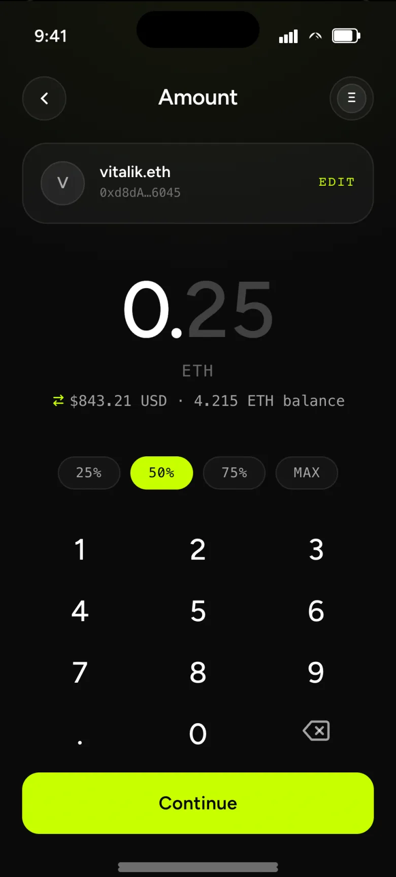
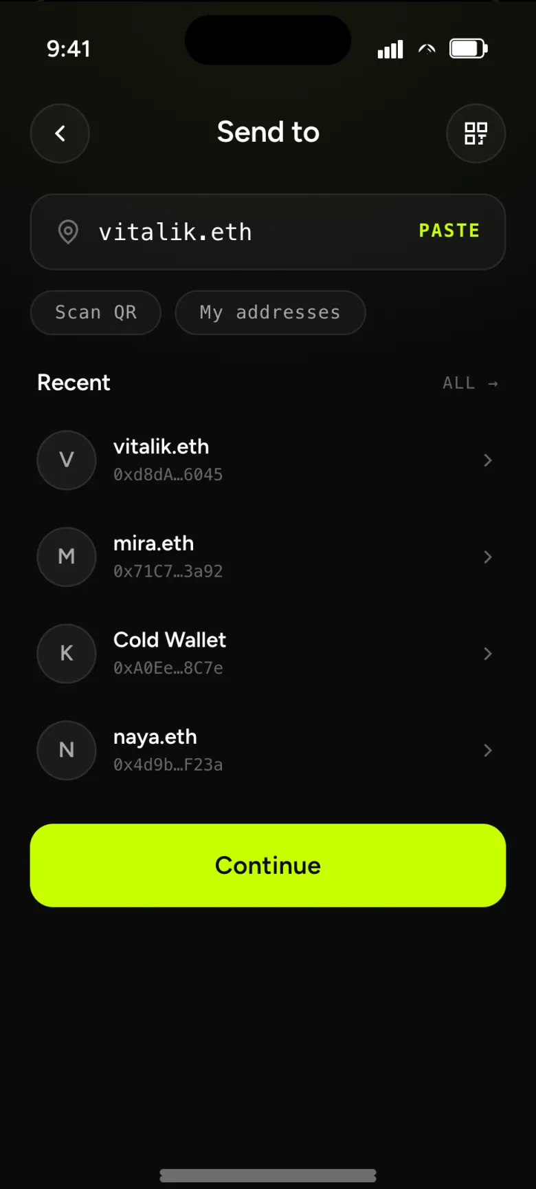
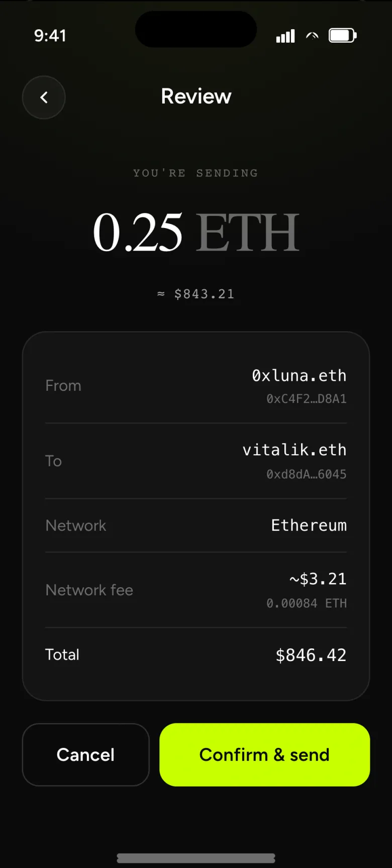
Send flow: tap Send on portfolio → pick a recipient (contact / paste / QR) → enter amount (numpad + chips) → review (amount · fee · total) → success (hash · receipt).
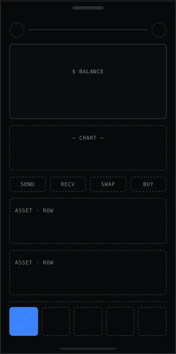
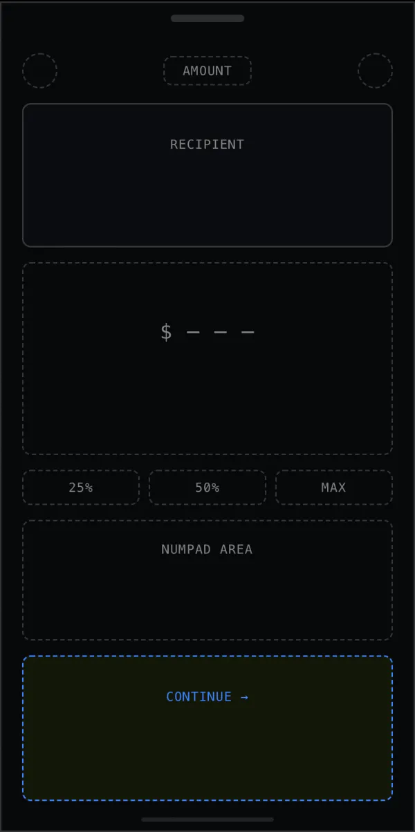
If it works in dashed boxes, it works. 4 frames, pre-colour, pre-type.
Click anywhere.
Ten screens, fully wired: tap the balance, swap a token, send to a contact. The same single accent guides every action.
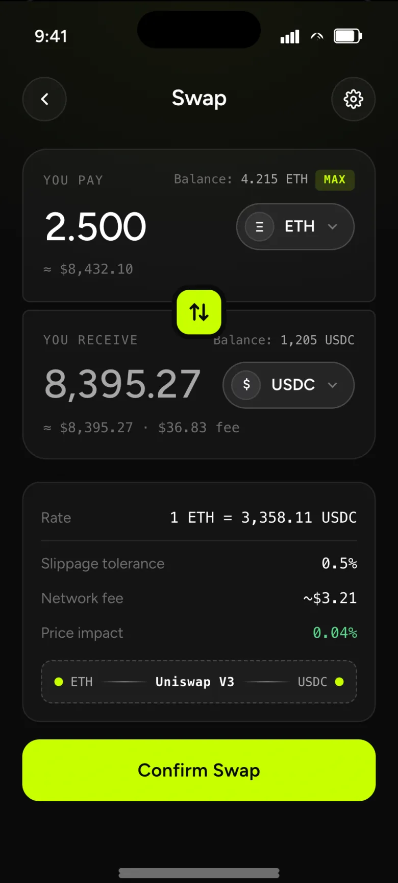
Swap · idleTwo cards, a rotating button; route, slippage and impact above the CTA.
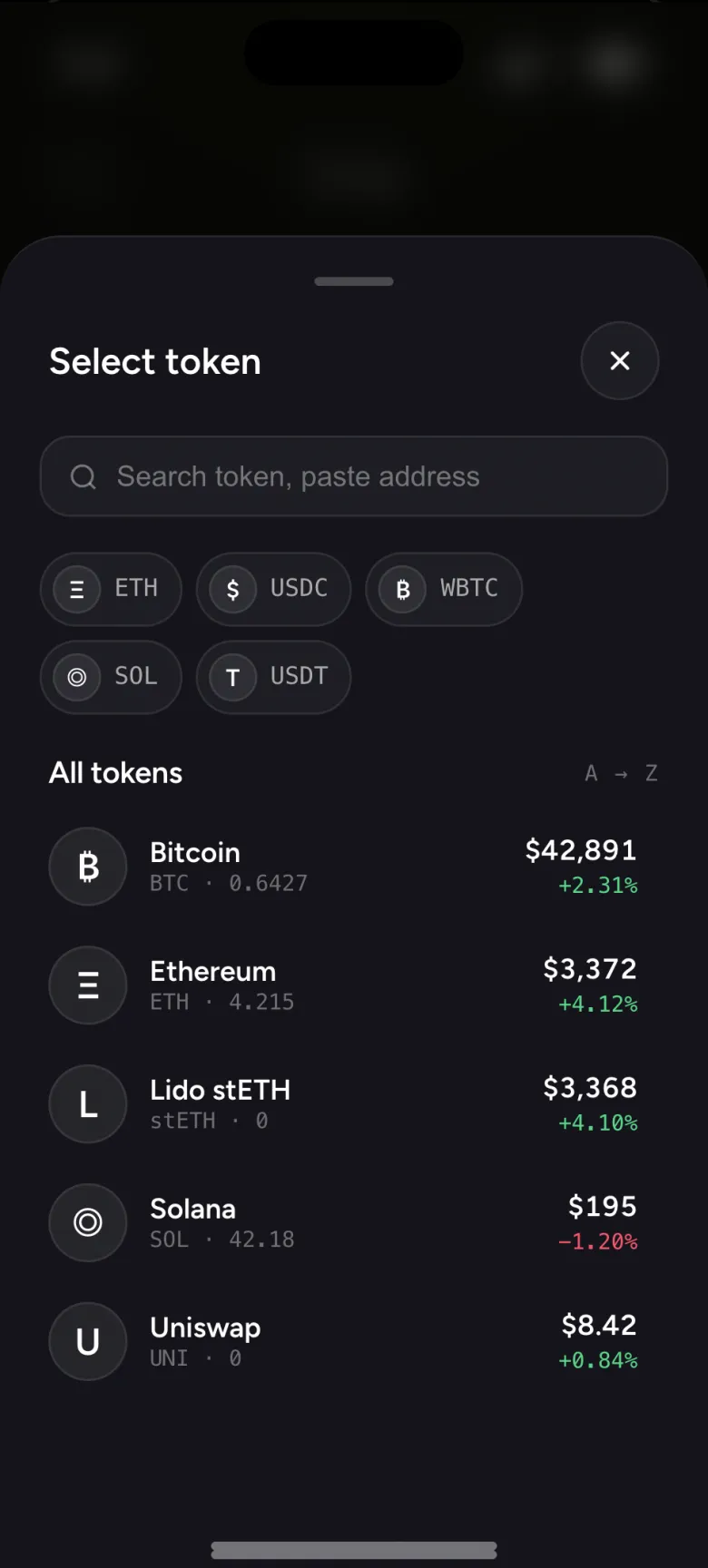
Token selectBottom sheet: search, quick picks, sorted list.
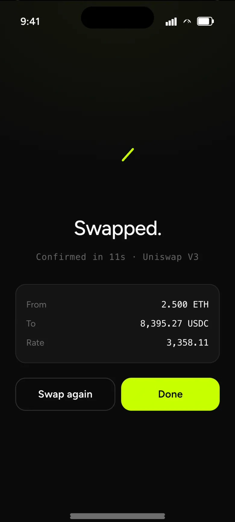
Swapped.The same drawn check, the pair as proof.
opens in a new tab
Every prototype screen
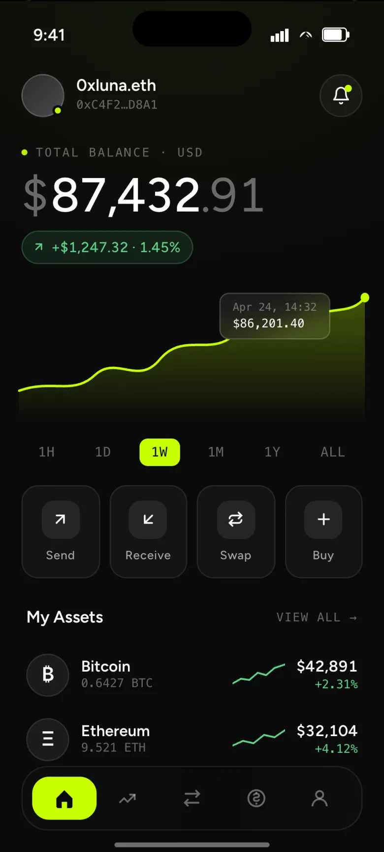
- Portfolio · home — balance is hero, the chart is glanceable, four primary actions one tap away.
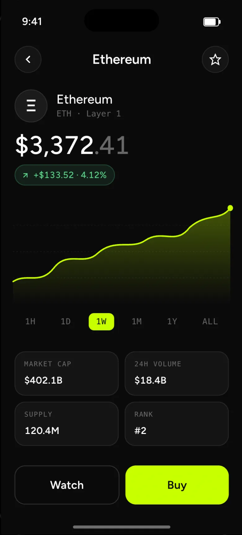
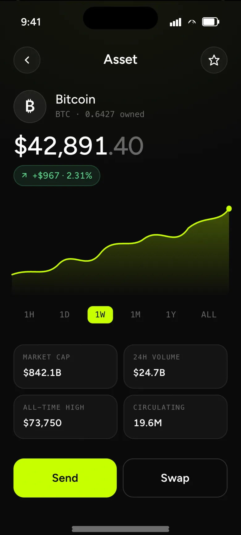
- Asset · Bitcoin — a focused chart, key stats in two columns, transactions below.
- Send · recipient — paste, scan QR, or pick a contact; validation happens before you can continue.
- Send · amount — numpad-first input, quick percentage chips and a fiat preview that flips on tap.
- Send · confirm — recipient, amount, network fee, total — the truth, in one screen.
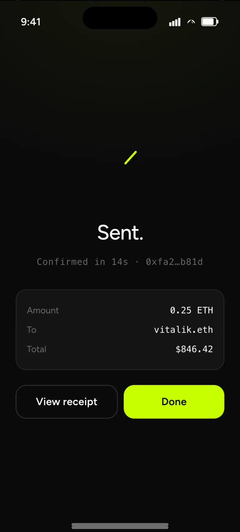
- Send · success — a drawn checkmark, a transaction hash, two next-actions.
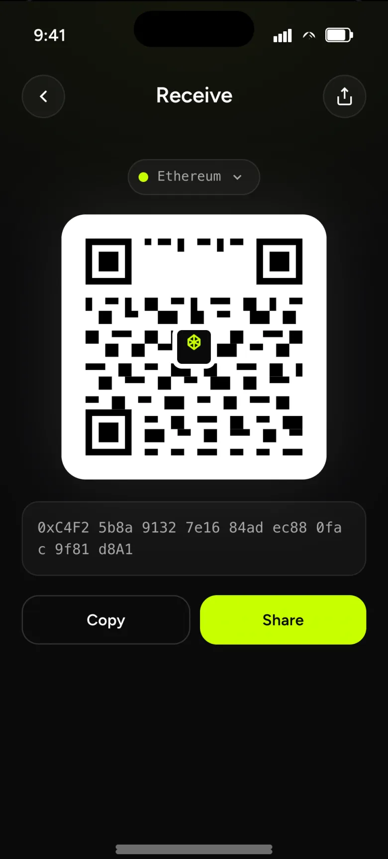
- Receive · QR — network selector at top, address with copy and share below.
- Swap · idle — two cards stacked, a rotating button between; route, slippage and impact above the CTA.
- Swap · token select — bottom sheet with search, quick-pick chips and a sorted full list.
- Swap · success — the same drawn checkmark, this time with the swap pair as proof.
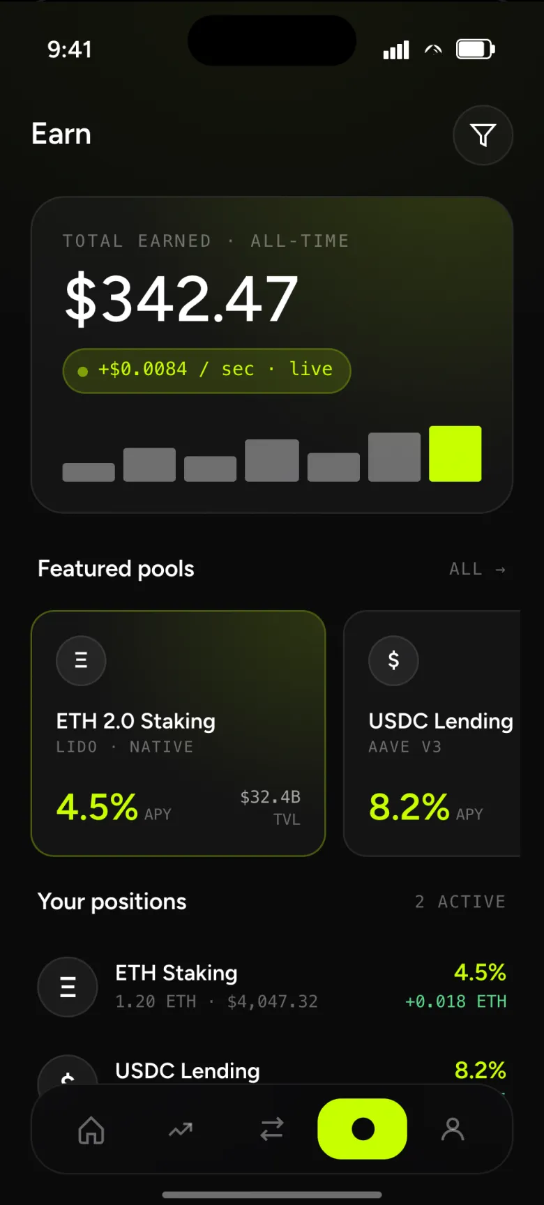
- Earn · overview — a live ticker turns yield into a heartbeat; featured pools, then your active positions.
Every screen, every state.
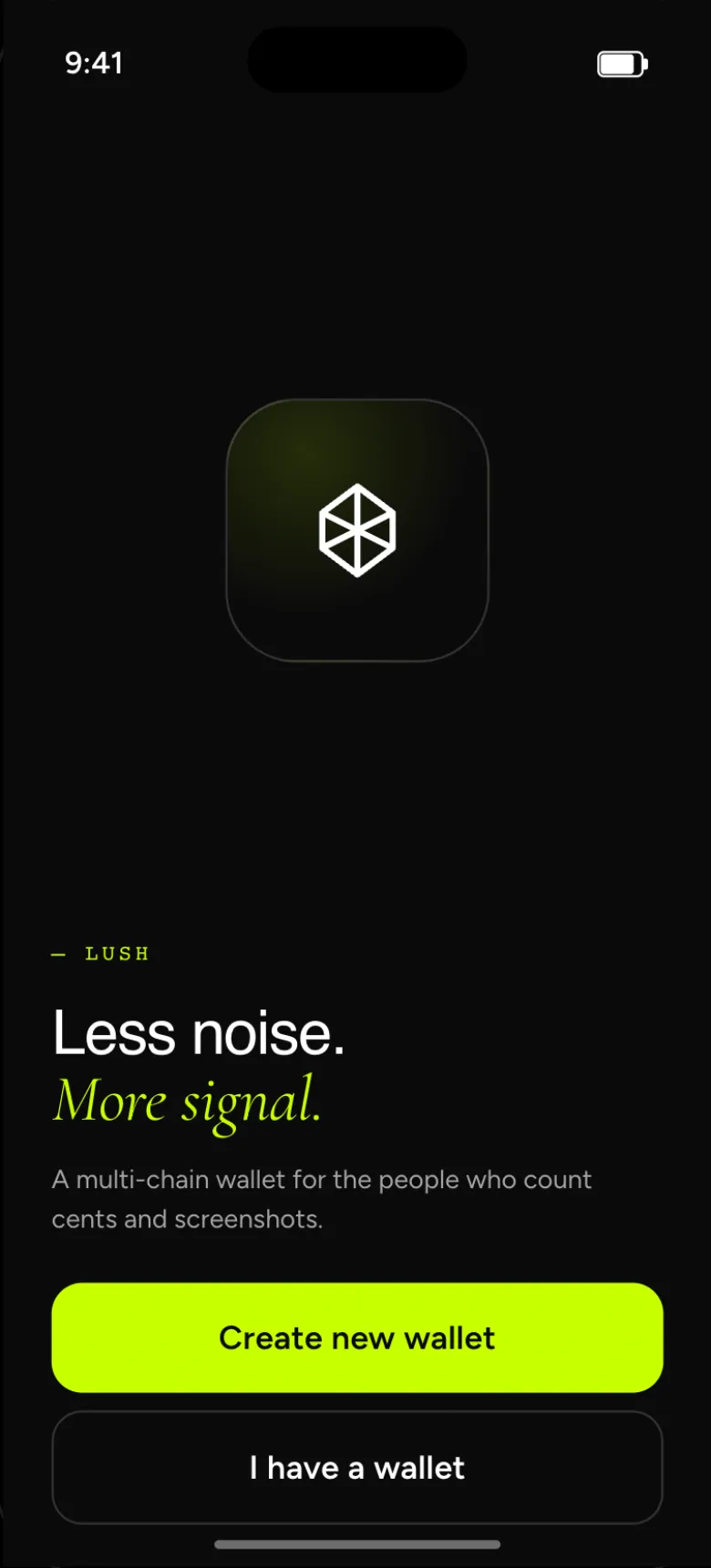
The seams between flows, not just the headlines — starting with five onboarding screens from welcome to passcode.
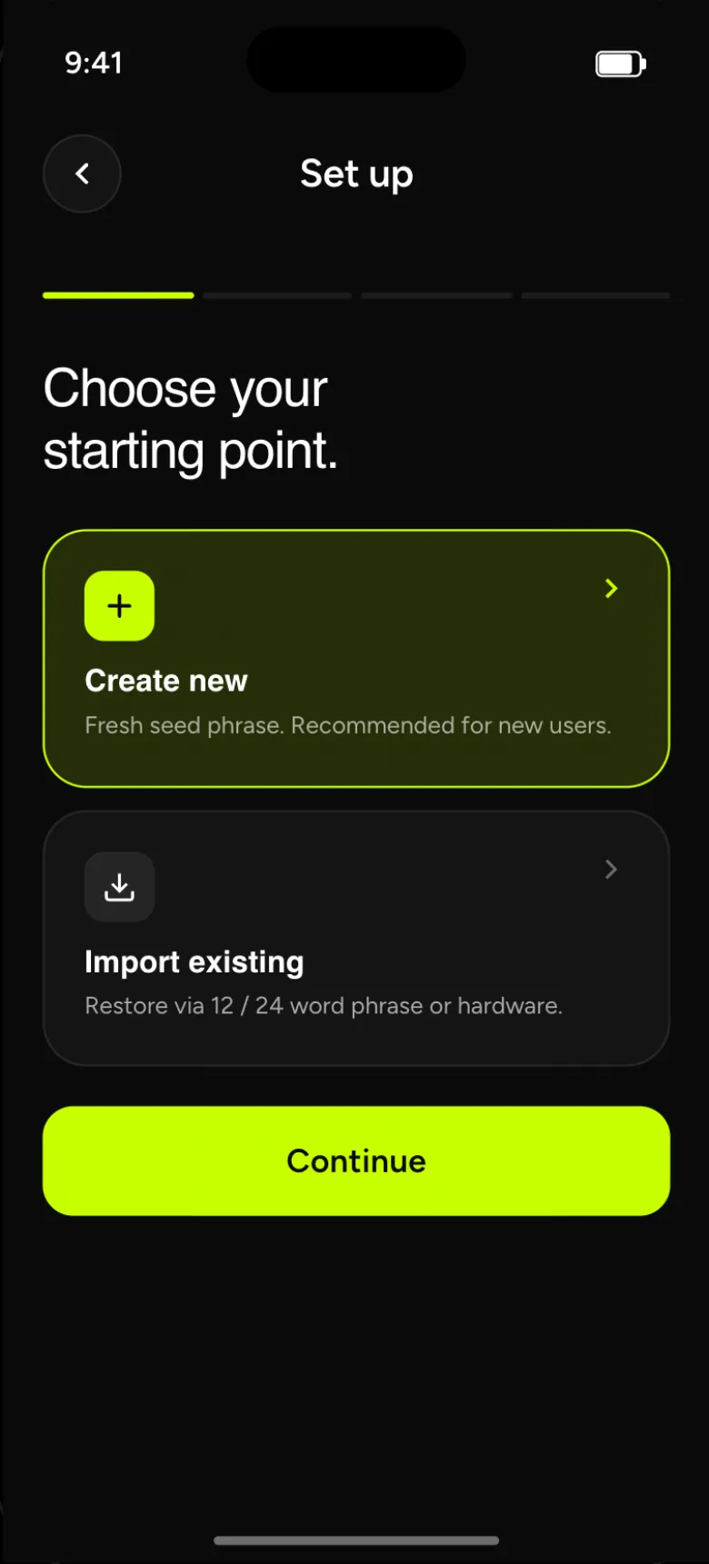
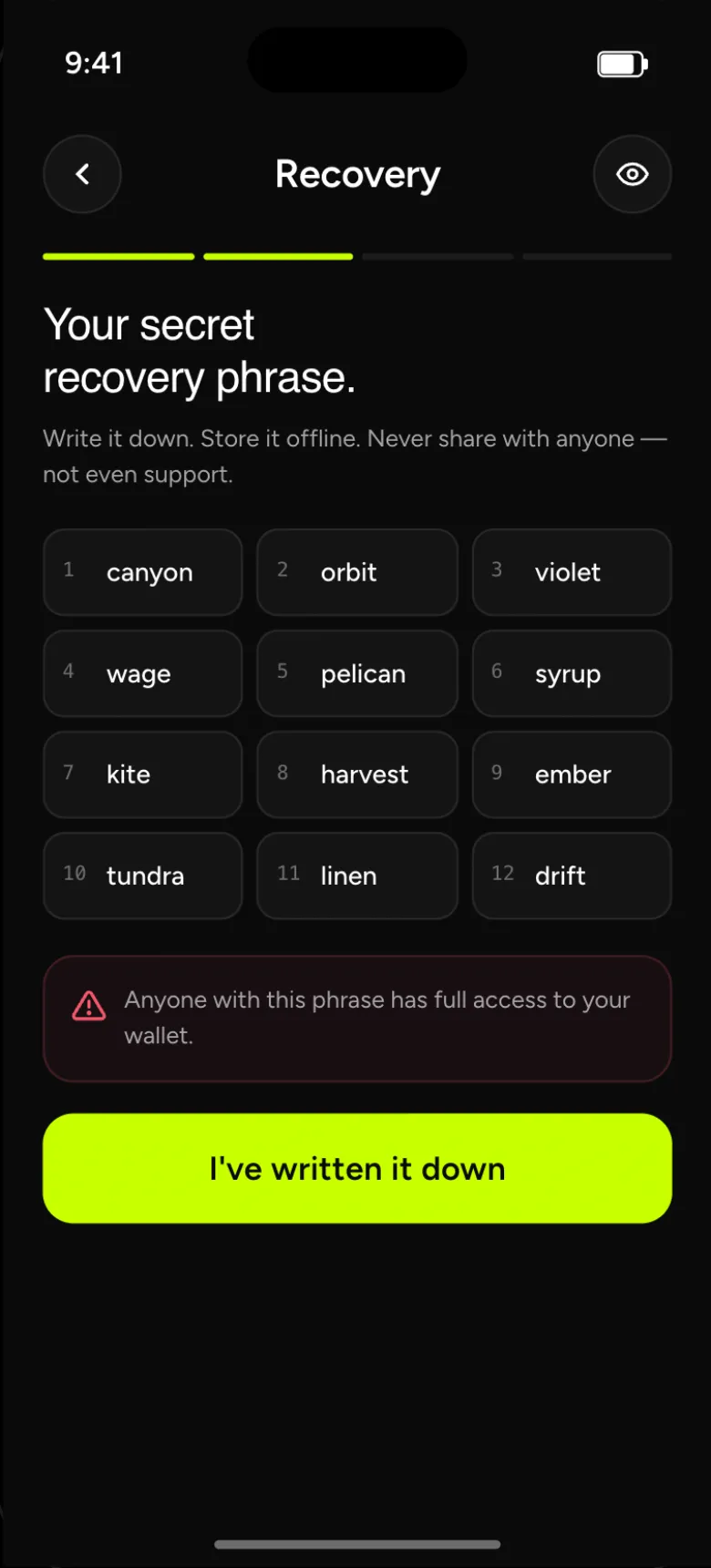
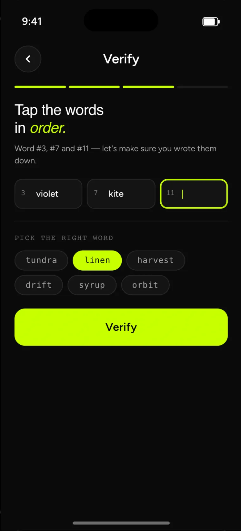
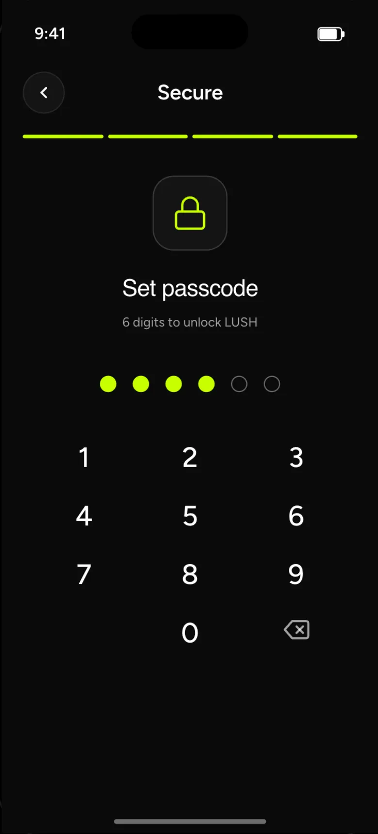
Empty, loading, failed, short. Designed, not left.
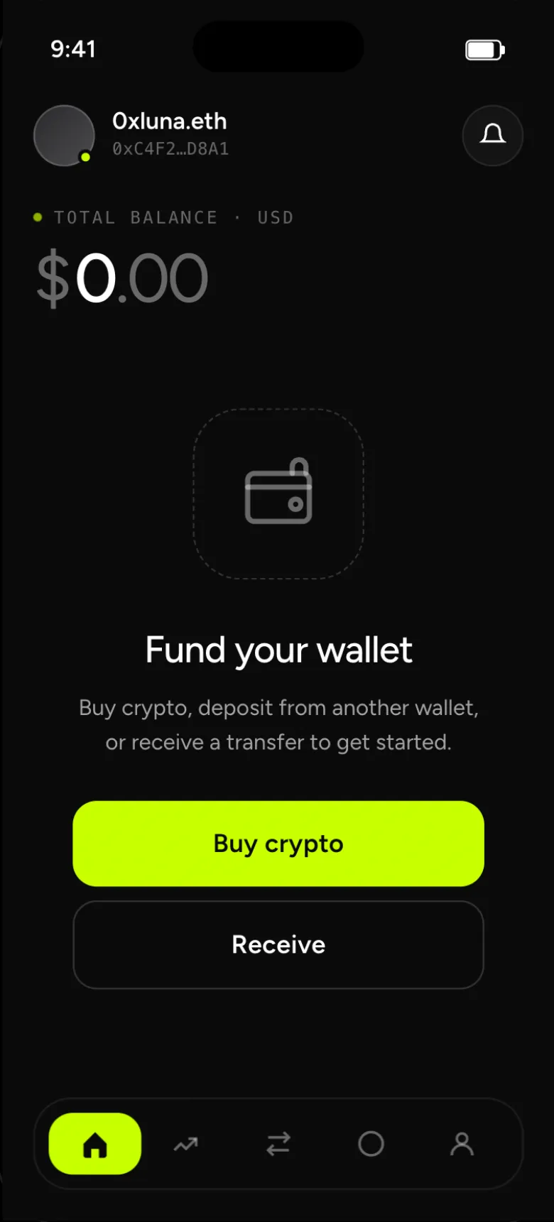
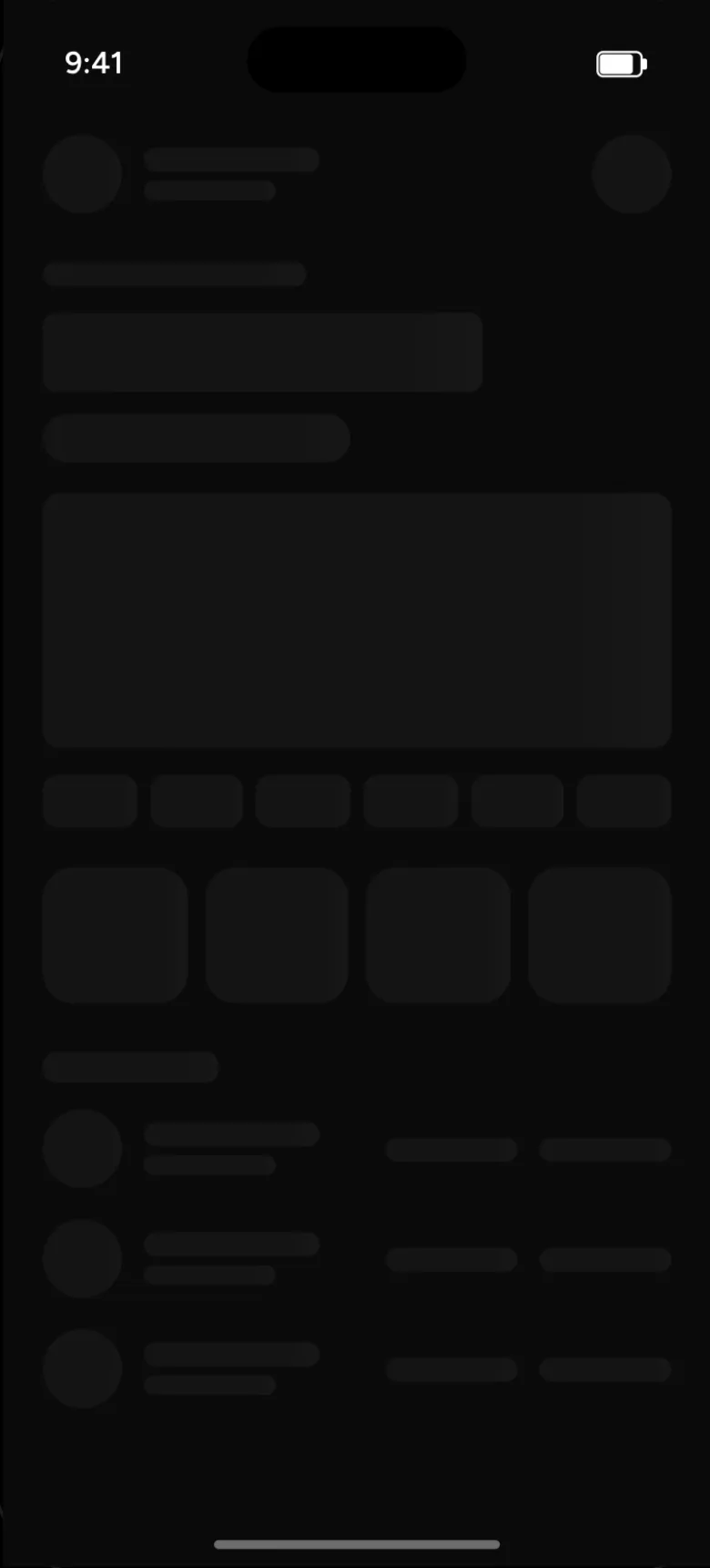
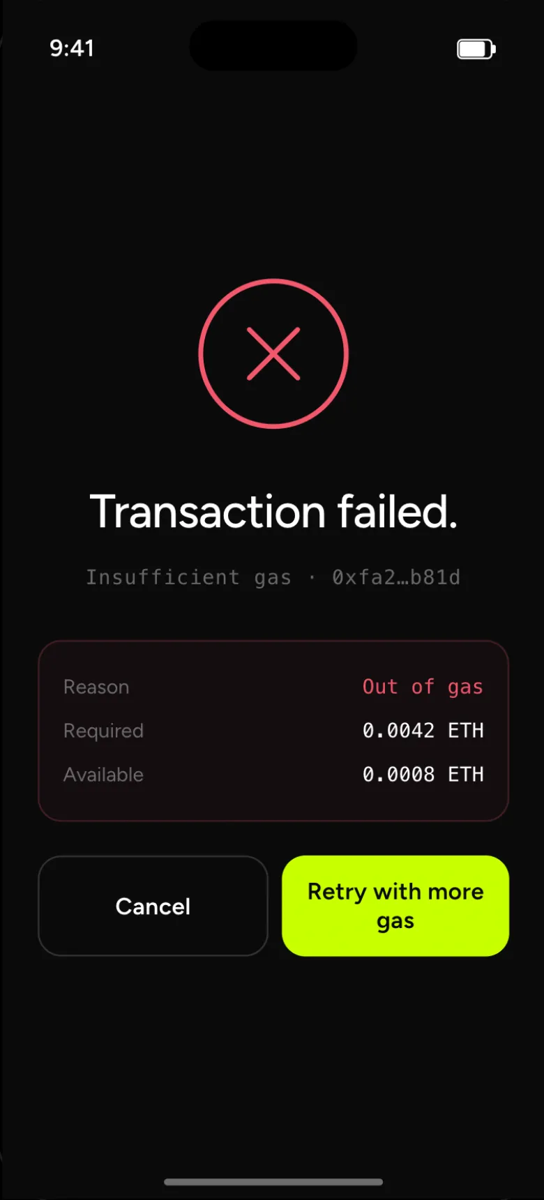
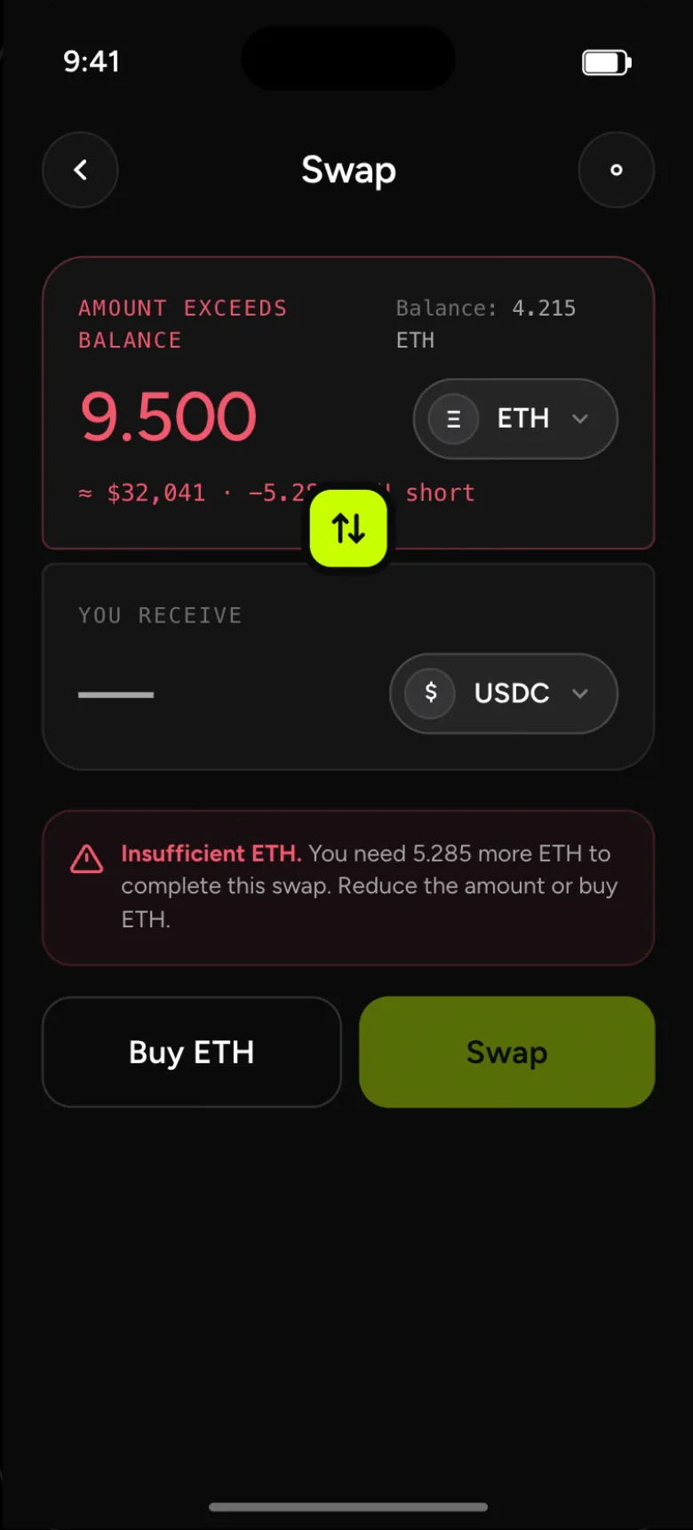
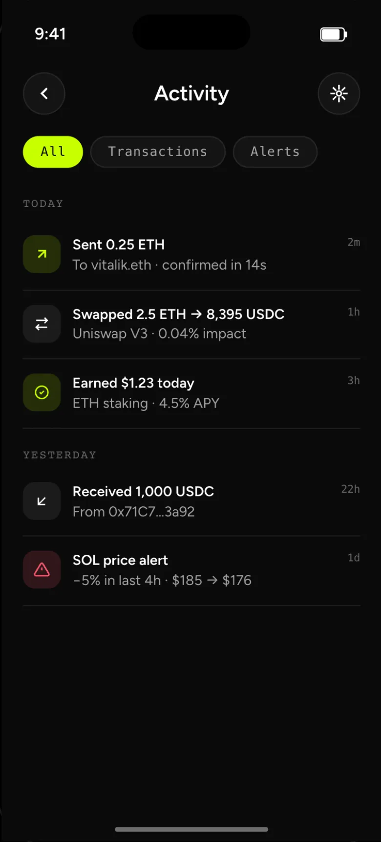
The detail behind every headline screen.
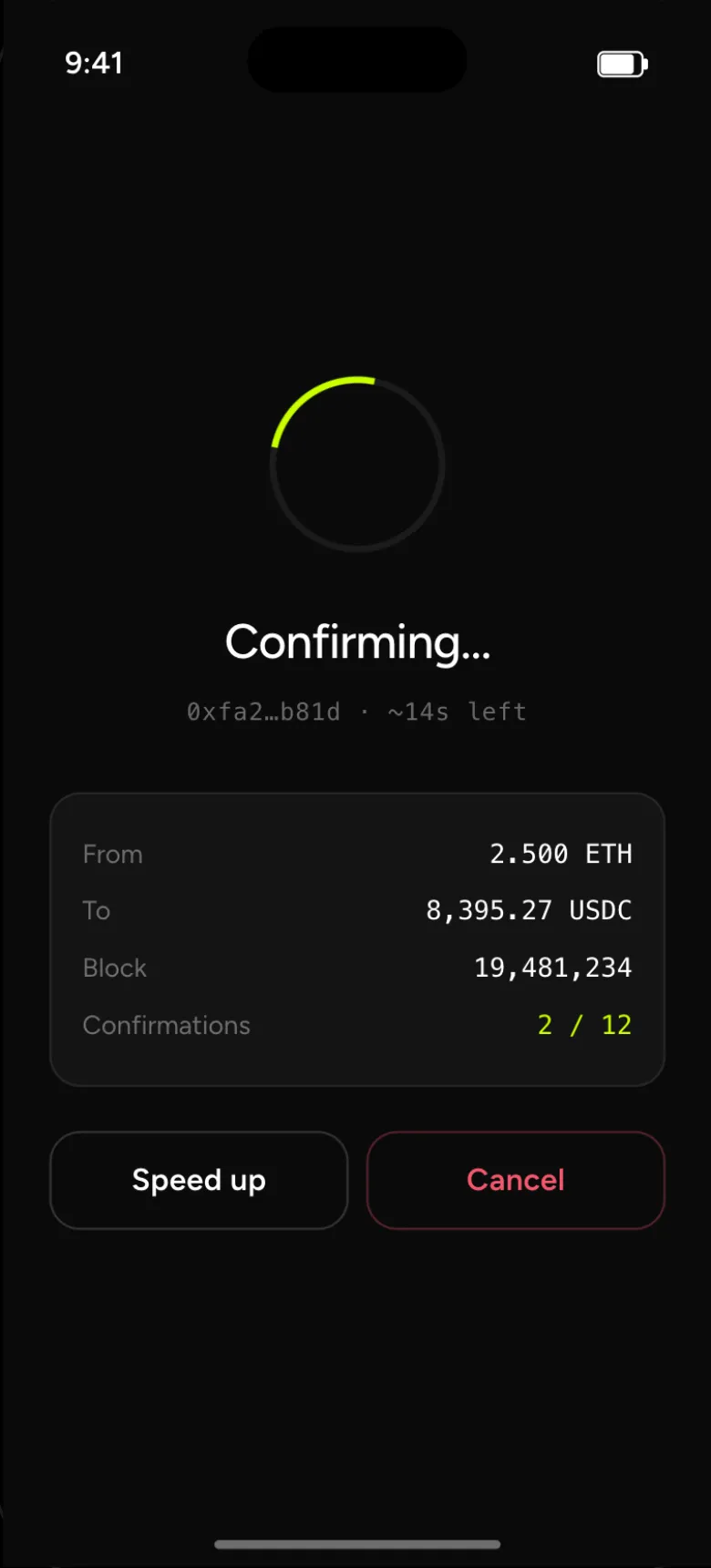
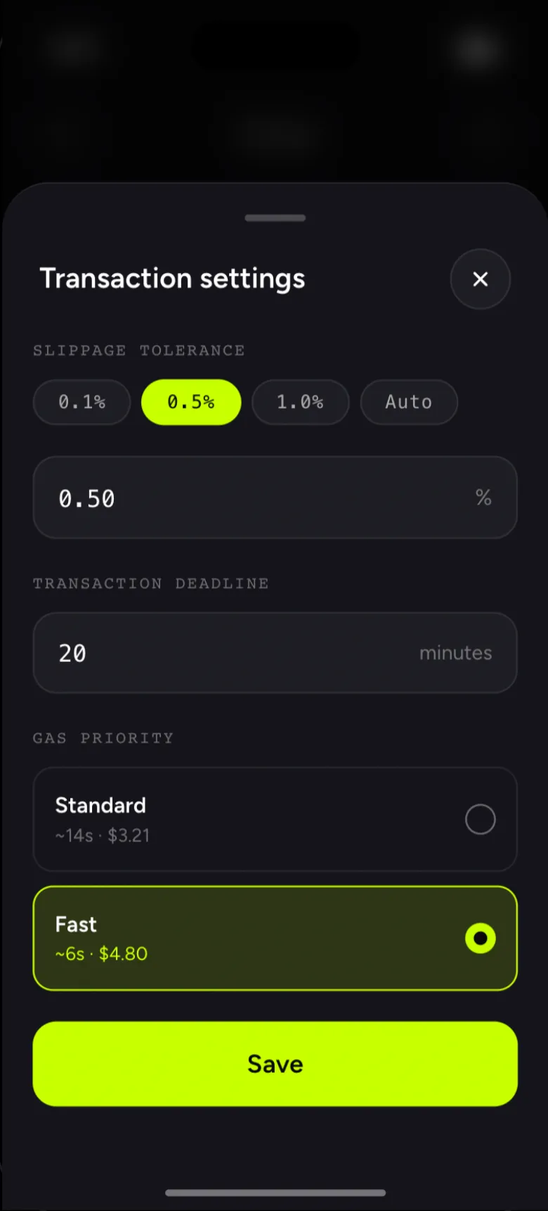
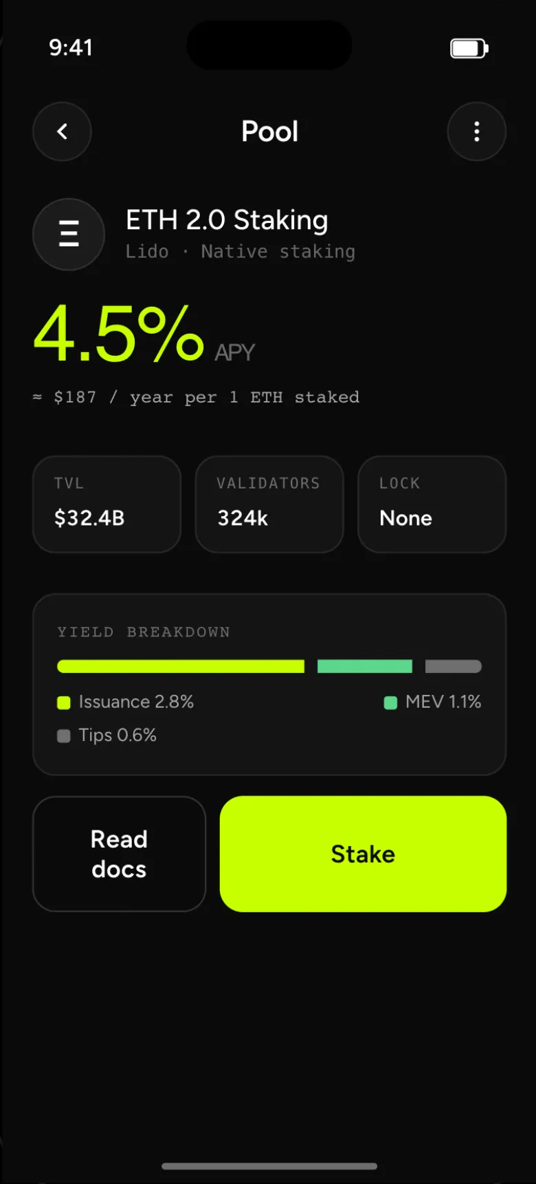
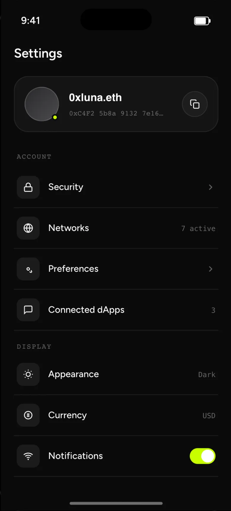
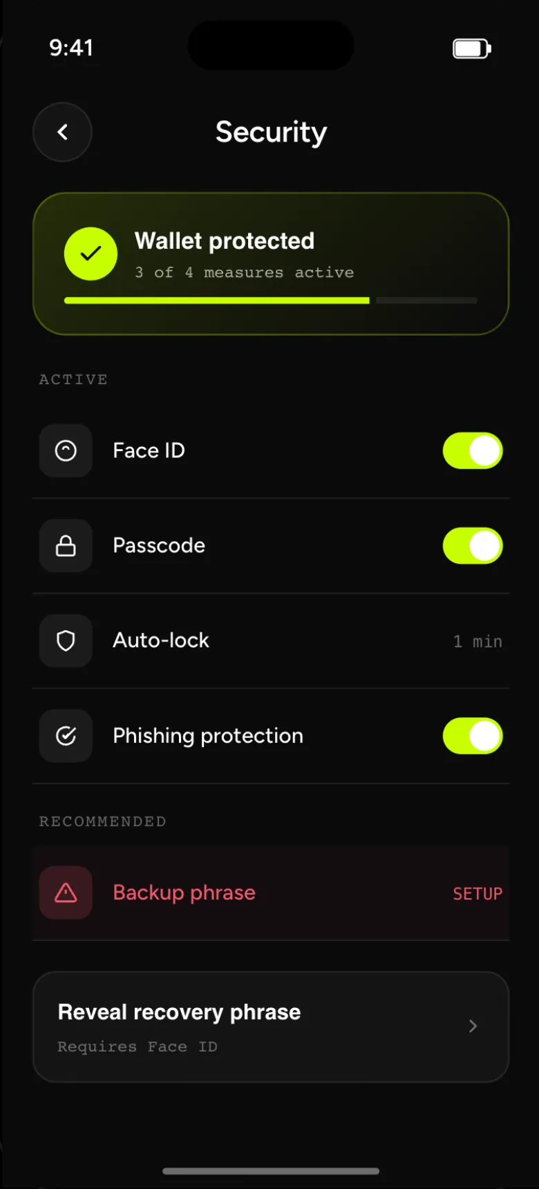
Pending transactions, slippage, staking, networks — then markets, token detail, settings and security.
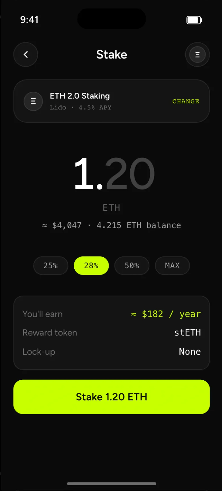
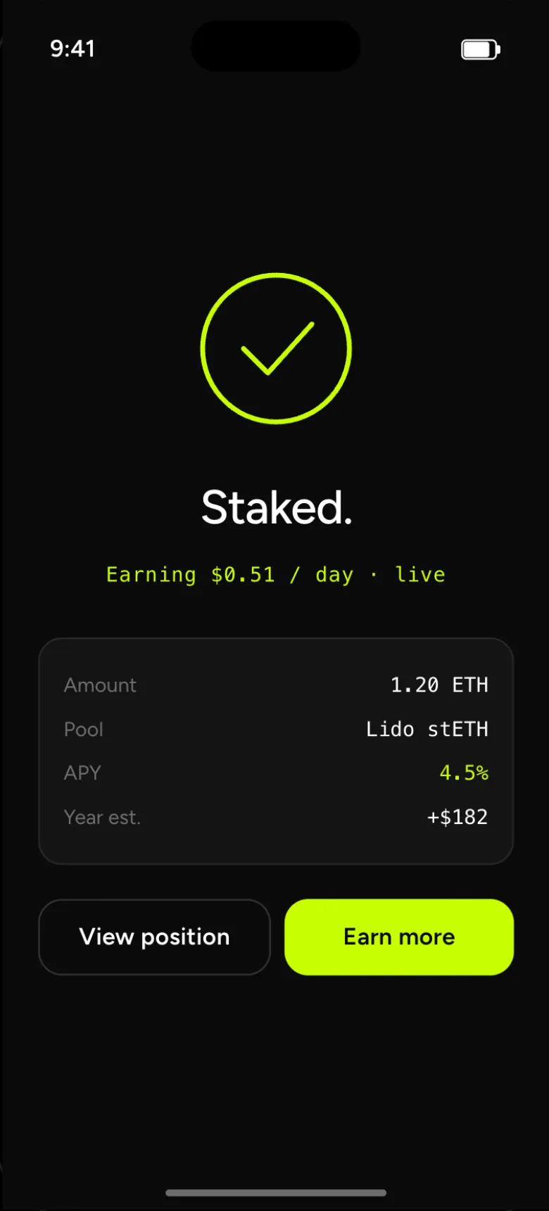
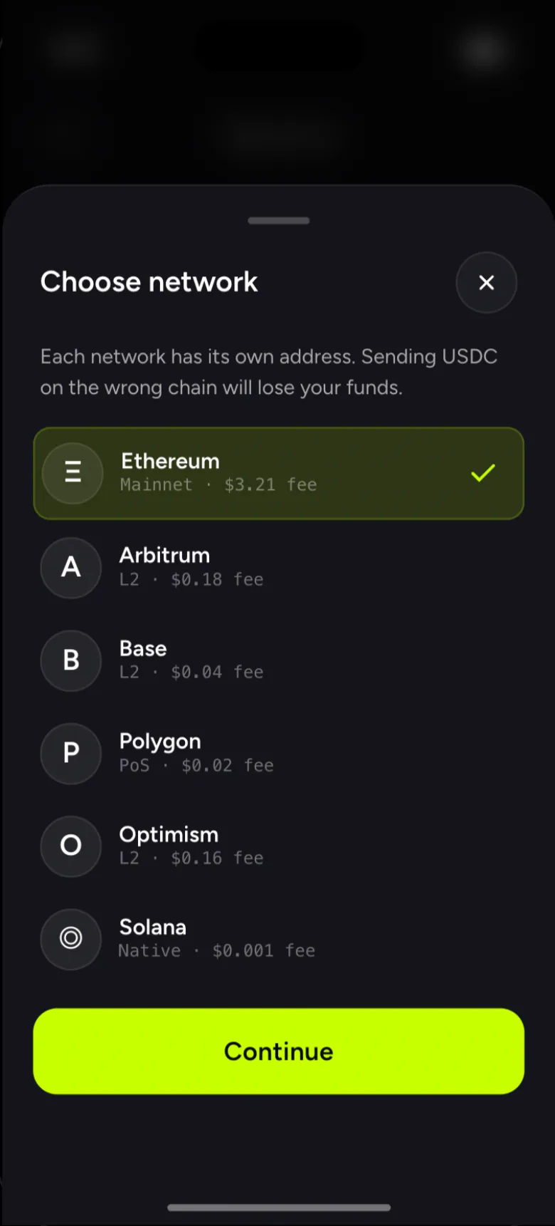
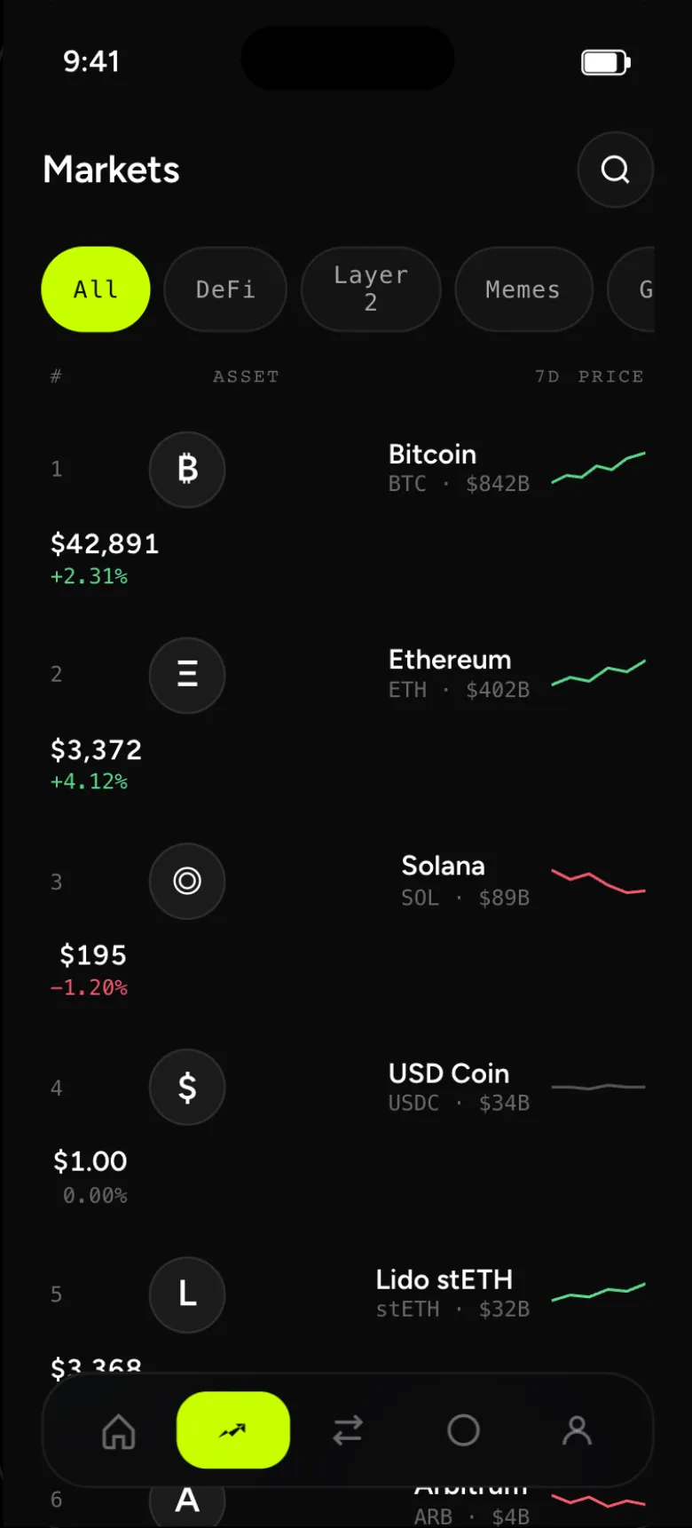
Six patterns, one rhythm.
Every motion has a function: confirm, locate, connect, predict. 200–320 ms on cubic-bezier(0.4, 0, 0.2, 1).
Tabular ticker
Numbers shift; the layout doesn’t.
Live pulse
Two rings mark anything real-time.
Skeleton shimmer
Reserves space while data lands.
Drawn checkmark
Ring, then check. Earned, not given.
Bottom sheet
The iOS curve for every modal.
Fade + slide
Between every flow step.
Motion spec
- 01 · Counter — tabular ticker. Tabular numerals + 80 ms updates. Numbers shift, the layout doesn’t. Used on every balance and yield surface.
- 02 · Pulse — live indicator. Two staggered rings, 2 s loop. Marks anything that updates in real time — balance, yield, gas.
- 03 · Skeleton — loading shimmer. 1.6 s gradient sweep over surface-1. Reserves space, keeps the layout calm while data lands.
- 04 · Success — drawn checkmark. Ring draws first (700 ms), check follows (400 ms, 0.6 s delay). Earned, not given.
- 05 · Bottom sheet — modal slide-up. 320 ms cubic-bezier(0.4, 0, 0.2, 1) — the iOS curve. Token select, network pick, settings — all use this.
- 06 · Page transition — fade + slide. Outgoing screen translates 8 px left at 0% opacity, incoming reverses. 320 ms. Used between every flow step.
The system, made strict.
One accent, two functional colours, neutrals, three families. Build one screen — get a hundred consistent.
Space Grotesk for display and headings, Inter 14/22 for body, JetBrains Mono for the live ticker.
Primary · accent, secondary · surface, outline · mono, ghost · dashed.
- 1Base cardbg · neutral
- 2Glass cardblur(20) · 7% white
- 3Accent panelfeatured · attention
Type specimen
- Display · Space Grotesk 500 · −0.03em — “$87,432.91”.
- Heading · Space Grotesk 600 — “Less noise. More signal.”
- Body · Inter 400 · 14/22 — glanceable, always tabular, never decorative — designed to be read in 0.4 seconds while waiting for an Uber.
- Mono · JetBrains Mono · ticker — “+$0.0084 / sec · LIVE”.
30 screens · 1 accent · 0 decoration.
More signal.
Need a similar build for your team? Lush took about seven hours, solo + AI — from research to a shipped prototype.
More projects
All projects
Previous case: EngiBoard — Native tracker · also VIZI — platform, design and build