Unicorn Brothers.
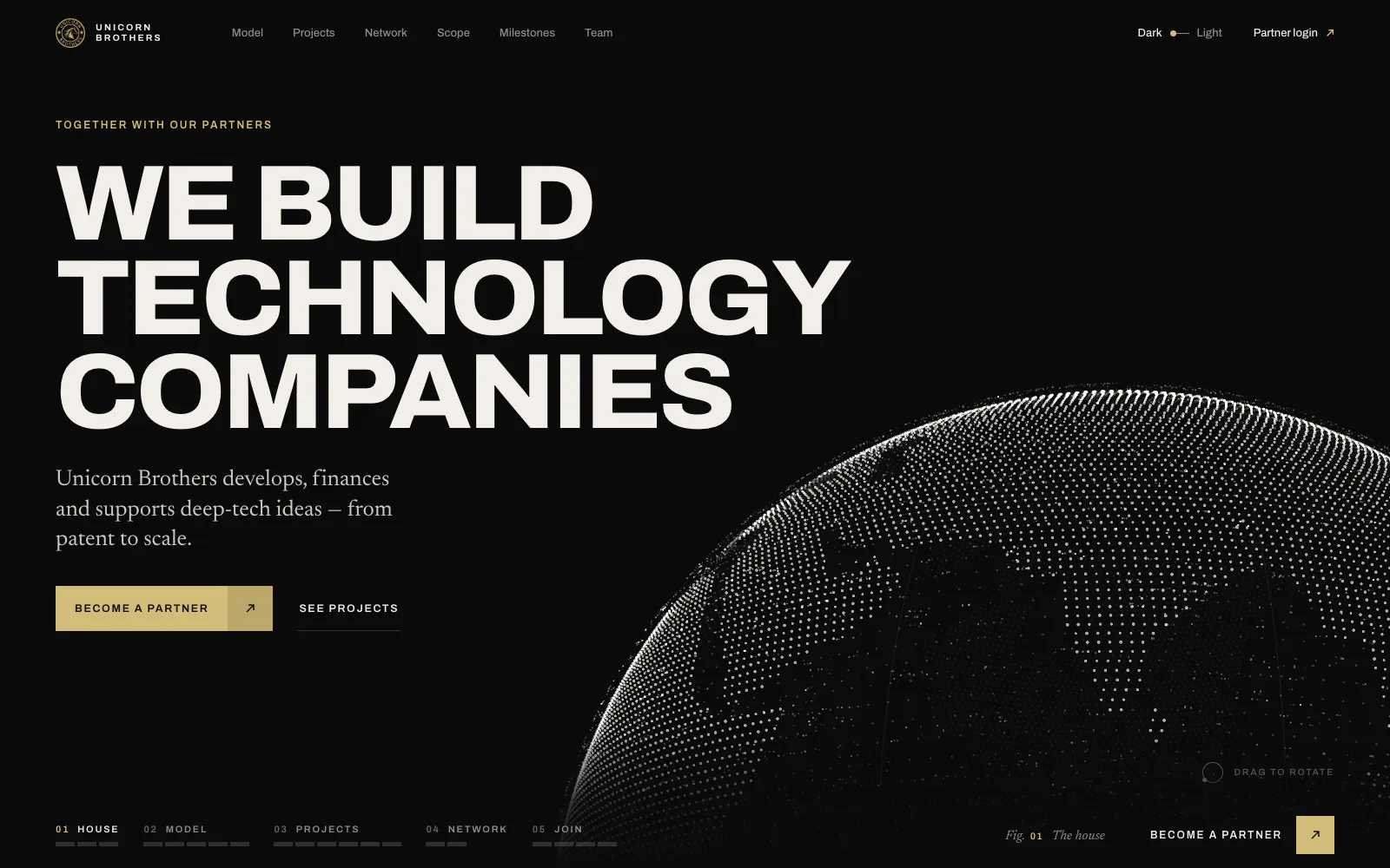
A house of deep-tech projects — Railwind, Neums, Solia — needed a site that tells one story: from patent to scale, together with partners. One continuous 3D scene carries the whole scroll.
Client project · design, 3D, build and admin · solo + AI
- What
- A new website for Unicorn Brothers, an India-based company that develops, finances and supports deep-tech projects with its partner network.
- Why
- The old Tilda site spoke about one project. The company is a house of several — and keeps adding more.
- My role
- Concept, narrative, 3D art direction, design, front-end, PHP back-end and admin. Claude as the design team and the engineering team.
- Result
- 3 concepts built as working pages · one picked and polished · an admin the client edits · news and articles with their own pages · not live yet
Not a landing for a product — a site for the house that builds products.
Read the full story
The work started as a plain job: rebuild the existing Tilda site as a PHP copy with a simple admin so the team could edit it themselves. That copy was done in a day — pixel-close, with pop-ups, news and a contact form.
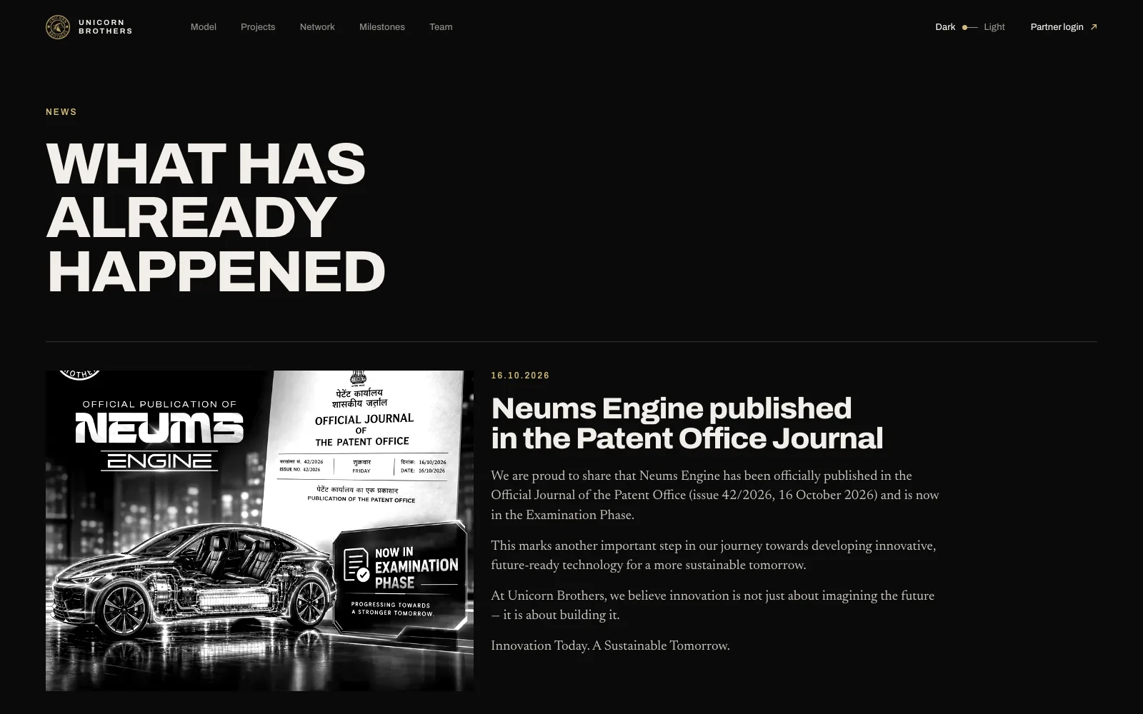
Then the real brief appeared. Unicorn Brothers is not one project. It is Railwind (electricity from passing trains), Neums (an electric motor, now published by the patent office), Solia (an AI companion) — and the next ones. The site had to say that in one breath and invite partners into the network.
So the second variant was designed from the business, not from the old page: one claim per screen, one continuous 3D scene that turns into each project, a partner network as a globe, and a single way in — open an account on the partner platform.
Three projects, one network, no single story.
Each project has its own field and stage. The site had to hold them all — and leave a seat for the next one without redesigning anything.
Railwind
Electricity from the air pressure of passing trains. Patent filings in four countries.
Neums
An electric motor. Published in the Patent Office Journal, now in examination.
Solia
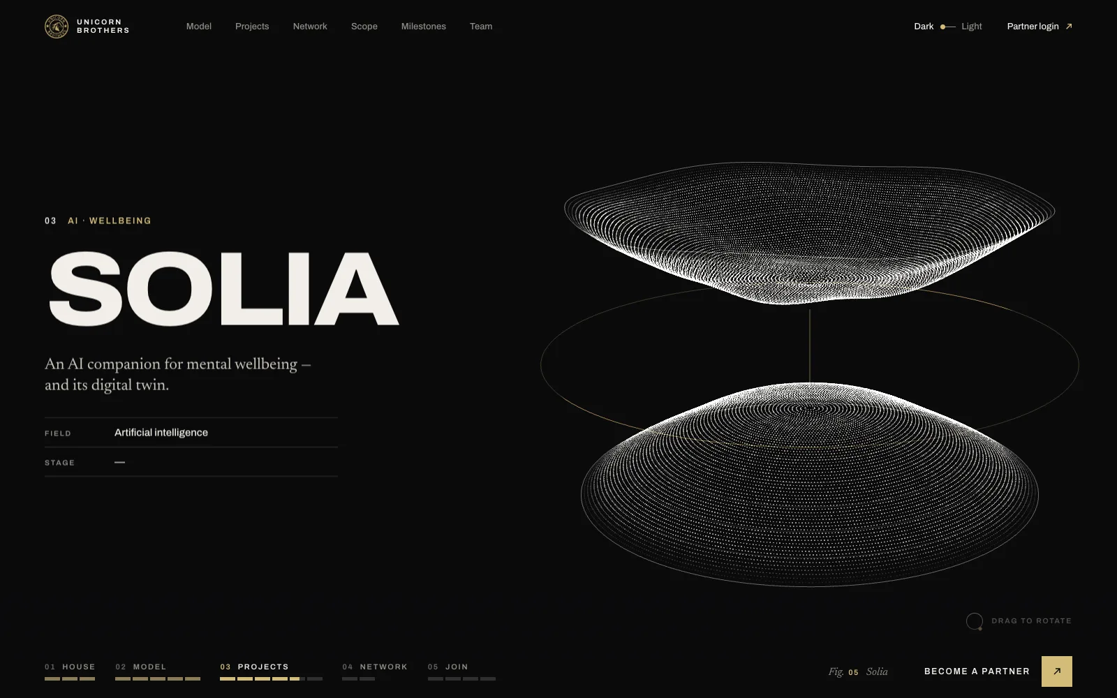
An AI companion and digital twin for mental wellbeing.
Next
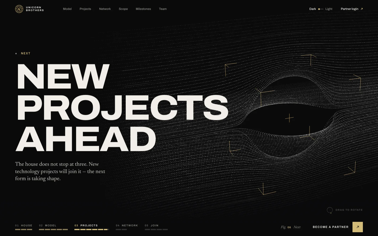
New projects will join the house. The form on screen is unfinished on purpose.
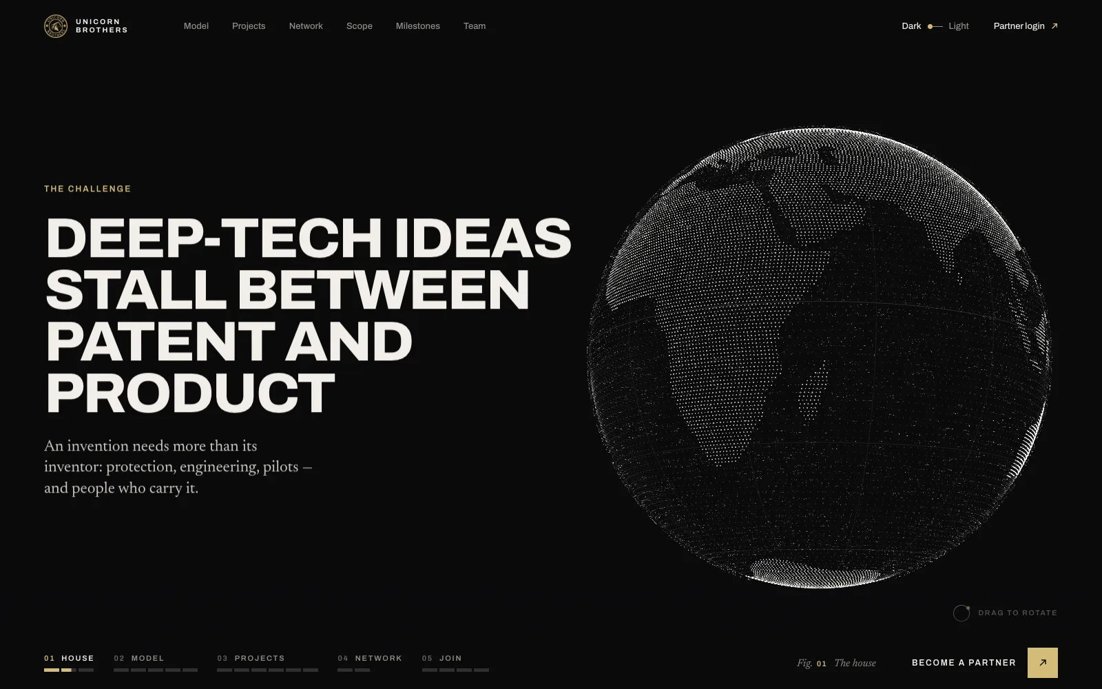
One scene, five chapters.
The page is pinned: the scroll drives one 3D object through House → Model → Projects → Network → Join. Every screen makes one claim.
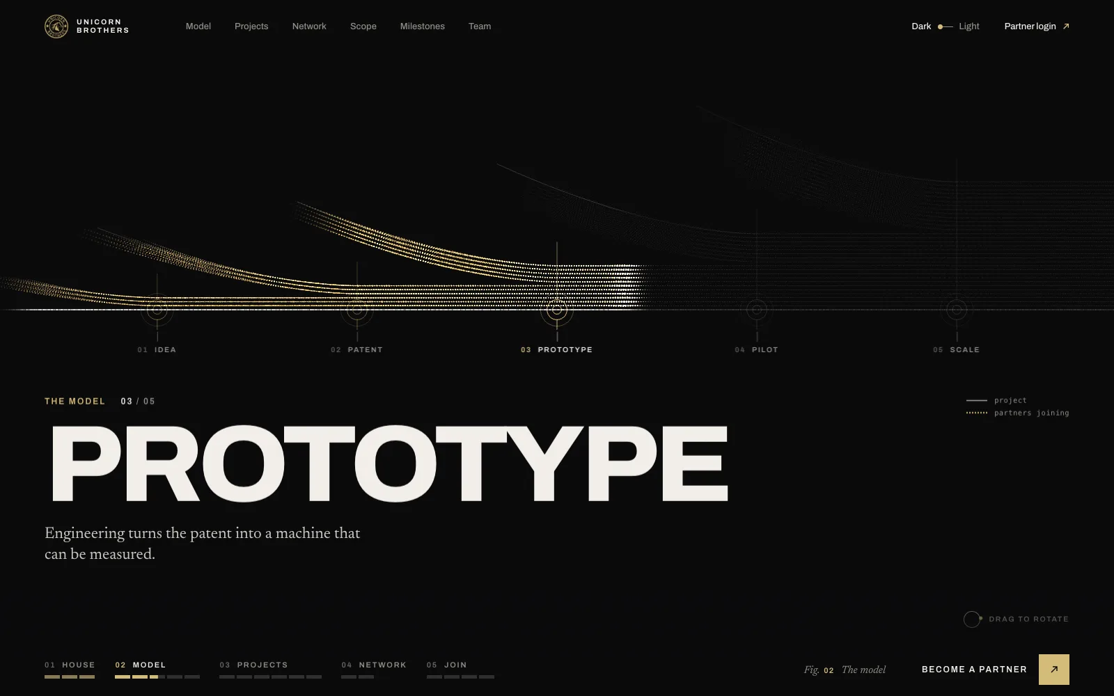
Model — how a project grows
A thin line of the project enters; at every gate rows of partners flow in and stay. 4 → 7 → 12 → 20 → 33. The flow is the model.
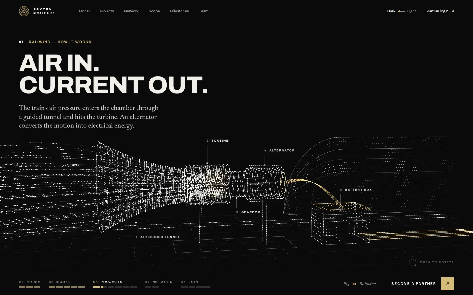
Projects — Railwind
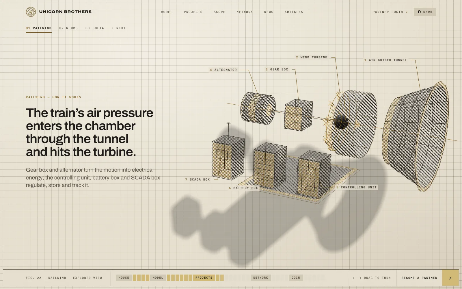
Air in, current out: the trackside unit drawn as a wireframe with the tunnel, turbine, alternator and battery box called out.
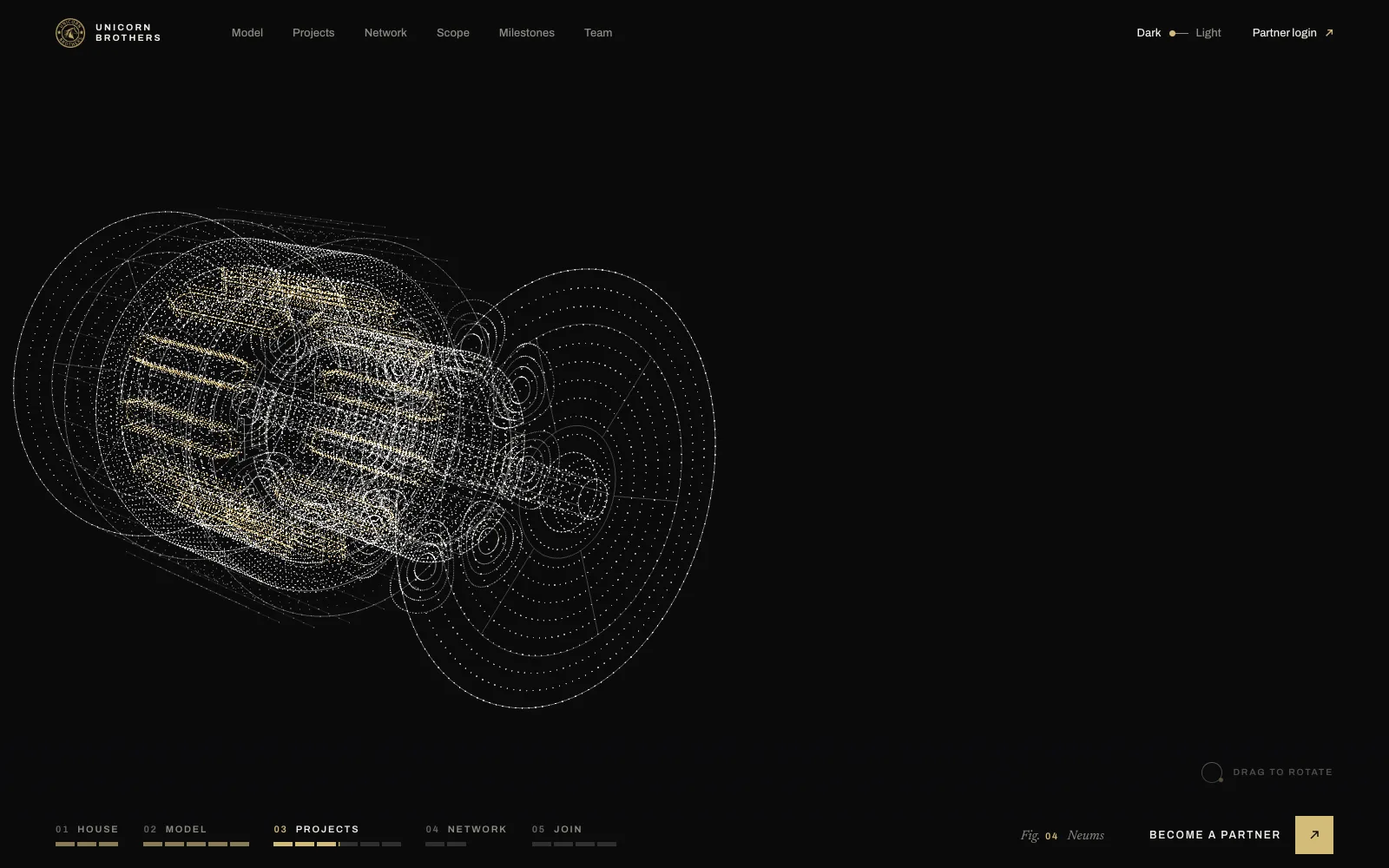
Projects — Neums
The same matter re-forms into each project. The motor is drawn in an exploded, measurable way, like an engineering sheet.
Projects — Solia
A form and its mirrored twin: the companion and the digital twin, without a single app screenshot.
Next — new projects ahead
The fourth form stays unfinished on purpose: the house does not stop at three.
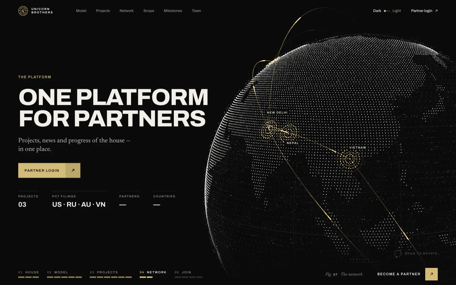
Network — the globe
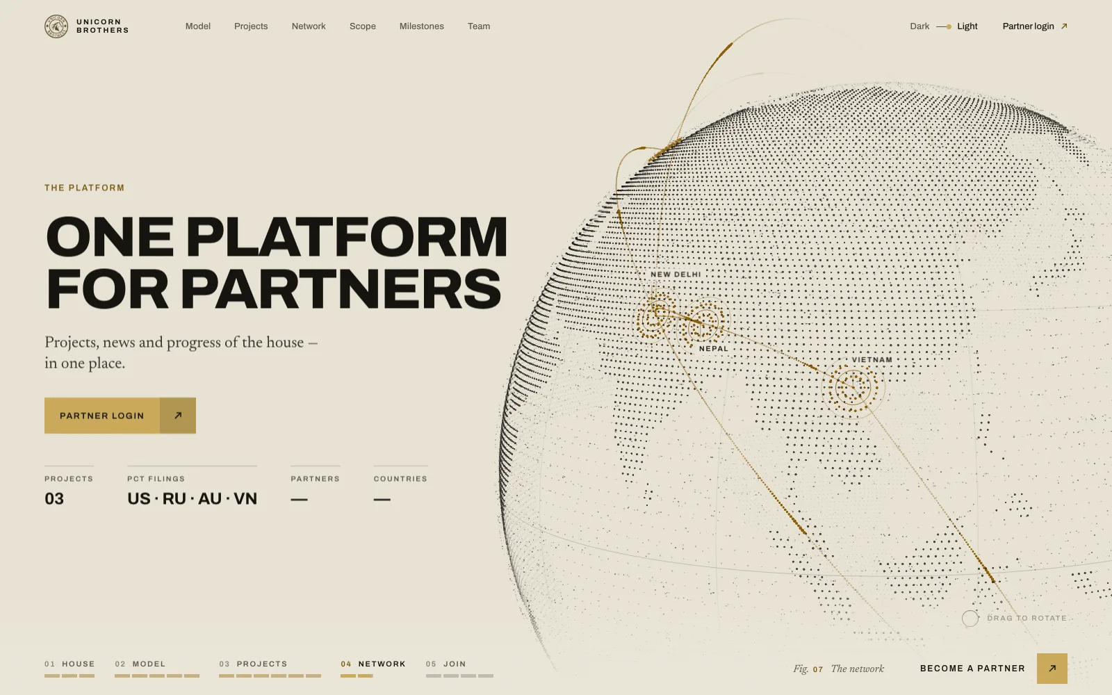
One platform for partners: the globe with New Delhi, the patent countries and the orbits between them.
Three renders of the same journey.
The narrative was fixed first. Then three directions rendered it, each as a working page with real scroll — so the client chose on live screens, not on boards.
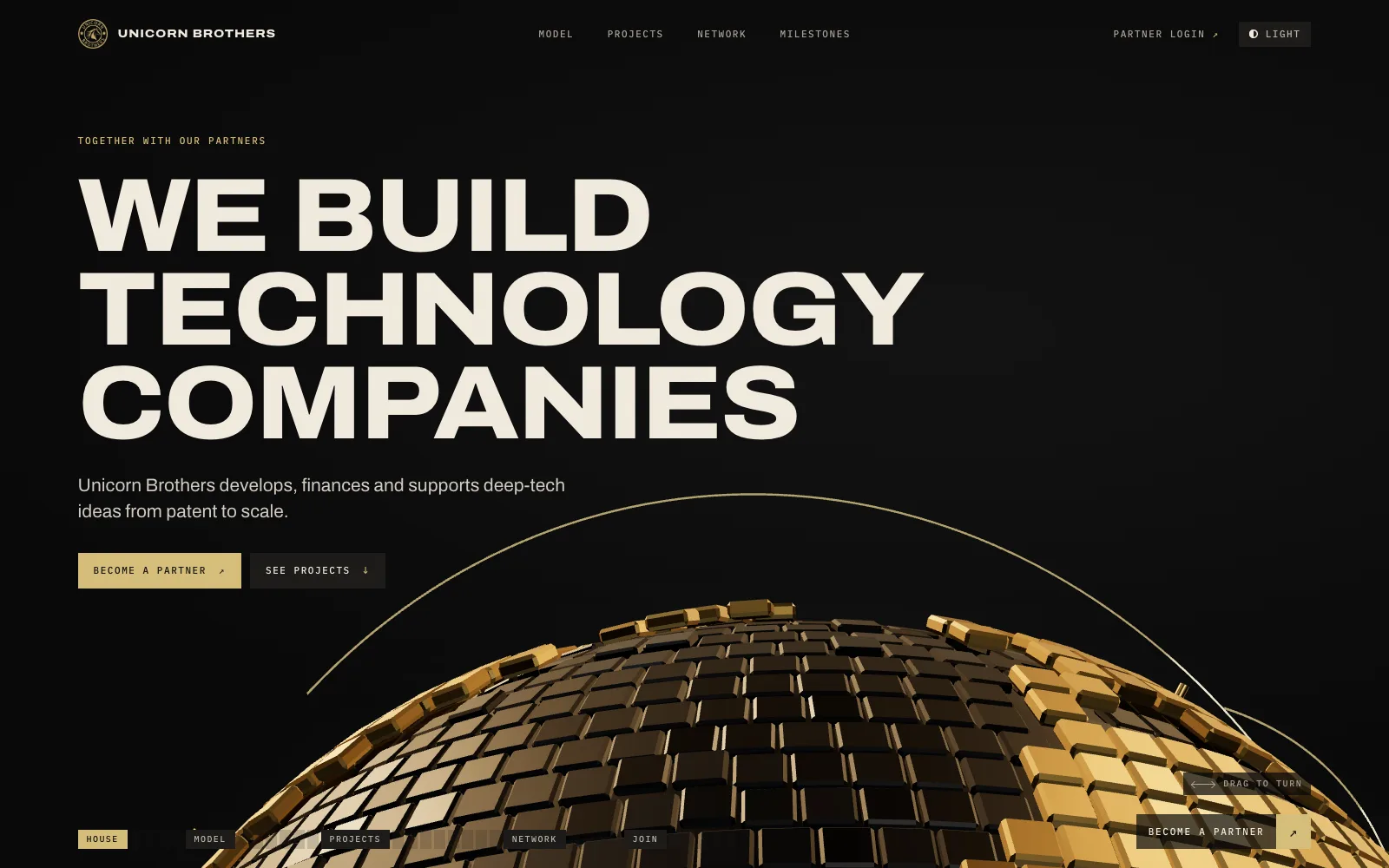
Matter
3,188 steel plates, one body of matter re-dealt into every form: globe, unit, motor, twin.
Blueprint
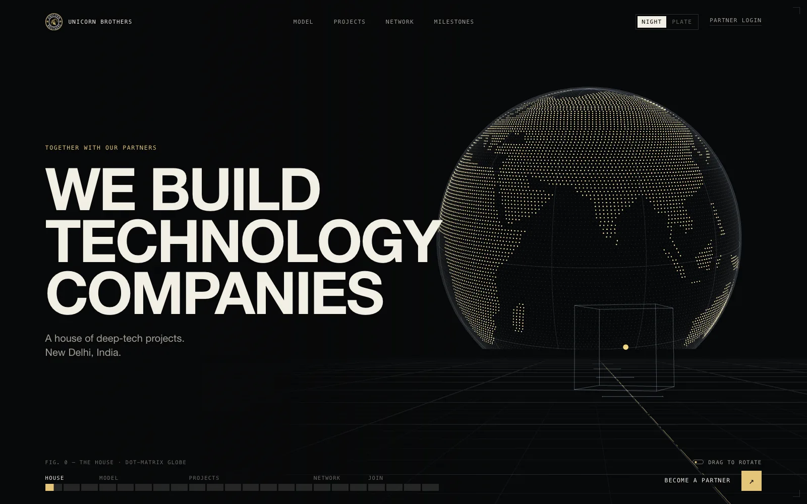
A dot-matrix globe and patent drawings. The light theme is literally a patent sheet.
Field
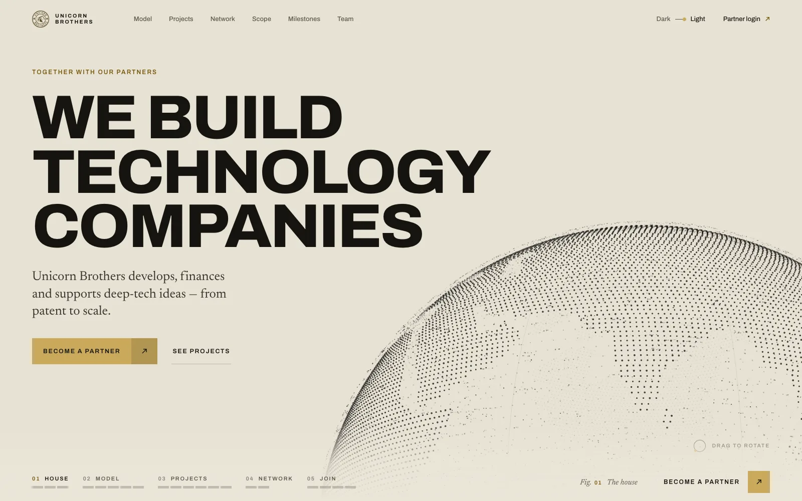
A particle field that flows around each form. Calm, airy, serif captions.
Dark stage, paper sheet.
Same scene, same copy. The dark theme is a stage with gold; the light one is a drawing on paper — frame, title block, hatched twins.
Then the page scrolls like a page.
Below the pinned scene: what the house works on, what has already happened, who is behind it — and one way in.
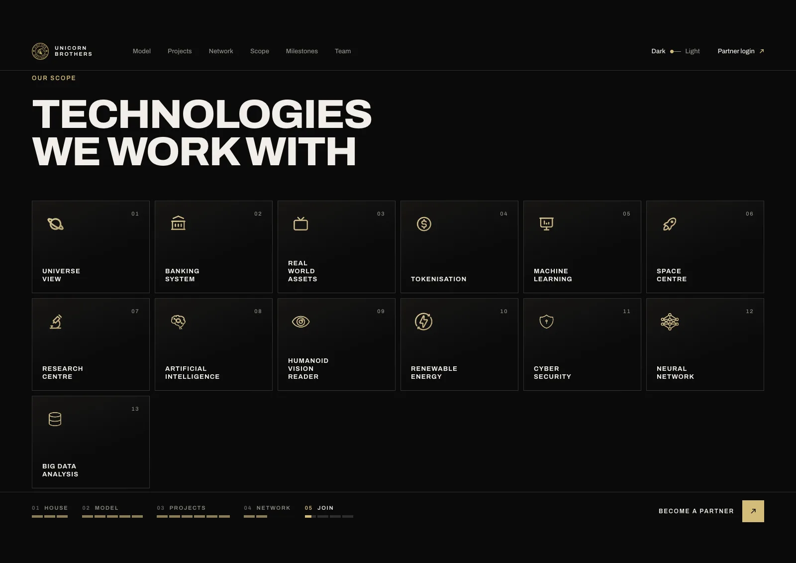
Thirteen directions
The client’s own icons, re-inked in gold through a CSS mask so they sit in the new palette in both themes.
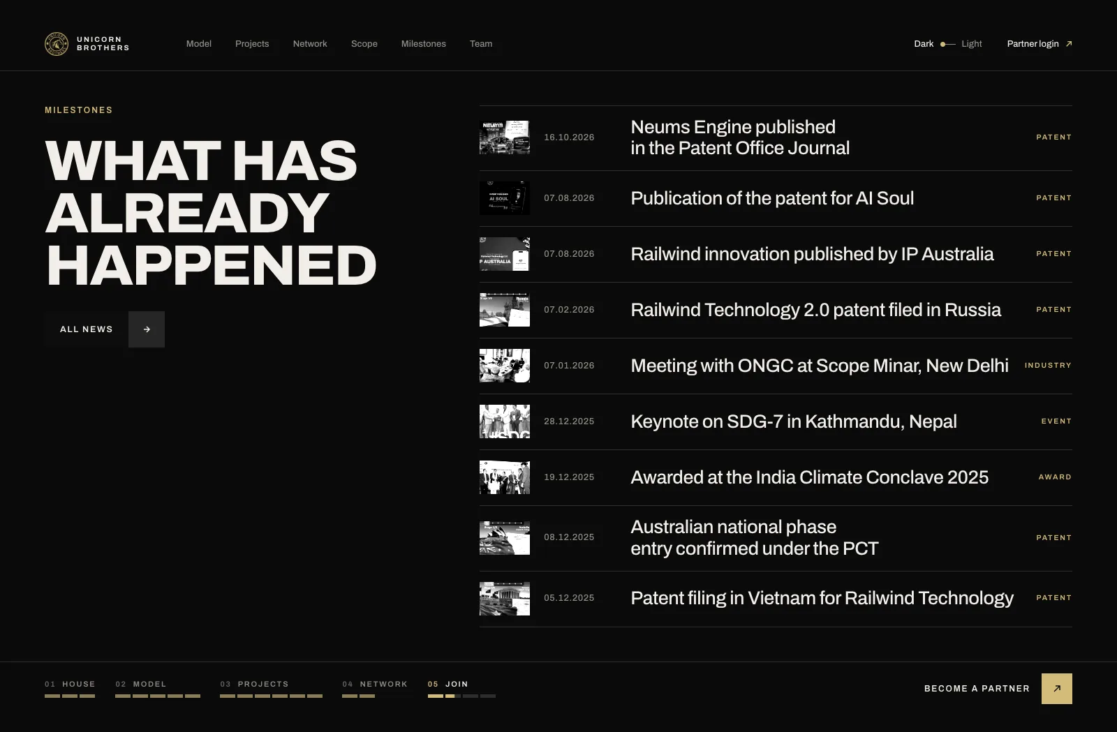
Milestones with pages
Every row opens its own news page. Hover shows the photo; the list stays a list.
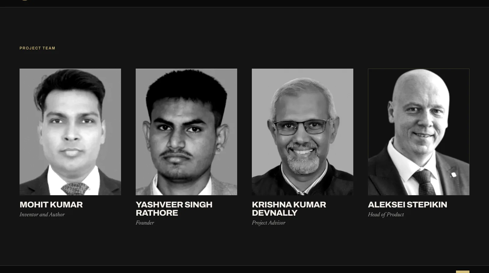
Four portraits
Black-and-white with a line screen, colour on hover. Same treatment for every photo on the site.
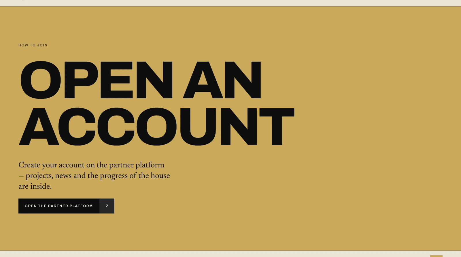
One block, one button
No “who are you” quiz, no four-step onboarding. Open an account on the partner platform — that is the whole call.
The same journey, held in one hand.
Text first, the scene below it; the model flow turns vertical; quality drops automatically when frames start to lag.
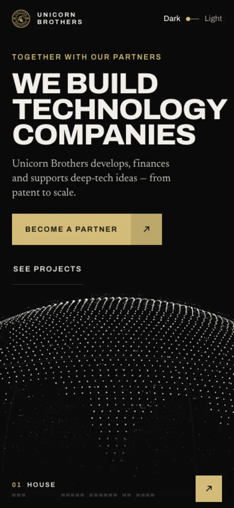
HouseOne claim, one button.
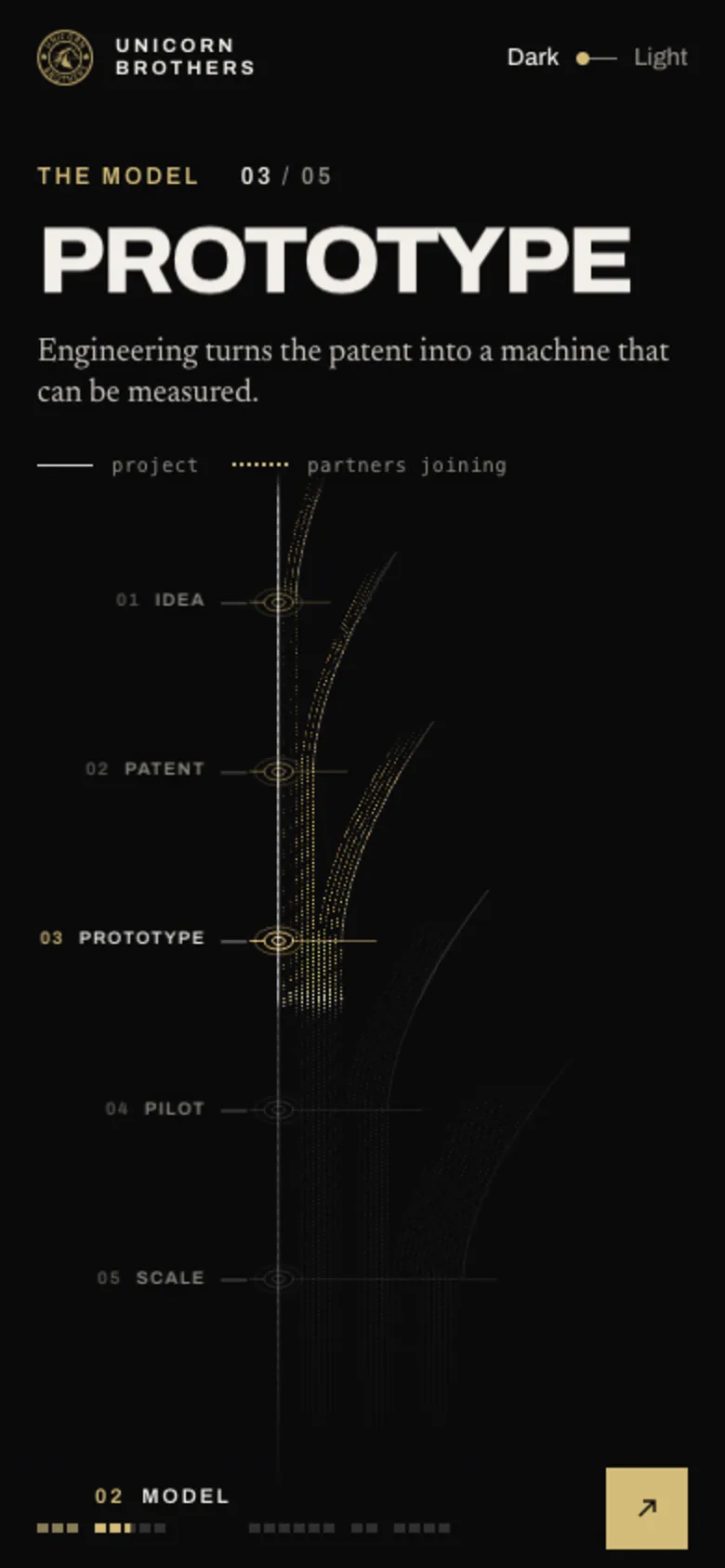
ModelThe flow runs top to bottom.
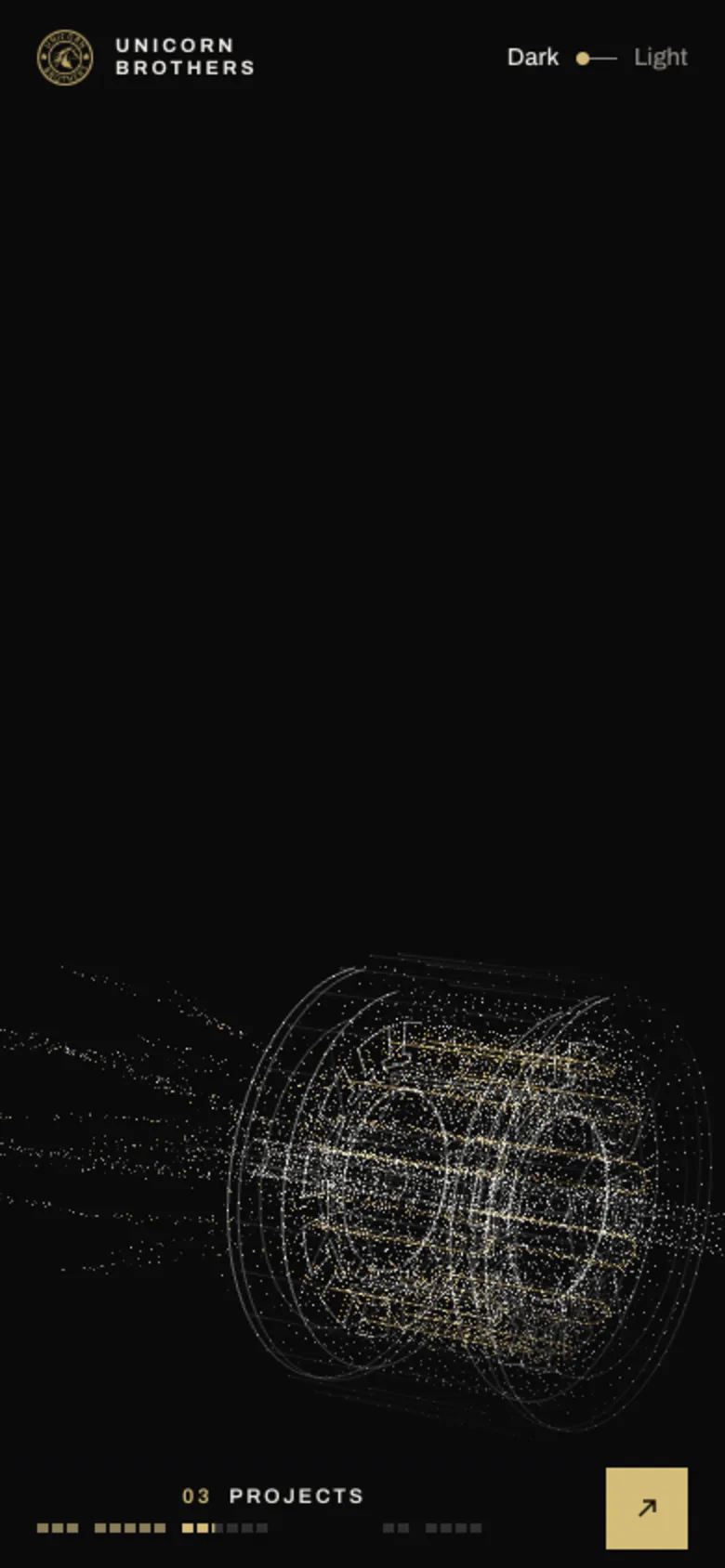
ProjectsThe field re-forms.
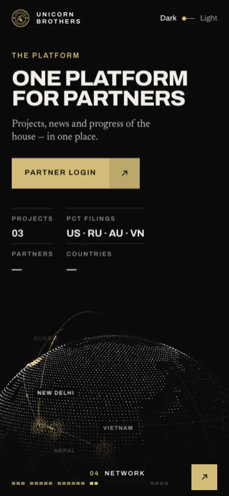
ScopeTiles in one column.
Built like a product, not a page.
External requests
three.js and fonts are vendored. A CDN that fails in the client’s network once was enough.
JSON + admin
Every text, photo and list in one content file. Admin in RU/EN with uploads, backups and a conflict check.
News and articles
Each with its own page and clean URL. A new item in the admin gets a page on save.
Frames per QA pass
A robot scrolls the page with a real mouse wheel in both themes and on a phone; I review the contact sheets.
Designer in the chair, AI as the team.
Three agents built three concepts in parallel from one brief. I directed, reviewed frames, cut what the business did not need, and wired the chosen one to the admin.
In progress. Honestly.
The redesign is not live yet: two candidates are on the client’s screen, the admin is wired to one of them, and the old site keeps working until the switch. Next steps are hosting, final copy for the projects and the launch.